Exercise – Understanding Colour

Brief:

Johannes Itten was an artist, designer and educator who spent much of his life exploring how colour works, especially the dynamic relationship between colours. This is one of his exercises.
Draw two grids of squares, filling one with colours that you like and the other with colours you dislike. Then put the two grids side by side and ask the question ‘which one looks better?’
The usual result is the grid full of colours you dislike. This is because we tend to pick bright colours as the colours we like, which when placed side-by-side look garish and jarring. By contrast the colours we think we don’t like as much are often the more subtle and muddier mixed colours, tertiary colours and occasional bright hues. When placed side by side the effect is more balanced.
This is an important lesson for designers when picking a colour palette to work with: use bright colours but balance them against more subtle colours. It will also help you become better acquainted with your image manipulation or DTP software – identifying where your colour swatches are, how to select them and how you blend colours by changing their opacity.
Next try experimenting with placing colours together as Itten did.

Beginning the task

The exercise started off by instructing me to create two grids of colours; the first being with colours that I liked and the second with the colours that I disliked. So this is what I did.

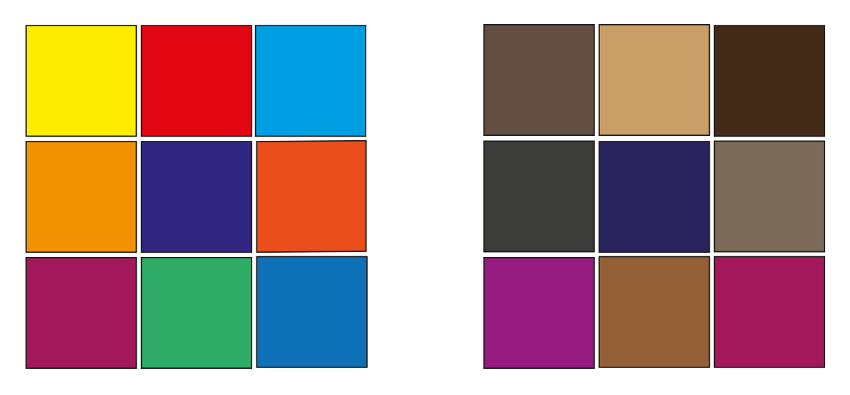
After creating the two grids of colours I asked myself “which one looks better?” I was surprised that my opinion was in line with Johannes Ittens school of thought. The colours that I usually dislike, when put together look more well balanced. Meanwhile the colours that I like and frequently use, when observed for a little while, look excessively bright.

Colour squares

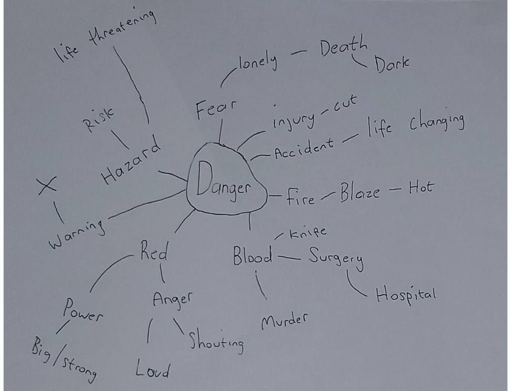
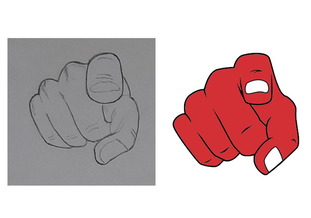
The next portion of the exercise wanted us to experiment with colours. More specifically, we were given twenty six different words and the idea of the task was for us to create a combination of two colours that best described each word. These are the examples I came up with.

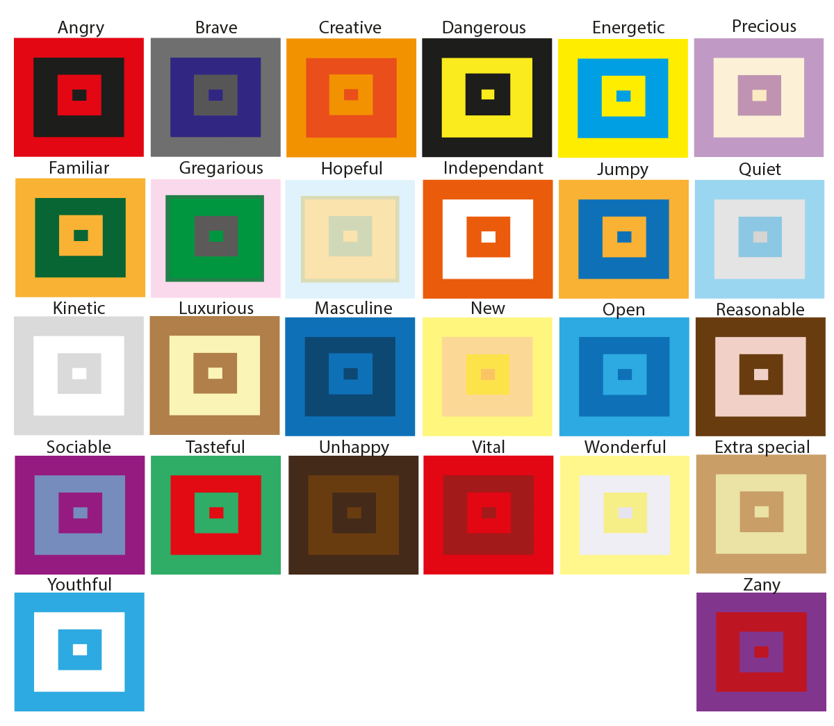
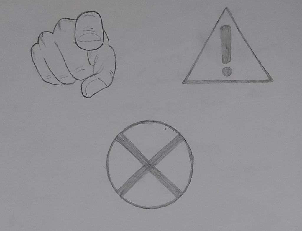
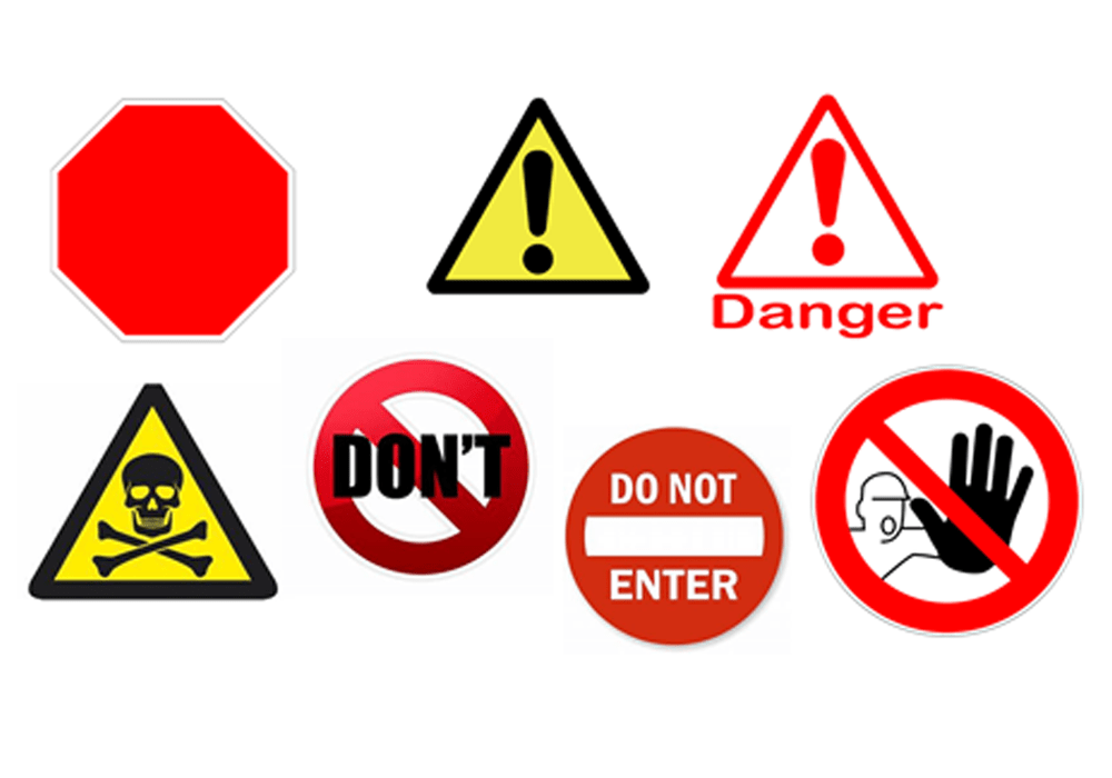
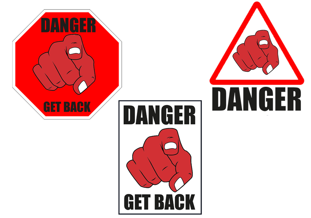
Some of the colours were easy to come up with, for example the hue that I chose for the word angry was red. The reason for this is because when I think about the word angry the first thing that comes to my mind is a furious, bright, red face. Another expression that I found quite straight forward was the word ‘dangerous’, I automatically chose the colours black and yellow because if you look at most signs that refer to the word danger these are the most popular colours.

However, there were other words that were more challenging. I had to think outside of the box to find the correct colour scheme. For example words like precious, wonderful and quiet had soft connotations to them. So for my colours to match those words I had to reduce the opacity of my colours to make them have a more softer effect. The word ‘wonderful’ reminded about a sunset, this is why I used a faint yellow colour. The word ‘precious’ made me think about an innocent baby which is why I used a combination of a soft purple colour on a light creamy background. For the word ‘quiet’ I used a baby blue colour on a light grey background. Once again this is because the colour and the word quiet reminds me of an innocent child. For words like unhappy I thought that a dark brown colour would work well with the dull mood.

Final thoughts

This exercise was very interesting. Some of the parts were quite challenging. Usually I like to conceptualize my ideas through imagery, but with this exercise I was limited to only use colours to illustrate the ideas. However, I was happy with the end result.

Exercise: Seeing the light

Using only an image of a light bulb, the word ‘light bulb’ and a block of colour of your choice create different designs that explore visual dynamics – as the kitten designs shown in the previous project. Think about your compositions, trying each element at a different sizes and cropping your photo. Your block of colour can be any size, so use it fully to create a sense of space in your composition. Think about layering your visual elements to create depth within your designs and think about contrasts. Use thumbnails to work out what sort of designs you might try. You can download and use this lightbulb image (above) from http://commons.wikimedia.org/wiki/File:Gluehlampe_01_KMJ.jpg and work on your computer or photocopy the picture of the lightbulb and work on paper. Be playful within the rules set, creating as many different designs as you can. Edit these down to about 20 designs that you feel represent the breadth of different approaches you have explored.

What am I being asked to do?

Create a range of different designs using the following three arrangements: An image of a light bulb, the word light bulb and a block of colour of my choice.

Design as many compositions as I can and then trim it down to 20 pieces.

What are the keywords?

Light Bulb, block of colour, composition, layering, depth, contrasts, playful, different, 20 pieces.

Experimenting ideas

The brief was quite straight forward with this exercise. We were told to create twenty different designs using a light bulb, the word light bulb and a block of colour. I designed quick and simple ideas, I made sure to play around with different sizes and layering because this is what the brief wanted me to explore, these are the designs I came up with.

I was very surprised with how many designs I could produce with such limited features. I also enjoyed playing around with the sizing and the layering of the images. For example in most of my designs the image of the light bulb comes across as the hierarchy, this is because of the size of the image and the way I placed it above all the other layers. Meanwhile in some of my other designs the wording of the light bulb comes across as the hierarchy because I layered everything else behind it – an example of this is my 6th draft.

One other thing that I really enjoyed is the fact that usually when I create a design that I like, I stop experimenting with any new ideas. If it wasn’t for the brief I would have been content with my first draft because I really liked the way the layers created depth within my design. But thanks to the brief I had no option but to design another 19 compositions which allowed me to play around with different formats.

I had a lot of fun with this exercise and I also believe that I will definitely benefit from it.

Tutor Feedback

This is a satisfactory solution and good to see that you have been surprised
how many designs can be made with small adjustments. You have explored
rectangular shapes but triangles circles and other forms could have been
equally explored. This is also true of your layering. That said you have
understood the brief and provided an adequate solution. Try to push your
visual research further.

Exercise: Signs and symbols

Brief:

In this exercise you will read existing signs, symbols and images, and then drawing on their visual language create your own symbols. Choose one of the following concepts:

Danger Movement Love Here

How does existing visual language represent these concepts, for example both ‘danger’ and ‘love’ use red, while ‘movement’ and ‘here’ use arrows. Research the different similes and metaphors that are in common use. Document them through drawings, collecting examples and mind maps.
Now create an alternative symbol to represent at least one of the concepts.
Pencil and paper is the fastest and most practical way of working out your initial designs. You may then want to develop your idea further using computer software.

What am I being asked to do?

Analyse the visual language of one of these four concepts: “Danger”, “movement”, “love” and “here” and then create a new symbol for it.

I began this exercise by analysing the four words on the subject of signs and symbols to get a better idea on how I could approach this brief. I was automatically inclined to the “danger” theme because this is the one I most connect to, I’ve always been into extreme sports and the more danger something holds the more excitement I feel.­ This is why I am going to explore the ‘danger’ theme.  

I started off by sketching up the ideas that popped up into my head straight away. The first thing I drew was the red cross symbol, I then drew the triangle sign with the exclamation mark. The third design was a picture that I already had in my collection. It is an image of a finger pointing directly at the reader, the image really caught my attention when I first saw it which Is why I saved it, I feel like I maybe able to use it effectively for this task.

Signs and symbols sketches

I wanted to expand more on the word ‘danger’ so I created a mind map to see where it would take me.


The mind map gave me a few words which reminded me about symbols which connect to danger. For example the word “death” reminded me about the “danger of death” sign and also the word “hazard” reminded me about the various different symbols that come up in the hazard perception test. I am going to research the different types of signs and symbols which already exist so I can use these ideas to form my own design.

These are the symbols that I collected. I can use ideas from each one to come up with my own design. I really liked the one on the bottom right, I have never seen it before and even though it doesn’t have any writing I can still understand what it is communicating, for example to me it is saying “Danger, get back!”. I think I am going to use the same concept for my idea.

I then went on to make a more polished, digital version of one of my sketches using Adobe Photoshop. I added a red colour to my design because from what I gathered red is the most popular colour with symbols which relate to danger.

Experimenting and developing ideas

After creating my main image I then designed the wording to go with the symbol. “Danger” and “Get Back” are the two expressions I decided to use as they are both very striking words. I then began to experiment with different backgrounds and these are the designs I came up with.


Designs and criticism

I really liked the top two designs because they looked more complete. I posted the three symbols in my family group chat for feedback and the one on the top left was the most popular, my cousin gave me criticism about the red on red colour scheme, he said he would have preferred to see a different colour background or a different colour image which was something that was also on my mind, so this is what I began to experiment on.

Final design

After experimenting with different colours this is the colour scheme I chose. The dark background puts more emphasis on my main image, I have also wrote clear instructions in big bold writing on the top and bottom of my symbol.

There are already so many different signs which makes me satisfied for being able to create a simple but unique idea.

Reflection

Overall I really enjoyed this exercise, I put more effort into developing and experimenting with my ideas instead of just jumping into a solution, I found this process very helpful. Even though I used minimalist ideas I was still happy with my final design.

Project: Visual Literacy

Research the work of graphic designers that interest you. How do they use visual language? What is it about the work that you admire? Make notes on their work, your reflections on it and note down aspects of it that you could use as a starting point yourself.

I follow many different pages on social media which are related to graphic design. However, most of them don’t have any information about the actual artist. My favourite page that I like to observe goes by the name “Success Pictures”. The goal of the page is to create content to inspire people, I feel fascinated by the way that they do this. They use examples of real life situations and famous quotes and slogans which they then interpret by creating pictures. Here are a few examples which they designed.

I am always amazed by the designs that this page comes up with and I can tell that their work requires a lot of lateral thinking. I enjoy creative approaches to tasks instead of obvious ideas. These are aspects which I would like to use in my own designs.

Assignment 2 – Thinking of You

Brief

Create a range of cards for sentiments or events that are worthy of a greetings card, but are currently not catered for by card manufactures.

The cards could be linked to other calendar events, obscure Saints days, sporting calendars or any other happening that is worth celebrating or commiserating. You may wish to explore some of life’s other landmarks that currently don’t feature in greetings cards, like getting your first grey hairs, being released from prison or any other personal landmark someone might want to share.

What am I being asked to do?

The brief for this task is for me to design three greetings cards for events which cards are not catered for. My goal is to come up with an exciting outcome to the brief with unique ideas that are worthy of a card.

How will the client judge a successful outcome?

The designs of the cards have to be appealing and interesting. I don’t have many limitations with this brief and the task is pretty straight forward. I am going to take advantage of this and try to use my lateral thinking skills to come up with something worthy of attention.

What are the keywords of the brief?

Create cards that are “worthy of a greetings card, but are currently not catered for by card manufactures.”

“The cards could be linked to other calendar events, obscure Saints days, sporting calendars or any other happening that is worth celebrating or commiserating.”

Coming up with ideas

When it comes to creativity the main thing that motivates me is to design something that I can relate to, this is really what sparks my interest. I am going to create a mind map to write down all the recent events that have taken place around me whilst keeping the brief in my mind. ­­

I noted down a few events that took place in my life over the past year. I think this is a good a way to come up with an idea because other people will share similar experiences as me, which in return is going to help me come up with an idea for a greetings card.

The three events that I am going to choose are: “losing your first tooth” “achieving your black belt” and “laser eye surgery”. I can construct an idea with any of the events on my mind-map but the three I picked are the ones that caught my attention the most.

Greetings card 1

The first event which I decided to create a greetings card for was “Losing your first tooth”. The incentive behind this idea is quite personal to me which is why I chose this subject. I have a younger brother who suffers from high functioning autism who faces many battles every day, a regular task that a normal person would go through is a huge event compared to someone who is autistic. One of the recent struggles which we have been facing is pulling out his teeth, we have a huge amount of anxiety around this subject, however I can use this ‘landmark event’ to create a greetings card.

Usually I like to sketch my ideas on paper, but because I have re-injured my rotator cuff in my shoulder I am unable to do so. I decided to go on to Pinterest for some inspiration and I found a few designs which I liked. These are the pictures that I saved.

After analysing these pictures I really liked the colour scheme and the aesthetics of them. I decided to play around on adobe photoshop where I came up with my own design. This is how my final design looked.

Final Design

Final Design

I was very happy with how my design looked. I think the colour scheme and the picture of the fairy flying away with the tooth makes for a perfect greetings card for a young child that has just lost his tooth.

Greetings card 2

The second greetings card I designed was titled “congratulations, you have achieved your black belt”. Achieving a black belt in martial arts is a very significant event. It takes years of hard work and strenuous training and not many people have the discipline to complete it. My younger cousin was recently awarded his black belt and I was extremely proud of him because I was the one who introduced him to martial arts. This is a very worthy event which is deserving of a greetings card.

At first I was sceptical with how I was going to approach this design but after looking at a range of different pictures on Pinterest I had a variety of ideas popping up in my head. These are the pictures that I saved.

These were the main images that I combined to come up with a unique design. This is what my final design looked like.

Final Design

Unlike my first greetings card this one was different, the idea wasn’t just to make the colour scheme look pretty. I wanted my images to have more meaning. The first thing I designed was the clock, the numbers on the clock aren’t telling the time in its place I have put dates of the years. The clock hands point to the years 2014 and 2019, this refers to the years that my cousin started his training and the year that he achieved his black belt. I created a silhouette of a student and a master bowing to each other which is something that is part of the martial arts culture and the black belt ceremony. I then placed a picture of the black belt in front of the clock because this is the main theme of the project. I showed my cousin the card that I made and he was astonished at the detail.

Greetings card 3

A close friend of mine recently had laser eye surgery and I thought that this would be an excellent idea to create a greetings card for. I left myself very little time for this task compared to the previous two so I got cracking straight away. I started browsing on Pinterest for some inspiration but I couldn’t find anything. so I began to type random stuff like “laser vision” and I got a few interesting pictures.

I spent a long time creating a set eyes shooting out laser. But once I added the background I knew I had to add more detail because the eyes on its own looked out of place.

I then went onto add more detail. I began by creating a face to go with the eyes. I then added a blurry effect in front of my image which is when my design started to look more impressive. I then placed two sentences on each corner of the card and my design looked full and complete. At the time I didn’t feel happy with the design because I felt like I rushed myself. However, looking back at it now I feel more content.

Final Design


Overall thoughts

Looking back at my greetings cards I feel happy with the ideas that I came up with. I was able to find an outcome to the brief with things from my personal life which is something I really enjoyed. Also my fluency in using Adobe Software’s is increasing which is making my confidence grow.

Exercise: Point of sale display

What are you being asked to do?

Brief broken down

Your local green grocer has asked you to produce a point of sale display to go above the fruit and vegetables in their shop. The final reproduction size will be 2 x A1 landscape. Either take photographs, create illustrations or use a combination to develop two images – one of fruit and one of vegetables.

Then identify any wording you might want to use. The most important things to remember are what the shopkeeper wants to achieve and who the message is for (the audience). The posters will be seen from quite a distance and mainly in people’s peripheral vision so the visuals need to be clear and dynamic.

How will the client judge a successful outcome to the brief?

If I can design the client a clear, eye catchy design which increases customer attraction and engagement then the brief will be met. 

Beginning the task

To start off the task I began to research and look at pictures of fruits and vegetables on Pinterest for some inspiration. I wanted my design to have striking colours, luckily fruit and vegetables are naturally very colourful which made my task easier.

One other thing I wanted to use for this exercise was Occam’s razor because I wanted my poster to be straight to the point. If I want to grab the attention of “passing shoppers” with one attempt I’d want my design to be clear and direct. I also decided to add a rhetorical question on my poster to make a potential customer think.

I used a stock image which I found on google and I added a linear light effect on the picture to make it look bright. At first I really liked the way it looked so I thought of the wording to go with it. “Eat healthy. Why not?” is the slogan I chose for my poster, I felt like the catchphrase is nice and effective because I think it will connect with the everyday person. This is how my poster looked.

Although I wanted my poster to have an eye catching effect I felt like the design was too bright. The background picture was so light that the wording almost blended in with the poster. I showed my younger brother my poster for feedback and he said it looked too simple. I wasn’t impressed with how my design looked either so I decided to redesign it.

I made a few simple changes to my poster. The first thing I did was I removed the linear light effect from the background, my wording on the picture already looked better. I then went on to design three yellow boxes with a ‘linear dodge effect’ and I placed them in between the writing and the background, this made my writing stand out even more.

Final thoughts

Overall I was happy with how my poster looked. This is another exercise that taught me that we don’t always have to think outside of the box. Sometimes using simple ideas and designs work best. The only problem I faced was that I wanted to use Adobe Illustrator for this task, but due to the time limit I scheduled for myself I used Adobe Photoshop instead because this is the software I am most familiar with. I wanted to make sure that I leave enough time for myself so that I don’t have to rush my assignment.

Research Point: What Software do I have?

Identify the software you have available to deal with desktop publishing, image manipulation and graphics/illustration. How familiar are you with it? What do you need to learn? Make notes in your learning log. Don’t forget that as a student you can get software at reduced rates, so take the opportunity to ensure you have what you need.

What software do I have?

I have a subscription with the Adobe Creative Cloud so I have access to all the essential software I need.

When I first started studying my go to software was InDesign, at the time I was most familiar with Adobe Fireworks but unfortunately this programme is now outdated so I wanted to make sure that I was up to date with all the latest programmes in the graphic design world. I felt like InDesign was the most similar to fireworks which is why I began to use it. However, the more I looked into design tutorials the more I noticed that Adobe Photoshop is the most popular software so this is the one I started to use.

I’ve developed my skills on Adobe Photoshop and now I feel comfortable using it. I use Adobe Illustrator from time to time but I’ve decided that I’m going to use it for the next few exercises because this is another software that I want to get familiar with.

Exercise: Too much or not enough information

Look around locally and identify a coming event – it could be a jumble sale, a local gig, concert or play, an exhibition or sporting fixture – and design two posters to promote it.

Make the first poster full of details and descriptions about the event. Include all the details that you think your audience might need.

For the second poster apply Occam’s Razor to pare back the information to a bare minimum – be extreme: how little information can you get away with and how few words can you use?

Now ask yourself and other people if you can, which of the designs works best. What is the key information you need to include?

How did the feedback help you with your final design? Make notes in your learning log. Redesign your poster using the feedback to guide you, creating a new poster that utilises the best points of both designs.

Choosing an event

To begin the task I decided to make a poster for the ‘five a side football tournament’ that takes place in my local sports facility every year, the OBA Millennium centre. I created a mind map to jot down any information I could use for my poster.

To meet the outcome of the brief I used all the information from my mind map, I wanted to put as much detail as I could without overfilling my design. I also added a picture of the building of the venue and a picture of the indoor football ground. This is what my poster looked like.

I then went on to use Occam’s Razor on my second poster. I cut down any extra information and only used details which were necessary. I made sure that the poster still did its job.

Feedback on my posters

I asked my family for feedback on my posters and I got the exact response that I expected. They liked the background design on my poster but felt like it had too much writing, the two pictures in the middle of the poster added to the jumble.

The feedback I received for the second poster was also quite obvious. My family thought that the information was displayed a lot more clearly however they felt like there was too little of it. They wanted me to add more detail that would engage my reader and draw them in.

­­

Final Design

After I received the feedback I went on to create a third poster, taking away both extremes of the brief I produced a balanced design. I used Occam’s Razor by restricting the information and keeping my design simple, I deleted any unnecessary pictures and replaced long sentences with more embracing words such as “all ages welcome”, “all levels welcome” etc.

Final Thoughts

Overall I really enjoyed this exercise because I feel like I will strongly benefit from it. Usually I always end up spending too much time on my designs. However applying Occam’s Razor has taught me that sometimes simplicity is key. I’ve learnt to find the perfect balance of having “too much or not enough information”.

Tutor Feedback

You were asked to look around and choose a local event, where is the
evidence of your search? What did you select from? You must show more of
your visual research. Also, I would like to see you exploring Occam’s Razor
principle by being totally reductive, where meaning is almost completely lost.
There is still too much text in the Posters.

Research Point – Critiquing your work

What issues does it raise? Do you have friends, family, colleagues or a group who will critique your work for you?

How do you approach being self-critical?

As a lateral thinker whenever I am tasked with an exercise or assignment I always begin to think outside of the box. Naturally I always want to find an exciting solution to the brief because this is what motivates me. However, sometimes I end up creating a design and when I look back on the brief I feel like my connection to the brief is very vague. Fortunately I always critique my work and make sure that the outcome is clearly met.

What issues does it raise?

The only drawback is that I end up trimming down and deleting designs off my work which I invested a lot of time on. However, this isn’t a major issue because this is just part of my design process. As long as the brief is met the client will be happy.

Do you have friends, family, colleagues or a group who will critique your work for you?

When I’m looking for a quick opinion on my work I usually just snap a picture of my design to my family group chat on WhatsApp. The problem I face with this is that the feedback I receive from them is just focused on how good my design looks and not on the brief. However, when I struggle to connect my work to the brief I use the OCA’s OCASA page where there are other active students who are willing to give feedback and some are also happy to share their own work and blogs to show how they met the outcome of a task.

This is a good mixture of balanced support that I get because I receive a lot of information that I can take in, not just from everyday people but also from other students who share the same goal as me.

Exercise: visualising your ideas

You have been asked to design a leaflet for an organisation, inviting people to to volunteer for a task. (You can choose the task for example, school governor, fundraising or building a community garden). In addition to a title the information has been broken down into four chunks each of about 120 words. You will also need to leave space for contact and address details.

Working with a sheet of A4 paper or larger if you prefer, and ignoring the actual words and subheadings, explore the different formats for leaflets that are possible. Consider and experiment with options for final size and types of paper as part of your visualisation.

The organisers are particularly interested in trying to attract new people. Your job is to find a way to make people want to pick up the leaflet. Be creative and playful in developing a range of ideas. Will the leaflets be put in racks? Will they be handed out or sent in the post? You will need to do some research to see how other people have solved similar problems.

Choosing which task

For this task I decided to go with the fundraising option because out of the three choices on the list this is the one I am most familiar with. I came up with the name ‘Chowdhury’s Trust’ and the theme of my project would be to raise money for starving children in Africa.

Experimenting with different leaflet formats

The aim of this exercise is more focused on making us experiment with different formats of leaflets more than the actual headings and subheadings so this is what I decided to focus on.

Although I was falling towards the gate-fold style leaflet  I felt like the tri-fold method would be the best option. The tri-fold design doesn’t just look professional but it also makes it easier to separate information. For example, I can use the front page to attract people by displaying pictures and a clear title, I can use another page to talk in detail about my charity and why people should help us, then the final page can be used to display any extra information such as contact details, online websites and address etc. The tri-fold style leaflets are also smaller and easier to carry, if I was to hand out my leaflet it would be more easier for people to fold it into their pockets.  

I then went on to learn how to make leaflets by watching tutorials on YouTube and I started to begin my design.

My main focus while designing the leaflet was to make it stand out. I played around with different colour schemes and I really liked the combination of having gold writing on a gradient black background and this is how my final design looked.

Final Design

Final Overview

Overall I was very happy with how my leaflet looked. The way my black background colour blends from dark to light is something that I am very impressed with, also the juxtaposition of the golden designs and the colour of the fonts compliments my leaflet. I was a bit worried at first because I wasn’t sure if black and gold would be the correct colour scheme for a charity fundraising event aimed for children in Africa. However, once my design was completed I was very pleased with how it looked.

Tutor Feedback

You have produced stronger work here, a clear process has led to a
satisfactory solution. The tonal range of the black is very effective as is the
classic gold. There is still a lack of evidence of image development through
iterations. Try to ask more questions that lead to more image development
How did you arrive at these colours? What other colours did you explore?
What would gold on black normally signify? is it appropriate to the charity?
By critically reflecting in this way you evidence your knowledge and
understanding which is essential for success at degree level study.