Look around locally and identify a coming event – it could be a jumble sale, a local gig, concert or play, an exhibition or sporting fixture – and design two posters to promote it.
Make the first poster full of details and descriptions about the event. Include all the details that you think your audience might need.
For the second poster apply Occam’s Razor to pare back the information to a bare minimum – be extreme: how little information can you get away with and how few words can you use?
Now ask yourself and other people if you can, which of the designs works best. What is the key information you need to include?
How did the feedback help you with your final design? Make notes in your learning log. Redesign your poster using the feedback to guide you, creating a new poster that utilises the best points of both designs.
Choosing an event
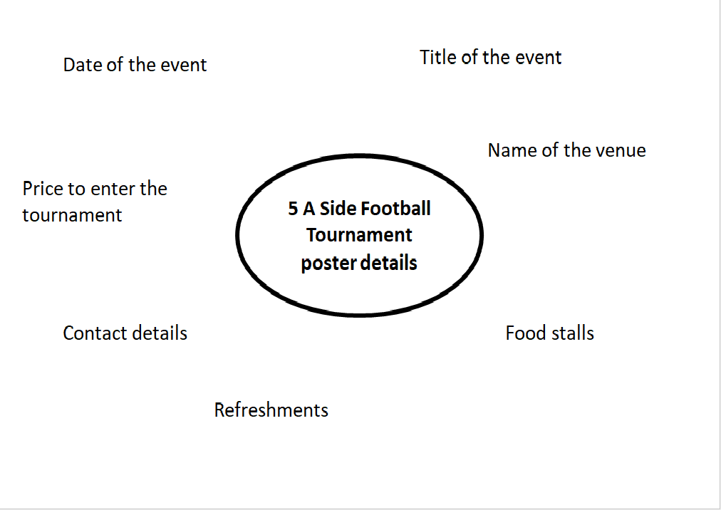
To begin the task I decided to make a poster for the ‘five a side football tournament’ that takes place in my local sports facility every year, the OBA Millennium centre. I created a mind map to jot down any information I could use for my poster.
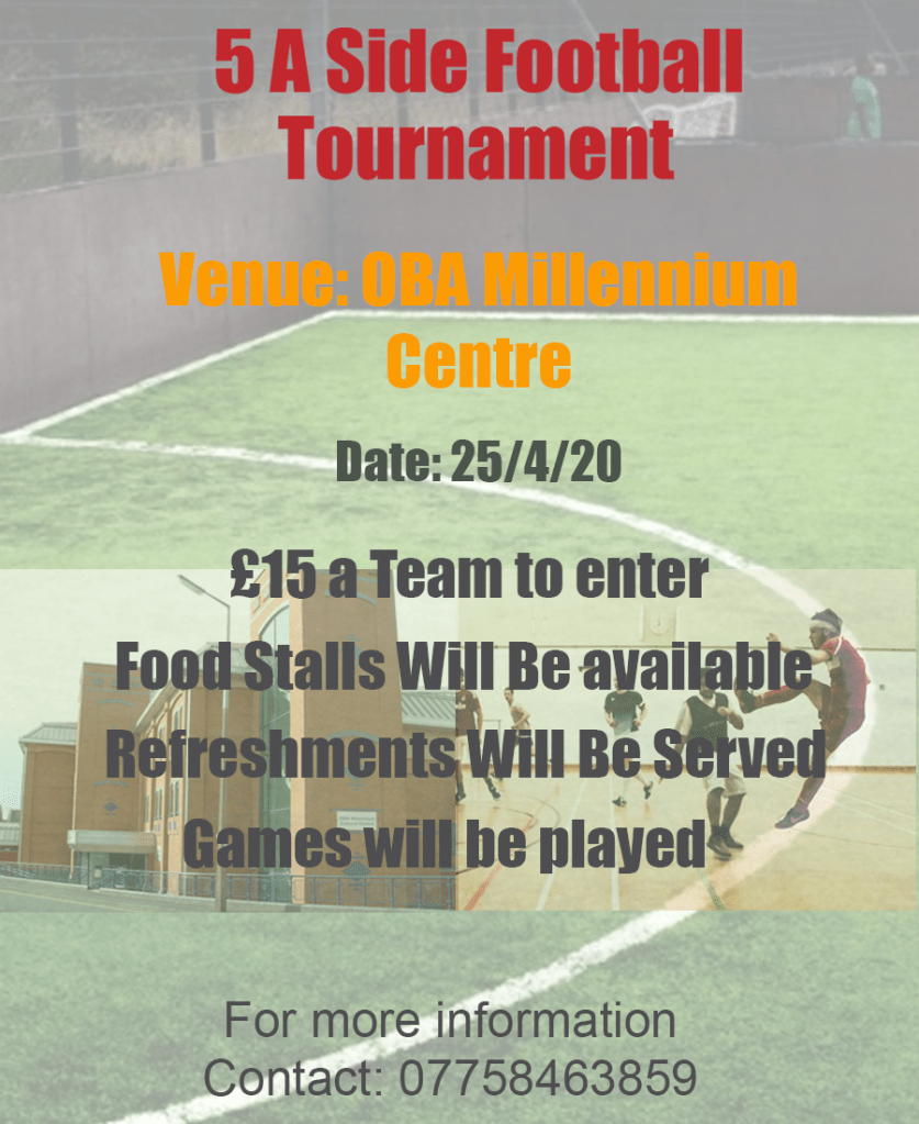
To meet the outcome of the brief I used all the information from my mind map, I wanted to put as much detail as I could without overfilling my design. I also added a picture of the building of the venue and a picture of the indoor football ground. This is what my poster looked like.
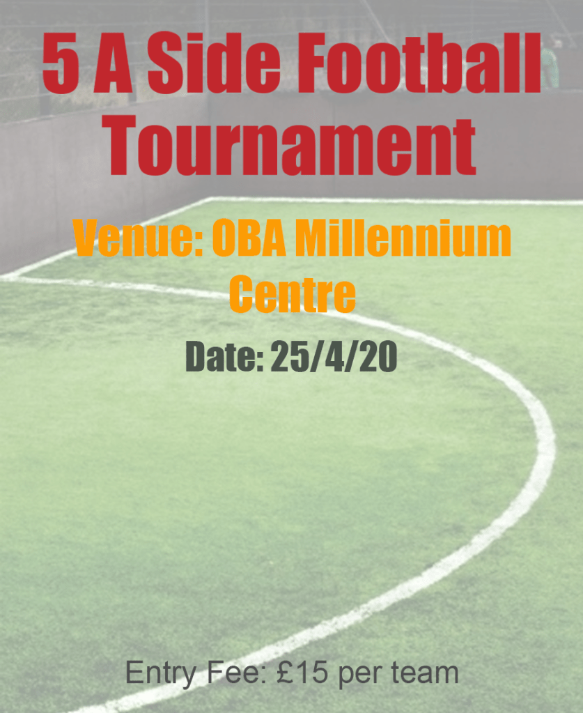
I then went on to use Occam’s Razor on my second poster. I cut down any extra information and only used details which were necessary. I made sure that the poster still did its job.
Feedback on my posters
I asked my family for feedback on my posters and I got the exact response that I expected. They liked the background design on my poster but felt like it had too much writing, the two pictures in the middle of the poster added to the jumble.
The feedback I received for the second poster was also quite obvious. My family thought that the information was displayed a lot more clearly however they felt like there was too little of it. They wanted me to add more detail that would engage my reader and draw them in.
Final Design
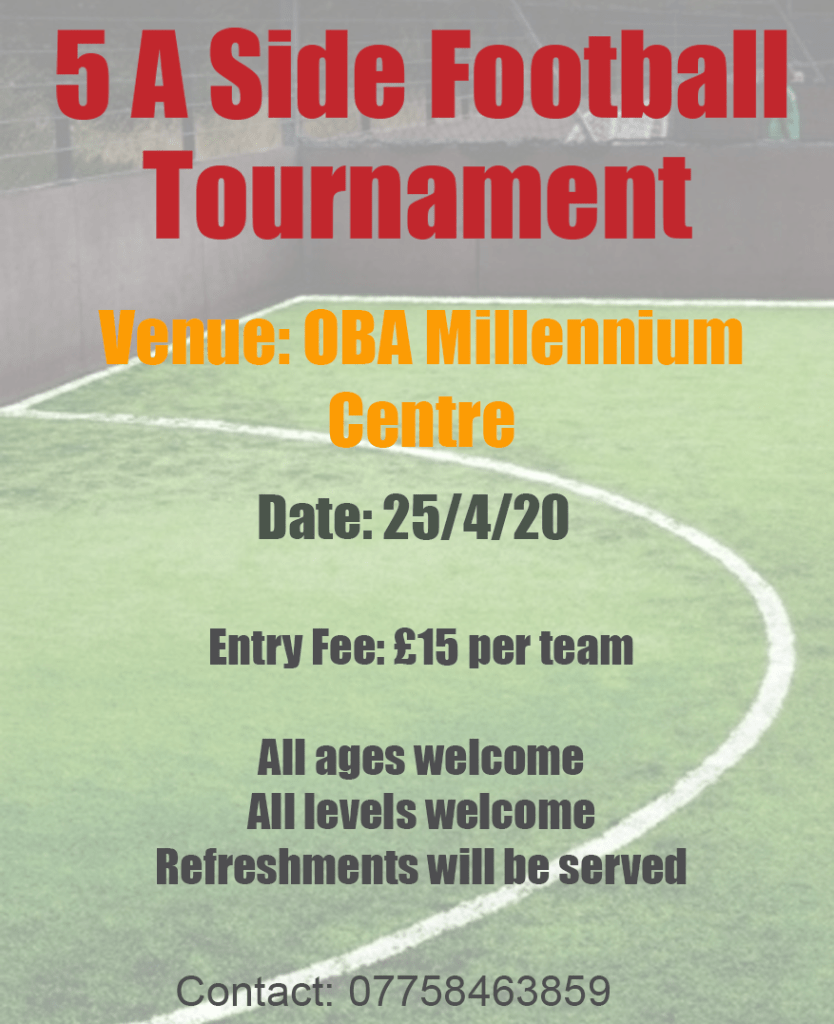
After I received the feedback I went on to create a third poster, taking away both extremes of the brief I produced a balanced design. I used Occam’s Razor by restricting the information and keeping my design simple, I deleted any unnecessary pictures and replaced long sentences with more embracing words such as “all ages welcome”, “all levels welcome” etc.
Final Thoughts
Overall I really enjoyed this exercise because I feel like I will strongly benefit from it. Usually I always end up spending too much time on my designs. However applying Occam’s Razor has taught me that sometimes simplicity is key. I’ve learnt to find the perfect balance of having “too much or not enough information”.
Tutor Feedback
You were asked to look around and choose a local event, where is the
evidence of your search? What did you select from? You must show more of
your visual research. Also, I would like to see you exploring Occam’s Razor
principle by being totally reductive, where meaning is almost completely lost.
There is still too much text in the Posters.
