Core Concepts Assessment

I am going to attach 8 of my strongest works which I will be sending in for submission, but first I am going to demonstrate how I achieved the learning outcomes.

LO1 develop your creative and visual abilities in your practice as a graphic designer.
LO2 use creative problem solving and research to generate visual ideas.
LO3 demonstrate your use of design and technical skills for graphic design.
LO4 articulate an understanding of the contexts of graphic design practices and reflect on your own learning.

Exercise – Visualising your own ideas

LO1 LO2 LO4

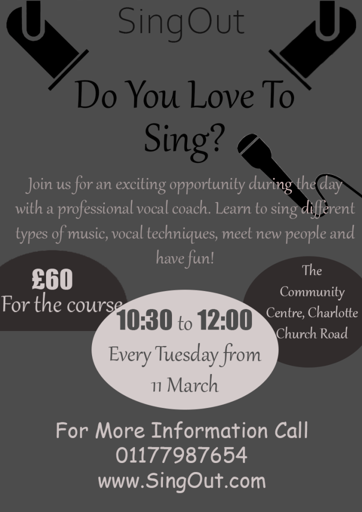
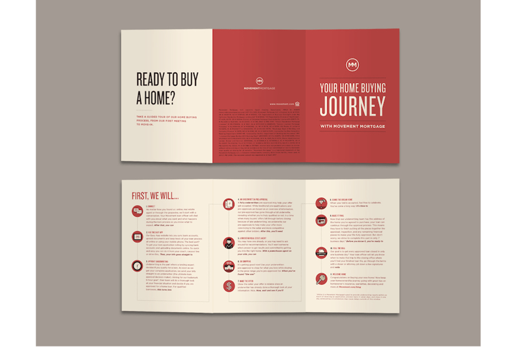
This exercise gave me the opportunity to experiment with different leaflet layouts, it gave me the chance to work out the positives and negatives of different format designs. I was able to use what I learnt to make my own leaflet in a way which I felt was the most effective.

Exercise – Lorem Ipsum

LO1 LO3 LO4

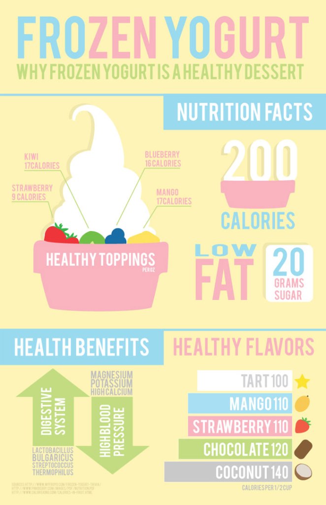
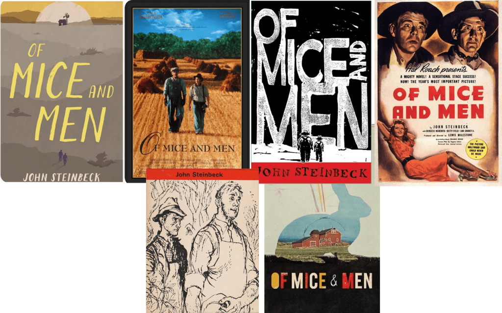
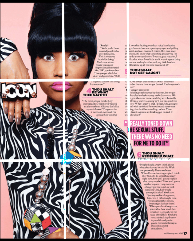
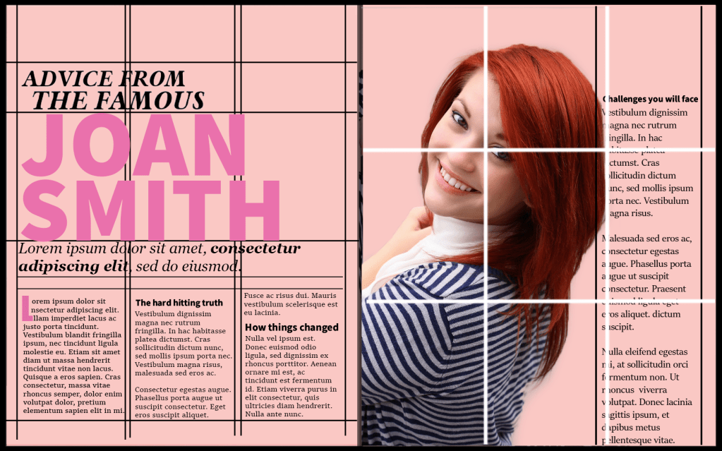
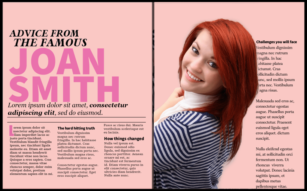
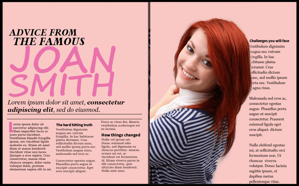
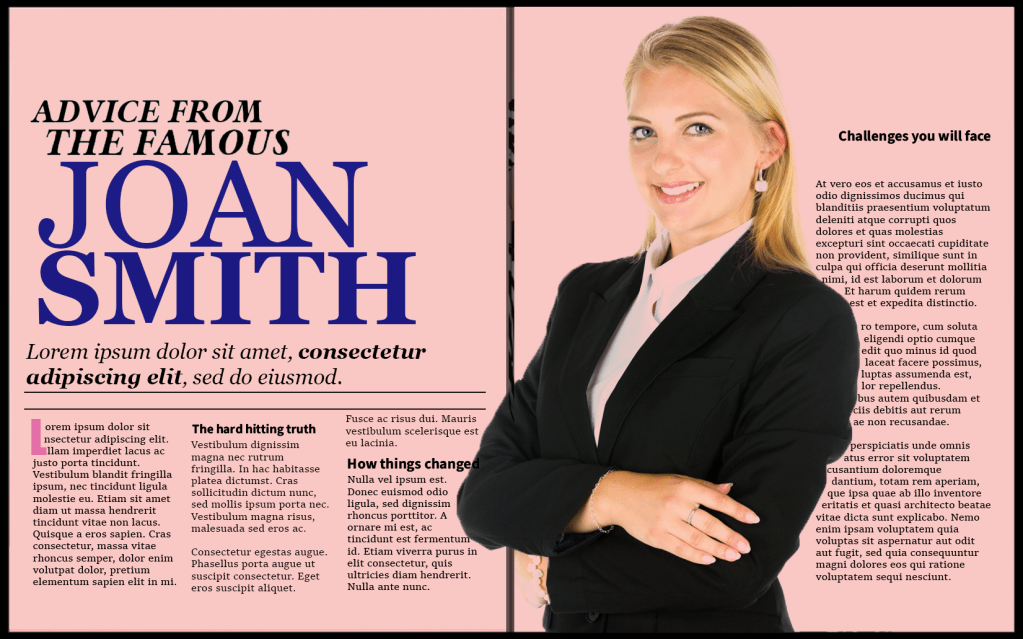
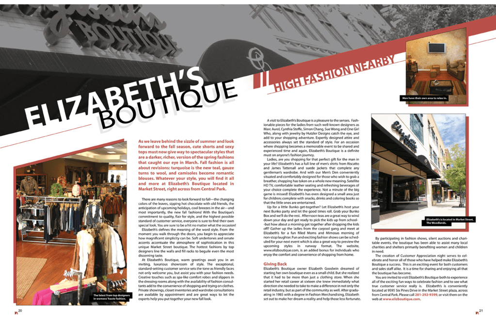
I found this piece of research point very informative and the exercise which followed allowed me to demonstrate what I learnt. It gave me a better understanding on how the structure of the columns, the colour scheme and how the serif fonts are constructed to enhance readability and legibility. I extracted the ideas from one of the examples and made my own magazine to display what I learnt.

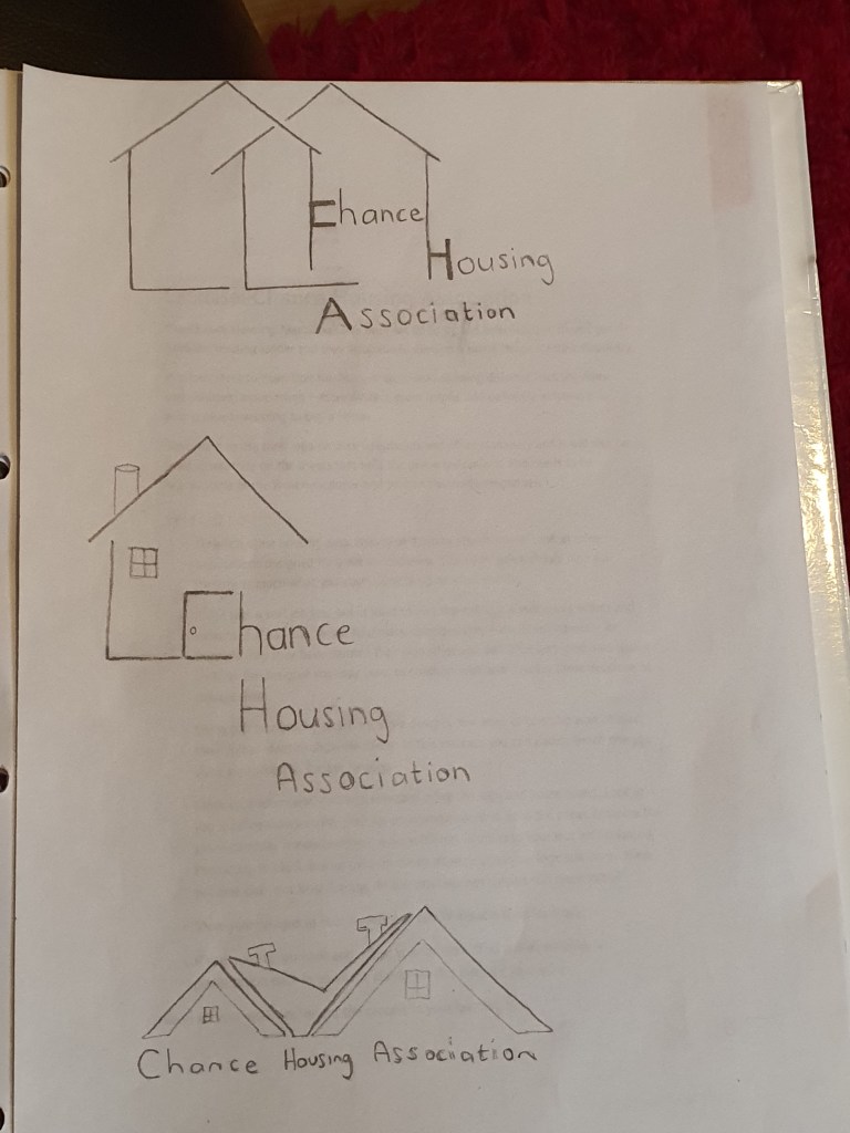
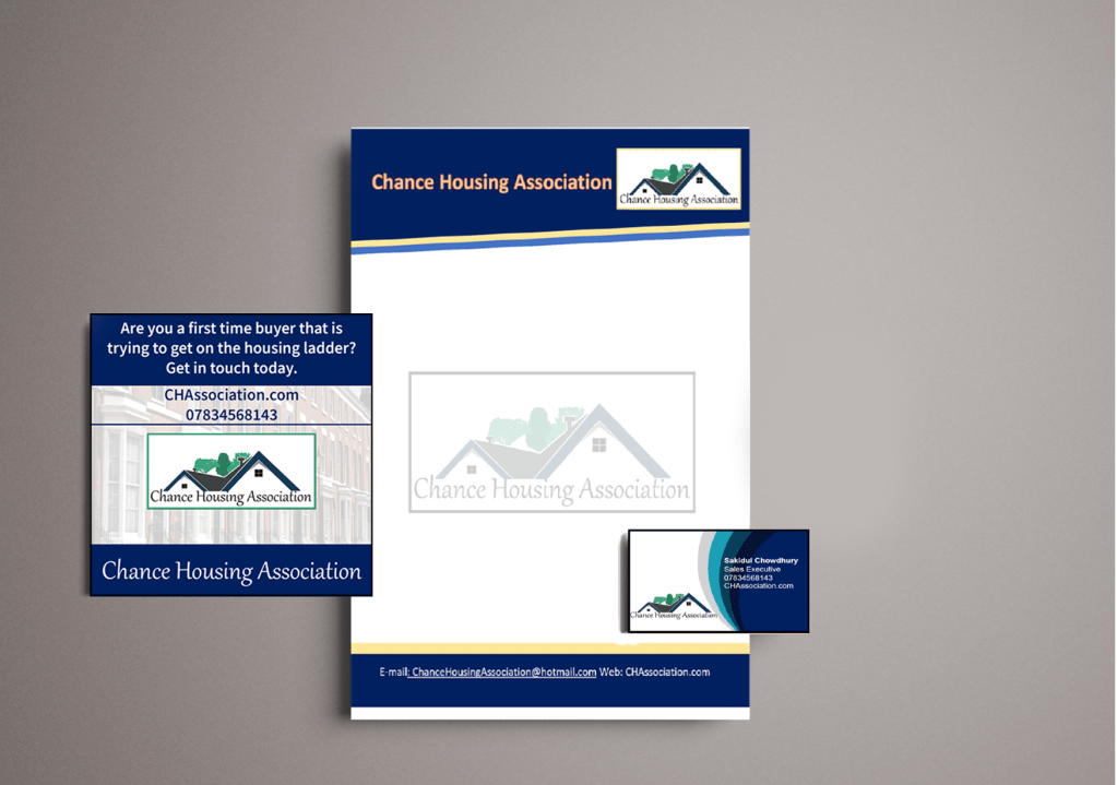
Exercise – Chance Housing Association

LO1 LO2

In this exercise I had very limited time constraints but thankfully I had a lot of ideas in my mind, I was able to make quick drafts on paper which made it easy for me to compare which designs work and which doesn’t. I then went on to develop the design which I felt was most effective and refined it into a polished logo which complimented the business card and letterhead which I created.

Exercise – Too much or not enough information

LO3 LO4

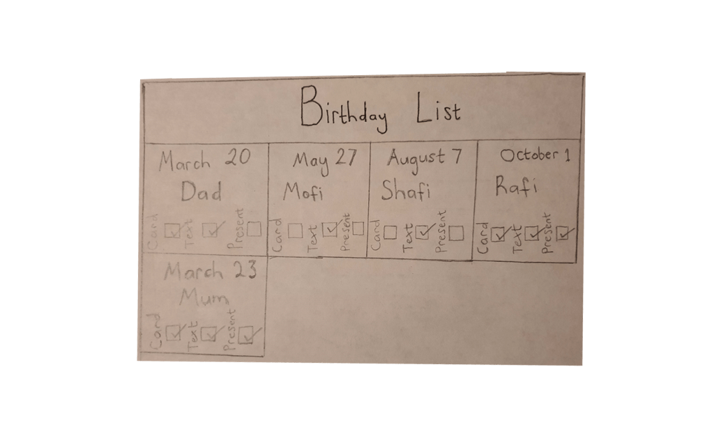
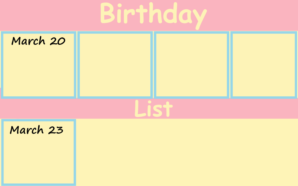
For this exercise I put into practice the principle of Occam’s Razor, in the context of graphic design. This exercise was very beneficial and it came at the right time; I was spending way too much time on minute details before this. Experimenting with the practice of Occam’s Razor opened my eyes to the fact that sometimes the minimalist approach is more effective when trying to make an informative poster which still looks aesthetically pleasing. My tutor wanted me to use even less detail in my poster when applying Occam’z Razor, but I felt like if I took away anymore information off from the poster then the poster would be impractical.

Exercise – Seeing the light

LO1 LO2

For this exercise I was given a picture of a light bulb, the world light bulb and a blank yellow shape. The brief wanted me to explore the ‘visual dynamics’. I was very surprised to see how many visual ideas I generated, I took these 3 simple objects and was able to develop 20 different compositions.

Assignment 4 – Show Me

LO2 LO3 LO4

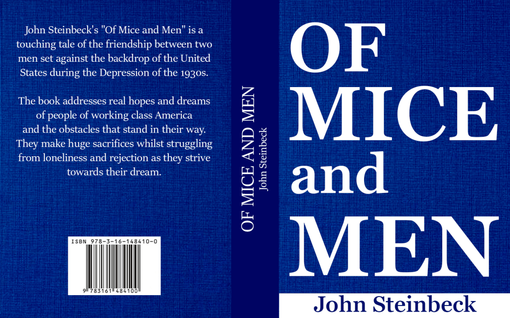
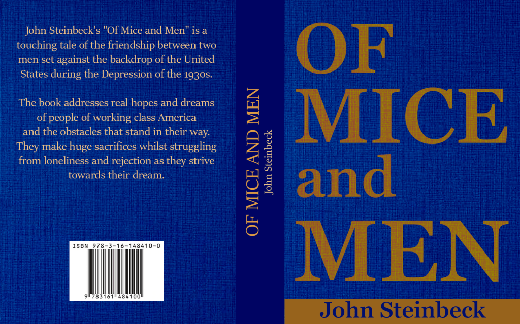
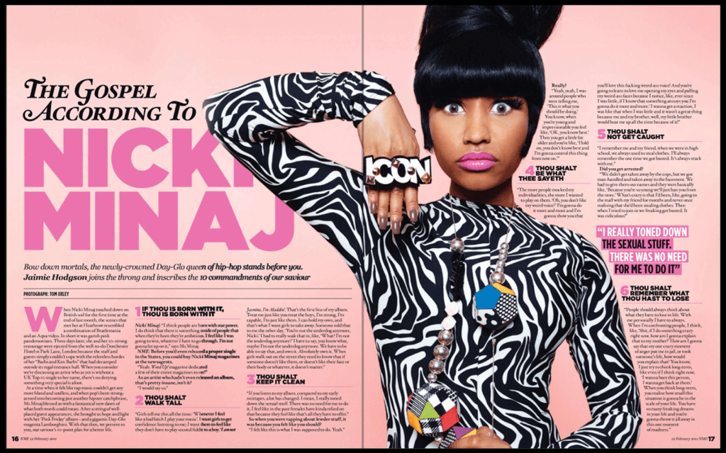
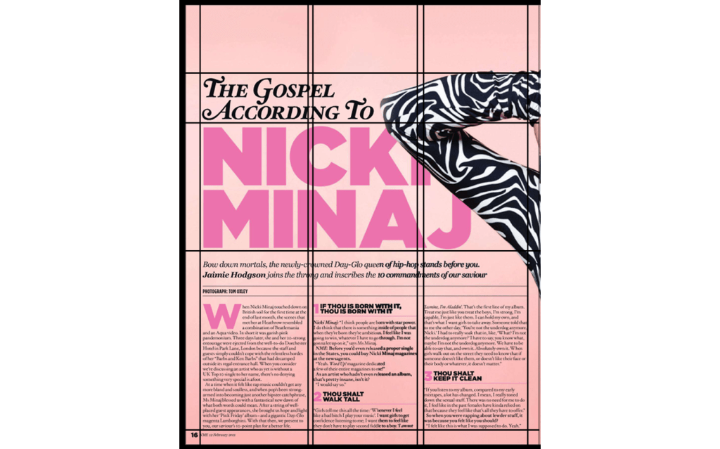
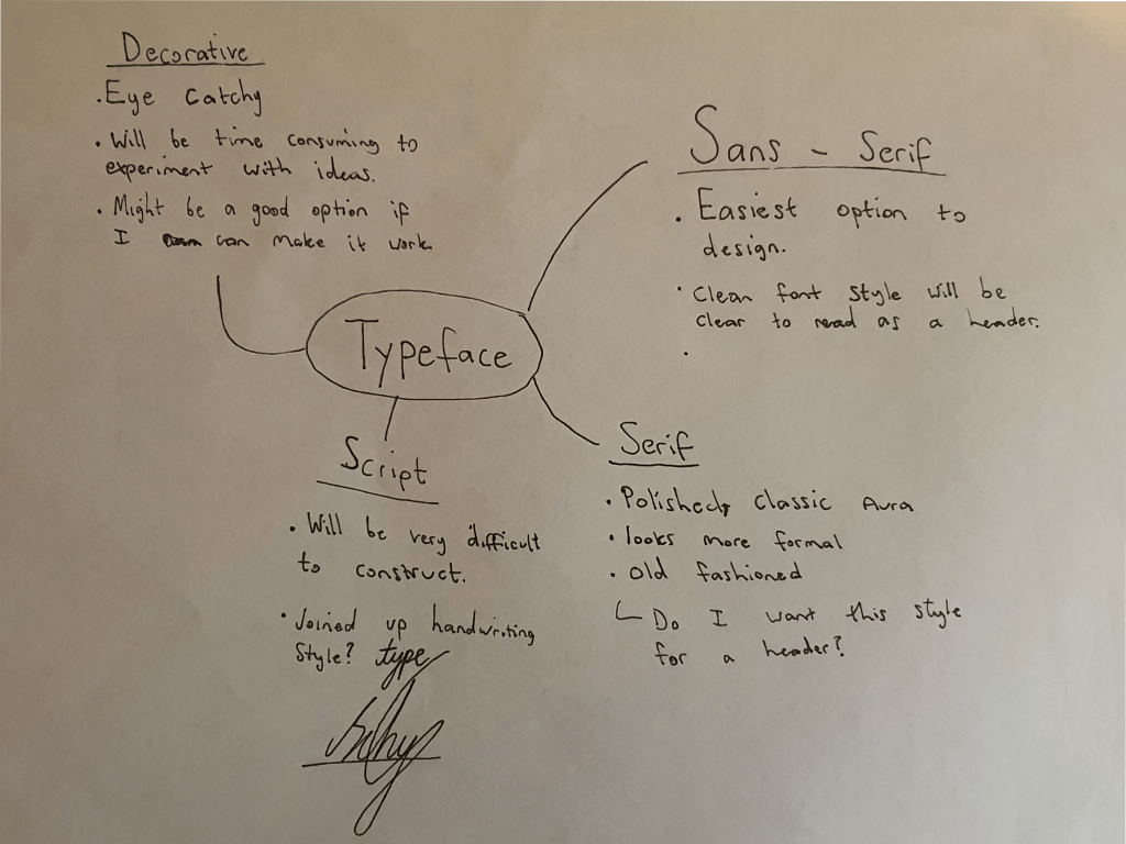
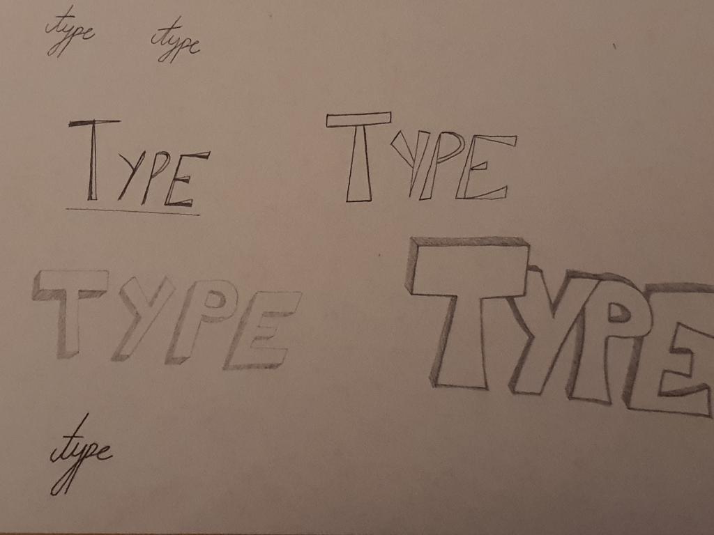
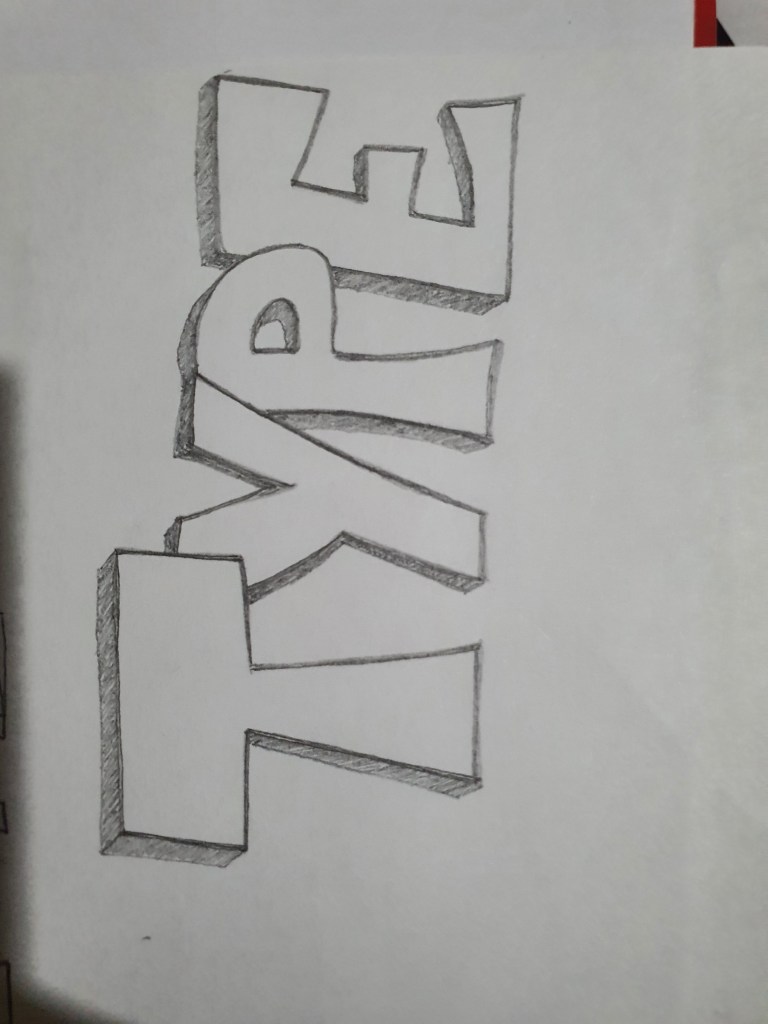
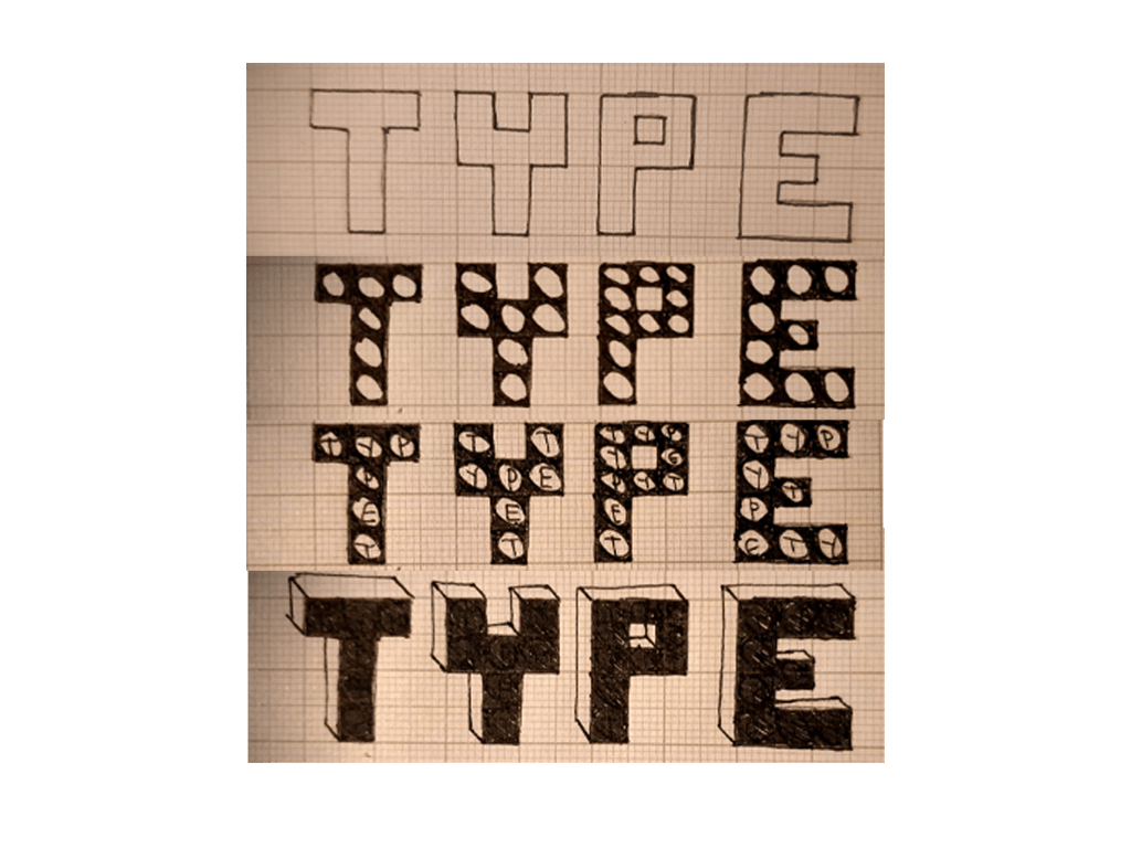
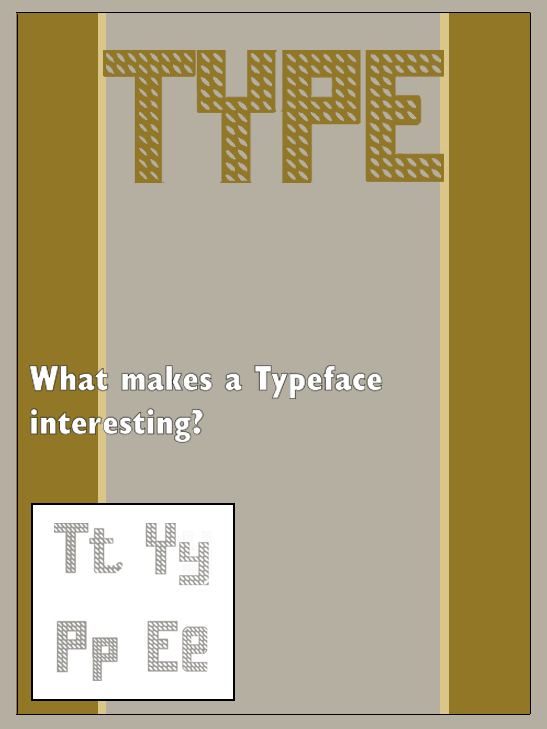
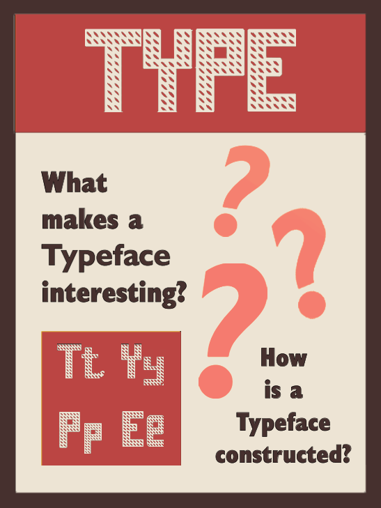
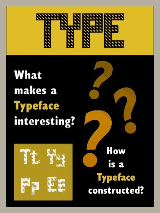
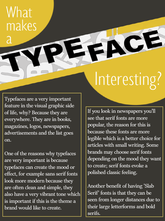
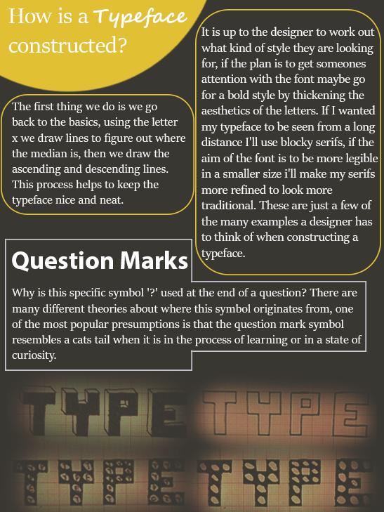
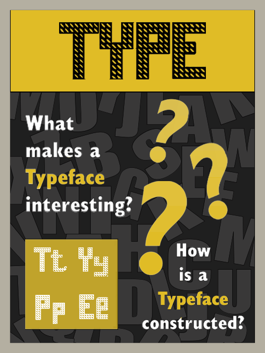
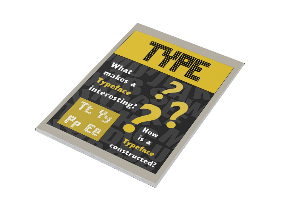
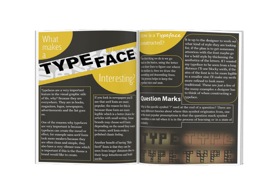
My research process for this assignment was more in depth than some of the previous exercises. The brief required me to create my own typeface (which is something I have never previously done) and to then go on to design my magazine. I was having a slight problem refining my hand written fonts at the beginning but I solved this problem by using graph paper to balance the size of my handwritten letters which I then polished using adobe illustrator.

I was also having a hard time trying to find an attractive colour scheme, but after experimenting with different colours I felt like black and yellow looked well together with my typeface. My magazine cover still felt like it was missing something so I went through my older assignments and decided to experiment with a mood board. After this experimentation my cover looked more complete.

Submission list

Project: Researching and developing ideas

Project: Visualising your ideas

Project: Working with colour

Project: Hierarchy

Project: Typographic cover

Project: Chance housing association
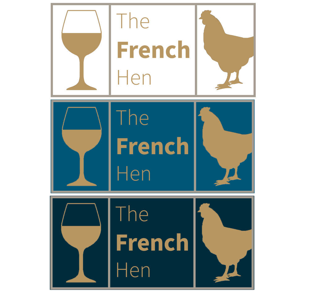
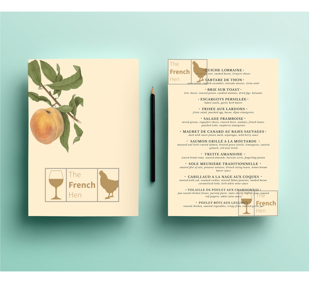
Project: French Hen

Assignment 5

Evaluation

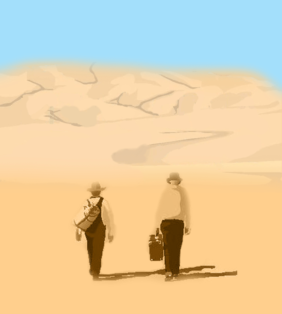
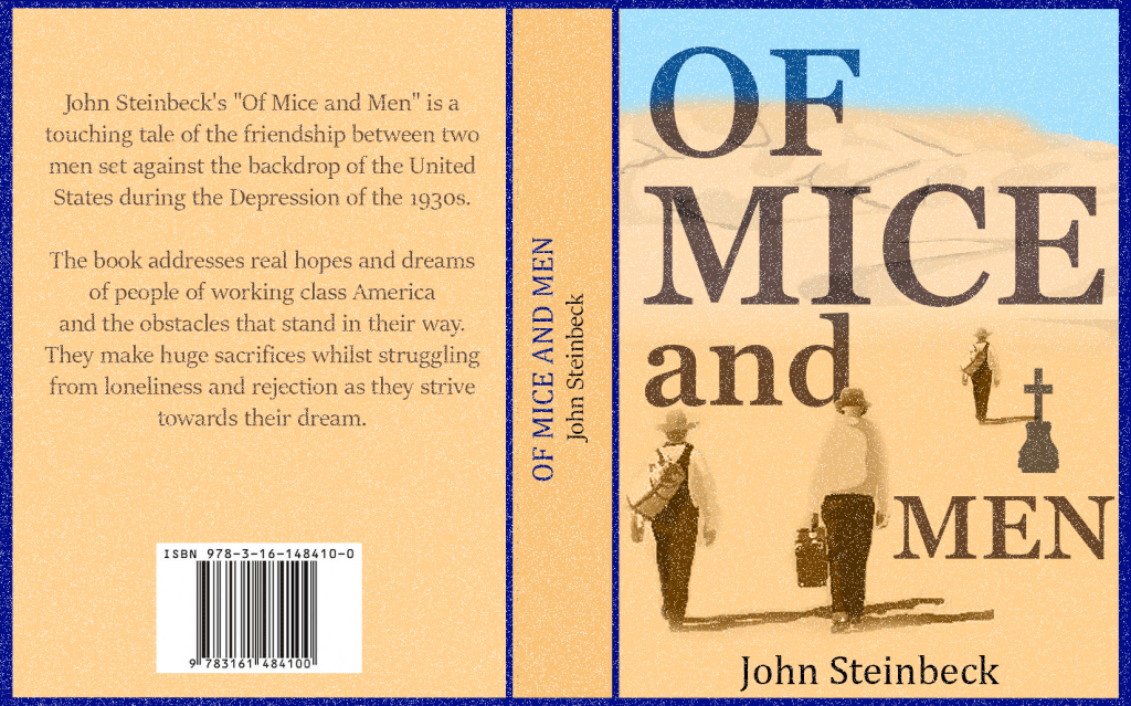
I have decided to submit projects from both the beginning of the course right to the end of the course to evaluate and analyse my progress. The more the course went on the more confident I felt in meeting the brief. For example with the ‘research and developing ideas’ exercise it took me over a month to create three book designs I felt happy with. I spent a lot of time tensely experimenting with the tools on Adobe Photoshop and felt hesitant and unsure if my work was heading in the right direction – until I felt like I fluky created a cover which I liked and then used on all three of my models. Comparing this exercise to my ‘Typographic cover’ is a milestone achievement, I created two covers in one day which met the brief successfully – my tutor was also impressed with my designs and they looked much more professional, this is a good example of how much my designing skills improved.

With the ‘visualising your ideas’ exercise I found it hard to express my own ideas into my works, I depended more on watching tutorials on YouTube instead of producing something the way I wanted them to look, I felt limited in what I could do so I think basing my designs off tutorials at this stage was a good idea. As I gained more experience through the course I became more independent in developing my own ideas, an example of that is the ‘Chance Housing Association’ exercise. Around this stage of the course I didn’t have to depend on any tutorials, I was able to make my logos and letterheads look the way I wanted them to look without any external help.

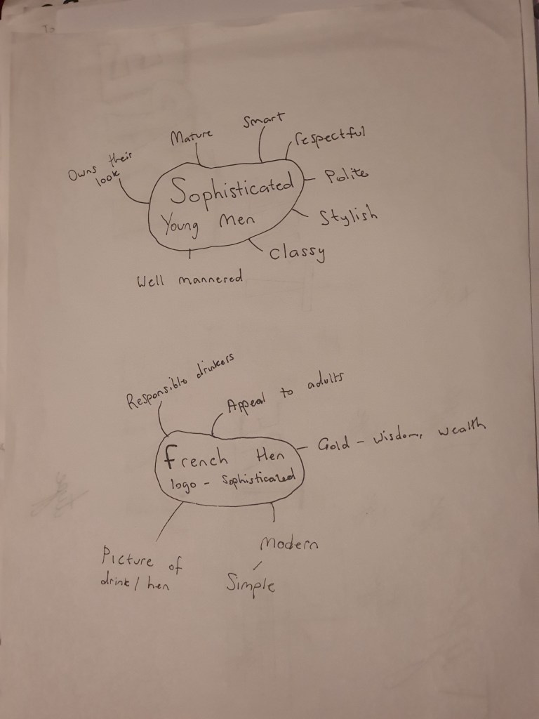
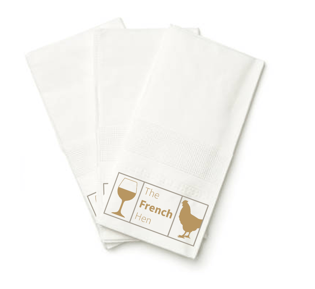
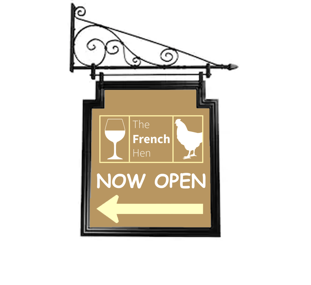
One thing I found very effective was the principle of Occam’s Razor, my tutor felt like I didn’t use it to its full advantage in the ‘Too much or not enough information’ exercise but I still learnt a lot from it. I had a bad habit of putting excessive time in over designing everything at the beginning of the course, but after learning about the Occam’s Razor theory I felt more comfortable in using less information on my designs. The project ‘Hierarchy’ is an example of where I used this principle, my tutor really liked the simplicity and the use of white space in the ‘apple pencil’ magazines that I created. Another project where I used this principle was in the ‘French Hen’ exercise, my tutor wanted me to ‘expand’ on my initial logo design but I wanted a simple looking logo like the examples in my mood board.

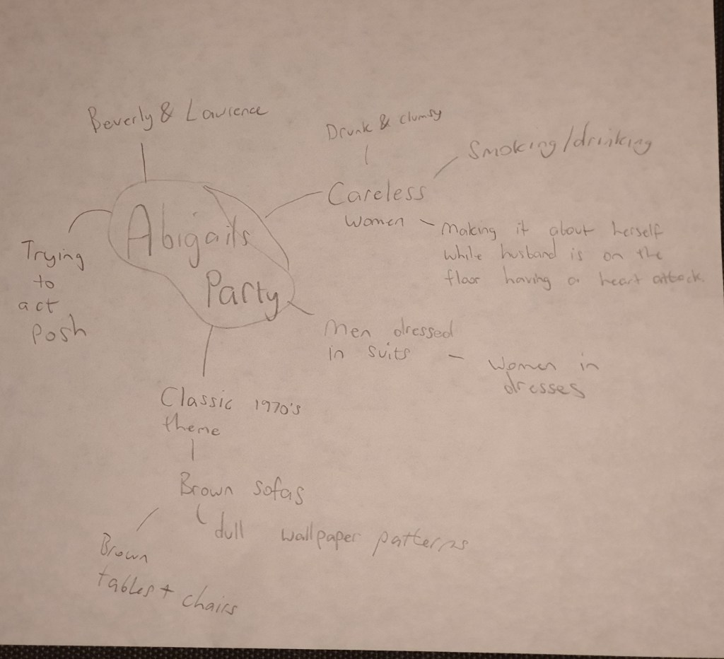
One thing I want to clarify about the ‘French Hen’ exercise is that my tutor was worried that some people might find my mind map about the word ‘sophisticated men’ sexist because I was ‘omitting’ women. The reason why I was analysing the word sophisticated in the context of men was because I wasn’t familiar with the word and because the brief was specific about young ‘women and sophisticated men’.

Studying this course has increased my confidence in designing. I have learnt how to break down and simplify complex briefs and my time keeping has increased significantly. In addition I feel like I have a more in-depth knowledge about colours, pictures and typography and I feel a lot more self assured when it comes to creating visual content to communicate messages. My skills in using Adobe Photoshop and Adobe Illustrator has also improved remarkably.

One thing I would have changed is evidencing my research. At the beginning of the course I used to do very little research before starting my exercises, I used to use my own initiative to come up with ideas. However, as I got more experienced I made sure to set some time to explore existing ideas on websites such as Pinterest. I also focused more on mind mapping and sketching my plans. I regret not putting more iterations of my development process. I will make sure to do this in the next unit.

Assignment Five: Your Choice

This final assignment is an opportunity to consolidate the understanding you’ve gained so far, reflect on the work you’ve enjoyed and your achievements. It allows you to create certain parts of the brief yourself so that you have the maximum capacity to show off your interests and talents.
Choose one of the briefs below. Then work through the design process, researching and visualising a range of ideas before critiquing your work and choosing your selected design to present as print ready artwork.

Brief 1: Book design

Penguin Books have asked you to design a new house style for a collection of books on design for children and young people.
They are starting with three titles: Colour, Typography and Photographs. You will need to produce three covers (front, back and spine). The designs will need to be recognised by readers as a series and at the same time be appreciated on their individual merits. The book dimensions are 190mm wide by 225mm high.
In addition they have asked you to produce the one on typography called A is for… It doesn’t have to be a conventional text book. Create an introductory chapter of at least 4 pages that is visually interesting and will entice young people into wanting to buy the book and read more about the fascinating world of typography.

Brief 2: Promotional design

A youth theatre club is performing a production of Abigail’s Party. Mike Leigh’s tale of suburban taste is set in the 1970s and explores middle class aspirations and preoccupations.
You will need to acquaint yourself with the play if you don’t know it already, as they are particularly keen for it to have a 70s feel. The play will be touring local theatres for a month, performing every Friday night and Saturday matinee.
Produce a poster (A3 portrait), a flyer (A5 landscape, double-sided) and newspaper advert (A6) to promote this event. In addition they would like their A5 programme cover to continue the design theme.
For the purposes of this brief you need to invent dates, times, places, names and any other information you think will be required. Use Lorum ipsum text for areas of body text.

Brief 3: Charity work

The Gerald Anthony Furniture Store is a charity that helps poor and displaced people furnish their homes with the basics. It has been running for over 100 years, staffed mostly by volunteers. They would like you to design a generic business card, letterhead, and paper mock up for the home page of their website. In addition they want you to design their 8 page annual review.
The review will consist of:
front cover
inside front with a bit of blurb about their history (90 words)
the chair’s report (365 words)
the co-ordinator’s report (300 words)
the treasurer’s report ((260 words)
a graph or design to show the breakdown of income and expenditure
Income
– local authority grant £48,927 – grants from trusts £66,750
– donations £14,655
– other £4,032
Expenditure
– direct charitable expenditure £113,192
– fundraising costs £6,655
– management and administration £10,924
a page giving the names of the main grant funders (20 in total with each name about three words long)
and a list of the management committee: chair, treasurer, co-ordinator secretary and five other members,
the back cover with an advertisement to encourage people to volunteer. Maybe the biggest challenge of this brief is to solve how to break up and lay out the text in the 8 page document. Photographs will need particular care as some people who benefit from the charity may not want to be identified.

Choosing which brief to tackle

I read through each of the briefs and I feel like the second brief is the one which will allow me to best showcase my strengths. I enjoy designing posters and flyers and designing a poster set in the 70’s evokes my nostalgic side. Even though I am not familiar with Mike Leighs tale ‘Abigails party’, I am curious to learn.

I enjoyed creating book designs in the previous exercises that I did, but I think that enjoyment was triggered by the interest that I had in the books that we were tasked to work on, for example the first exercise wanted us to design covers for a classic collection of HG Wells books and the second exercise was based on one of my all time favourite books ‘of mice and men’. Even though I enjoy learning about colour and typography, creating a “introductory chapter of at least 4 pages” along with the three covers does not spark my motivation.

Designing a business card and letterhead for the third brief is something that interests me, but writing an 8 page annual review is quite tedious and for this reason this brief would be the last on my list.

What am I being asked to do?

My task is to create:
A poster (A3 portrait), a flyer (A5 landscape, double sided) and a newspaper advert (A6).
The promotional designs should have a 70’s feel, they are based on Mike Leighs tale ‘Abigails party’.

Keywords

‘Suburban taste’, ‘set in the 1970s’, ‘middle class aspirations’.

Design Issues

The only issue at the moment is that I am not familiar with the play or the author Mike Leigh, so I’m going to begin the task by watching clips of the tale and looking at images based on it. Apart from that the rest of the brief seems quite straight forward.

To get more accustomed with the play I began by reading the stories plot, I then skimmed through the plays on YouTube, some of the acting was quite cringey but the setting gave me a better idea of the theme, I then found clips of the original copy which made the theatrical side more interesting to watch. I made a mind map to keep track of the things that stuck out to me the most.

As I was analysing the clips the first thing that got my attention was the retro 1970’s wallpaper and the dark coloured furniture. Seeing Beverly smoking and drinking at the same time was interesting, this might be a potential image for my poster. The dress code was also quite interesting, the men were wearing suits whilst the women had dresses on which reminded you of the 70’s.

Mood Board

After briefly analysing the theme in the clips I wanted to take a further look by looking at the images, I saved pictures of the furniture that was used in the live plays, I also saved pictures of the type of clothes people used to wear back in the 70’s. I came across some wallpaper background which had a very retro feel to them, my plan is to create the same theme with my background.

Sketches

I then went on to sketch a few ideas that I may put on my poster, I drew a silhouette of Beverly smoking, I also drew a picture of a hand holding a cigarette and a glass of alcohol, at this point I’m still debating if I am going to use silhouettes or if I’m going to use stock images. The sofas and wallpapers that are used on the sets create a very strong theme of the 70’s which is something I want to replicate for my design.

Designing the background

For the background my plan was to create a psychedelic 70s themed setting like the ones I saved in my mood board, the colour scheme I chose was interesting, I then went on to experiment with different arrangements.

The image below is the one I initially chose for my background, but the colours were so busy it was affecting the readability of my poster, I also felt like my imagery was drowning in the background because the colours were so dazzling.

Experimenting with fonts

I really liked this font, it had a very classic touch to it, I experimented with drop shadow, I even tried to refine it but it just wasn’t connecting with the background. I was trying to make everything fall in to place but it kept having the opposite effect so I decided to change things up.

The colour scheme started to feel problematic so I toned down the colours by adding a brown filter on top of my background, I also chose a more clear font for my typeface which was easier to refine, I added a red drop shadow to the font which gave it a more retro look, at this point I felt like my poster was slowly looking the way I had planned it to look.

Even though the colour scheme looked slightly better I still wasn’t feeling content so I experimented further, I also made some tweaks and I was happy with the final design.

Final poster design

The colour of the final design was more balanced, the background of the poster was light brown so to balance it I added a banner across the top and bottom of the poster with a darker shade. To make sure my fonts didn’t clash with the background I placed shapes behind the text. I then began to search for an image to represent Beverly and I found a picture of a woman dressed in a 70’s outfit, I added a drop shadow on this image to make her stand out. All the writing in my poster is in sans-serif, I wanted the title of the play to stand out so to establish the hierarchy I increased the size of the font and added a clear retro type face to it.

Flyer

For my flyer I used the same colour scheme and designs as my poster, I then made slight changes to the layout and then shifted my focus to separating the information. I made sure that my first page consisted of the title ‘Abigails party’ and the image representing Abigail. I didn’t want to over fill the first page with information so I left an inviting statement “Get a taste of the 70’s” and went on to the second page.

The second page is where I left all the important information such as where the event will take place, the times and the ticket prices. I made sure that the information is clear to read so I chose a serif font to to enhance the legibility. There was still space left on the page so I finished off by adding a picture of the ‘performer’.

Newspaper AD

With the newspaper ad the first thing I did was I designed the layout, I put a banner across the top and bottom of the ad which I coloured in blue, I chose this colour because it is quite a popular colour with newspaper adverts. I added a picture of Abigail and I added a red circle behind her to make her stand out, I also added an outer glow on her to add to the effect. I then finished off by adding the information that I felt was important such as: the price of the tickets, the date, time and location.

Once I completed the newspaper ad I then experimented by adding a black and white theme to it to see if it would work, I was happy to see that it still looked complete.

Programme Cover

Because the A5 programme cover didn’t need much information I removed any detail that I felt was unnecessary. I made sure that my A5 programme cover continued the design of the poster to fulfil the brief. I kept the heading ‘The Grand Theatre Presents’ and the name of the title ‘Mike Leigh’s Abigails Party’. I added a picture of Abigail and placed a red circle behind her to bring more attention to her. The programme cover would be in the viewers hand while they are at the theatre so there wouldn’t be any reason to add information such as where and what time the play is.

Mock-ups

Feedback and final thoughts

If I had to re-do this task I wouldn’t choose a psychedelic design for my background; it took me longer than I thought to adjust my designs to work well with the busy theme but eventually I got there. I asked my friends and family for feedback and they liked the colour scheme and the designs, they could tell that the aim of my poster was to create a retro background which made me feel like I met the brief. To create a retro theme I used an old fashion font for the typeface ‘Abigails Party’, I also used an image of a woman wearing a retro outfit, I then went on to design an old fashioned background to create a strong sense of the 70’s and I feel like the poster would attract someone that is looking to go to an event of that genre.

Tutor Feedback

You have shown you true ability here and have spent more time on research
and development, this still needs to be expanded but your empathy with the
70s shapes, colours and designs is perfect for the era the Fashion too is
ideally suited to the brief very well done. There is more sense of a process as
the design evolves. You have researched the fonts very well and as a result
have produced a very functional poster. Given you like to use imagery and to
tell or suggest a story, I’m referring to “Of Mice and Men” I would like to have
seen you deal a little more with the content of the play, but I think again you
had time constraints. It is still a very good solution but needed more time for
iterative development through visual and textual research.

Exercise: The French Hen

Newton and Ridley, the brewers best known for their pub, The Rovers Return, are opening a cafe/wine bar nearer the city centre.
The bar is designed to appeal to younger women and sophisticated young men. The brewery has identified a gap in the market and wants to provide a ’sophisticated and relaxed’ venue for the ‘discerning’ drinker. This bar is to be called the French Hen and will be in direct competition with the cheap ‘binge drinking’ venues on the same street. The brewery is also trying to enhance its own image as a ‘respectable’ alcohol vendor.
They want you to develop some ideas for a logo, to be used:
• on covers for the food and cocktail menus
• in colour on the signage outside, and as a cutout for a window detail
• on T-shirts for the staff and paper napkins
• for one side of a beermat, the other will carry advice on sensible drinking.
There are many conventions that have been developed around the marketing of both bars and products to this age range. You need to be conscious the whole time of avoiding clichés and stereotyping.
Draw up at least three ideas to start with. Be critical of your work. Check it against the information you have here. Will it do what the client wants – and how will you know?
When you have decided which one you are happiest with, mock up the menu covers, the outside sign, the window detail, a T-shirt, paper napkin and beermat. Does it all still work?

I wasn’t too familiar with the word ‘sophisticated’ so the first thing I did was I created a mind map to get a better understanding of it. The definitions I was reading felt vague so researching on the characteristics of a sophisticated person gave me a better understanding.

Mind map

I then made a few notes that I want to consider for my logo which might be of importance when I start to design it.

Mood board

I then went on to research some existing logo designs of high end bars and I saved the ones that stood out to me the most.

I feel like the golden colour gives the logos an elegant touch, I also like the rectangular shape of the the two logos on the left.

Development

With the ideas that I retrieved from the mood board I sketched up my three proposals. A dark blue and golden colour scheme for my second design with the right font would look luxurious. The third design has an interesting layout but for this specific target audience I feel like it looks too tacky. My first sketch is the one that I will refine, it isn’t overly simplified or too basic and with the right touch I feel like it will look amazing.

Logo Design

For the logo design I used an elegant gold colour, I kept the same colour for the box, I then experimented with a few different colours for the background. This is how they looked.

Looking at the logos as they stand I preferred the blue themes, but I need to make sure that my logo looks consistent on the menus, t-shirts and on the beermats, taking this into consideration I think having no background colour will be the best option.

Final Logo design

Mock-ups

Because of my decision with the colour choice on my logo, I didn’t have to make too many changes to make my mock-ups work, I had to make a slight change with the outdoor signage but the logo design is still consistent. The design I’m most happy with is the menu, it looks really well refined and the logo goes well with the overall colour. I was struggling to find a free stock image of a fancy napkin so I made use of the one that I found, I placed the logo at the bottom of the napkin and I was content with how it looked.

Final thoughts

At first I was a bit confused with the name ‘the French hen’, it sounded like a weird name for a bar and I felt like adding an image of a hen will be even more peculiar, maybe I felt this way because I don’t drink and I don’t usually go to pubs, but once I started looking at existing bar logos the ideas started flowing. Overall I’m happy with the designs that I created and I feel like the criteria of the brief is met. I really enjoy creating logos and I hope I get the chance to design more in the future.

Tutor Feedback

There is an element in your mind map that I need to address, sophistication is
not a gender bias attribute, and not exclusive to men. I am sure you did not
intend to omit women, so please remember to be inclusive when it comes to
any reference to gender, race, colour ,size or disability to avoid discrimination 3
This is essential for a graphic designer as contemporary graphics can make a
change to all of our attitudes towards each-other. Examples of this would be
the BLM movement and BAME.
You evidence a good selection of Brands that speak to high end
sophistication. Again you have an initial idea and do not expand that idea
further through iterative sketches and preliminary designs, I now time is an
issue, but you have ability, and this is the way to explore a greater part of your
creativity.
The logo is satisfactory but has not been pushed far enough in terms of the
design solutions.

Exercise: Chance Housing Association

The Chance Housing Association has been set up to try and help first time buyers get onto the housing ladder and they want you to develop a brand image for their stationery.
It is important to them that the Association is seen as being different from the other local housing associations – more modern, more helpful and definitely welcoming to young people wanting to buy a house.
They want to use their logo on their letterheads and office stationery and it will also be used somewhere on the sheets that hold the property details. It also needs to be reproducible in the local newspaper and professional trade magazines.
What to do
Research other housing associations’ and estate agents’ styles. Look at other publications designed for a similar audience. This information should help you identify as much what you don’t want to do as what you do.
If this was a real job you would need to visit the housing association’s offices and website, if it has one, to see how many decisions they have already made – for example they may have painted their sign silver and dark blue and used a particular font. As the designer you may want to continue with and develop those decisions or change them.
Using just typography sketch up some designs. You want to come up with at least three initial ideas to show the client. In this instance you can decide which one you think works best to further develop.
Mock up a letterhead and business card using the logo and house brand. Look in you local newspaper and mock up an advertisement to fit in the paper. Measure the space carefully remembering to leave sufficient margins so your text isn’t cramped. Photocopy in black and white onto cheap paper – does your logo still work? Have any fine lines got lost? Are the differences between colours still discernible?
Show your designs to your friends and family. What is their feedback?
If you need to, go back and adjust your artwork. If all is well make up a presentation pack to show the client – in this instance your tutor. Keep all your work and record the process in your learning log.

Research

I began the task by researching existing logos for housing associations, when I looked at the logos the first thing that came to my head is that they all look basic but sometimes simple logos are more effective, since the target audience for this task is for first time buyers I would prefer to make a simple design instead of adding unnecessary detail.

Mood board

Experimenting with ideas

After analysing some existing logos I began to experiment with some ideas, since my brief wanted three ideas to choose from I narrowed down my research to my three favourite proposals.

I felt like the word positioning in the first two ideas didn’t work too well, with limited time I didn’t want to waste more time on refining two ideas which I didn’t feel confident with, I also felt like the third design is the most conventional out of the three designs so I decided to go with that one.

Logo

I used the shapes in Adobe Illustrator to form my logo, this is what I created.

I felt like my logo was incomplete, when I add a box around the logo it looked more complete.

Business card

I then used photoshop to create my business card, since blue was one of the main colours in my logo I decided to use this as my theme. I really liked the design, it looked simple and professional.

Letterhead

I used Microsoft Word to create my letterhead, I kept the colour scheme the same as my previous two designs, I also added a picture of my logo in the middle of the page where I lowered the opacity for it to blend in with the background.

Newspaper ad

I then went onto the newspaper ad, blue fits in effectively in newspapers which was an advantage for me.

Presentation pack

Feedback and reflection

I really enjoyed this exercise, even though I had a very limited time scale I feel like I did the task successfully. I asked my family for feedback and they really liked the colour scheme, they also said that the presentation pack looked professional as a whole which was reassuring.

Tutor Feedback

This is much stronger, still more evidence of iterations of design colour and
typeface would help but that said a good solution. Given the limited timescale
a very professional solution well done.

Exercise: Poster & Flyer

This exercise is about how you deal with two different spaces to work in.
You have been asked to design an A3 poster and an accompanying double sided A6 flyer to promote a singing course run by an organisation called SingOut (all one word). They have very little money so want to print these posters on their black and white photocopier. You can use a colour paper if you want.
You may want to include an image such as a drawing or photograph, but be very careful with photos as they tend not to reproduce well on a photocopier particularly if they are colour photos. You will need to check by printing off your design and/or photocopying it.
The information they want to give is:
Do you love to sing?
Join us for an exciting opportunity during the day with a professional vocal coach. Learn to sing different types of music, vocal techniques, meet new people and have fun!
10.30 to 12.00 every Tuesday from 11 March
The Community Centre, Charlotte Church Road
£60 for the course
No experience needed/no requirement to read music
For more information call 011779 8765432 http://www.singout.comThe first thing you need to do is work out if you have all the information you need to fulfill the brief. If not what is missing? Work out the hierarchy of the information. How will you divide your information up to fit on both sides of your flyer? How will you link the design for the poster with that of the flyer? How can you make the poster eyecatching and effective with such a limited palette? Which typeface or faces will you use and why have you made that decision?
When you have finished pin your poster up and critique your work. What do you think? Keep notes and sketches in your learning log.

The first thing I did was I began to research magazine posters to analyse the designs.

Mood board

The common pattern with all of these magazines is that they all use eye popping designs which go hand in hand with the bright colours. My brief for this task is to create a low budget, black and white poster therefore I will stick to creating simple silhouettes instead of over the top designs.

Sketches

I experimented with a few different layouts but this one started falling into place. There is a lot of information that needs to be publicized in the poster so I need to make sure that my designs don’t clash with the text; bearing in mind that I have a limited pallet.

Experimenting with layouts

I felt like the colour scheme in the first design is more eye catchy than the second one but I liked the second poster better because I’ve managed to add some pictures to it.

Final Poster Design

I decided to go with my original layout, I added a few more designs to it and I also added a white strip behind the wording ‘Do you love to sing?’ I did this to make the hierarchy stand out. I then circled the information that I felt like will be the most important to the viewers, for example the information of the time and the price of the classes – I changed the number of the price and the time to the font ‘impact’ to make them stand out even more. The majority of the text on the pages were in a serif font, I did this to make the paragraphs more legible, I also felt like this font looked quite fancy so I kept it the same for the title.

Flyer Design

To make my A6 flyer link with the poster I kept the top half of the designs on the main pages the same, I also kept the same fonts and colour scheme on all of the pages.

I wasn’t forced to keep all of the information on one page which is why my flyers look less tacky, I would have preferred to keep more white space on my poster but the brief required me to add a lot of information

I feel like this exercise wasn’t my best piece of work, but I established the hierarchy and broke down the information constructively so I feel like the criteria is met.

Exercise: Birthday List

For this exercise you are going to make up a poster list for yourself. It is intended that you keep it pinned to a noticeboard or wall to remind you of the dates and, as it will be there a long time, it needs to look good.
Start by collecting all the birthdays of your friends and family. You’ll need their name and birth date, to decide whether or not you buy them presents or just send a card, text message or email.
When you have all this design a page to include all this information.
Now you design your own ordering the information that best suits you and including as much additional information as you would find useful.


Once I read the brief I began to write down all the birthdays in my family, I then began to sketch up the idea that came to my mind, it was very basic and simple but I believe I can refine it until it looks complete.

Sketch

I then went on to Pinterest to see if I could derive any ideas for the task, I was hoping to come across some existing birthday list posters but I didn’t find any, so instead I saved some birthday themed images which might come in handy.

I already had the idea for my layout prepared, I just needed to find a good colour scheme to go with it. I went through some images that I had saved in my computer and I felt like this colour combination would work for a birthday-friendly poster.

I then went on to apply the colours, I coloured the boxes in yellow with blue outlines and I placed two pink banners across the page where I put my titles as the hierarchy. Even though I was trying to make these colours work they just wouldn’t fall into place so I stopped experimenting any further.

Final Design

This is what my final design looked like, I balanced my design by using dominant, secondary and accent colours, I then added pictorials to show what I was going to send to each person, I then finished off by designing a few balloons to go with the birthday theme. I found this exercise very enjoyable and practical.

Exercise: Giving information

Find some examples of information graphics. For example bus timetables, city maps, diagrams or representations of statistical data. Look at the way they are designed and try and work out the decisions the designer made. What can you learn from them and when would it be appropriate to use a similar design solution?
For this exercise you are going to describe your immediate surroundings using information graphics; this could be a plan of your desk, the layout of your house, the arrangement of objects in your cupboards or your morning journey; anything will do.
Before you start you will need to think about scale and about how you will break down the information for your design. Create a graphic that represents an aerial or front on view of your location. Be mindful of the hierarchy of the elements in the composition and the dynamics needed to draw the viewer’s eye from one stage to the next. Use typography, numbers and colours to describe what is being represented. You may want to produce a key to help us understand what is being shown, as well as a diagram title to put things in context.
Keep all your sketches and notes in your learning log.

Infographics break down information in a very interesting fashion. For example I came across this infographic poster of a frozen yoghurt, I very rarely pay attention to the nutritional information when I buy deserts, but because this was broken down in such a productive way It made me want to find out what it was saying.

I have a friend who owns multiple desert bars and I think that this design solution would definitely be of help for anyone who is looking to advertise the ingredients or nutritional information of their products.

Mood board

I always have fitness related infographs popping up on my newsfeed, I have always thought that these are a very effective way to present information. I am excited to make my own infograph.

Sketch

I designed a rough sketch of the idea that I had in mind, but looking at it now it just looks like my weekly timetable and I am not sure if this idea will meet the criteria of the brief.

Coming up with an idea

Since today is Sunday I’ve decided to base my infograph on how I usually spend my Sundays, when we are not in lockdown.

Final Design

I began the task by designing a graph, once I created the graph I used colour coded boxes to break down my journeys. At this point the time scales of my journeys were clear but the specifics of my exact whereabouts were vague, this is when I decided to take snap shots from google maps which I then polished into my graph.

I am very happy with my final design, even though it is very simple it is filled with information and the colour code makes it even more easier to follow.

Exercise: Judging a book by its cover

Choose a book by an author you are familiar with. You are going to design two different covers for it, one using illustrations or photography and the other using just type.
Design the whole cover including the spine and back page. Include the title of the book, the author’s name, a brief description of the story and any other information you think is necessary.
As you are working remember that your design is intended to help a reader know what the experience of reading the book will be. Is it a serious text book or an off-beat funny novel? Are the readers expected to be young women or older men and does this matter? Is it an ‘easy read’ or ‘literary’? Does the publisher have a house style you need to be part of?
When you have finished critique your work – which of your two designs do you feel works the most successfully and why? Make notes in your learning log.

I decided to choose one of my all time favourite books, ‘Of Mice and Men’. I remember when the main character ‘George’ had to sacrifice the life of his best friend ‘Lennie’ after years of striving towards a dream that they both had. The story cuts very deep so I will try to replicate this theme on my design.

Mood Board

I went on Pinterest to get some inspiration and it was interesting to see that the book cover has been re-iterated many times, I think this is because of the popularity of the book and because of the fact that it has been around for a long time.

From the examples that I saved I have seen some examples dominated with images and illustration, some with words and some with a mixture of both.

Design One: Type Cover

The first thing I did was I designed the cover of the book, I wanted an old fashioned theme so I designed a dark blue leather cover. Most American western books have serif fonts so this is what I decided to use.

Since I wasn’t allowed to use any pictures I didn’t want to fill up the space with unnecessary writing, I increased the size of the title until it took over the whole page and it looked really good.

Even though the font looked good I felt like the white colour didn’t go too well with the sad theme of the story, I also wanted to change it to a more western type cover.

Final Design

I am really happy with the final outcome of my type cover. The colour scheme goes with the dark depressing theme of the story. I wanted to show that the story is based in American West, even though I wasn’t allowed to use pictures I feel like the serif font mixed with the brown colour represents this well enough.

Illustration Cover

The first thing I did was I re designed an image of George and Lennie; the two main characters. The story was based in West America so I used photoshop to re create this hot, dry scenery.

Final Design

Once my imagery was set I just had to slightly re arrange the placement and the colour of the font and it was complete. I wanted my images to briefly tell the story of the famous George and Lennie who started their journey together – this is why I placed them side by side at the front of the cover. As the story progresses, George is forced to kill Lennie, this is why I designed a grave beside George as he walks off to the distance.

Final Overview

My thoughts on the illustration vs type cover debate is that they both are effective. Some people are attracted by imagery and some people feel more curious to find out what is behind the simple cover. Even though my first cover doesn’t have any images, the target audience will still be able to tell that it will be more of a serious book than a funny one just by looking at the fonts and the dark colours. However, if a potential customer was looking for a book to spark their deep emotions I think my second cover will be more effective in getting their attention because of the images of the grave and the men walking alone into the distance.

If I was to produce my own book I would definitely use images on my front cover, in this fast moving world I think images communicate better than words.

Tutor Feedback

This is a good piece of design with very sensitive use of complementary
colours, you say brown, but it has a very orange cast that activates the blue
creating a visual energy and increased dynamic of the fonts, again I think you
can consider the borders around the blocks of type and where they are set on
the cover, more experiments on scale and placing will bring different readings
to the text. That said very successful.
Mice and men 2
You have created a very different feel, more nostalgic and as you rightly say
have created and intrigue with the image manipulation, again a good solution.

Exercise: Magazine Pages

Choose a magazine, newspaper or journal and work out the grid or grids they have used.
You will probably need to look at least four pages to get a feel of the layout.
Measure the size of the pages, the margins, the text columns and the gaps in between them. How many columns do they use? Is it the same on every page?
Can you identify the fonts they use? Do you have it or one with similar properties?
How do they use photographs and illustrations? How much ‘white space’ on the pages is there?
Draw up a two page spread using the same grid as the magazine. Indicate text using Lorum Ipsum and indicate images by either filling a picture box with a 10% tint or using a picture from your collection.
When you have done this see if you can develop the grid further.
Select a title and images and see how many variations you can come up with. What happens when you alter the body font or headline font? Do different kinds of images change the ‘feel’ of the publication? Do you think the readership for each of your variations would be the same? Does the image you choose suggest a different design? Which ones work best and why? Make notes in your learning log.

I began browsing to see which magazine I want to analyse and this ‘Nicki Minaj’ magazine caught my attention. It has a very large image of the star in the middle of the article which is enough to spark someone’s curiosity, then when you look into the article it has very beautiful headings and colour schemes. I also liked the white space at the top of the page which creates a bit of breathing space for the viewers and also prioritises the focus area for the article.

Nicki Minaj magazine size
Height: 14.306 inches
Width: 22.917 inches

First page layout

Page size:
Height: 14.306 Inches
Width: 11.500
Margins:
Top part is 2.350 Inches.
Side: 0.630 Inches.
Bottom 0.6 inches.
Columns:
Three column layout.
Width: 3.330 Inches.
Height: 4 Inches.

Second page layout

For the second page I used ‘the golden selection’ grid to see how it aligned with the image, the top left of where the lines intersect were on her face, the bottom left of the intersection were on her chest and the one on the bottom right was just below her shoulder. This proved to me that the golden selection method is definitely an important and effective tool.

Margins

The margins are the same as the first image, the only part that is different is the gap in the margin from the writing to the left side of the page, this is because of the image.

Columns

The second page has two columns, the paragraph furthest to the image is 3.330 inches wide and 11.1 Inch in height. The paragraphs closest to the image is approximately 2.25 Inches wide, it varies because the paragraph is placed around the image.

Fonts

Heading ‘The gospel according to’ – Mauritius Bold Italic. App used= ‘What the font’.
Heading ‘Nicki Minaj’ – Alright Sans Ultra. App used= ‘IdentiFont’.
Text below the heading – Georgia Bold Italic.
Subheading – Geometos Soft Ultra.
The body text is unclear but I can tell that it is a serif font, from what I can see it seems similar to the font ‘Sitka’.
The magazine uses a range of different fonts and an overlapping image which takes over part of the first page and more than half of the second page.

Replicating the grid

I then created a layout of the magazine and replicated the grid, I did this so it could assist me with designing my own magazine.

Design one

My first magazine is almost a duplicate of the Nicki Minaj magazine. I used the exact same layout, colours, columns and the same/similar fonts on my own copy, I also used the grid to help me to manage how much white space and what font sizes to choose. The golden selection grid is another effective tool which I used to align my picture. This is what I created.

The colour scheme of the magazine seemed more suitable for a women’s gossip magazine, I wanted my font to match with this theme so I experimented with a script font to give it a more cheeky touch.

I think the font of the heading on this page could be more targeting towards a teenage audience because of the sassy style.

Experimenting with a different image

Design two

I then changed the image to a more formal picture, to have the same effect with my heading I changed the heading to a serif font and I also changed the colour to blue, these two adjustments completely changed the whole theme of the magazine. The magazine transformed from looking like a women’s gossip mag to a professional business publication.

Reflection

I enjoyed experimenting with the grids, especially the golden section grid which is used to align pictures. After using it myself I feel like it is a very effective tool. One other thing that sparked my interest was the effectiveness of using white space, it makes the article a lot more scannable and enhances the legibility. After creating my first magazine I really enjoyed how two subtle changes can change the whole theme of the project – my second magazine compared to the first one is an example of that.

Assignment Four: Show me

Context

Typographers and type foundries (the companies that commission and produce typefaces) have always had to promote their latest designs to printers and designers to show off a particular typeface, its different fonts in a variety of sizes and contexts, and the unique features of it. Once Specimen Sheets were the main way of doing this. Nowadays most of that marketing takes place online – research type foundries on the internet.

Brief

Design the font for use on the cover of a magazine called type and write a short article for the magazine using a range of typefaces, with typographic illustrations, drawing on all that you have learned in this section. The article should include sections on:

• what makes a typeface interesting • how a typeface is constructed • question marks.

Requirements

Do a mock up of the magazine cover to show where and how your title font will appear along with other cover elements.
Produce a magazine article that is attractive and interesting enough for someone to want to pick it up to read, and which shows off what that you have learnt so far about typography. Add illustrations, photographs and colours as you want.

What am I being asked to do?

My task is to design a magazine cover with the title ‘Type’. I also have to create my own typeface. Once I have created the typeface I will then have to write an article on all that I have learnt on this section. The article should be based on ‘what makes a typeface interesting?’, how a typeface is constructed and question marks.

Keywords

‘Design the font’, ‘cover of a magazine’, ‘type’, ‘short article’, ‘range of typeface’.

Design Issues

The thought of having to design my own font caught me a bit off guard because I have never done this before. My only concern at this point is that I’m wondering how I’m going to develop a handwritten font into a digital version clean enough to be the title of a magazine.

Mind map

I created a mind map to make some brief notes on the different styles of fonts, I’m already leading towards the sans-serif department but I am going to draw a few sketches to get a better feel of all the fonts.

I tried to mimic my signature but the handwriting script style wasn’t working with these letters because the balance of ascending and descending letters were not there with the word type.

I then uploaded one of my handwritten fonts (the one below) on adobe photoshop, I added colour to it and tried to refine it but it looked so bad that I forgot to save it.

I then took a different approach, I used graph paper to design my fonts which made it easier to balance the size of my handwritten letters, I then went onto adobe illustrator and used the shapes to redesign my letters, I modified the shapes and refined it and this is the font I created.

Designing the cover

Once I created the font I then moved on to designing the cover. I began by going over the magazines I saved in the previous exercise to jog my memory. At first I felt like I was struggling to design a cover to match the font, my typeface was something unique that I created so I didn’t have the option to research how this font is usually used in a magazine which was a bit of a problem, so I started experimenting with colours to see which one fits well.

This is the first cover I created, I tried to colour code the typeface to the cover by adding brown strips to the page, the idea seemed entertaining at the time but I felt like it was too dull to catch the attention of a potential customer.

I then decided to copy the colour scheme of a brochure which I saved. The red and cream colour looked satisfactory so I decided to experiment a bit more with other colours.

When I tested out the black background it brought my excitement back, I added a yellow strip across the top which made the colour scheme more exciting. I placed my typeface right at the top of the page, I then added a sans serif font to the page with the questions ‘what makes a typeface interesting?’ and ‘how is a typeface constructed?’ I used a white colour on the fonts and highlighted the word ‘typeface’ in yellow which looked really good on the black background, I also added a box on the bottom left of the page with upper case and lower case letters of my own font. I was happy with the colour scheme but the magazine still looked incomplete.

Even though I was happy with the colour scheme the magazine still looked really empty to me, there wasn’t really any space to add pictures in the cover and I wanted to do something with the background space so I created a mood board with letters.

Mood board

Once I created the mood board I then lowered the opacity and placed it on my background. This made my magazine complete.

Second part of the magazine

Now that I had my theme in place my focus shifted on the design and the layout. Once again I went through the collection of magazines that I had saved and one of the designs caught my attention.

I really liked how the title went across the page diagonally which is something I wanted to do to my article. Here is what I created.

For the heading I used the eye catchy font ‘Impact’, for the words ‘what makes a’ and ‘interesting’ I used a light sans serif font which makes the word ‘typeface’ stand out even more. I put the paragraphs in columns of two in which I articulated the importance typefaces hold. For the body text I used a serif font to make the writing more legible.

Page 3

For the third page I wrote two paragraphs explaining how a typeface is constructed, once again I used a serif font for legibility and I circled both of the paragraphs in orange for the reader to know which heading the paragraph belonged to. I added a script font to the word ‘typeface’ in the heading because I wanted to use a variety of fonts without overdoing it. I placed the second heading in a bold sans serif font, I had to research the origins of where the question mark symbol came from which was slightly confusing because I came across so many theories, the story of the cats tail made sense to me and it is also one of the more popular theories so this is the story I narrated. To finish off the article I added some of my own handwritten fonts on the bottom of the page, I was happy to be able to make use of so many different typefaces without over doing it.

Final Design

Feedback

I asked my brother for feedback and his opinion was the same as mine which gave my confidence a boost. He liked the colour scheme of the magazine, he also voiced his appeal for the mood board that I created for the background.

Reflection

I’m content with the overall design of the magazine, creating a new typeface was very new to me and basing my whole magazine off the typeface did feel a bit puzzling at times. If I was to do anything differently maybe I would design the cover first and then create the typeface to fit the theme.
The exercises in part four really has triggered my passion for typography, I find myself analysing typefaces everywhere I go whether its an advert on a billboard or a logo on a jacket, this will definitely benefit me as a designer.
This section took me a lot longer than I was planning to, adapting to the new changes due to the pandemic whilst having close family members being affected by the virus was very troubling. I am happy that I have completed this unit.

Tutor Feedback

It is good to see you using your sketches here, but the visual development
moves to a more finished Typographic solution too quickly, as a consequence
there is a reduced level of creative and critical thinking.
More evidence of your research into other texts on type and your observations
on how they use type and layout will better feed your knowledge and
understanding and help your mark in future.