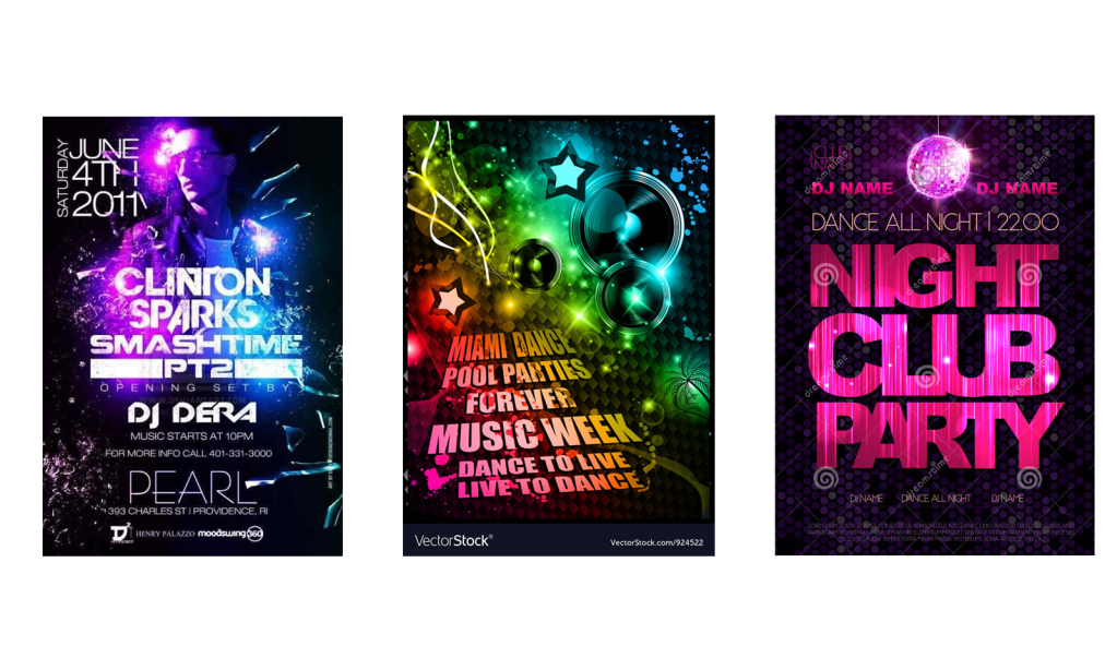
Using about 500 words of Lorum Ipsum (or other dummy text) you are going to design three different pages: • an interview with a TV actor in a listings magazine entitled: Will Sheila tell the naked truth? • a review of a new piece of hardware or software in a specialist computer magazine • a book review in a newspaper’s weekend edition. Research these types of publications and identify three different combinations of typefaces appropriate for each publication. Now you need to invent headings and subheadings for your articles. Set these combinations so that your header is above 12pt in size, your body text is 12pt or below and subheadings sit in between in your hierarchy. You will need to create some text to allow you to show your combinations in action. Use your text to describe your decision making process, why you think the combination works and what your intentions were.
I don’t remember the last time I’ve scanned through a ‘listings magazine interview’ so I began my research by looking at existing copies.
After looking at the examples the task seemed simple enough, select a font for the heading, subheading and body text and workout which combinations are appropriate.
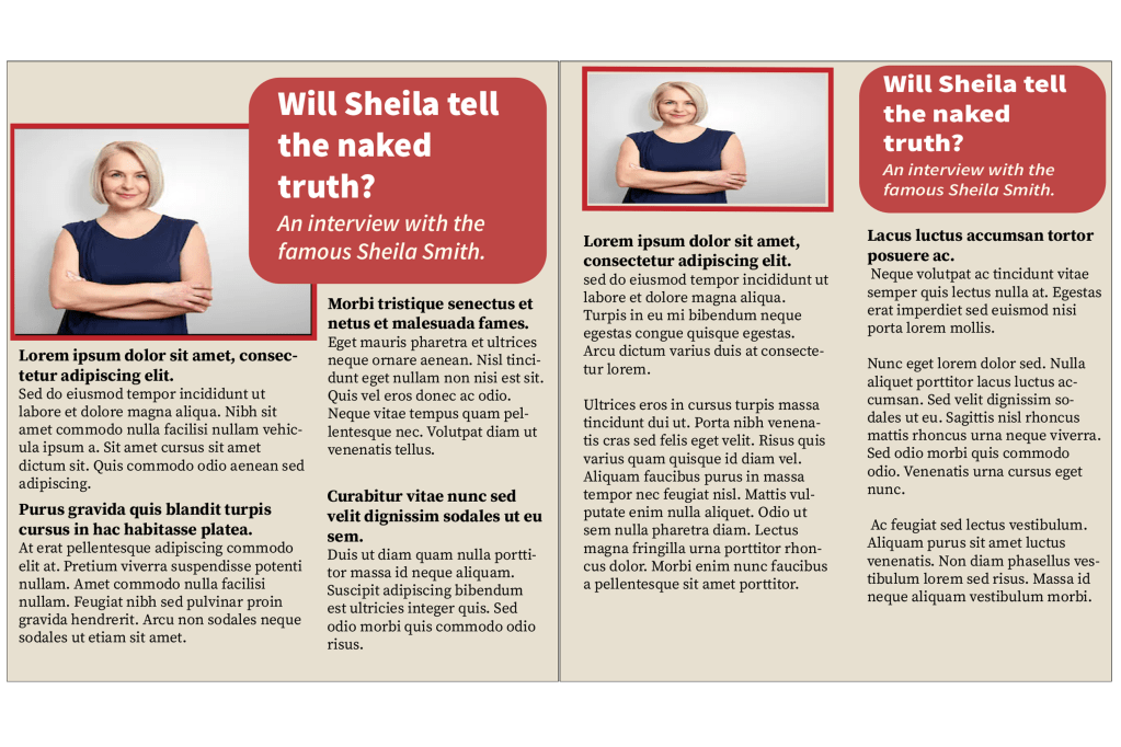
I really liked the layout of this magazine that I created, I put the picture and the heading on both pages, and I split the paragraphs into two columns. The heading font is ‘source sans variable’ and I put the wording below in italics which worked well. For the body text I used ‘source serif variable’, I kept the same typeface for the subheadings but I made the font bigger and bold. For the next magazine I’m going to try to experiment with the layout, columns and fonts…
Magazine 2
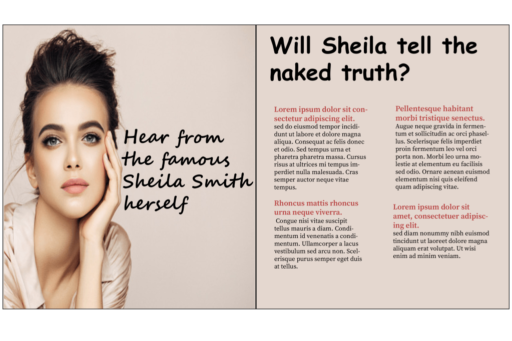
For the second magazine I went with a different style, on the first page I placed a big picture with a small caption reading ‘hear from the famous Sheila smith herself’, I chose the ‘Segoe smith’ font to go with the sassy quote. For the heading I chose ‘comic sans MS’ because the font has a feminine touch to it just like the overall image of my magazine and for the body text I kept it the same font as the previous one, the only change I made was that I coloured the subheadings in red.
Magazine 3
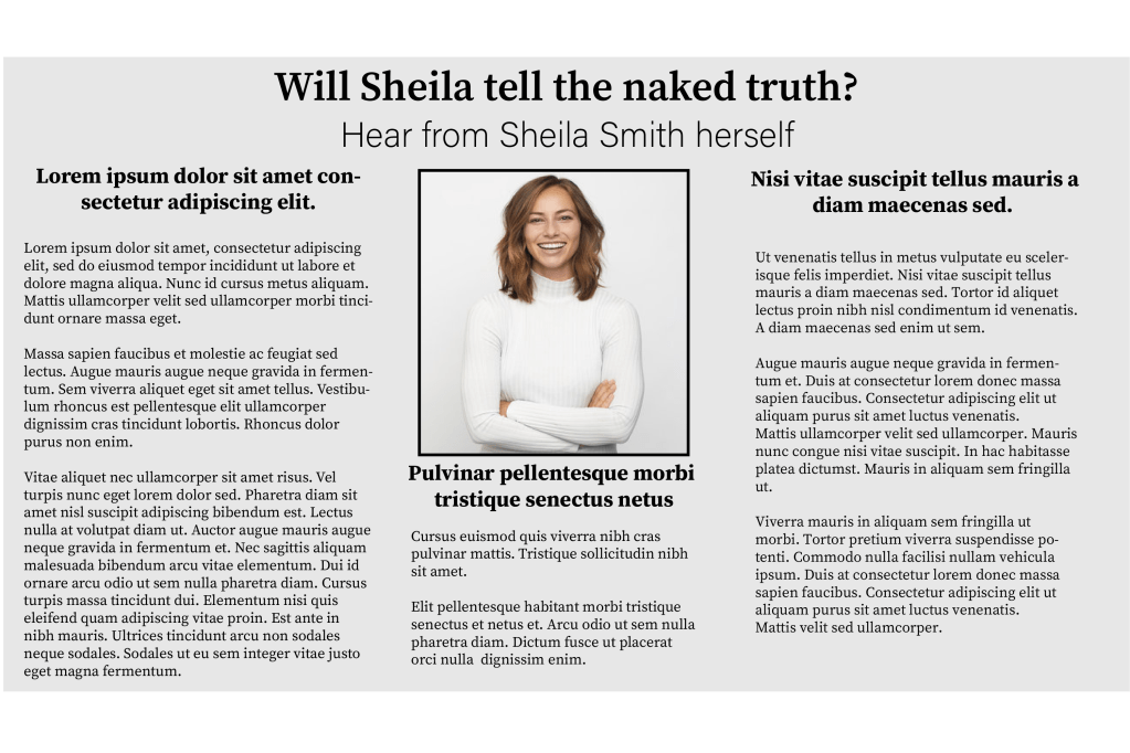
I tried something different with the third magazine, instead of having two separate pages I kept all of the information together but I split them into 3 columns. I used the ‘source serif variable’ font for pretty much the whole magazine, I did this because I wanted my design to look more formal and for the heading and the subheadings I just made the typeface slightly bigger and bold.
I created three very different magazines and I enjoyed experimenting with the different concepts.
Second part of the exercise
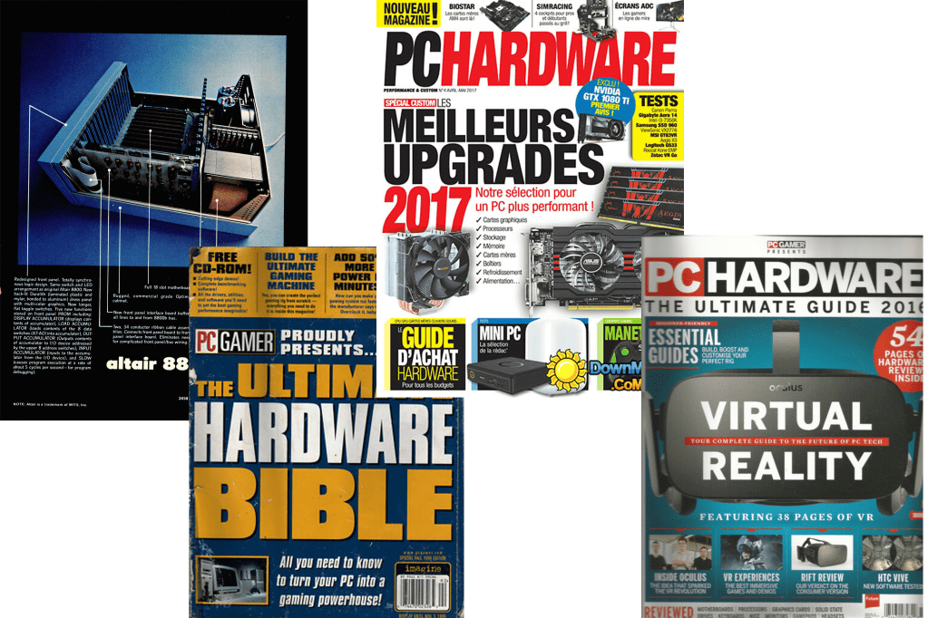
The second part of the exercise wanted me to create a magazine review for a computer hardware or software, the first thing I did was what I usually do – I looked up computer/ gadget magazines to obtain some ideas. I decided that I wanted to base my magazine on the apple pencil.
Magazine 1
Magazine 2
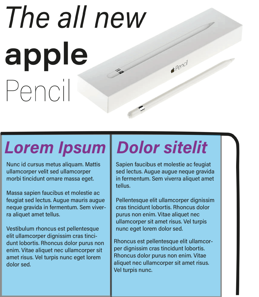
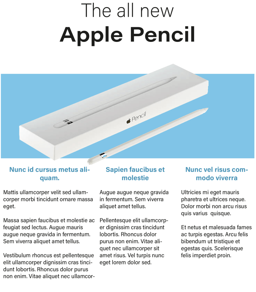
For my second magazine I went with a different approach, I separated the information: I put the heading on top of the page, imagery in the middle and the detailed paragraphs at the bottom. Once again the font I chose was ‘Acumin variable concept’, I put the words ‘the all new’ in the normal version of the font and I changed the name of the product ‘Apple pencil’ to a bigger size and in bold, I did this to establish the hierarchy. For the subheadings below I changed the colour of the typeface to match with the image and I also changed them to bold.
Magazine 3
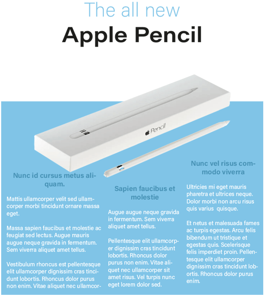
I felt like the second magazine worked really well so I wanted to stick to the same concept. before I started the third magazine I went back to the ‘light bulb’ exercise because I remember experimenting with lots of different layouts – I picked the idea that I thought will be suitable for this exercise.
After choosing the layout I made slight changes to the fonts, I changed the first line of the heading to the same colour as the bottom half of the page and I changed the the colour of the body text to the top half of the background, I then changed the subheadings to a slightly darker shade of blue. Once it was complete I really liked the final design.
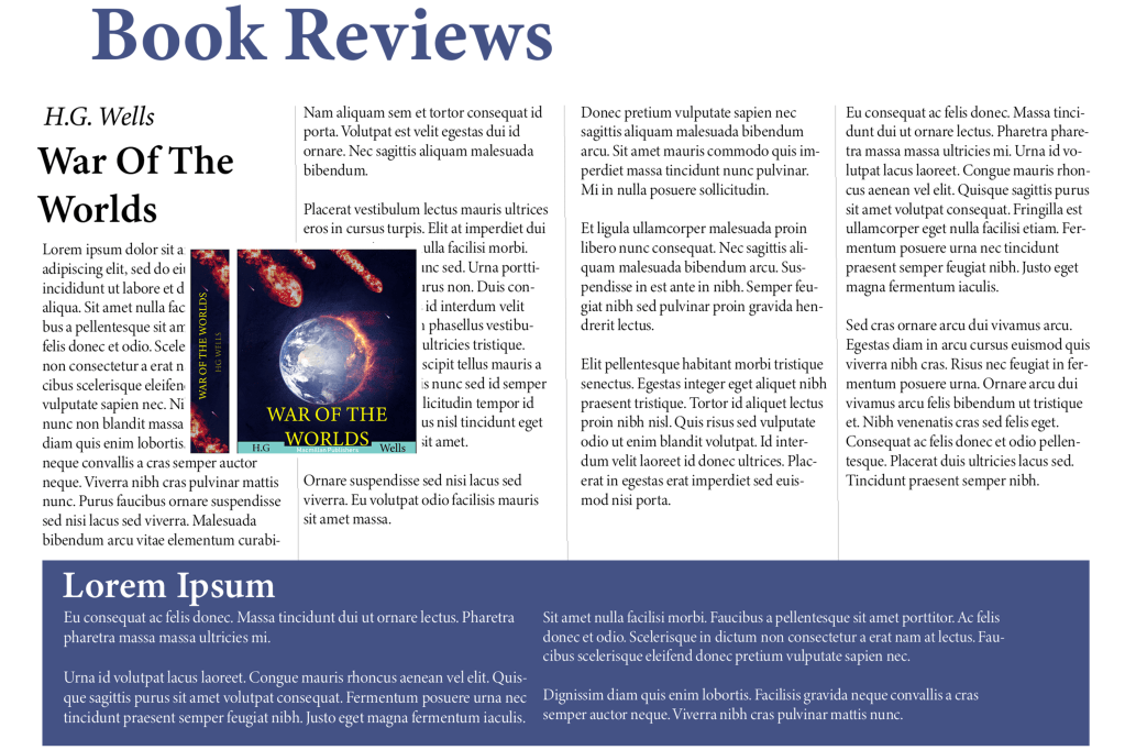
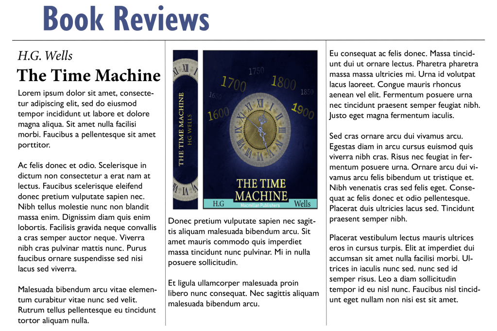
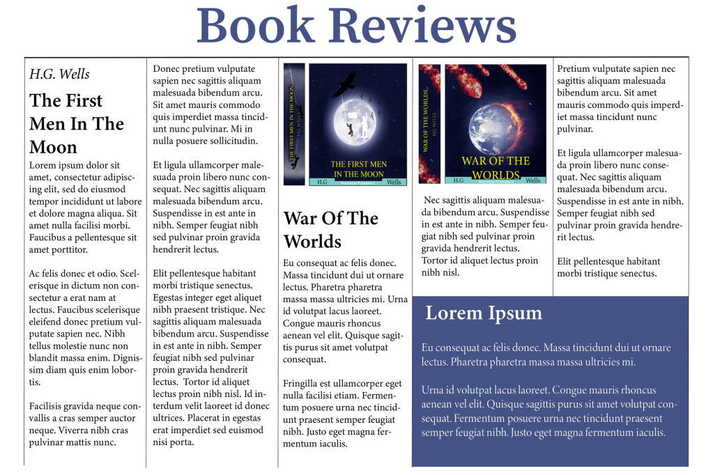
Book review
My task for the third part of this exercise is to create a ‘book review’ in a newspapers weekend edition. When I browsed newspaper book reviews online the first thing I noticed is that the paragraphs come in columns of three’s four’s and five’s. For some reason I was expecting all of the headline fonts to have serif’s but I was quite surprised to see that there is an equal mixture of both serif and sans serif. The imagery in the article are not positioned in a specific place; some are on the left, some are in the middle and some are on the right. These are things I will consider when designing my own papers.
Fonts ⦁ Heading: Minion Variable Concept ⦁ Sub heading: Minion Variable Concept Semi-bold ⦁ Body text: Minion Variable Concept Display
I kept all of the fonts similar because I really like this serif font, it gives it a very professional look which is what I need for a newspaper article. I spaced out my paragraphs in four columns and left another area at the bottom for a separate story. For my next article I’m going to try a different font with a different layout.
Book review paper 2
Fonts ⦁ Heading: Gill sans nova bold ⦁ Sub heading: Minion Variable Concept bold ⦁ Body text: Gill Sans Nova Regular
For the heading and the body text I used a sans serif font and it looked much better than I thought, the reason why I used this font is because I wanted to experiment with something different, a serif font would make more sense for the body text because it is much more legible. I also used three columns instead of four – I had to slightly increase the size of the text because or else the sentence would spread apart too much. I also placed the image right in the middle of the page instead of across the two columns, however I think placing the image across two columns makes more sense because it allows you to fit in more writing.
Book Reviews paper 3
Fonts ⦁ Heading: Source Serif Variable ⦁ Sub heading: Minion Variable Concept ⦁ Body text: Minion Variable Concept Regular
I changed the layout of the third paper, this time I experimented with five columns, I created a separate area in the bottom right instead of taking up the complete bottom part of the page like the first one, I did this to maximise the word count in the article without it looking too boring. I also made sure to keep a serif font for this page because when there is so many words in an article there is a bigger chance for the viewer to misread something.
Final thoughts
I feel like most people already have a natural inclination in knowing how certain fonts should look from the perspective of hierarchy, it is common knowledge that the headline usually has the biggest typeface and that the subheadings are slightly bigger than the body text. However, it was fun working with different combinations to work out which one works the best. I feel like for formal projects such as newspaper articles I would lean towards serif fonts and for women’s magazines I feel like modern sans serif fonts work better.
Tutor Feedback
You were asked to typeset headings, subheading and body text for three different pages. It was good to see you referring to the lightbulb project, The Apple pencil is very successful in terms of layout, you give a suitable type and layout with lots of space and well-designed columns creating a cool understated layout in keeping with the product, well done. I would like to have seen you use range left and justified to explore the spatial possibilities. You are using space much more effectively and the page can breathe, much improved well done.
Lorem Ipsum is dummy text with more-or-less normal distribution of letters that makes it look like readable English. It has been used for many years and some desktop publishing packages now use it as their default model text.
If you don’t have it already, go to http://www.lipsum.com and generate as much as you need.
Now select one of the designs from your research that you like and think works. Using the dummy text, try and copy the layout and design as closely as possible. You will need to measure the margins and column widths. If you don’t have the exact typeface get as near as you can. If you are copying a page that includes photographs just leave 10% tinted boxes to indicate their position.
Is the type serif or sans serif? Is the text set ragged or justified? Are there spaces after paragraphs or are new paragraphs indented? How many columns are there to a page?
What happens when you alter the fonts, change the alignment, adjust the leading or tracking?
Now try another, different publication from your collection.
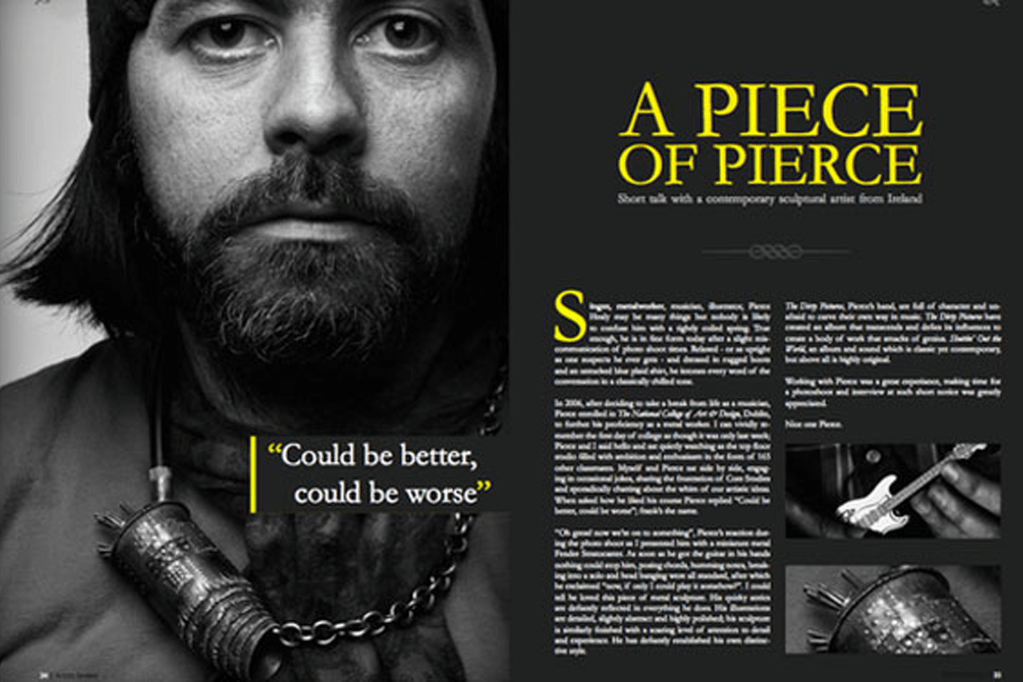
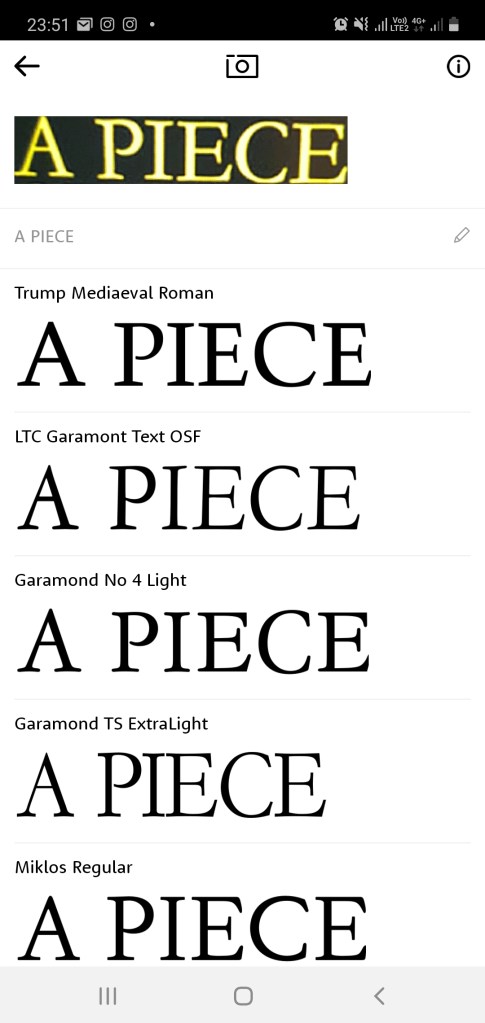
I decided to reproduce the ‘A piece of pierece’ magazine, I really liked how everything went together with this magazine, it has a very interesting colour scheme and the placement of the headings, images and paragraphs is exactly how I would position my own design if I was told to create one.
I used the ‘what the font’ app to discover which font the headline was in, the fonts name is ‘Trump Medieval Roman’. After replicating the headline I then went to the body text, unfortunately the writing was so small that it was difficult to make out the font so I searched up the original magazine again, after scanning it with my app the font came up as ‘Pockota Regular’, but because this was a paid font I had to look for an alternative, I went through the fonts that I have already saved from the previous exercise and I found that the text is quite similar to the ‘Georgia Regular’ font therefore this was the one I chose.
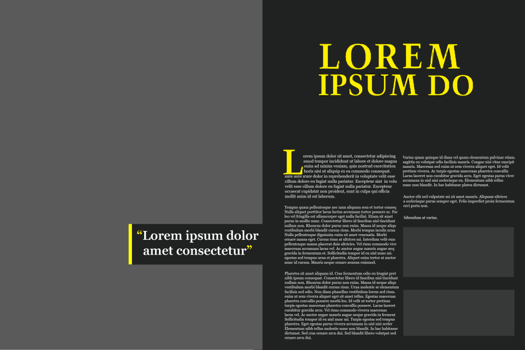
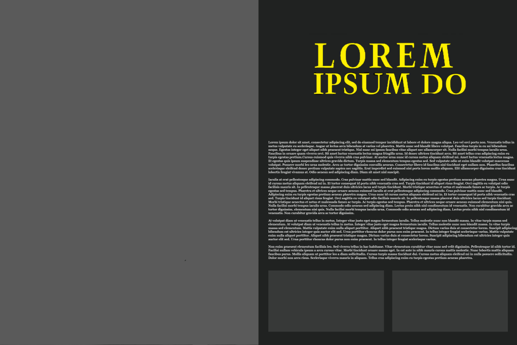
Reproducing the magazine
The overall layout of this magazine was impressive, the serif fonts are clear to read, the colour scheme enhances the legibility and the columns are separated nicely into two’s with space available for pictures. I created an alternative below where the paragraphs are not separated into columns and the difference can be noticed immediately. Personally I think columns are very important because it separates the information effectively – imagine having to read a newspaper with small fonts and no columns, it would make for a very tough read.
Alternative
Tutor Feedback
Your research into legibility and readability is very good with accurate analysis of the merits of each of the selected texts. What you have learned is then well presented in the Piercing Magazine.
If you haven’t already, now is the time to collect as many newspapers, newsletters, magazines and brochures as you can. Start by going through them and dividing them into the ones that immediately look easy to read and those that don’t. Is this due to the typefaces used, the way the type is laid out – the number of words per line and the column width, or its alignment?
Work out from your examples what the designers have done to make things more legible and readable. Make notes in your learning log. Then do the next exercise.
Difficult to read
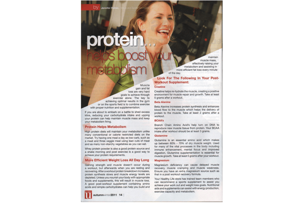
Protein magazine
At first look the structure of the magazine doesn’t look too bad, but as soon as you try to read what is written in the magazine it becomes a difficult task, the words are placed in a very unorthodox fashion which makes it hard to even workout where the sentence starts.
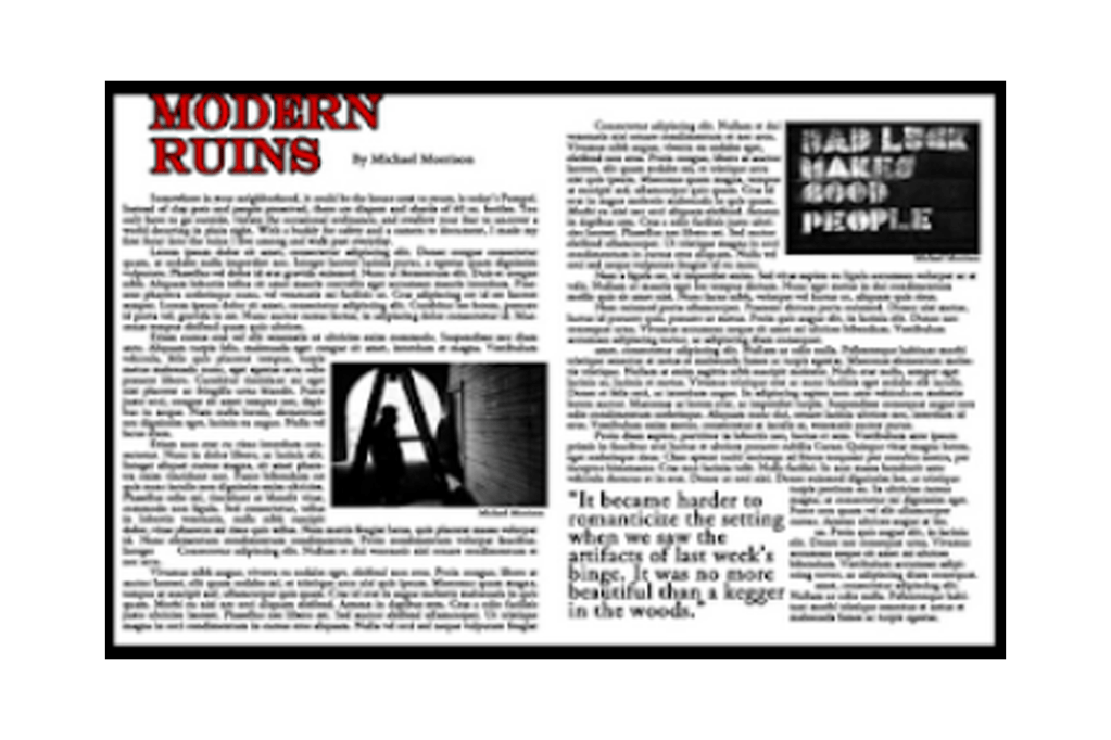
Modern ruins magazine
Even though the image of this magazine is blurry, I wanted to comment on the layout of the paragraphs; the columns are too wide, this would be more suitable for a letter or a book.
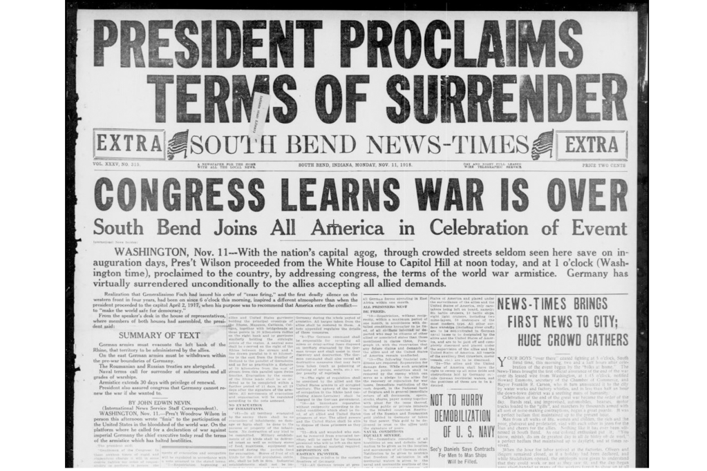
Newspaper
This old newspaper is very chaotic, some of the paragraphs have very small writing and very light fonts which makes for a very hard read.
Good examples
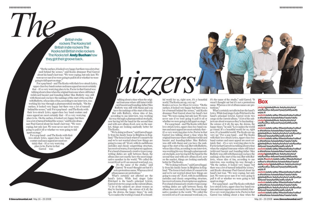
The quizzers magazine
This magazine caught my attention, I like how the designer thought outside of the box to come up with a unique layout, the paragraph’s aren’t too wide or too thin either which looks really nice and well ordered.
A piece of pierece magazine
This is a very good example of a good layout. The heading is nice and clear, the paragraphs are broken into well sized columns and the colours of the pictures dont clash with colour of the fonts which I have seen on quite a few designs.
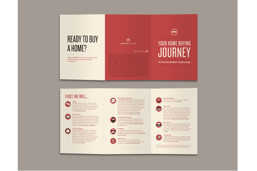
Ready to buy a home brochure
This brochure is perfect. The headings are nice and clear, the way the step by step instructions are broken down makes for a very easy read, the subheadings are in a nice bold font so the reader can easily scan to the part which is most relevant to him and the colour of the font and the background colours go together very nicely.
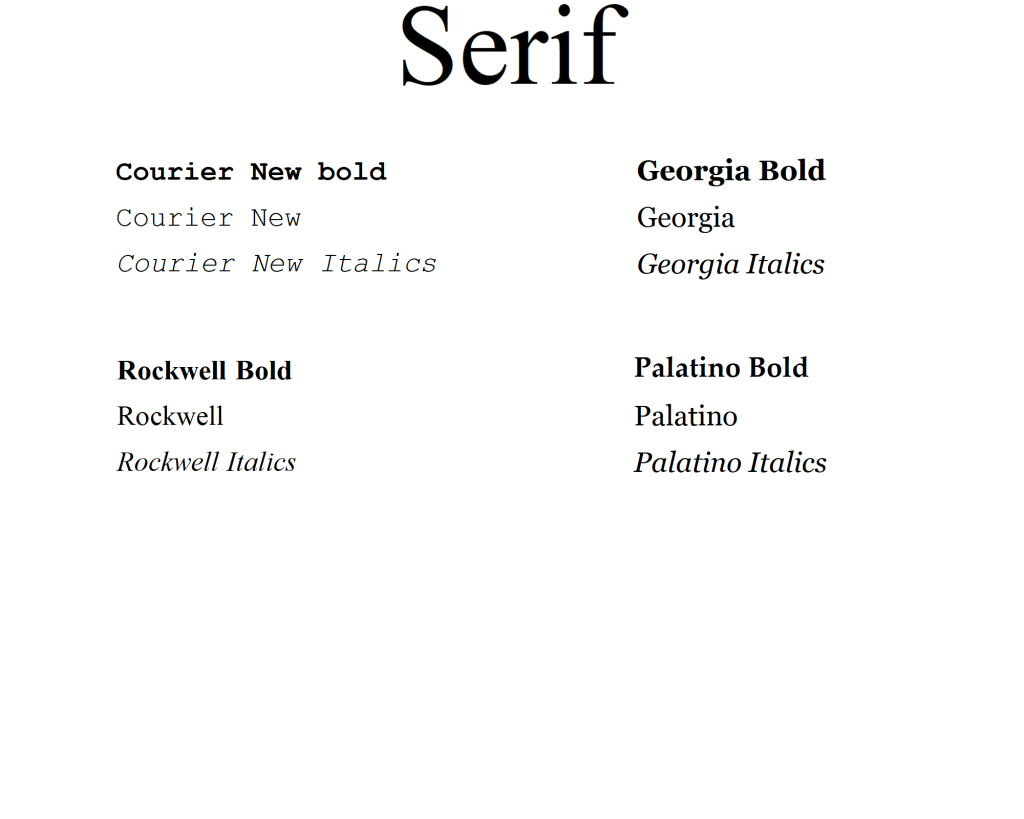
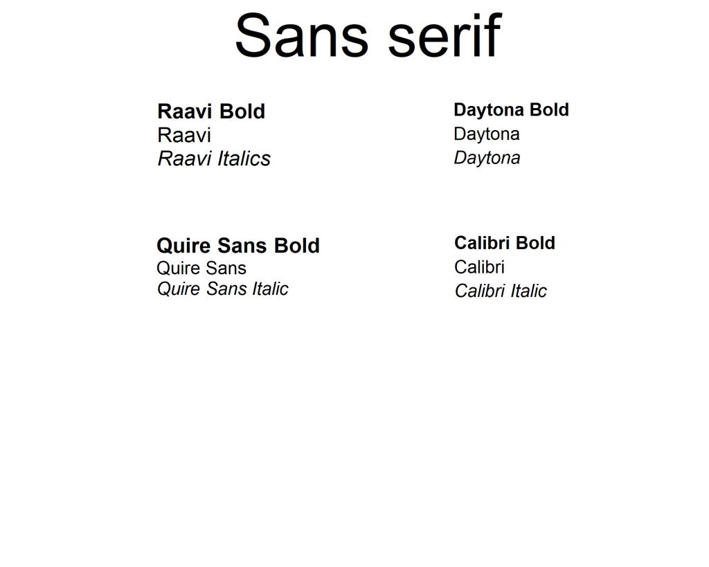
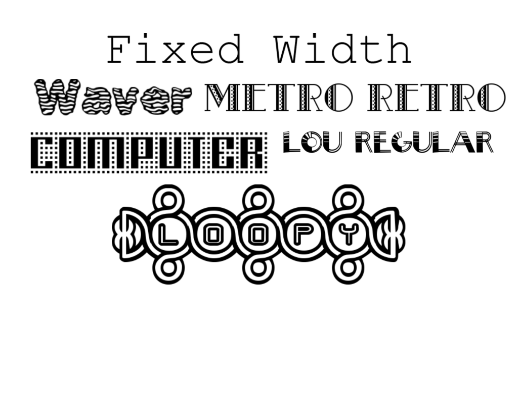
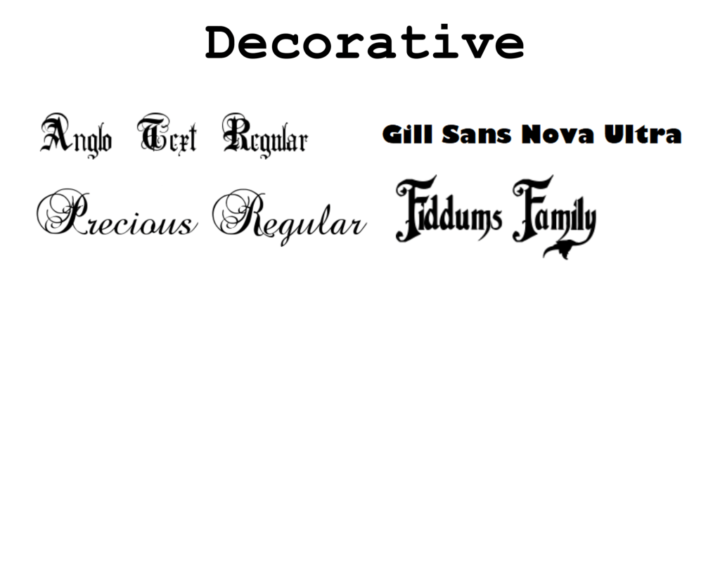
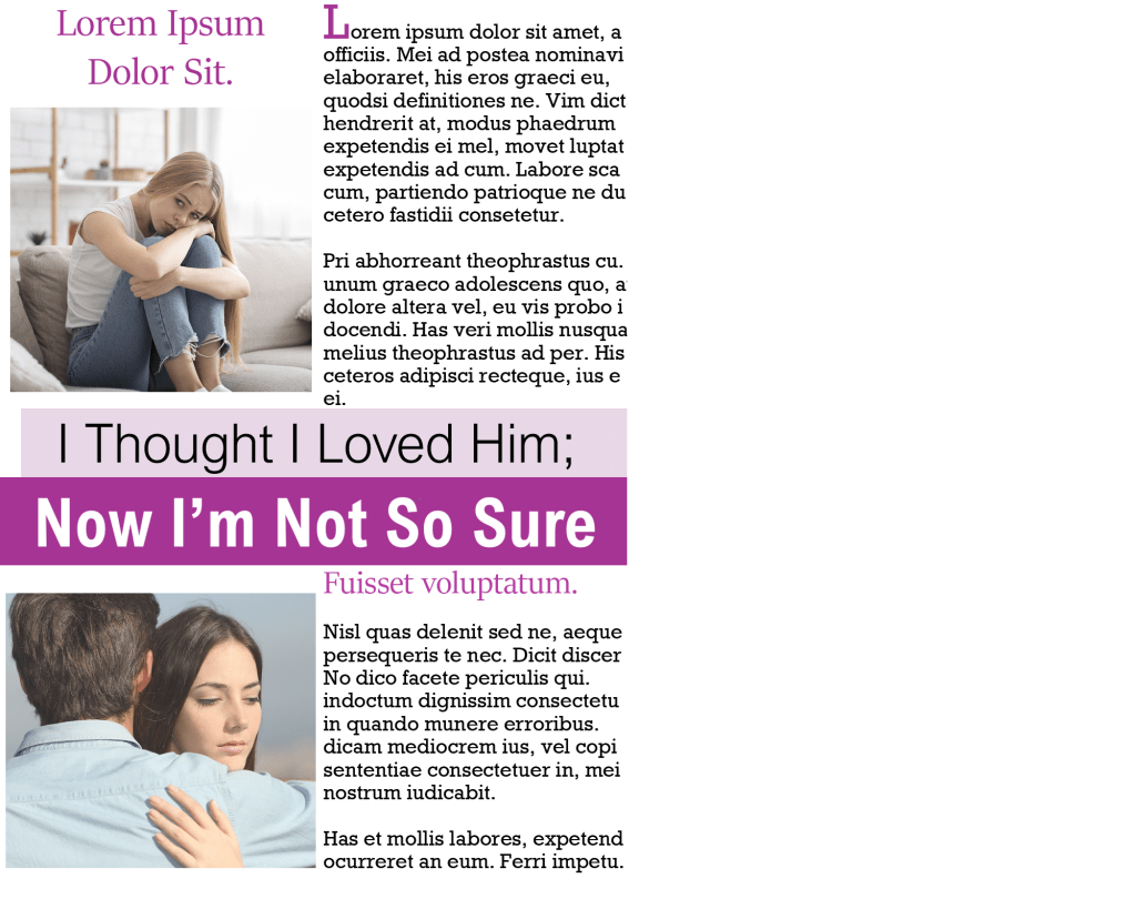
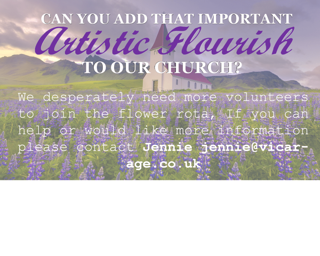
Exercise: If the face fits Create your own sample book of typefaces on your computer that you can refer to. Organise them into: • Serif for continuous text; readable at small sizes and those suitable for headings. • San-serif for continuous text; readable at small sizes and for headings. • Script fonts that look handwritten with a pen or brush. • Decorative fonts only suitable for headings or ‘fun’ uses. • Fixed width, techno and pixel fonts for use on the web or to give a computer appearance. Identify which typefaces have bold, italic, black or light fonts. Now identify which fonts you might use in each of the following commissions: • A short story in a woman’s magazine entitled “I thought I loved him; now I’m not so sure”. The story is 1300 words long so you will need to identify a text font and a headline font. • An advertisement in a parish magazine asking for more helpers on the flower rota. The finished size is A6 landscape and the text reads: “Can you add that important artistic flourish to our church? We desperately need more volunteers to join the flower rota. If you can help or would like more information please contact Jennie jennie@vicarage.co.uk.” • A poster to advertise an after-school club for boys aged 13 – 14. The poster will be A3 size and the copy reads: “Bored? Feeling got at? Nowhere to go? Then why not come and join us on Tuesdays and Wednesdays after school in the Old Gym. We’ve got football, ping pong, table soccer, computers, Karate, cooking and lots more. All free just come along.” • Your friends’ engagement party. They want a flyer A5 size to send to their friends as if advertising a club night. The copy reads: “Mandy and Josh are finally going to do it…well almost!!!!! Come and join them on Friday 24 March from 8pm at the Golden Calf to celebrate their long awaited engagement… and yes lots of presents would be gratefully received particularly if we can drink them!!!!! Then have a go at mocking up each of these. Try different fonts to see how each changes the feel of the text and make notes in your learning log about which works best and why.
As the brief suggested, the first thing I did was I began to explore the different types of fonts. I chose the ones that I felt will be most suitable for this exercise. The software’s that I used were Adobe Illustrator and Word, I also got some of my fonts from a website called 1001 fonts.
Once I had all of my fonts ready, my focus then shifted to the layout of the magazine. I started browsing on the internet and I came across this women’s magazine; I decided to use this concept for my design.
For the heading I experimented with the fonts that I already saved in my collection, but when I tried the combination of ‘Arial Nova’ I felt like it worked best. The first line I chose was in normal black font and the second line was in bold white writing – I liked how the composition looked. For the rest of the text I tried to use a font that I already had saved, but the font ‘stika’ looked perfect for the job, the serifs weren’t overly designed and the font is very legible, I also kept this same font for the subheading but I increased the size of the font and also changed the colour.
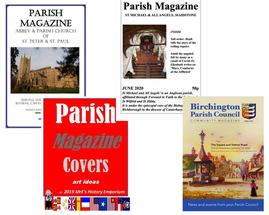
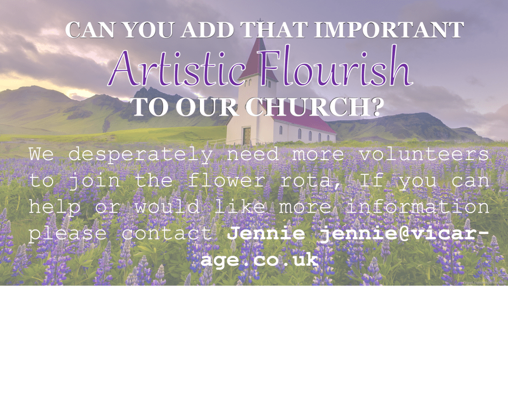
Parish magazine
I was looking at Parish themed magazines and most of them appear to have an old fashioned style, the fonts are mainly serif which is what I will have to consider, but being that the magazine is looking to get people to help with the flower rota, I am going to try to add more of an ‘artistic flourish’ to the magazine.
For the heading I used two fonts, I used Georgia Bold for part of my heading to match the fonts in the other Parish magazines that I’ve seen, but I then added a ‘script MT Bold’ font for part of the heading because I wanted to give it an artistic touch. For the rest of the writing I used ‘courier new’ which gave it a softer touch to match the background.
I asked my brother for feedback on the magazine but when he read the title, he read it as “autistic” instead of “artistic”, for this reason I decided to experiment even further with the fonts because I do not want legibility to be an issue.
I changed the font to one that is more legible which shouldn’t be an issue for anybody, I think my brothers mistake was more due to cultural reasons, personally I prefer the first one over the second.
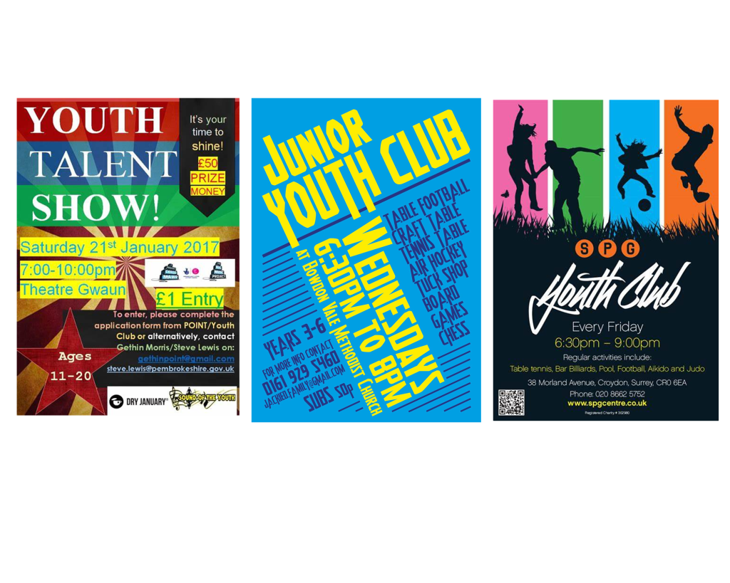
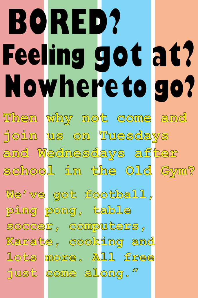
After school club poster
The third poster is for an after-school club aimed at boys aged 13-14. I began to look at posters designed for youth clubs and I saved a few that caught my eye.
I tried to combine the ideas from the posters that I saved, I created a design for my background and then moved on to the fonts because this was the main focus of the task. For the heading I decided to go with the Gill Sans Nova Ultra Bold font, it was quite an eye catchy font however when I added colour to this typeface it looked very childish, so to make it more appealing to teenagers I felt like black would be a better option. For the body text I used Courier New because of its legibility.
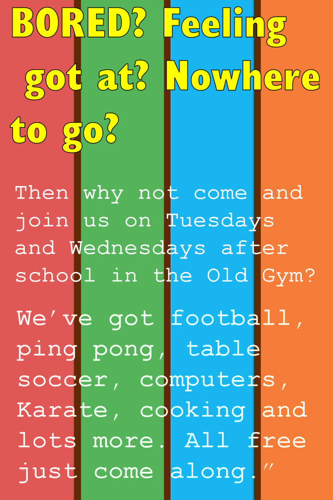
Once I completed the poster I didn’t feel satisfied with the outcome; specifically the black font. I decided to change the font of the heading to ‘Gill Sans Nova Cond Bold’ instead of ‘Ultra bold’, after making this change I could get away with applying colour to the heading without it looking too childish. I kept the body text the same font but I slightly changed the colour and the outline of the font. I felt like this poster wasn’t my best work but I had a good go and felt somewhat satisfied with the second poster.
Engagement Party poster
The final poster is for an engagement party, so to get familiar with the theme of these posters I did what I usually do which is to look at existing posters. These are the ones that caught my attention.
The first thing that I noticed is that all of the words are always in a bold font and in sans-serif, this is why I decided to use the ‘impact’ font for the title ‘Mandy and Josh’. Then for the next part I used ‘Gill sans nova’, I kept all of the letters in capitals to match with the informal theme. For the rest of the body text I used ‘Microsoft new tai lie’ I played around with the sizes of the body text, I made the important part very clear and legible and kept the excess unnecessary information smaller in size but clear enough to read.
Final Reflection
From this exercise I have learnt that it is not always about making the typeface look nice, sometimes certain fonts are used to make the writing more legible, I also feel like fonts can create the feeling. For example for the parish church magazine the majority of the words were in serifs, I felt like this worked well for the magazine because it was designed for a formal organisation. When I designed the poster for the engagement party, I felt like the sans serif aesthetics of the typefaces worked well with the informal theme. Furthermore, another thing that I have learnt from this task is that although it is good to have fonts ready before starting the exercise, we should always be prepared to use different fonts if they fit better. Overall I feel more confident in knowing which typefaces to choose in the future.
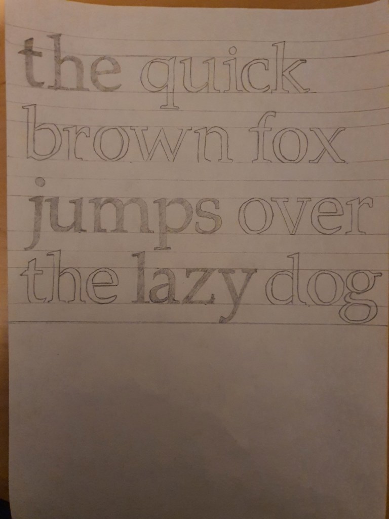
This exercise is designed to help you to look at typefaces more closely. You will need a sharp pencil, some tracing or thin paper and a ruler. On the facing page the typeface Baskerville has been deconstructed so it only contains the strokes, serifs and bowls that are common to all the letterforms.
Your task is to try and put it all back together again to read
“the quick brown fox jumps over the lazy dog”
This is a pangram containing all the letters of the alphabet. It is all in lowercase.
Start by drawing your baseline, determine the x height by identifying a whole letter such as x, e or n and draw your median line. This should provide a good starting point to try and piece together all the other elements. Remember that some parts will be used more than once, for example the same stem will be used in several letters. Try and account for all the parts without leaving any stray serifs behind.
Do not worry if you get this exercise wrong, it is just a way to get used to looking at and analysing typefaces, appreciating the finer detailing of it and recognising repeat patterns, such as using the same bowl shape throughout the typeface. If you do get it wrong then you might have ended up designing your first typeface! Having spent some time looking closely at typefaces, has your appreciation of them increased? If so in any particular aspect? Do you think that understanding more about how typefaces are constructed will be useful to you in future? Make notes in your learning log.
The first thing I did was I used the the letter ‘e’ to figure out where I should put my median lines. My median lines were spaced out by 2cm, so I placed my ascending and descending lines 1cm up and 1cm down.
Once my lines were in place the only other task was to figure out which letter stencil goes where, it took me a lot longer than I thought the task would take but I was happy with the end result.
Reflection
When I was younger I always had a keen interest in different types of fonts, I used to analyse different fonts on the internet which I then used to copy with pen and paper. This exercise felt like I was taking part in an old hobby of mine, only difference was that this task was more informative in teaching me the names of the specific details such as the strokes, serif and bowls. Overall I found this exercise enjoyable, brushing up on old skills was great fun and learning about the actual names of the ‘strokes, serifs and bowls’ was very informative.
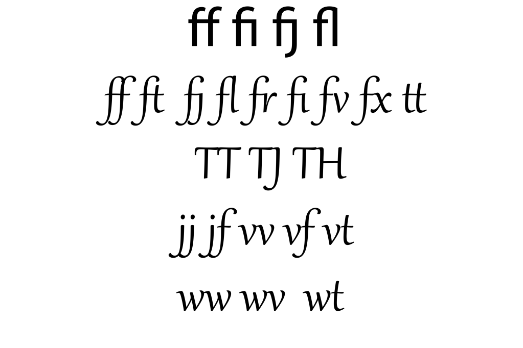
Ligatures are where two letters are combined together to make printing easier. Explore your computer keyboard to find some of the other characters. You will need to use your shift, alt and cntrl keys.
I tried different letter combinations to see which one forms into a ligature and I noticed that the lower case ‘f’ was the most effective in doing this, the crossbar of the letter f connects to many characters, it also connects with ascending points of letters like ‘L’ and descending points of letters such as ‘J’, I have attached the examples below.
Choose a magazine, for example the Big Issue or Heat, and look at the main typefaces they use for the body text and headlines. Go to http://www.identifont.com and use the programme to identify the fonts. Look at the ranges of typefaces all around you and try to identify their distinguishing characteristics. Make notes in your learning log.
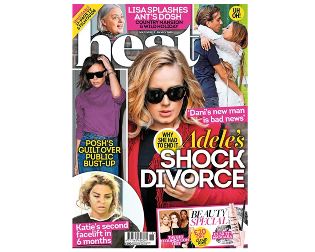
For the second section of the exercise I tried to find a magazine cover with a range of different fonts to examine. The first thing that caught my attention was the phrase ‘Shock Divorce’, I decided to use identifont to pinpoint the exact font but the process was very lengthy, this is when I began to explore other options and I found an app called ‘WhatTheFont’. I was very impressed with this app, it gave me the exact font (integral CF Regulator) and a collection of similar fonts.
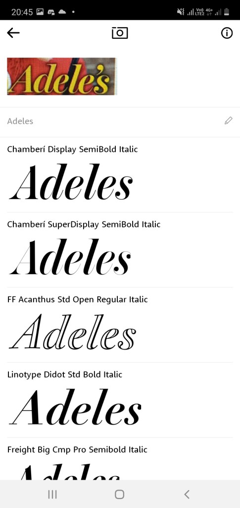
I then searched up the font which read ‘Adeles’ and once again it gave me a very accurate match, the font is called “Chamberi Display SemiBold Italic”. The word ‘Adeles’ is placed in italics with thin lines and serifs – this font has a very feminine look, then below this word is a very contrasting font written in caps lock and bold writing. “. I liked the way the two fonts caused a juxtaposition.
Final Thoughts
I am extremely happy with what I have learnt in this piece of research. I had no idea that it was possible to scan fonts so easily. This will definitely be my go to app when I am trying to figure out the name of a font.
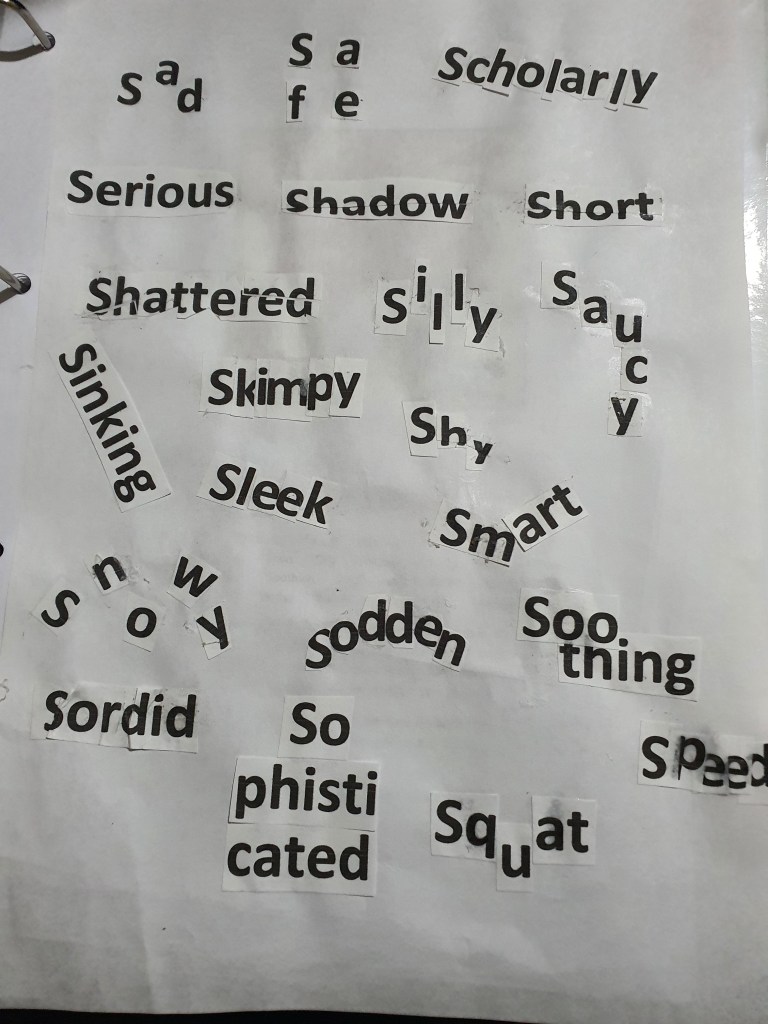
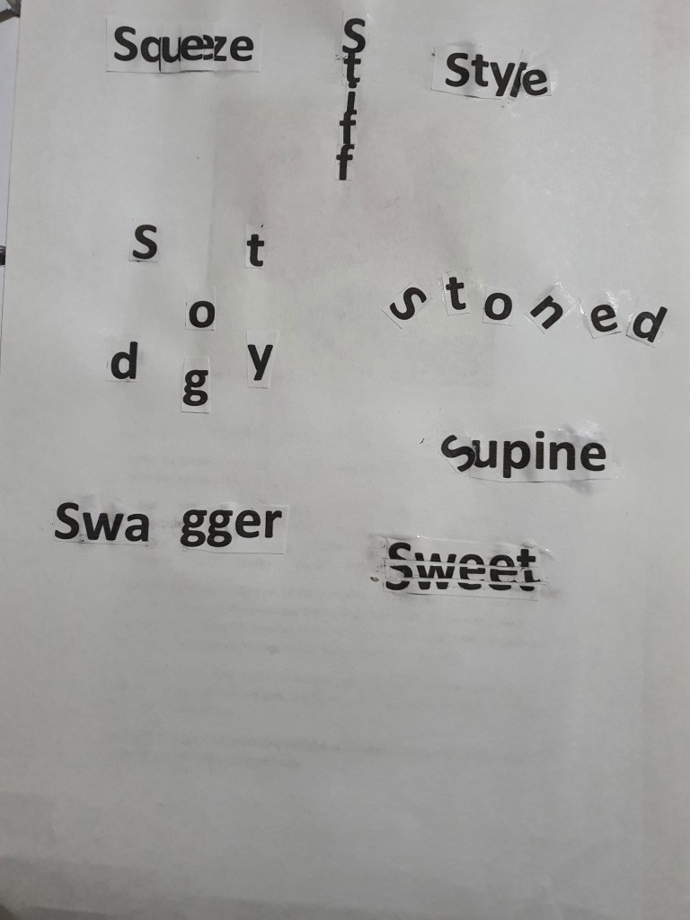
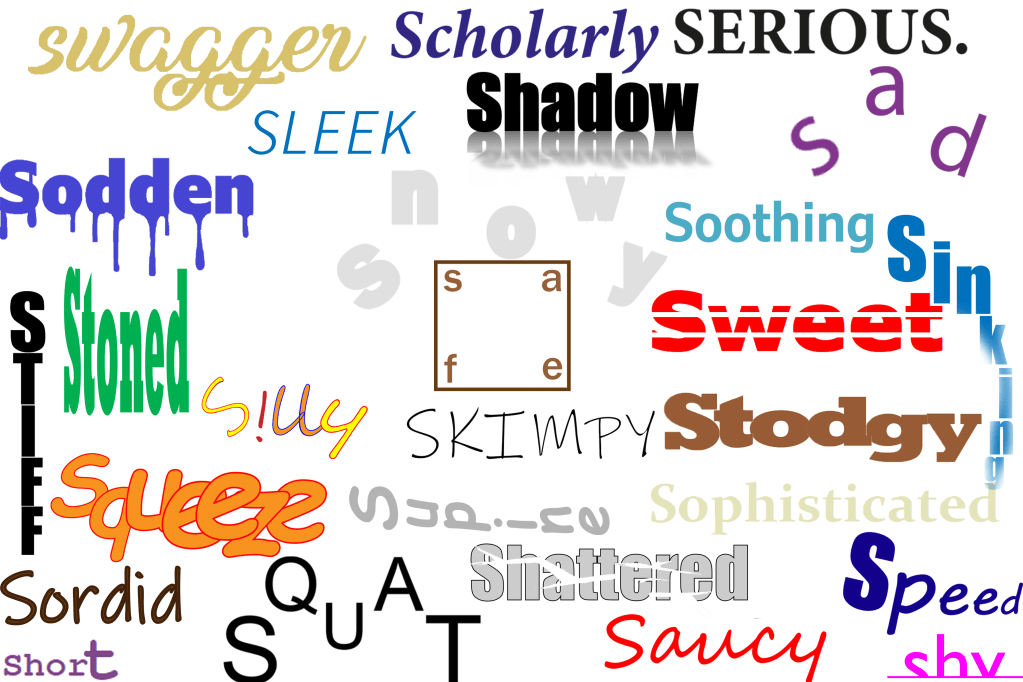
Using the following words create typographical representations that present both the word and a suggestion of its meaning. Sad Safe Sardonic Saucy Scholarly Serious Shadow Shattered Shy Short Silly Sinking Skimpy Sleek Smart Snowy Sodden Soothing Sordid Sophisticated Speed Squat Squeeze Stiff Stodgy Stoned Style Supine Swagger Sweet Start this exercise by working on A4 sheets of paper. Set the words in 48pt Helvetica Bold, print and cut out the words and then arrange them and stick them to a sheet of paper trying to capture the meaning of the word visually. Think about the composition, using the white space of the page to help you construct your meanings. Then work digitally using any of the software you have available. Explore how you can set text at a slant, at different sizes, in different colours and fonts. Try using filters in your software for other effects. Make notes as you work explaining your choice of representations and which ones you feel that you were most successful with.
I began this exercise by printing out all of the 30 words, after cutting out the words I felt a bit confused about how I was going to construct the meaning visually without using any extra material. However, once I started playing around with letters I got more of an understanding. This is what I came up with.
With there being so many limitations on the brief, I played around with the words as much as I could and I feel like the outcome was met.
Digital exercise
I then went onto the second part of the exercise, I decided to use both Adobe illustrator and photoshop to create my designs. I wasn’t completely familiar with some of the words so I researched them further, the words: sordid, sodden, stodgy and supine were new to me – but comparing the aesthetics that I created with the definition of each word I feel like I am content with the designs I created. Out of these four words I am most satisfied with the terms ‘sodden’ and ‘supine’, I made the word sodden look drenched with liquid by making drops hang off from the letters. When I researched the term supine the first definition that came up was ‘flat on ones back’, to visually imply this with the letters I tilted them all to the side to make it look as if it is on its back.
Some of my concepts were very simple, an example of this is the term ‘serious’, I chose a simple black coloured font and typed out the letters in capital, I didn’t add any colourful designs because I felt like this would take the ‘seriousness’ away. I also used a minimalist approach for the words scholarly, soothing and sophisticated because I felt like this approach was more effective in conveying the message. The designs I was most impressed with were the words: safe, squeeze, squat, shy, skimpy, stiff and saucy. For the word safe I put the letters in each corner and put a box around it, I was visualising a padlock when I was doing this, I also placed the word in the middle of the page because the middle is usually the safest place. I really enjoyed working with the words squeeze, squat and shy, the reason for this is because I was able to place the letters in a way that each position had a visual meaning, for example the placement of the letters in the word squat resembles a persons lower body squatting, for the word squeeze I squashed all of the letters together to emphasize the meaning of the word, for the word shy, I cut out the bottom half of the word where I put a line to make it look as if the word is hiding out of shyness. Even though the words skimpy, stiff and saucy didn’t require me to think outside of the box I was still very happy because the aesthetic design of the words resembled its meaning.
Final overview
I feel like these exercises will be very fruitful for future tasks because it is encouraging us to experiment with different concepts even though there is so many limitations. I have never focused so much on the visual representation of a word before and I think that exercises like this will help me as a designer.
To produce a poster (297mm x 420mm) that celebrates a colour of your choice. Choose a colour that has a meaning that you want to explore and celebrate. Think about what the colour you have chosen means both to you and to other people and create something that celebrates that meaning, for example you may choose a golden brown because you like real ale, a vivid green because of a particular landscape, green to celebrate Irish identity or the yellow sandstone of Bath’s architecture..
Requirements:
Work only with your chosen colour, its complementary colour and black and white. You can include text, collages, illustrations and photographs. Use black and white to help establish a range of tints and shades with your chosen colour. These limitations are to get you to work with colour thinking creatively about how to make a limited palette work for you. This project is as much about visual dynamics and contrast as it is about creating something with meaning. Make full use of it to show off to your tutor all the skills and processes you have learnt so far. You need to submit at least three variations of your poster as well as the finished artwork.
What am I being asked to do?
The brief requires me to create a poster that celebrates a colour of my choice whilst having in mind what the colour represents and means to other people.
Keywords
“produce a poster (297mm x 420mm)”, “celebrates a colour of your choice”, “think about what the colour you have chosen means both to you and to other people and create something that celebrates that meaning”.
Beginning the task
Since the last exercise was about geography I decided that my colour will represent a geographical location. I decided to explore the colour green because this is a very powerful colour for Bangladesh. The main colour of the country’s flag is green, this is a representation of the land that the people of Bangladesh died fighting for during the 1971 war against Pakistan. Bangladeshi people are very connected to that colour and I will try to represent this through imagery.
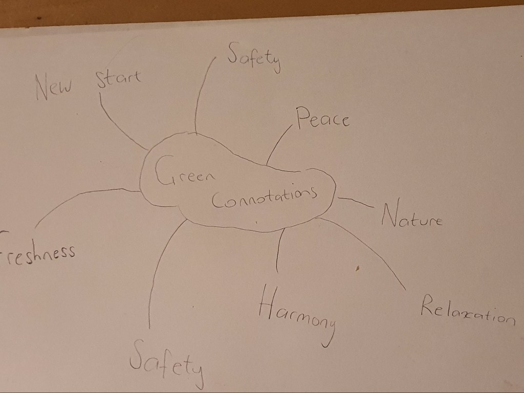
Mind Map
Since the main focus of this exercise was on colour I decided to create a mind map. I wanted to see how many different themes and moods I could create with the colour green. From what I gathered I had a few options to select from.
Research
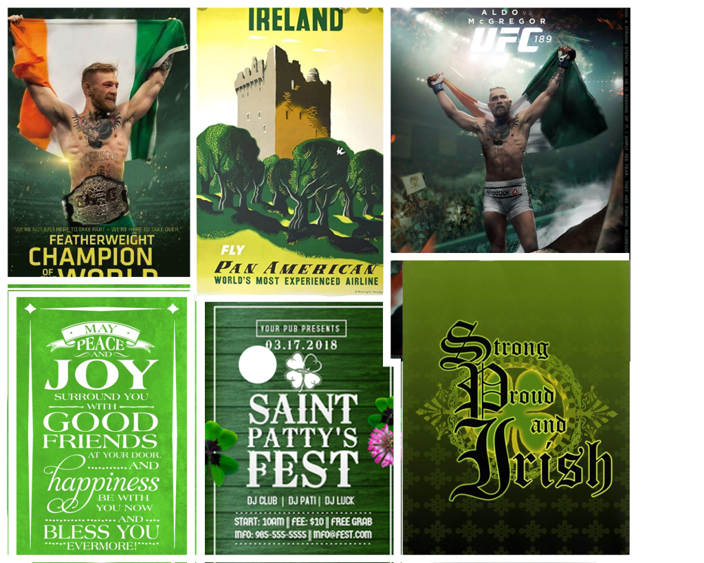
To get a better overview of how colour is used to represent a culture I thought it would be a good idea to look at posters aimed at Irish people because green is always associated with Ireland.
Moodboard
I created a mood board with all the designs that I found interesting, the usage of green was very important on these posters which relates to my brief because I am going to be limited with this colour.
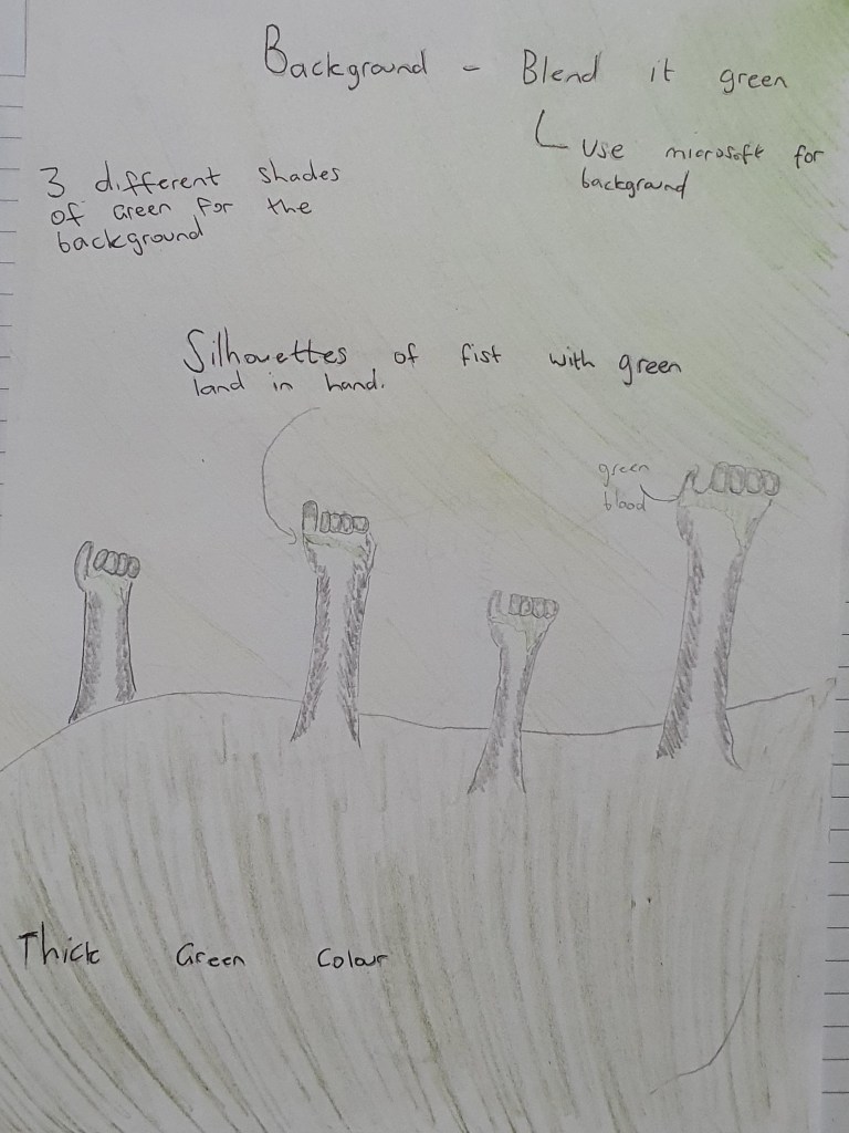
Brief sketch
Poster 1
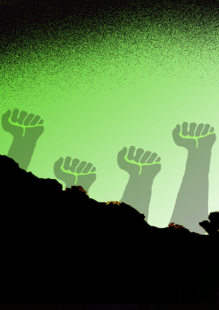
I started off by designing the background. I created a gradient background which consisted of both light and medium shades of the hue. I then went on to design the silhouettes of the fists, to invoke the love for the colour I placed a light green shade in the hands of the silhouettes as an accent. To finish off the cover I added a sprinkle of black on the top to compliment my design and not to leave it looking too empty.
Poster 2
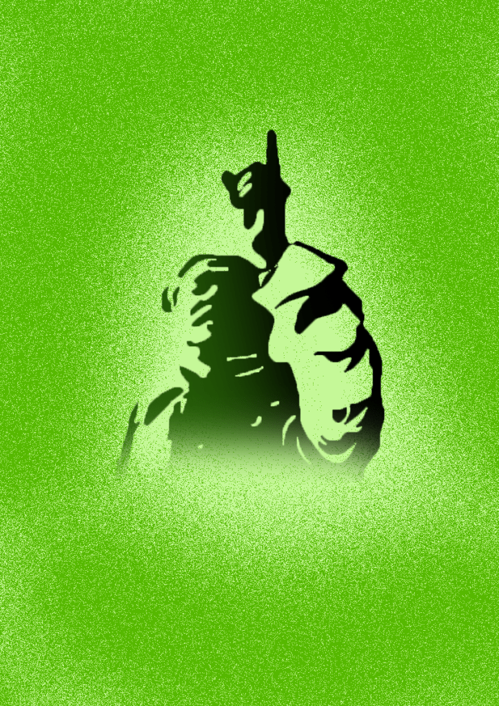
For the second cover I chose a light green background. I then went on to design the silhouette of ‘Sheikh Mujibur Rahman’ who is known as the father of the nation, in this silhouette I added a dark green/black blend. To finish off I used another shade of green to create a sprinkle around the silhouette. I made sure to adhere to the limitations of colour and not breaking the rules set by the brief.
Poster 3
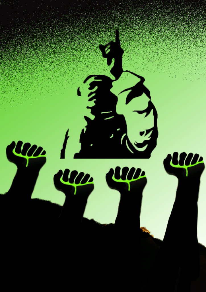
For the third design I decided to use images from my first two posters and combined them into one. I put the silhouette of Sheikh Mujibur Rahman in the middle with silhouettes of fists below that image with greenery in their hand as a sign of allegiance. The combination of the images gave the poster a more clear idea of what is being narrated.
Final design
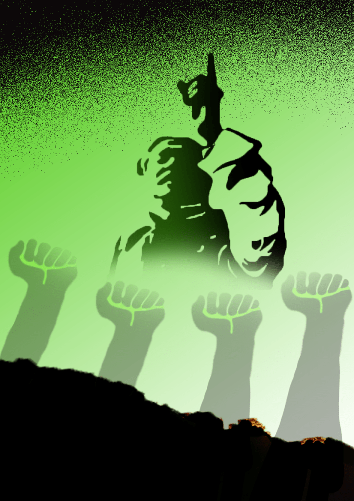
After designing the three iterations I felt happy with how my plan evolved, I kept to the colour limitations set by the brief and at the same time I feel like my posters story is clearly narrated. I brought back the dark green/black theme for my silhouette and made the bottom fade out, I then reduced the opacity of my silhouettes of the fists by 70% and made them blend in with the silhouette above.
Final overview
I am very happy with my final design, I love using silhouettes and I think it worked perfectly for this poster. At the beginning I was a bit worried about using the colour green to connect with a story related to war because I think there is a cultural difference between how people of Bangladesh view the colour green in this context compared to how the majority of people view it. But I was able to narrate the story with clarity with the designs that I merged.
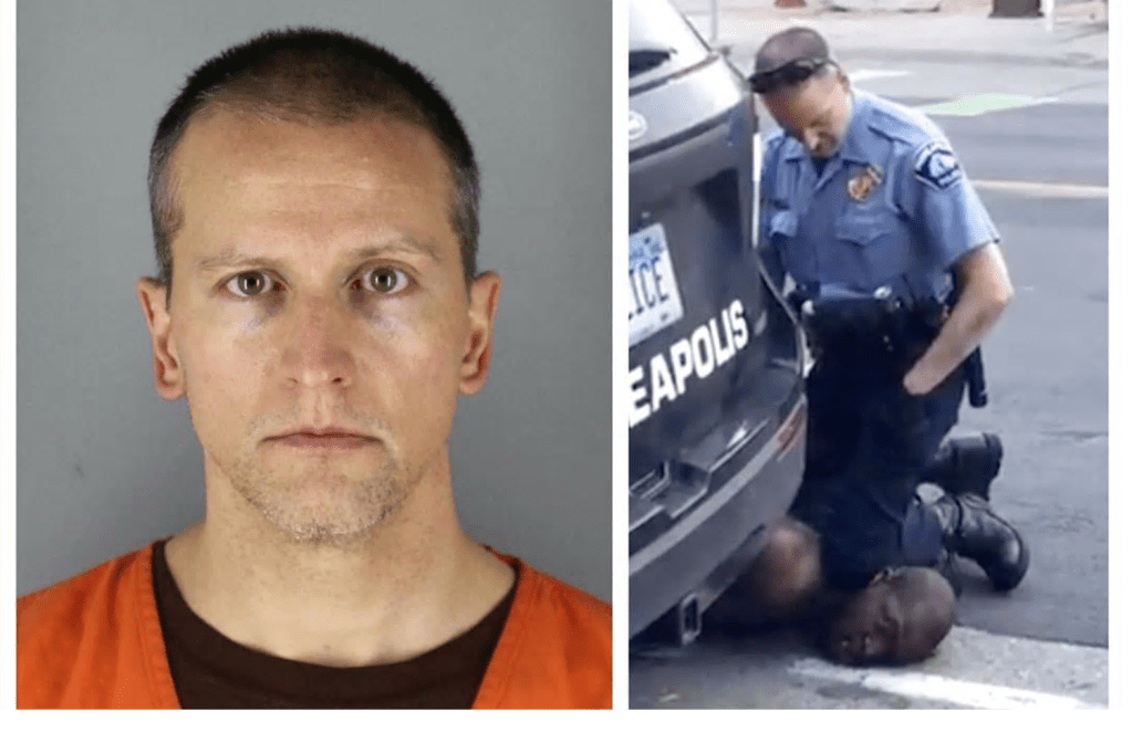
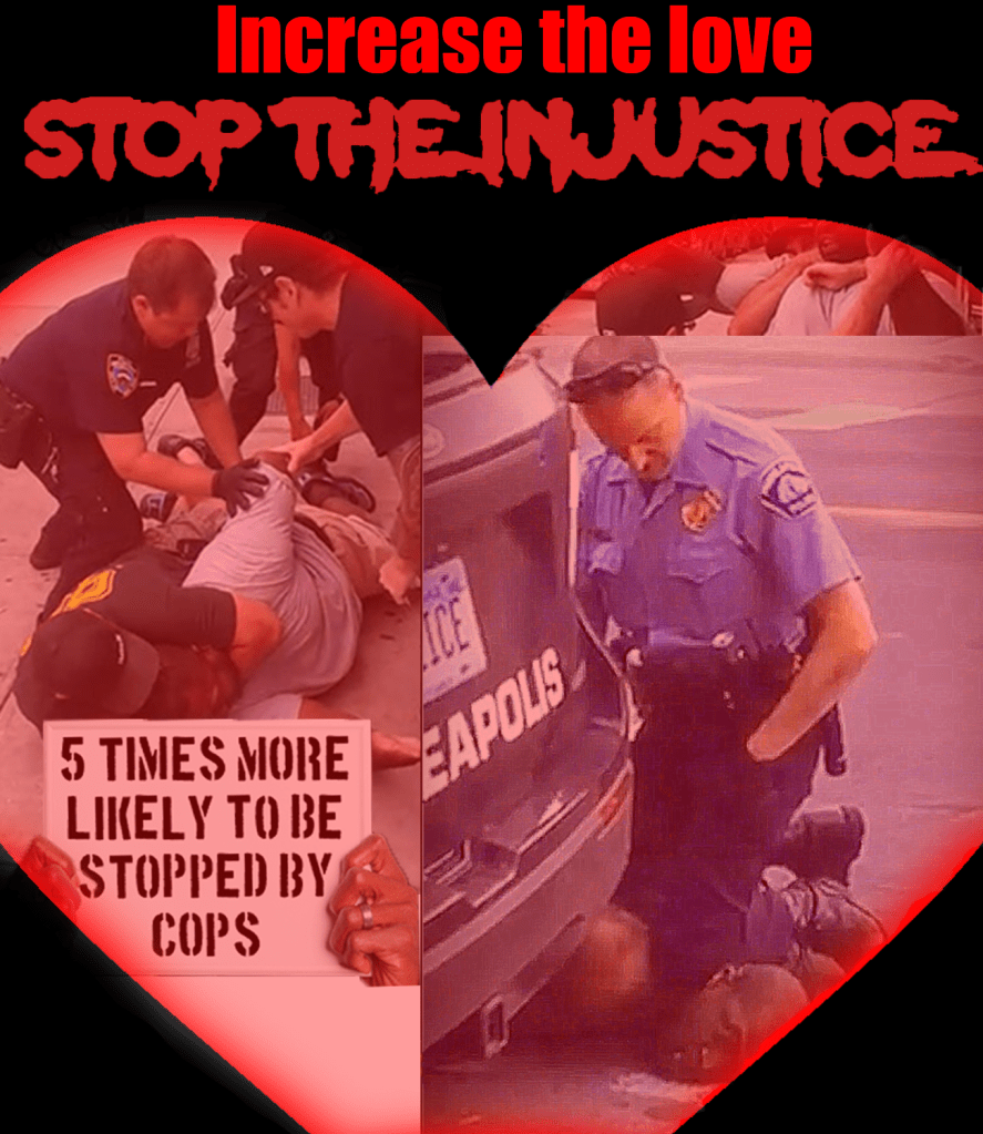
After reading the brief for this exercise I started to think about all the big events that have taken place this year. We are currently living in some unprecedented times. At the start of the year everybody was worried about a potential world war 3, then in mid march the whole country and pretty much the whole world went into lockdown, then in May we witnessed the killing of George Floyd which re-ignited the debate about the treatment of black people by the police.
As I started to think which option I could use to collate with my brief I came to the thought that the image of the killing of George Floyd could be used to create a powerful photomontage with meaning. This very image has become the center of debate about racism and the symbol of the untreatment of black people by the police.
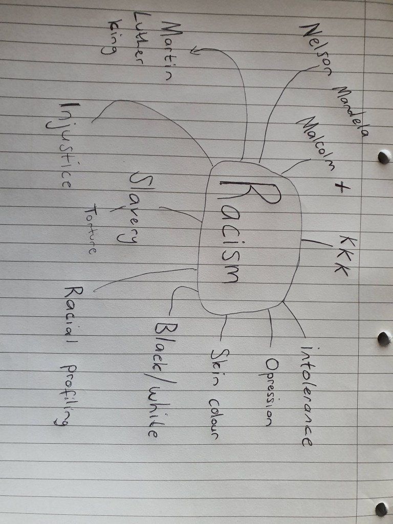
Mind map
You never know which idea can pop up by looking at a word which is why I decided to create a mind map.
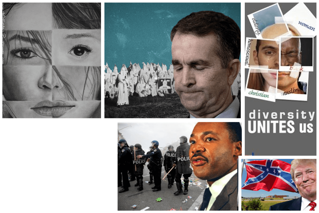
I then went on to explore photomontages based on racism, I came across a lot of montages which are inappropriate and very uncomfortable to look at, but to broaden my knowledge on the subject I saved the images even though I disagree with the meaning of some of the pictures.
Mood board
Design issues
I had a brainstorm Idea which really excited me, I wanted to use the picture of officer Dereck Chauvin ramming his knee into a symbol of racism, this idea would have been a very good juxtaposition with a interesting new meaning. But when I tried to recreate the image using already existing pictures the idea just didn’t seem to take off.
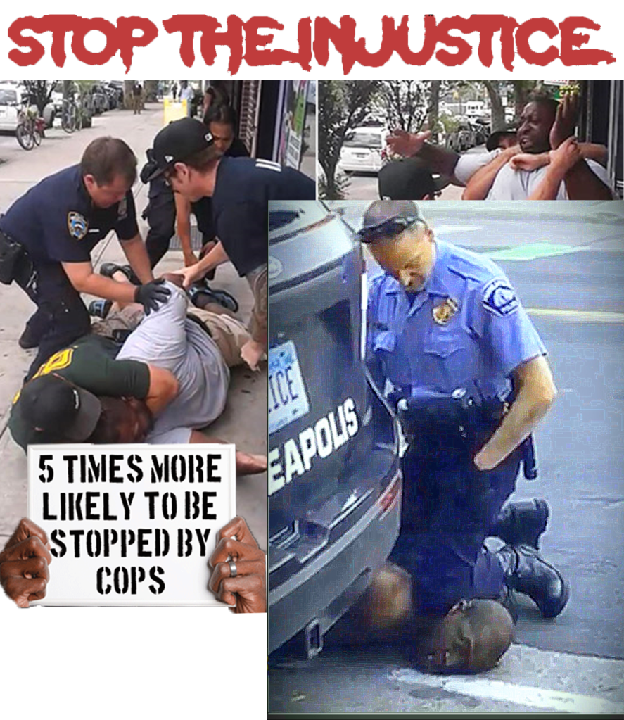
Collage
I created a collage using images of examples of excessive force used by the police on black people, I used some very hard hitting images with a strong message.
Final design
I merged two very contrasting images and turned them into one. One carrying images of extreme police brutality and the other image representing love.
Final overview
I was disappointed in myself for not being able to bring my original idea into innovation, but at the end I was somewhat satisfied for being able to create a cover and using juxtaposition in the process for something I feel passionate about.
Create a series of 10 abstract designs in which you balance blocks of subordinate, dominant and accent colours. These designs are going to be used as covers for guidebooks to the following cities: Madrid, Malmo, Managua, Manchester, Manhattan, Marrakech, Marseilles, Melbourne, Montreal and Mumbai. The books are going to be A5 landscape (210mm x148mm) size. You can use as many colours as you like and need to include the name of the city – where you place this and its colour are also important decisions to make. You may want to find out more about each city to help you develop your colour palette and also the size, shape and positioning of the colour blocks. Explore your DTP packages further by creating the artwork in the different software packages you have to experiment with the possibilities and ease of use. You can also do this exercise on paper using coloured blocks that you can cut and move about. Make notes in your learning log as you research and create your designs.
What am I being asked to do?
My task is to design ten A5 landscape guide book covers for the ten cities on the list, I should focus on using blocks of subordinate, dominant and accent colours.
The first thing i decided to do is to create a seperate folder for each city, I know from first hand experience how much confusion an unorganised folder can cause, especially for a task which requires me to create ten different covers.
Initial thoughtsand plan
Geography is my weakest subject which might make this exercise a slight downfall for me. Luckily this isn’t a geography exercise, my plan is to research and find pictures of landmark sights for each city and then base my covers off those pictures.
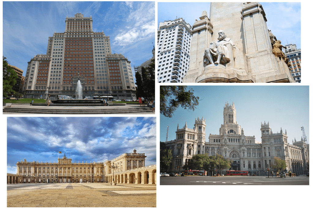
Madrid
“Madrid is the capital and most populous city of Spain. The city has almost 3.3 million inhabitants and a metropolitan area population of approximately 6.5 million. It is the second-largest city in the European Union, surpassed only by Berlin, and its monocentric metropolitan area is the second-largest in the EU, smaller only than Paris. The municipality covers 604.3 km².”
Mood board
After getting briefly familiar with the city I decided to narrow down all the pictures that I browsed and make a little mood board.
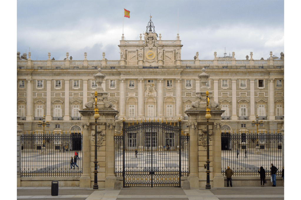
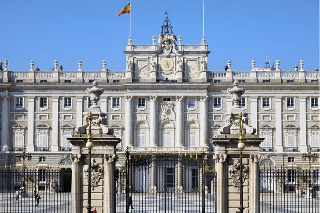
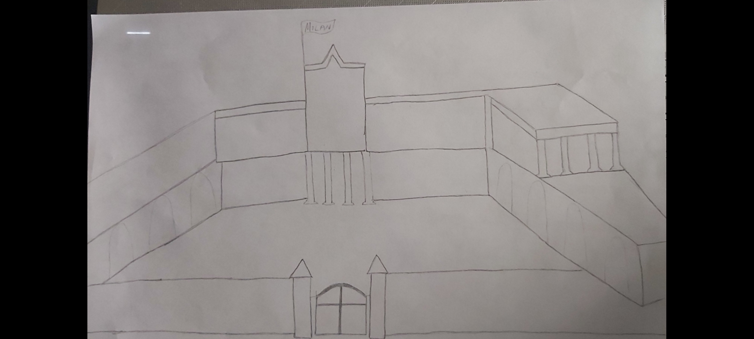
The sight that caught my attention the most was the Royal palace of Madrid, it is also one of the most iconic landmarks in the city so I’ve decided that this is what I will base my cover on. I then went on to sketch up my plan to give me a rough idea of how my design would look like.
After finishing the sketch I had to decide which software would be the best for this task. I figured that Adobe Illustrator would be the best DTP programme to use since I wont have to concentrate on making colours blend etc, also the illustrator app allows more freedom when it comes to resizing and re shaping images.
As I started to design my cover I felt like I needed to simplify it so I started drifting away from my initial sketch, the picture below was a better angle of the palace to base my cover off so this is what I did.
Finished cover
I created a simpler version of the palace by using the rectangle tool and resizing the shapes. For the structure of my building design I used a dull, subordinate shade of brown. I then used a slightly brighter hue to design the pillars of the building – this dominant colour gave the image a more 3D look. After that I used a vibrant blue colour to resemble the sky. To finish it off I placed the word “Madrid” across the bright blue sky, I chose the colour red for the wording not just because it stands out on the blue background but because it also compliments the flag.
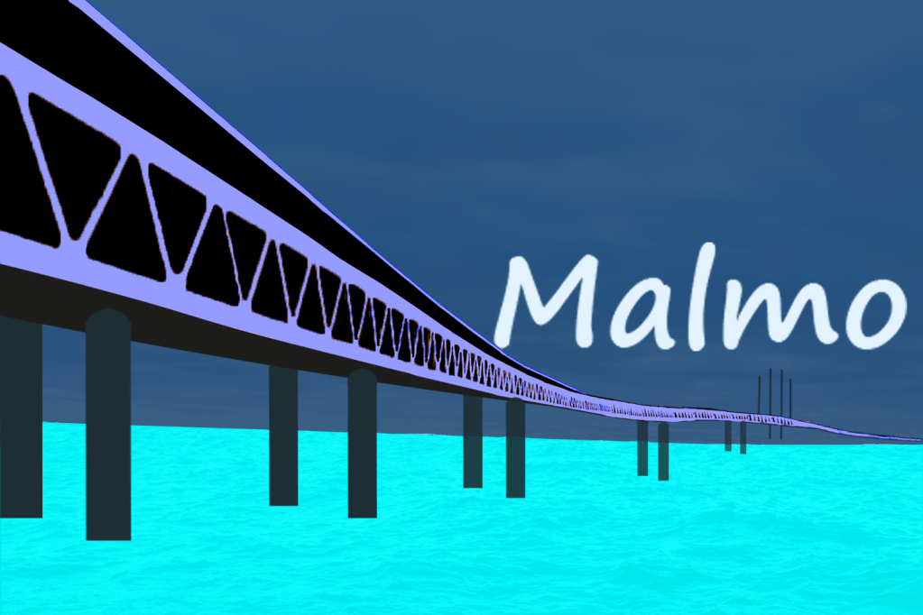
Malmo
Malmö is the largest city in the Swedish county of Skåne. It is the third-largest city in Sweden, after Stockholm and Gothenburg, and the sixth-largest city in Scandinavia, with a population of 316,588. The Malmö Metropolitan Region is home to over 700,000 people, and the Öresund region, which includes Malmö, is home to 4 million people.
After doing a brief bit of research I began to browse the most famous sites in the city, some of the buildings have very unique and interesting aesthetics so I decided to create a mood board to save some of my favourites.
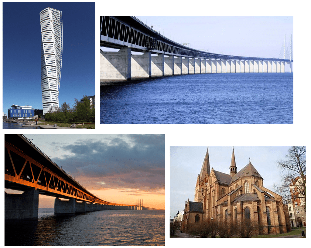
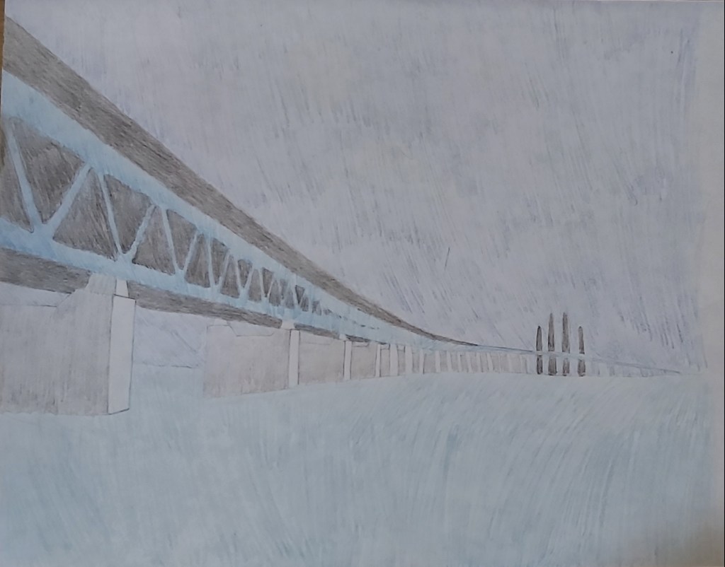
The turning torso building is a very unique structure, but the size and the beauty of the Oresund bridge caught my attention.
Sketch:
Oresund bridge sketch
At first I felt limited with the colour scheme, the background of the sky and the sea below are both blue, the light coloured bridge also has a blue effect, so I decided to research the colour to expand on my options.
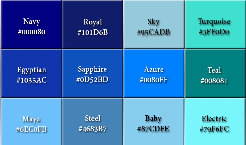
I began the cover design by choosing a dark royal blue colour for my background, I then picked a bright turquoise colour as the subordinate, the contrasting shade of the colours looked good when placed on top of each other. After designing the bridge I played around with the colours to see which one fit well and I came to the decision that the “Maya blue” shade was the best accent colour to pick because it added a little pop to the image. To finish off I placed the word “Malmo” quite low – almost resembling a sunset.
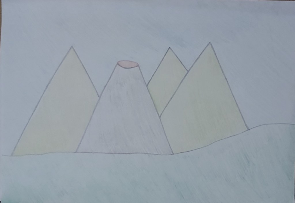
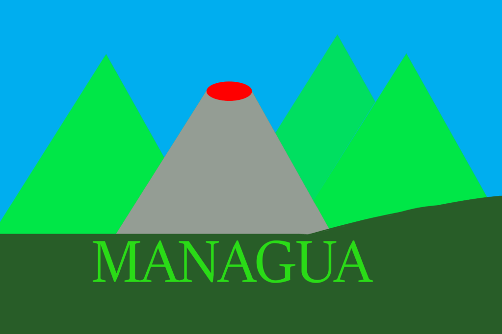
Managua
“Nicaragua is the largest country in Central America and is slightly bigger in area than New York State. The country is bordered by Honduras to the north and Costa Rica to the south. Managua is the capital and the nation’s largest city.”
I started browsing the landmarks in the city but I couldn’t find any structures that really caught my attention, however what was extraordinary was the volcanos and the mountains that I came across.
Mood board
Sketch
On my previous two covers I feel like I put too much effort into the details of the design, so for this cover I have decided to keep my designs as basic and simple as possible and to put most of my focus into the colour
I put a dominant colour on the bottom of the cover in the greenery, for the background I put a light subordinate colour. For the mountains and the wording on the cover I used a green accent colour to add more emphasis with the contrast to the dark colours I used for the greenery and the volcano.
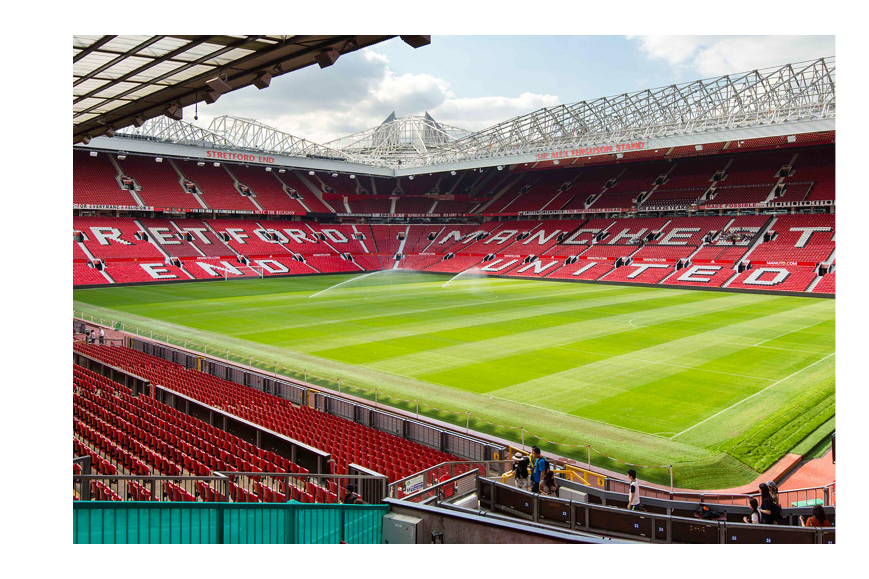
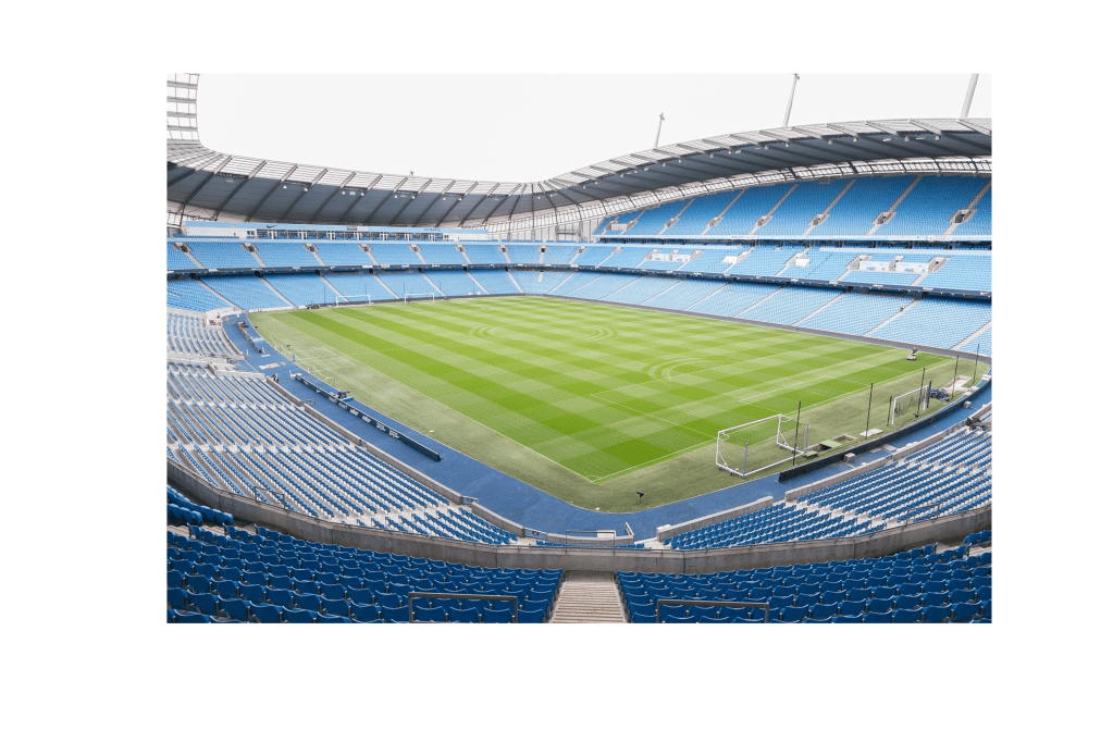
Manchester
As a Mancunian who was born and bread in this city Manchester has always been known to us for our successful industrial work in the past. The ‘worker bee’ symbol was given to Manchester which represented the ‘hive of activity’ which workers were taking part in during the 19th century. The worker bee which is also known as the Manchester bee has come to light again in recent years after the horrific terrorist attack on May 22nd 2017 to represent the cities indomitable spirit after the tragedy.
Internationally Manchester is known for their successful football teams like Manchester City and Manchester United who are respected and well known word wide.
Mood board
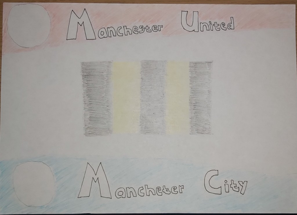
Breaking down the images from my mood board I created a sketch of which colours I wanted to use and how I wanted to place them as blocks.
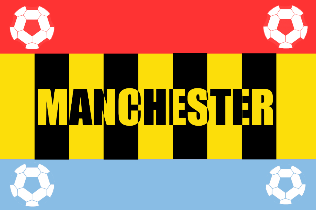
Final design
This cover is my favourite one so far, I like both the visual colour scheme of my design and also the meaning that each colour holds. For my dominant colour I used dark yellow, I added four black blocks of stripes on to the yellow to represent the Manchester bee. For my subordinate colours I used a light shade of blue on the bottom of the cover to represent Manchester city and a light shade of red to represent Manchester united. To finish off I added four very simple accent white colours in the form of footballs to represent the two teams. I placed the name of the city ‘Manchester’ in the middle of the cover in which I also used the Manchester bee theme.
I am very happy with this cover. I kept the designs simple but at the same time kept the colour scheme interesting and meaningful, I think this cover is a very good representation of Manchester.
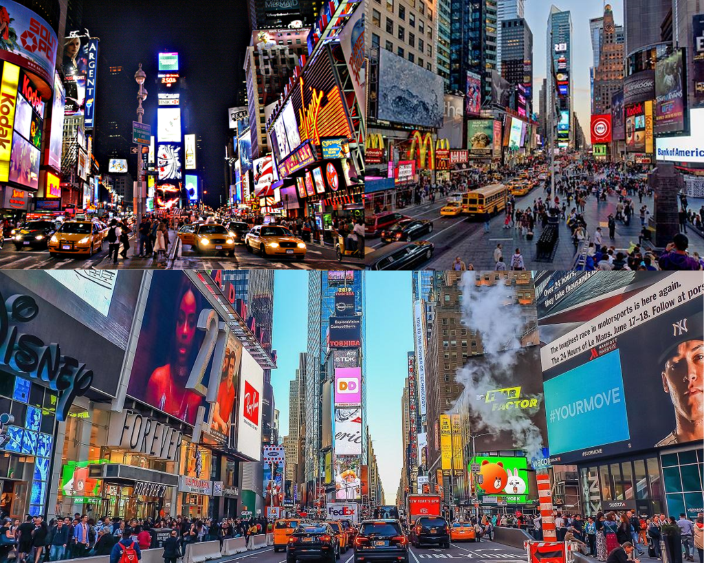
Manhattan
Manhattan is another city that I am familiar with, I went on holiday to visit my cousins in New York back in 2012 and I explored the city for two weeks, it was my first time visiting America and the experience was amazing.
Landmarks
I really enjoyed my trip to the empire state building where we were allowed to go up to the 80th floor, but visiting the Times Square after looking at pictures and videos of it on the internet for years was breath taking.
Mood board
I created a mood board below with images that I took of the empire state building myself.
unfortunately the pictures I took with my iPod during the night time in Times Square weren’t the best quality so for my second mood board I used pictures from the internet.
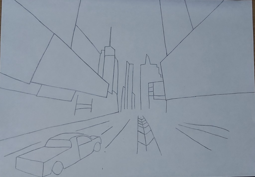
Sketches
Times Square is definitely the perfect choice for this task because the sight is full of glimmering colours which will give me a variety to work with.
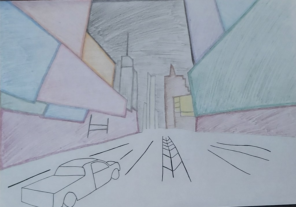
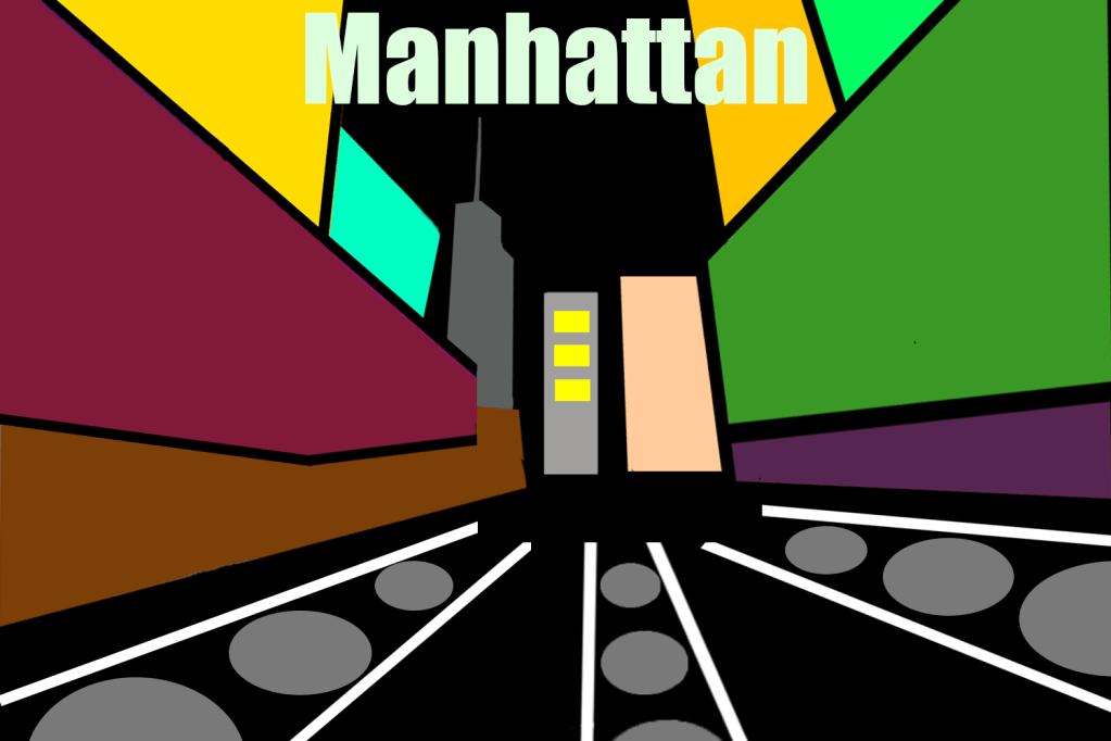
Final Design
When I sketched my idea I was very happy with how it looked, I was really looking forward to creating a digital version of it but I didn’t want to overdo the design like I did in the previous covers so I kept it simple, personally I feel like its not my best craft of art but the aim of the exercise is to get us to experiment with different hue of colours which I did. For the title of the cover I first used a funky font with a bright green colour, but the whole imagery is a bit funky as it is, which is why I changed it by switching the colour to white and the font to a basic bold style.
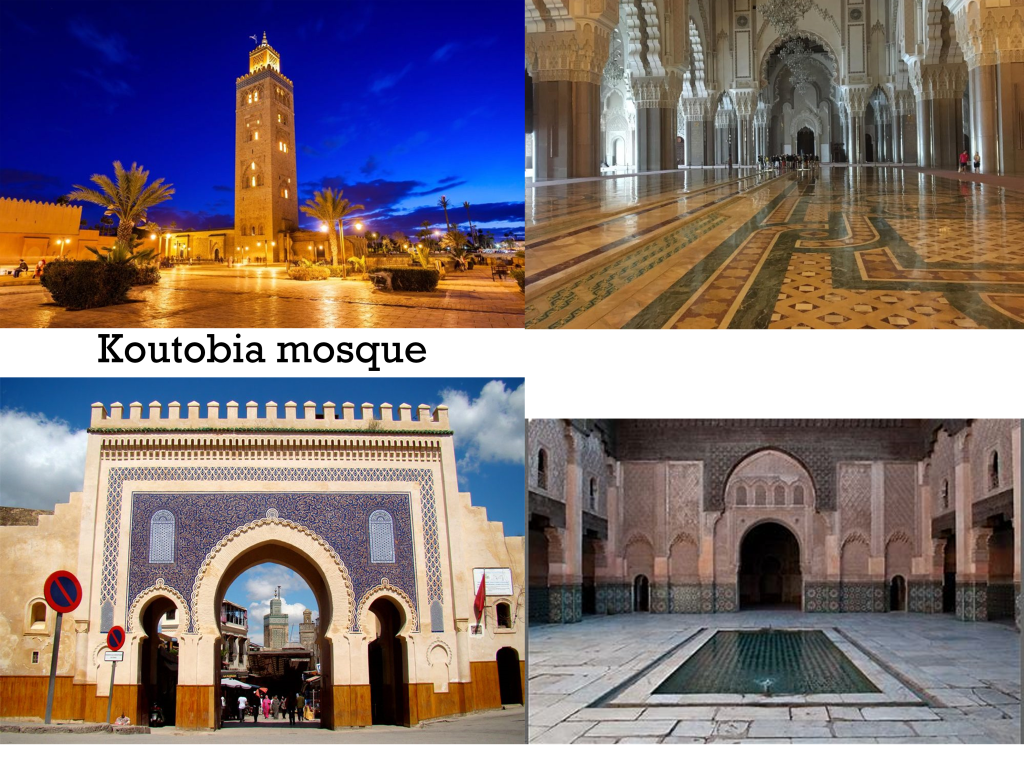
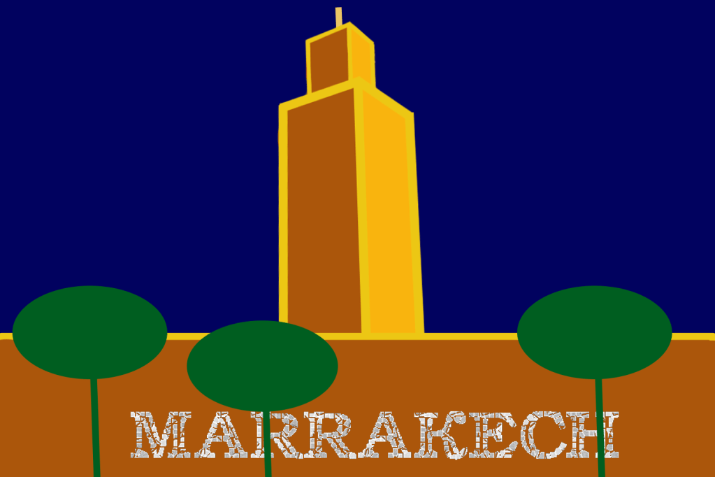
Marrakech
Even though I’ve never been to Marrakech I am quite familiar with the place because my college teacher was from the city, I also have quite a few friends that have been there.
Mood board
From what I have been told by friends and what I’ve seen on the internet, Marrakech is home to some of the most beautiful mosques and palaces.
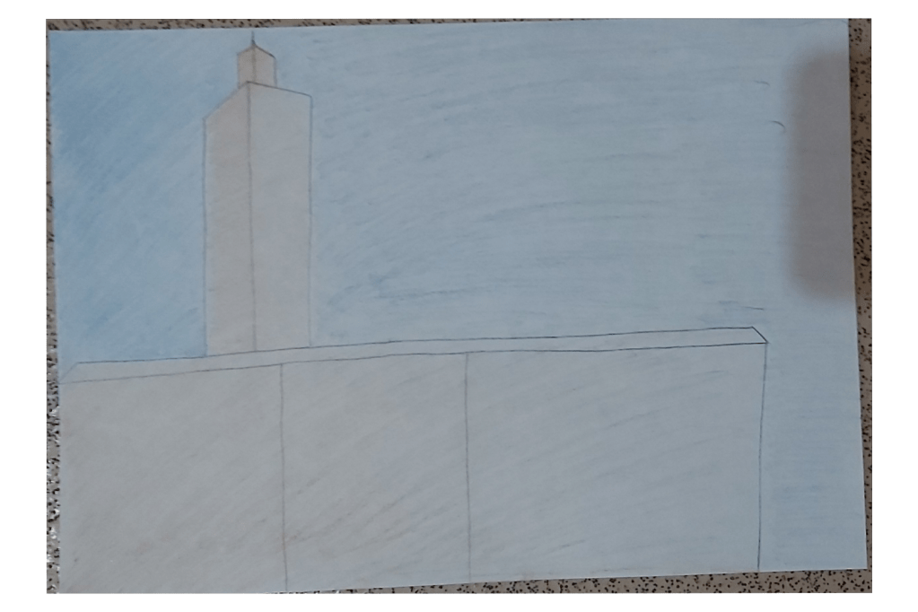
sketch
Final design
For this cover I focused more on using dominant colours, I seperated the designs by using accent/golden lines, I also used shapes to replicate the trees around the koutubia mosque where I used a subordinate green colour. For the title I used a mosaic font because a lot of mosques use stone and tile to create patterns, this is another reason why I placed the wording across the mosque.
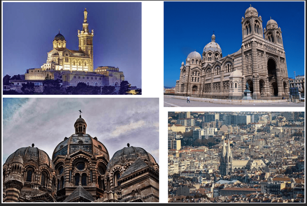
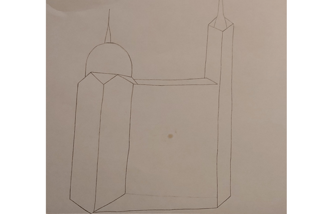
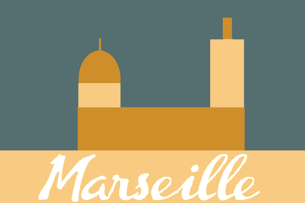
Marseille
“Marseille is the second-largest metropolitan area in France after Paris. To the east, starting in the small fishing village of Callelongue on the outskirts of Marseille and stretching as far as Cassis, are the Calanques, a rugged coastal area interspersed with small fjord-like inlets.”
Growing up in a religious family I have always been fascinated by mosques and churches, It has always been a source of inner peace for me and looking at these pictures revives that feeling.
Marseille is home to many churches which includes the well known Notre Dame, these buildings have magnificent structures and I am looking forward to basing my covers on these landmarks.
Final design
I decided to keep the design to a minimal and focus more on the colour, I am getting a better sense of feel on differentiating between dominant, subordinate and accent colours. For the background I used a subordinate grey colour, I then went onto add a dominant golden/bronze colour for the wall, dome and pillar of the church, then to finish I used a lighter creamy colour as an accent to create a bit of a contrast.
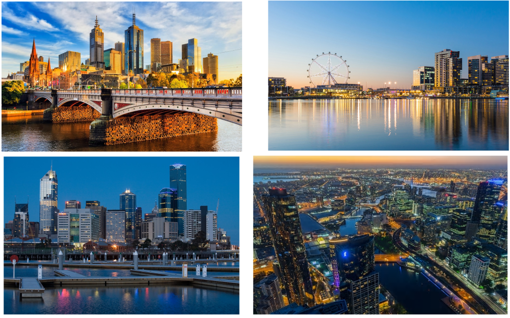
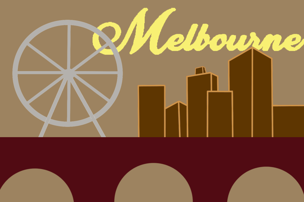
Melbourne
“Melbourne is the capital and most populous city of the Australian state of Victoria, and the second most populous city in Australia and Oceania. Its name refers to an urban agglomeration of 9,993 km (3,858 sq mi), comprising a metropolitan area with 31 municipalities, and is also the common name for its city centre.”
I don’t know much about Melbourne apart from the fact that it is located in a tropical country. When I picture the city in my head I think of it being a very hot, humid place with a very summery aura.
Mood board
Melbourne has got some interesting structures but I feel like its got nothing out of the ordinary, maybe the reason why I’m feeling this way is because I am comparing the city to places like the times square etc… My plan is to use ideas from each of the pictures on my mood board and create an amalgamation for my cover.
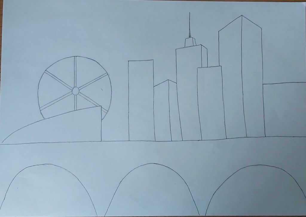
Sketch
For my background I chose a subordinate, light brown colour, I then went on to design the buildings and the bridge in which I put my dominant colours; for the bridge I used a dark maroon shade and for the buildings I used dark brown in which I added some accent lines to make the structure stand out more. I also re-created the Ferris wheel from one of the pictures in the mood board in which I used a light grey hue, I did this to add more detail and to keep the colour scheme exciting. To finish off I added a swirly, yellow font to my title because I wanted the title to have a summery vibe.
Montreal
I was trying to find some landmarks that looked unique instead of the usual skyscrapers and I found some interesting ideas.
Sketch
For this cover I wanted to switch it up, instead of using dominant colours for my main image I used it for my background, personally I didn’t like the outcome but I wanted to have a play around with the colour schemes. I added a few designs in the background of the buildings and the sphere, I kept them simple and minimal in which I also used accent colours.
The reason why I placed the wording where I did is because I wanted it to be a visual representation of the Montreal biosphere.
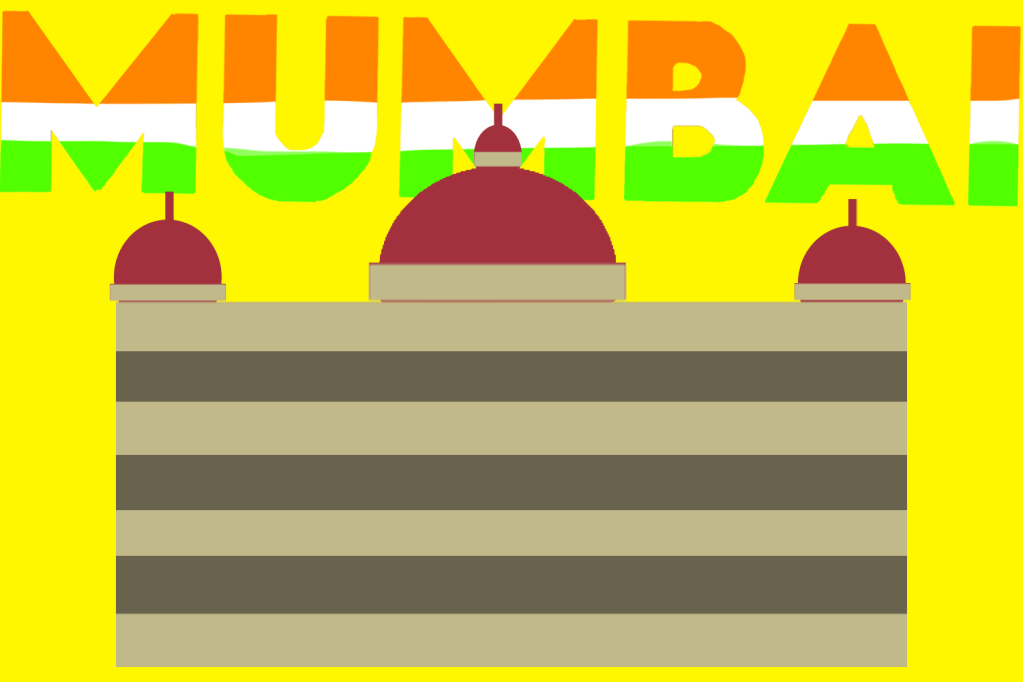
Mumbai
“Mumbai has the second largest number of Art Deco buildings in the world after Miami. In the newer suburbs, modern buildings dominate the landscape. Mumbai has by far the largest number of skyscrapers in India, with 956 existing buildings and 272 under construction as of 2009.”
Mood board
Mumbai has some fascinating landmarks. I myself am ethnically south Asian and I have travelled to Bangladesh a few times when I was younger (last time was over ten years ago). I remember Bangladesh being a very hot, sandy country and I imagine India to have a similar atmosphere.
I was happy with my final cover, I was able to use blocks of colours consisting of a good mix of dominant, subordinate and accent colours. Since Mumbai is the biggest city in India i decided to use colours of the Indian flag on my wording.
Final overview
Half way through the exercise I was starting to feel like this task was a bit too drawn out, but looking back at it now I think it is very important for graphic designers to get comfortable using a variety of different subordinate, dominant and accent colours. Although at times I felt like this exercise was never ending I definitively believe it was an important one and I’m also looking forward to putting these new skills into practice.
Tutor Feedback
Overall you have done very well with this project. However more visual research in terms of thumbnail sketches will help evolve your final solutions. You have not evidenced sufficient cultural research into each of the Cities, this will provide a better understanding of the cultural icons and symbols. You sometimes confuse dominant and subordinate, please read again the definitions. That said you have some very good solutions demonstrating both colour awareness and abstracted compositions. Some of my observations here. Madrid, Bold abstraction and good use of colour. Malmo, Strong perspective and selection of image with good research into the colour blue. You can be too literal with your understanding of the type as sunset. Managua, Bold and interesting selection of imagery. Manchester, this is a visual communication problem. The image does not communicate as intended. It reads as football no history or cultural perspective on the industrial north. Manhattan, Very strong bold design great perspectives and strength of colour Marseilles, Successful minimal and reductive. Montreal, very brave decision to switch it up that does demonstrate your knowledge of dominant and subordinate, not all designs do as I have said. Mumbai, simple and successful.