This final assignment is an opportunity to consolidate the understanding you’ve gained so far, reflect on the work you’ve enjoyed and your achievements. It allows you to create certain parts of the brief yourself so that you have the maximum capacity to show off your interests and talents.
Choose one of the briefs below. Then work through the design process, researching and visualising a range of ideas before critiquing your work and choosing your selected design to present as print ready artwork.
Brief 1: Book design
Penguin Books have asked you to design a new house style for a collection of books on design for children and young people.
They are starting with three titles: Colour, Typography and Photographs. You will need to produce three covers (front, back and spine). The designs will need to be recognised by readers as a series and at the same time be appreciated on their individual merits. The book dimensions are 190mm wide by 225mm high.
In addition they have asked you to produce the one on typography called A is for… It doesn’t have to be a conventional text book. Create an introductory chapter of at least 4 pages that is visually interesting and will entice young people into wanting to buy the book and read more about the fascinating world of typography.
Brief 2: Promotional design
A youth theatre club is performing a production of Abigail’s Party. Mike Leigh’s tale of suburban taste is set in the 1970s and explores middle class aspirations and preoccupations.
You will need to acquaint yourself with the play if you don’t know it already, as they are particularly keen for it to have a 70s feel. The play will be touring local theatres for a month, performing every Friday night and Saturday matinee.
Produce a poster (A3 portrait), a flyer (A5 landscape, double-sided) and newspaper advert (A6) to promote this event. In addition they would like their A5 programme cover to continue the design theme.
For the purposes of this brief you need to invent dates, times, places, names and any other information you think will be required. Use Lorum ipsum text for areas of body text.
Brief 3: Charity work
The Gerald Anthony Furniture Store is a charity that helps poor and displaced people furnish their homes with the basics. It has been running for over 100 years, staffed mostly by volunteers. They would like you to design a generic business card, letterhead, and paper mock up for the home page of their website. In addition they want you to design their 8 page annual review.
The review will consist of:
front cover
inside front with a bit of blurb about their history (90 words)
the chair’s report (365 words)
the co-ordinator’s report (300 words)
the treasurer’s report ((260 words)
a graph or design to show the breakdown of income and expenditure
Income
– local authority grant £48,927 – grants from trusts £66,750
– donations £14,655
– other £4,032
Expenditure
– direct charitable expenditure £113,192
– fundraising costs £6,655
– management and administration £10,924
a page giving the names of the main grant funders (20 in total with each name about three words long)
and a list of the management committee: chair, treasurer, co-ordinator secretary and five other members,
the back cover with an advertisement to encourage people to volunteer. Maybe the biggest challenge of this brief is to solve how to break up and lay out the text in the 8 page document. Photographs will need particular care as some people who benefit from the charity may not want to be identified.
Choosing which brief to tackle
I read through each of the briefs and I feel like the second brief is the one which will allow me to best showcase my strengths. I enjoy designing posters and flyers and designing a poster set in the 70’s evokes my nostalgic side. Even though I am not familiar with Mike Leighs tale ‘Abigails party’, I am curious to learn.
I enjoyed creating book designs in the previous exercises that I did, but I think that enjoyment was triggered by the interest that I had in the books that we were tasked to work on, for example the first exercise wanted us to design covers for a classic collection of HG Wells books and the second exercise was based on one of my all time favourite books ‘of mice and men’. Even though I enjoy learning about colour and typography, creating a “introductory chapter of at least 4 pages” along with the three covers does not spark my motivation.
Designing a business card and letterhead for the third brief is something that interests me, but writing an 8 page annual review is quite tedious and for this reason this brief would be the last on my list.
What am I being asked to do?
My task is to create:
A poster (A3 portrait), a flyer (A5 landscape, double sided) and a newspaper advert (A6).
The promotional designs should have a 70’s feel, they are based on Mike Leighs tale ‘Abigails party’.
Keywords
‘Suburban taste’, ‘set in the 1970s’, ‘middle class aspirations’.
Design Issues
The only issue at the moment is that I am not familiar with the play or the author Mike Leigh, so I’m going to begin the task by watching clips of the tale and looking at images based on it. Apart from that the rest of the brief seems quite straight forward.
To get more accustomed with the play I began by reading the stories plot, I then skimmed through the plays on YouTube, some of the acting was quite cringey but the setting gave me a better idea of the theme, I then found clips of the original copy which made the theatrical side more interesting to watch. I made a mind map to keep track of the things that stuck out to me the most.
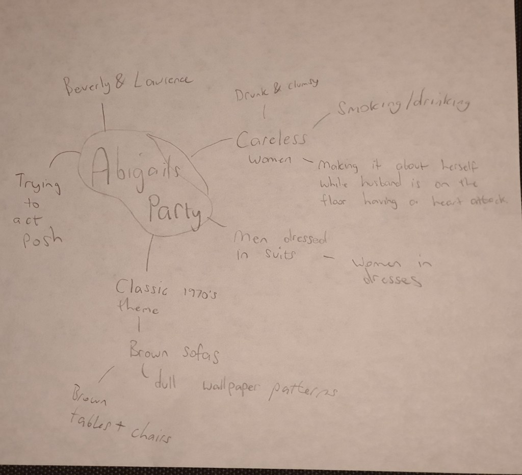
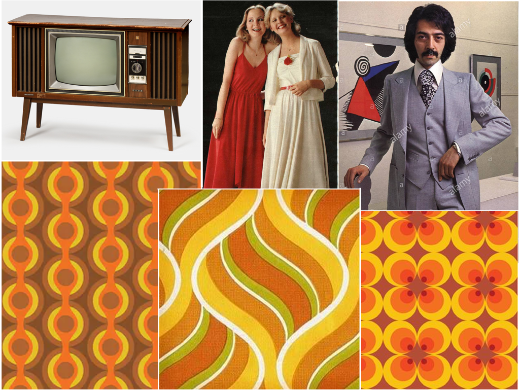
As I was analysing the clips the first thing that got my attention was the retro 1970’s wallpaper and the dark coloured furniture. Seeing Beverly smoking and drinking at the same time was interesting, this might be a potential image for my poster. The dress code was also quite interesting, the men were wearing suits whilst the women had dresses on which reminded you of the 70’s.
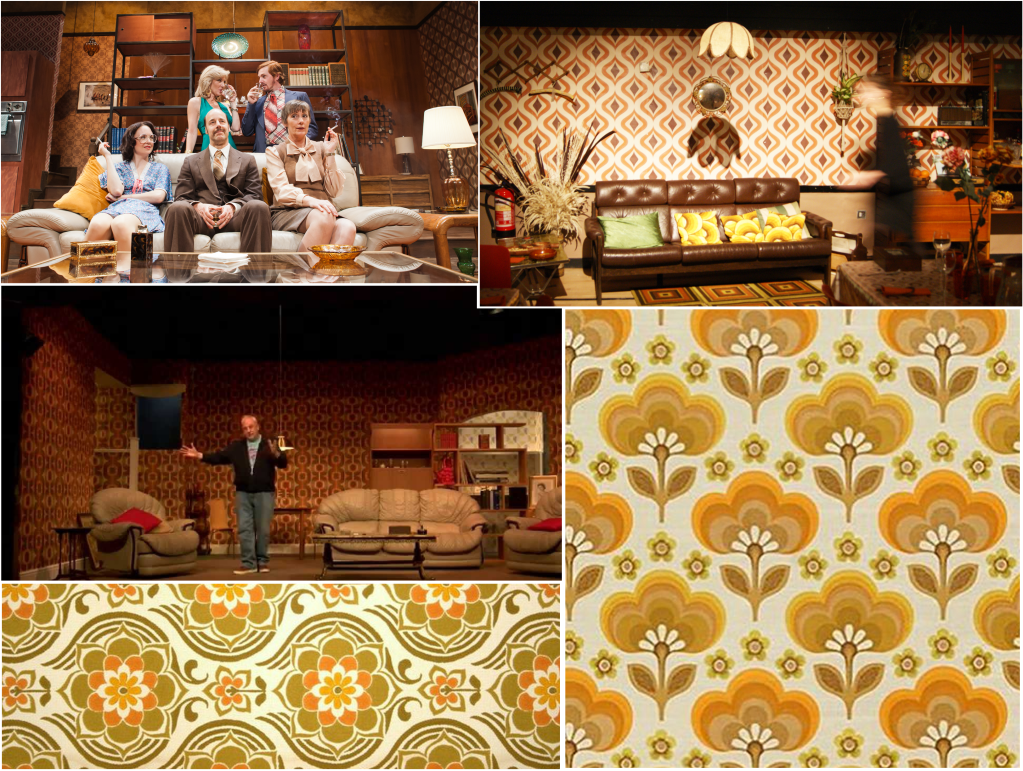
Mood Board
After briefly analysing the theme in the clips I wanted to take a further look by looking at the images, I saved pictures of the furniture that was used in the live plays, I also saved pictures of the type of clothes people used to wear back in the 70’s. I came across some wallpaper background which had a very retro feel to them, my plan is to create the same theme with my background.
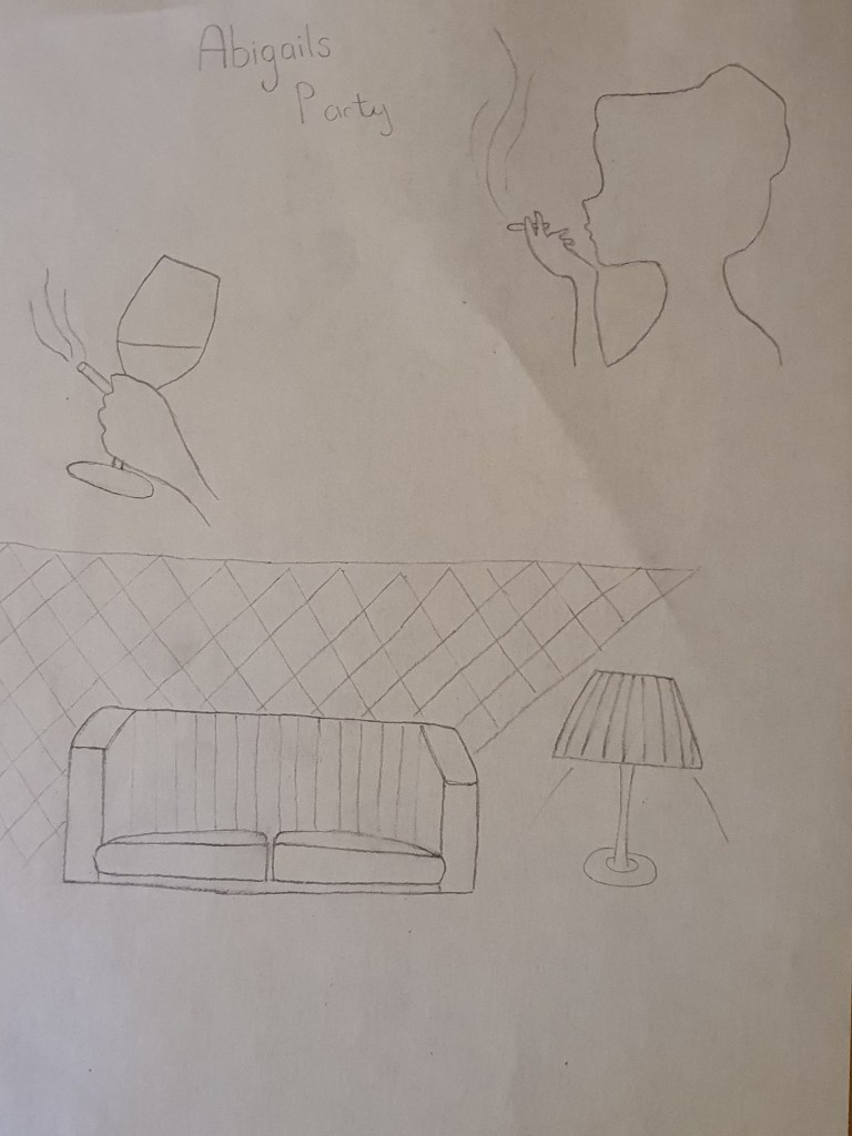
Sketches
I then went on to sketch a few ideas that I may put on my poster, I drew a silhouette of Beverly smoking, I also drew a picture of a hand holding a cigarette and a glass of alcohol, at this point I’m still debating if I am going to use silhouettes or if I’m going to use stock images. The sofas and wallpapers that are used on the sets create a very strong theme of the 70’s which is something I want to replicate for my design.
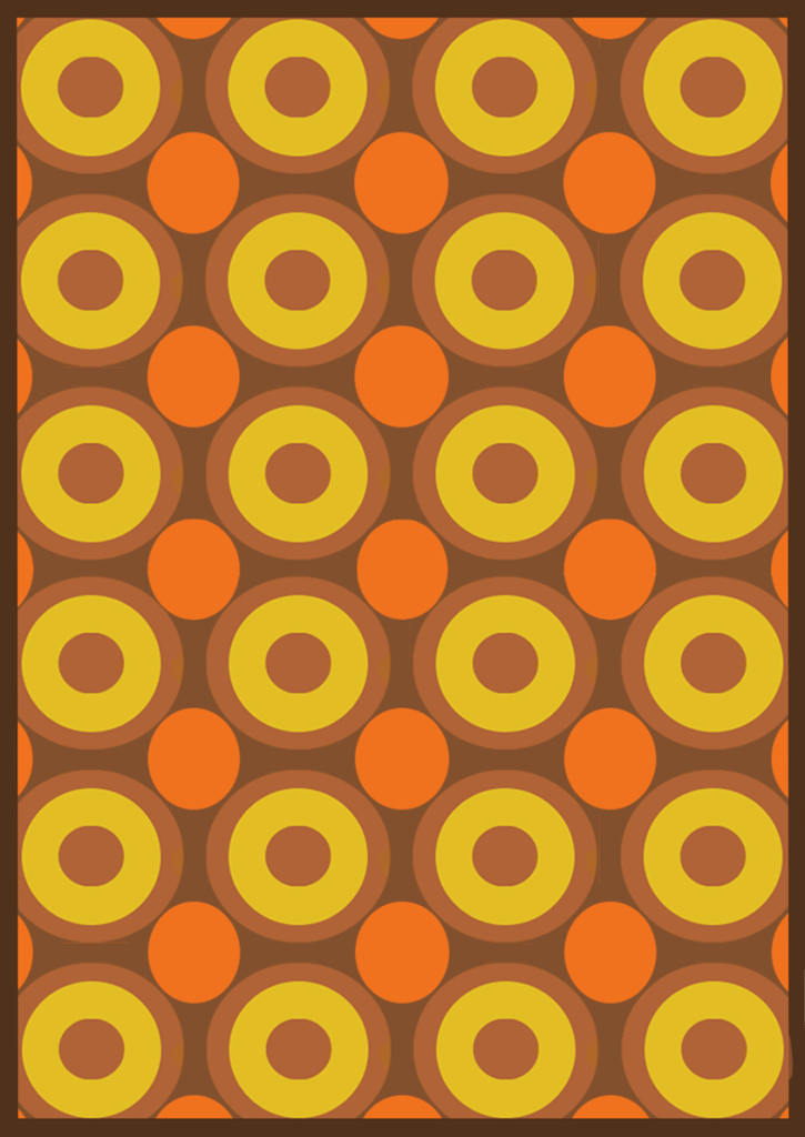
Designing the background
For the background my plan was to create a psychedelic 70s themed setting like the ones I saved in my mood board, the colour scheme I chose was interesting, I then went on to experiment with different arrangements.

The image below is the one I initially chose for my background, but the colours were so busy it was affecting the readability of my poster, I also felt like my imagery was drowning in the background because the colours were so dazzling.
Experimenting with fonts
I really liked this font, it had a very classic touch to it, I experimented with drop shadow, I even tried to refine it but it just wasn’t connecting with the background. I was trying to make everything fall in to place but it kept having the opposite effect so I decided to change things up.
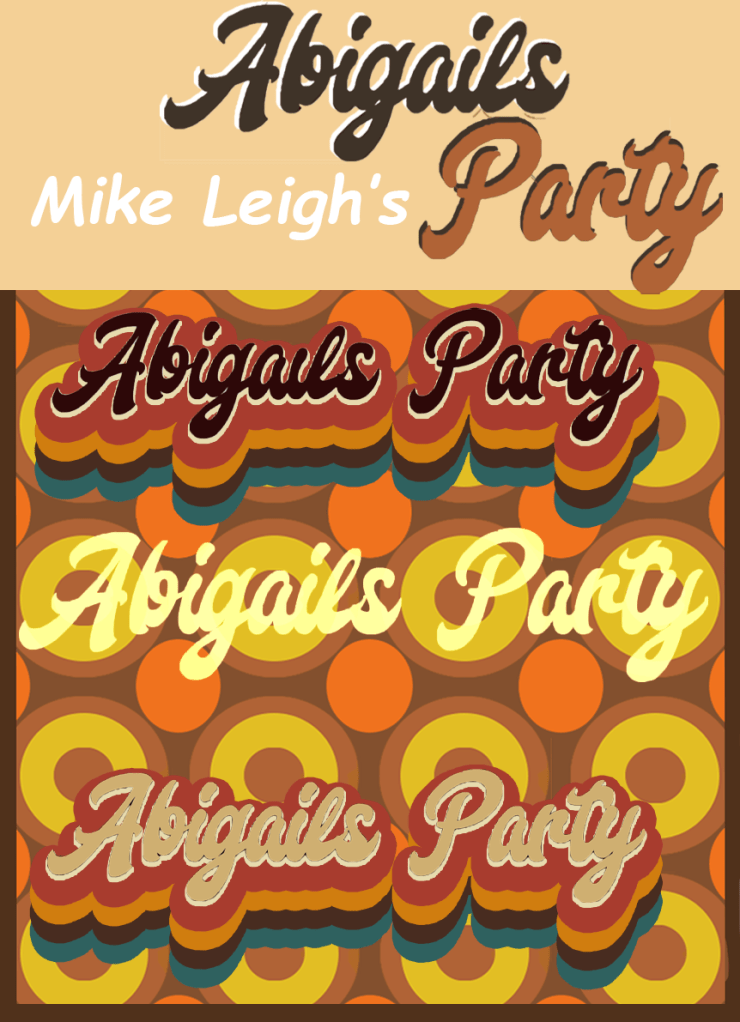
The colour scheme started to feel problematic so I toned down the colours by adding a brown filter on top of my background, I also chose a more clear font for my typeface which was easier to refine, I added a red drop shadow to the font which gave it a more retro look, at this point I felt like my poster was slowly looking the way I had planned it to look.

Even though the colour scheme looked slightly better I still wasn’t feeling content so I experimented further, I also made some tweaks and I was happy with the final design.
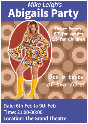
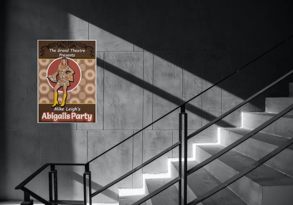
Final poster design
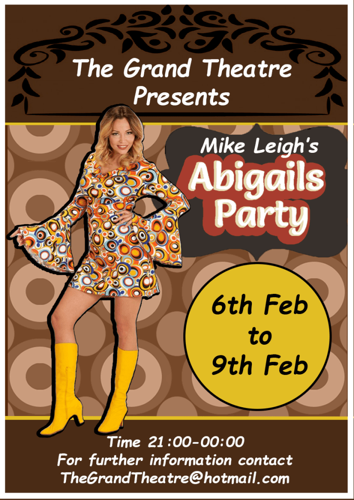
The colour of the final design was more balanced, the background of the poster was light brown so to balance it I added a banner across the top and bottom of the poster with a darker shade. To make sure my fonts didn’t clash with the background I placed shapes behind the text. I then began to search for an image to represent Beverly and I found a picture of a woman dressed in a 70’s outfit, I added a drop shadow on this image to make her stand out. All the writing in my poster is in sans-serif, I wanted the title of the play to stand out so to establish the hierarchy I increased the size of the font and added a clear retro type face to it.
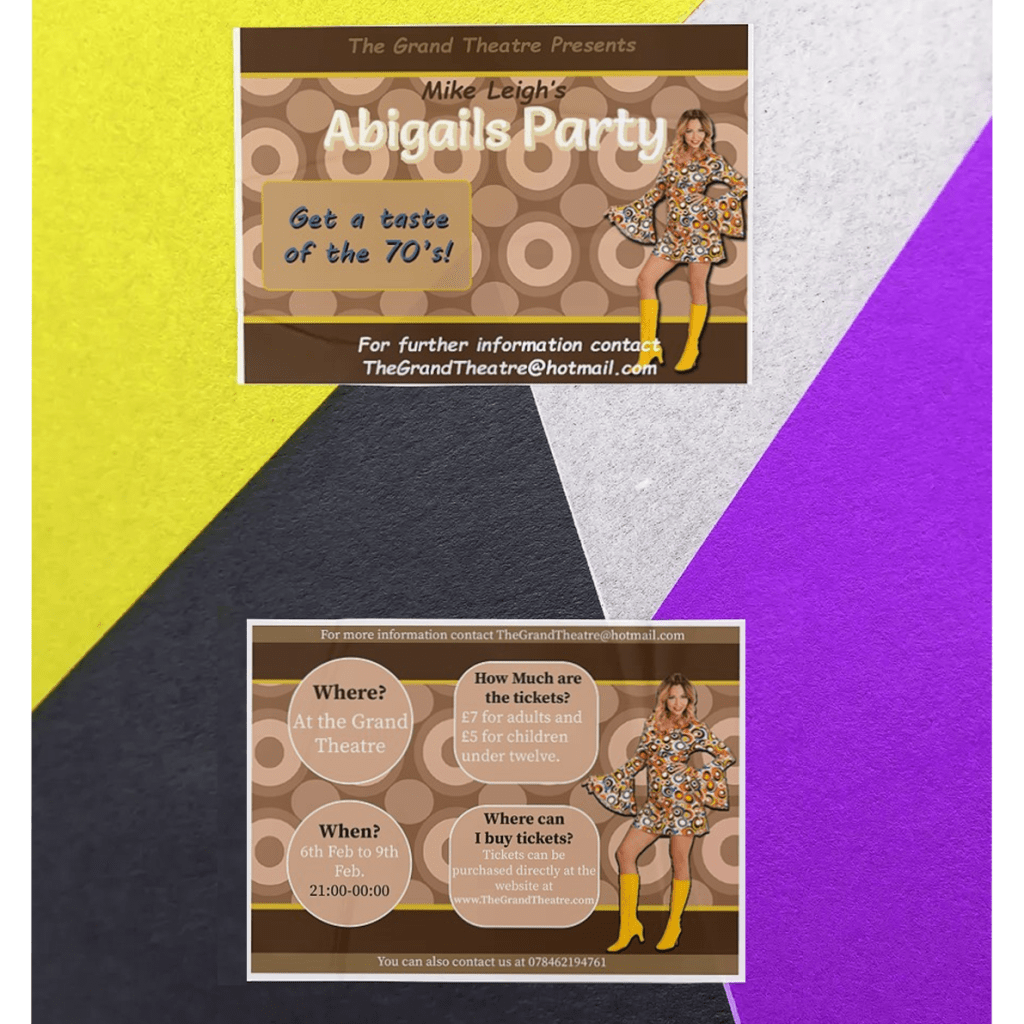
Flyer
For my flyer I used the same colour scheme and designs as my poster, I then made slight changes to the layout and then shifted my focus to separating the information. I made sure that my first page consisted of the title ‘Abigails party’ and the image representing Abigail. I didn’t want to over fill the first page with information so I left an inviting statement “Get a taste of the 70’s” and went on to the second page.

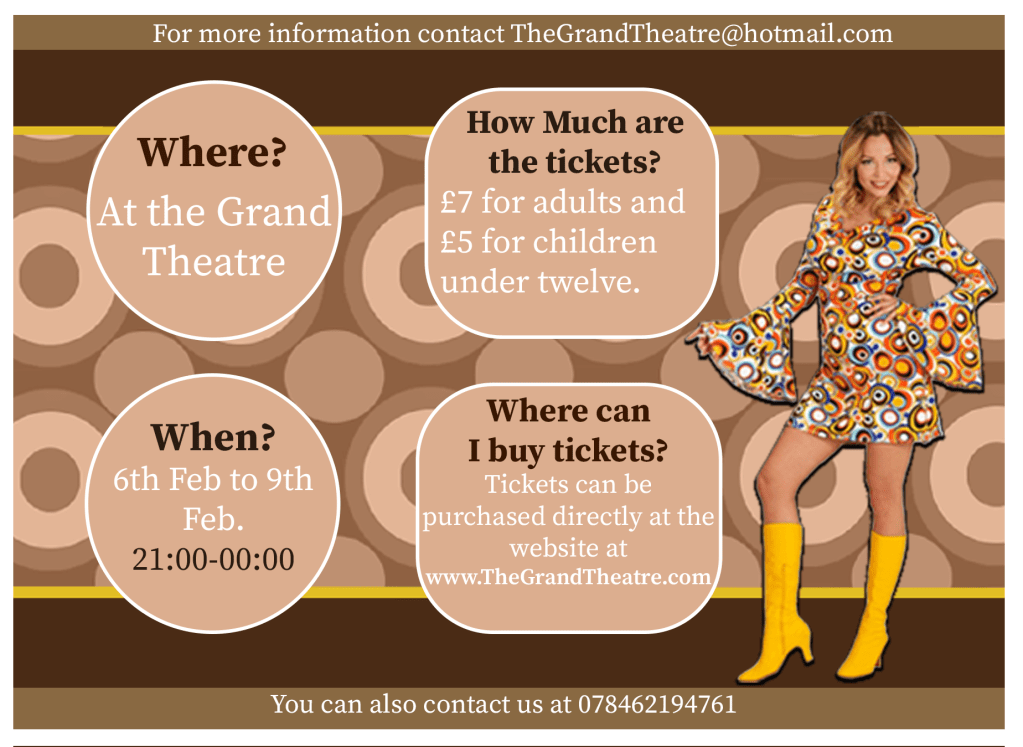
The second page is where I left all the important information such as where the event will take place, the times and the ticket prices. I made sure that the information is clear to read so I chose a serif font to to enhance the legibility. There was still space left on the page so I finished off by adding a picture of the ‘performer’.
Newspaper AD
With the newspaper ad the first thing I did was I designed the layout, I put a banner across the top and bottom of the ad which I coloured in blue, I chose this colour because it is quite a popular colour with newspaper adverts. I added a picture of Abigail and I added a red circle behind her to make her stand out, I also added an outer glow on her to add to the effect. I then finished off by adding the information that I felt was important such as: the price of the tickets, the date, time and location.
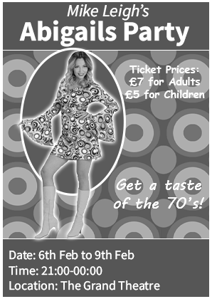
Once I completed the newspaper ad I then experimented by adding a black and white theme to it to see if it would work, I was happy to see that it still looked complete.
Programme Cover
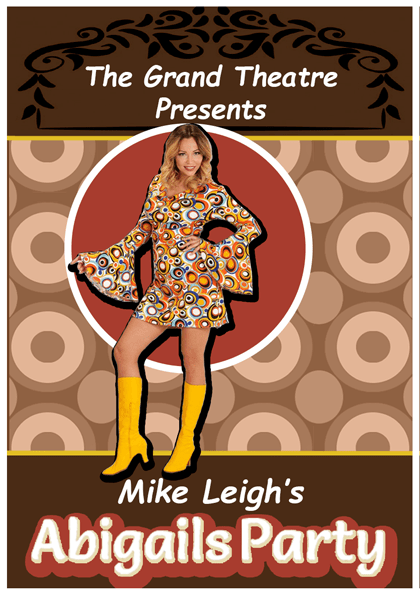
Because the A5 programme cover didn’t need much information I removed any detail that I felt was unnecessary. I made sure that my A5 programme cover continued the design of the poster to fulfil the brief. I kept the heading ‘The Grand Theatre Presents’ and the name of the title ‘Mike Leigh’s Abigails Party’. I added a picture of Abigail and placed a red circle behind her to bring more attention to her. The programme cover would be in the viewers hand while they are at the theatre so there wouldn’t be any reason to add information such as where and what time the play is.
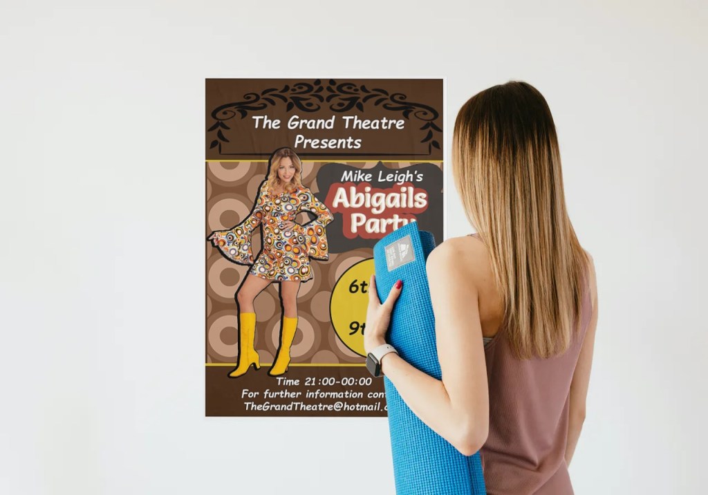
Mock-ups
Feedback and final thoughts
If I had to re-do this task I wouldn’t choose a psychedelic design for my background; it took me longer than I thought to adjust my designs to work well with the busy theme but eventually I got there. I asked my friends and family for feedback and they liked the colour scheme and the designs, they could tell that the aim of my poster was to create a retro background which made me feel like I met the brief. To create a retro theme I used an old fashion font for the typeface ‘Abigails Party’, I also used an image of a woman wearing a retro outfit, I then went on to design an old fashioned background to create a strong sense of the 70’s and I feel like the poster would attract someone that is looking to go to an event of that genre.
Tutor Feedback
You have shown you true ability here and have spent more time on research
and development, this still needs to be expanded but your empathy with the
70s shapes, colours and designs is perfect for the era the Fashion too is
ideally suited to the brief very well done. There is more sense of a process as
the design evolves. You have researched the fonts very well and as a result
have produced a very functional poster. Given you like to use imagery and to
tell or suggest a story, I’m referring to “Of Mice and Men” I would like to have
seen you deal a little more with the content of the play, but I think again you
had time constraints. It is still a very good solution but needed more time for
iterative development through visual and textual research.
