Newton and Ridley, the brewers best known for their pub, The Rovers Return, are opening a cafe/wine bar nearer the city centre.
The bar is designed to appeal to younger women and sophisticated young men. The brewery has identified a gap in the market and wants to provide a ’sophisticated and relaxed’ venue for the ‘discerning’ drinker. This bar is to be called the French Hen and will be in direct competition with the cheap ‘binge drinking’ venues on the same street. The brewery is also trying to enhance its own image as a ‘respectable’ alcohol vendor.
They want you to develop some ideas for a logo, to be used:
• on covers for the food and cocktail menus
• in colour on the signage outside, and as a cutout for a window detail
• on T-shirts for the staff and paper napkins
• for one side of a beermat, the other will carry advice on sensible drinking.
There are many conventions that have been developed around the marketing of both bars and products to this age range. You need to be conscious the whole time of avoiding clichés and stereotyping.
Draw up at least three ideas to start with. Be critical of your work. Check it against the information you have here. Will it do what the client wants – and how will you know?
When you have decided which one you are happiest with, mock up the menu covers, the outside sign, the window detail, a T-shirt, paper napkin and beermat. Does it all still work?
I wasn’t too familiar with the word ‘sophisticated’ so the first thing I did was I created a mind map to get a better understanding of it. The definitions I was reading felt vague so researching on the characteristics of a sophisticated person gave me a better understanding.
Mind map
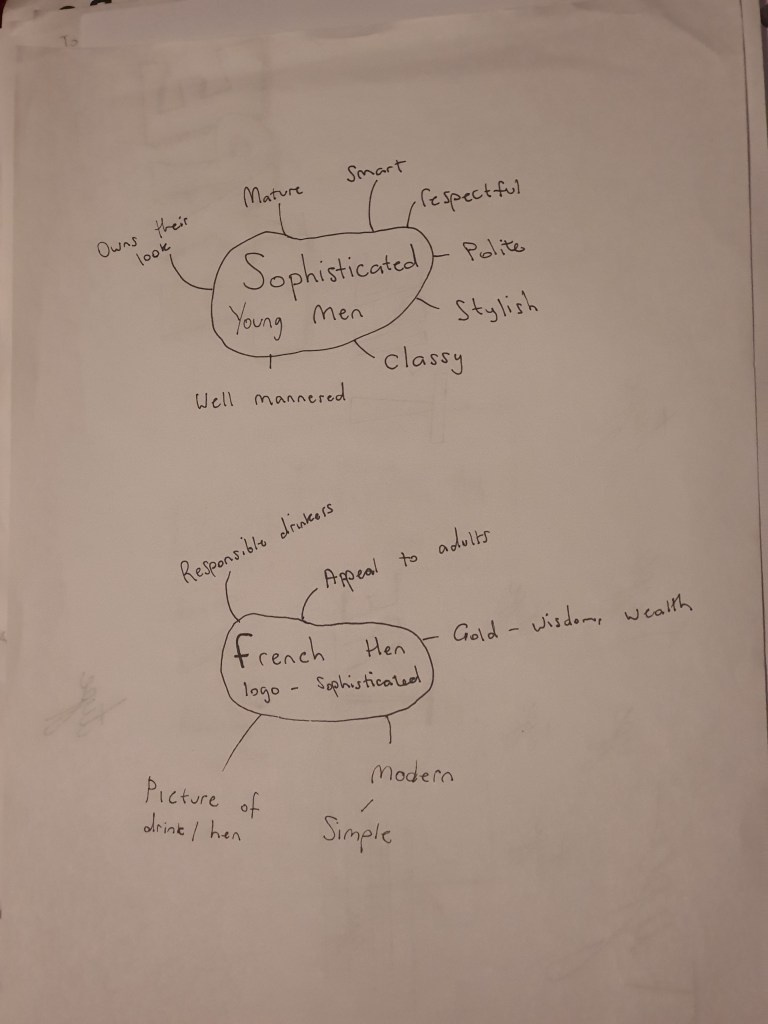
I then made a few notes that I want to consider for my logo which might be of importance when I start to design it.
Mood board
I then went on to research some existing logo designs of high end bars and I saved the ones that stood out to me the most.
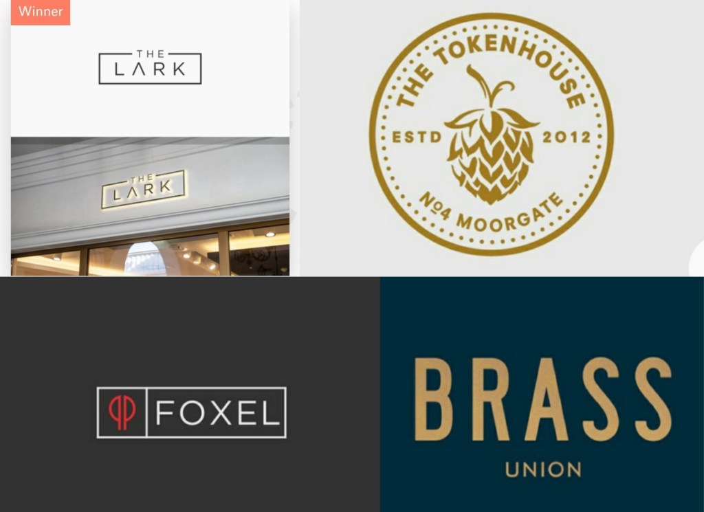
I feel like the golden colour gives the logos an elegant touch, I also like the rectangular shape of the the two logos on the left.
Development
With the ideas that I retrieved from the mood board I sketched up my three proposals. A dark blue and golden colour scheme for my second design with the right font would look luxurious. The third design has an interesting layout but for this specific target audience I feel like it looks too tacky. My first sketch is the one that I will refine, it isn’t overly simplified or too basic and with the right touch I feel like it will look amazing.
Logo Design
For the logo design I used an elegant gold colour, I kept the same colour for the box, I then experimented with a few different colours for the background. This is how they looked.
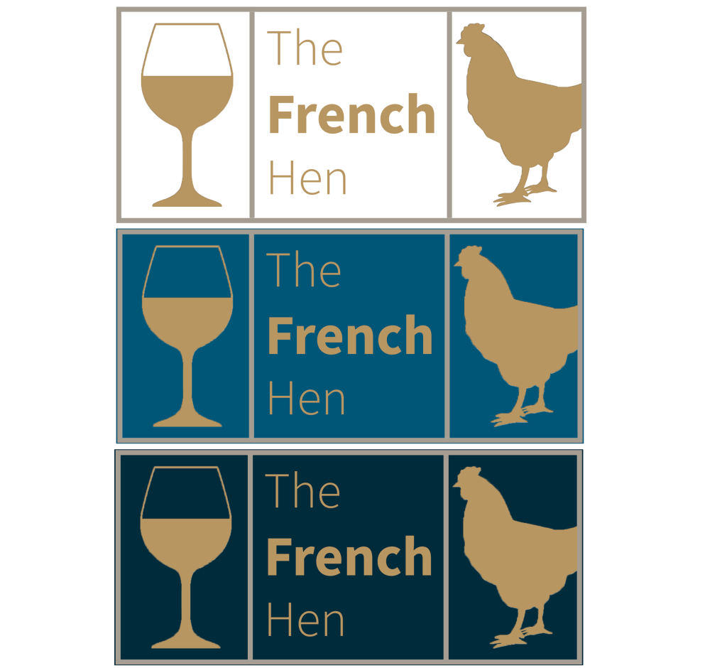
Looking at the logos as they stand I preferred the blue themes, but I need to make sure that my logo looks consistent on the menus, t-shirts and on the beermats, taking this into consideration I think having no background colour will be the best option.
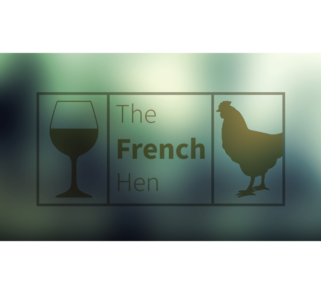
Final Logo design
Mock-ups
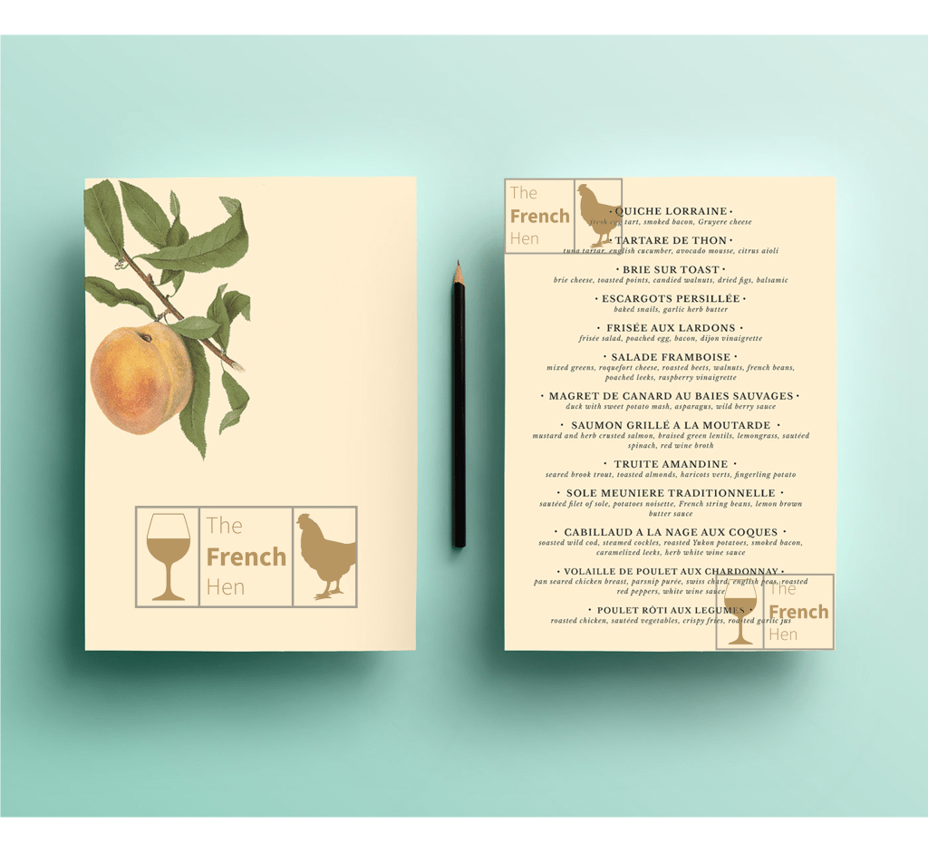
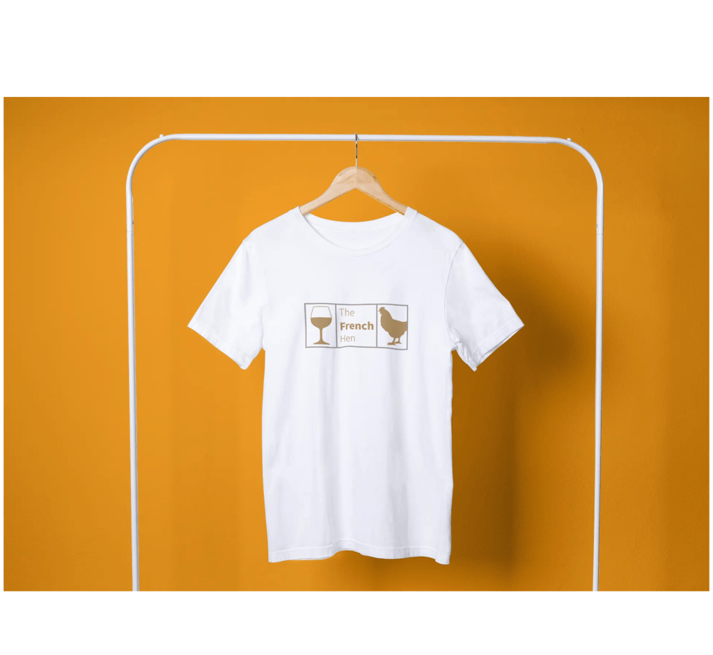
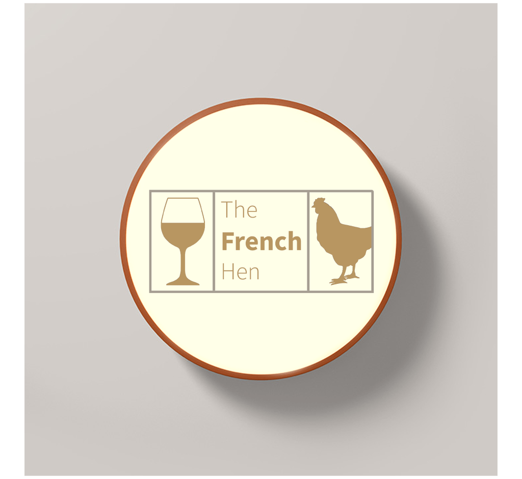
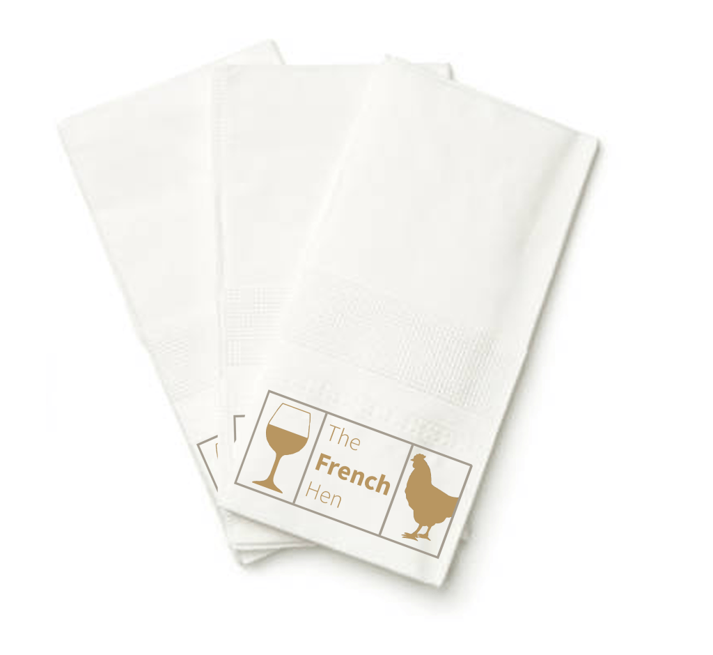
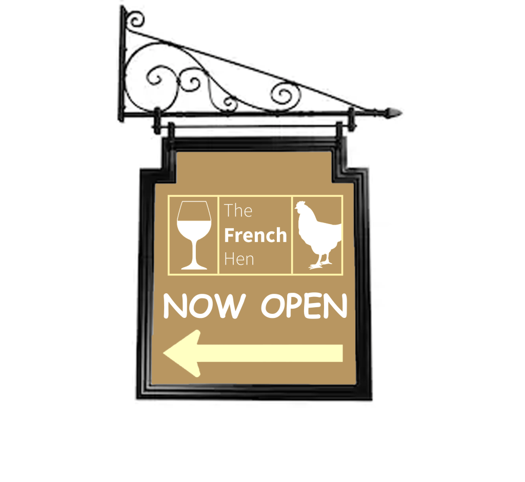
Because of my decision with the colour choice on my logo, I didn’t have to make too many changes to make my mock-ups work, I had to make a slight change with the outdoor signage but the logo design is still consistent. The design I’m most happy with is the menu, it looks really well refined and the logo goes well with the overall colour. I was struggling to find a free stock image of a fancy napkin so I made use of the one that I found, I placed the logo at the bottom of the napkin and I was content with how it looked.
Final thoughts
At first I was a bit confused with the name ‘the French hen’, it sounded like a weird name for a bar and I felt like adding an image of a hen will be even more peculiar, maybe I felt this way because I don’t drink and I don’t usually go to pubs, but once I started looking at existing bar logos the ideas started flowing. Overall I’m happy with the designs that I created and I feel like the criteria of the brief is met. I really enjoy creating logos and I hope I get the chance to design more in the future.
Tutor Feedback
There is an element in your mind map that I need to address, sophistication is
not a gender bias attribute, and not exclusive to men. I am sure you did not
intend to omit women, so please remember to be inclusive when it comes to
any reference to gender, race, colour ,size or disability to avoid discrimination 3
This is essential for a graphic designer as contemporary graphics can make a
change to all of our attitudes towards each-other. Examples of this would be
the BLM movement and BAME.
You evidence a good selection of Brands that speak to high end
sophistication. Again you have an initial idea and do not expand that idea
further through iterative sketches and preliminary designs, I now time is an
issue, but you have ability, and this is the way to explore a greater part of your
creativity.
The logo is satisfactory but has not been pushed far enough in terms of the
design solutions.
