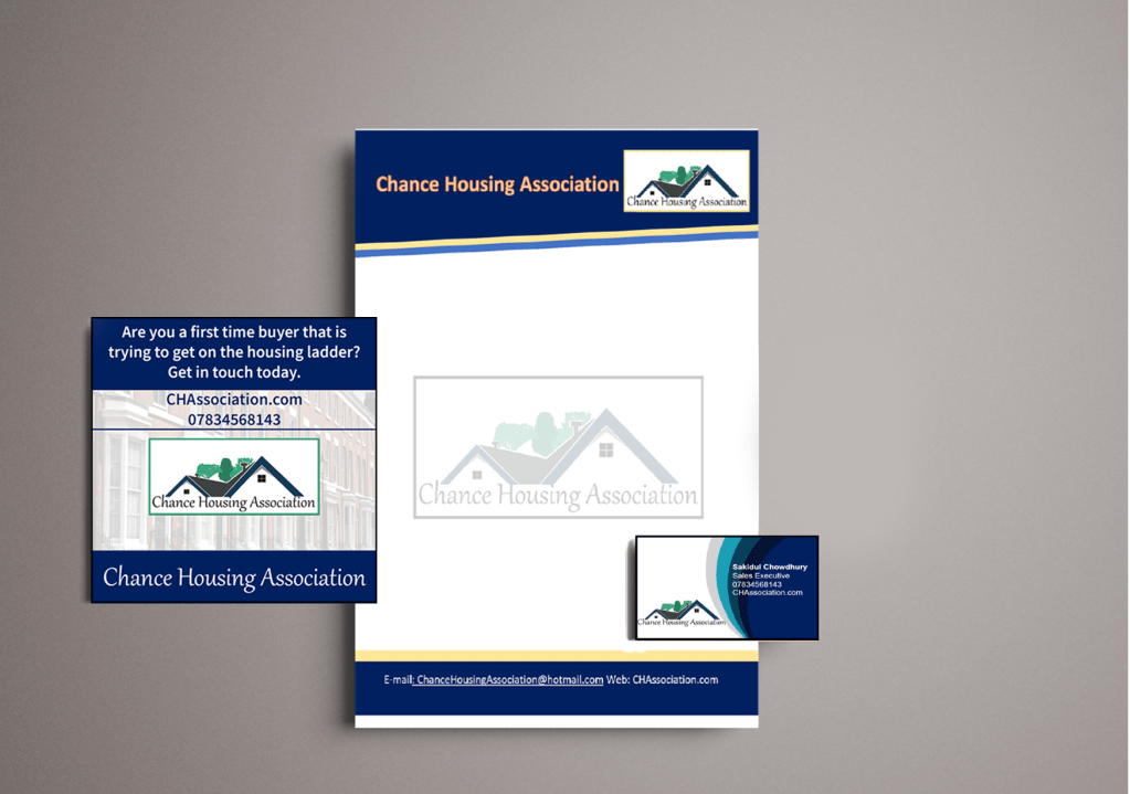
The Chance Housing Association has been set up to try and help first time buyers get onto the housing ladder and they want you to develop a brand image for their stationery.
It is important to them that the Association is seen as being different from the other local housing associations – more modern, more helpful and definitely welcoming to young people wanting to buy a house.
They want to use their logo on their letterheads and office stationery and it will also be used somewhere on the sheets that hold the property details. It also needs to be reproducible in the local newspaper and professional trade magazines.
What to do
Research other housing associations’ and estate agents’ styles. Look at other publications designed for a similar audience. This information should help you identify as much what you don’t want to do as what you do.
If this was a real job you would need to visit the housing association’s offices and website, if it has one, to see how many decisions they have already made – for example they may have painted their sign silver and dark blue and used a particular font. As the designer you may want to continue with and develop those decisions or change them.
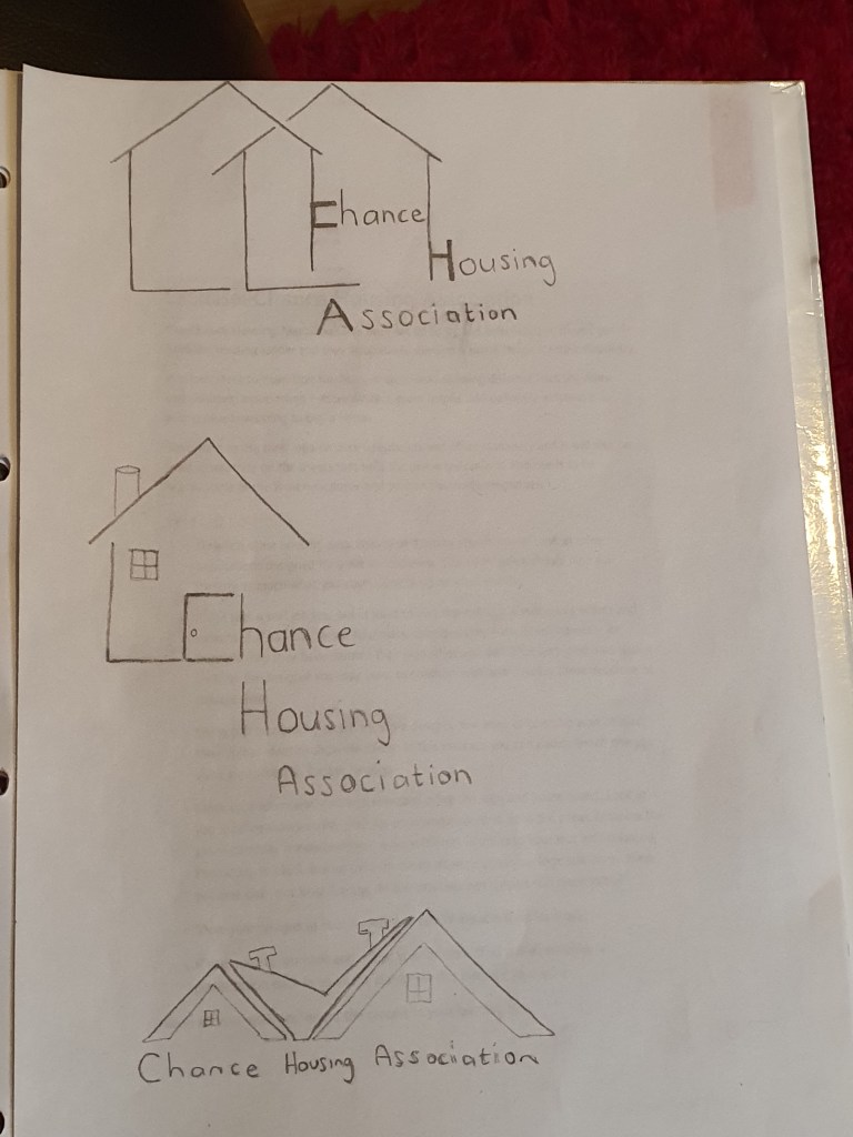
Using just typography sketch up some designs. You want to come up with at least three initial ideas to show the client. In this instance you can decide which one you think works best to further develop.
Mock up a letterhead and business card using the logo and house brand. Look in you local newspaper and mock up an advertisement to fit in the paper. Measure the space carefully remembering to leave sufficient margins so your text isn’t cramped. Photocopy in black and white onto cheap paper – does your logo still work? Have any fine lines got lost? Are the differences between colours still discernible?
Show your designs to your friends and family. What is their feedback?
If you need to, go back and adjust your artwork. If all is well make up a presentation pack to show the client – in this instance your tutor. Keep all your work and record the process in your learning log.
Research
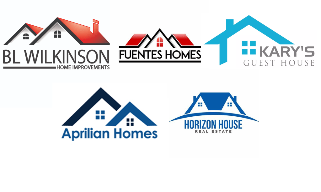
I began the task by researching existing logos for housing associations, when I looked at the logos the first thing that came to my head is that they all look basic but sometimes simple logos are more effective, since the target audience for this task is for first time buyers I would prefer to make a simple design instead of adding unnecessary detail.
Mood board
Experimenting with ideas
After analysing some existing logos I began to experiment with some ideas, since my brief wanted three ideas to choose from I narrowed down my research to my three favourite proposals.
I felt like the word positioning in the first two ideas didn’t work too well, with limited time I didn’t want to waste more time on refining two ideas which I didn’t feel confident with, I also felt like the third design is the most conventional out of the three designs so I decided to go with that one.
Logo
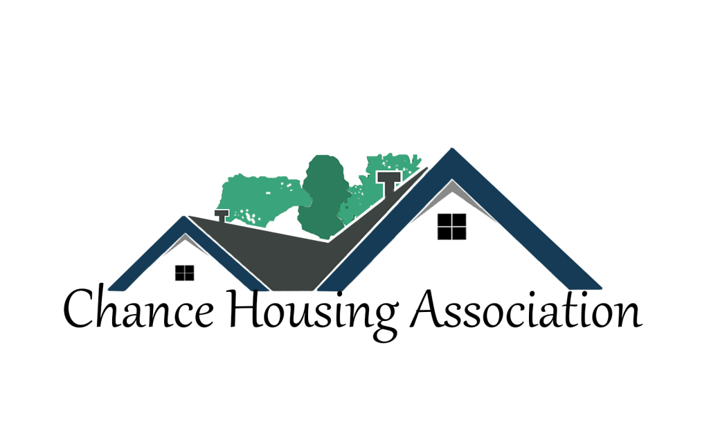
I used the shapes in Adobe Illustrator to form my logo, this is what I created.
I felt like my logo was incomplete, when I add a box around the logo it looked more complete.
Business card
I then used photoshop to create my business card, since blue was one of the main colours in my logo I decided to use this as my theme. I really liked the design, it looked simple and professional.
Letterhead
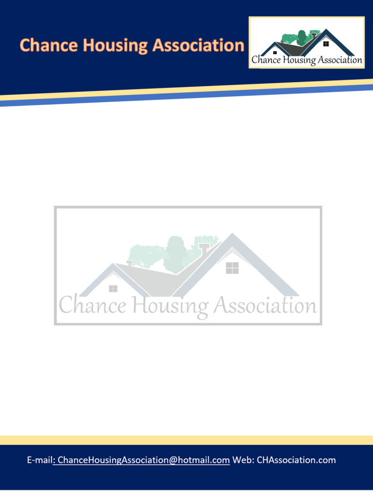
I used Microsoft Word to create my letterhead, I kept the colour scheme the same as my previous two designs, I also added a picture of my logo in the middle of the page where I lowered the opacity for it to blend in with the background.
Newspaper ad
I then went onto the newspaper ad, blue fits in effectively in newspapers which was an advantage for me.
Presentation pack
Feedback and reflection
I really enjoyed this exercise, even though I had a very limited time scale I feel like I did the task successfully. I asked my family for feedback and they really liked the colour scheme, they also said that the presentation pack looked professional as a whole which was reassuring.
Tutor Feedback
This is much stronger, still more evidence of iterations of design colour and
typeface would help but that said a good solution. Given the limited timescale
a very professional solution well done.
