This exercise is about how you deal with two different spaces to work in.
You have been asked to design an A3 poster and an accompanying double sided A6 flyer to promote a singing course run by an organisation called SingOut (all one word). They have very little money so want to print these posters on their black and white photocopier. You can use a colour paper if you want.
You may want to include an image such as a drawing or photograph, but be very careful with photos as they tend not to reproduce well on a photocopier particularly if they are colour photos. You will need to check by printing off your design and/or photocopying it.
The information they want to give is:
Do you love to sing?
Join us for an exciting opportunity during the day with a professional vocal coach. Learn to sing different types of music, vocal techniques, meet new people and have fun!
10.30 to 12.00 every Tuesday from 11 March
The Community Centre, Charlotte Church Road
£60 for the course
No experience needed/no requirement to read music
For more information call 011779 8765432 http://www.singout.comThe first thing you need to do is work out if you have all the information you need to fulfill the brief. If not what is missing? Work out the hierarchy of the information. How will you divide your information up to fit on both sides of your flyer? How will you link the design for the poster with that of the flyer? How can you make the poster eyecatching and effective with such a limited palette? Which typeface or faces will you use and why have you made that decision?
When you have finished pin your poster up and critique your work. What do you think? Keep notes and sketches in your learning log.
The first thing I did was I began to research magazine posters to analyse the designs.
Mood board
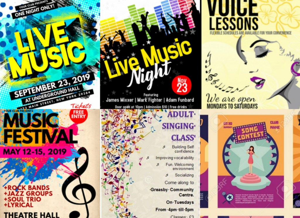
The common pattern with all of these magazines is that they all use eye popping designs which go hand in hand with the bright colours. My brief for this task is to create a low budget, black and white poster therefore I will stick to creating simple silhouettes instead of over the top designs.
Sketches
I experimented with a few different layouts but this one started falling into place. There is a lot of information that needs to be publicized in the poster so I need to make sure that my designs don’t clash with the text; bearing in mind that I have a limited pallet.
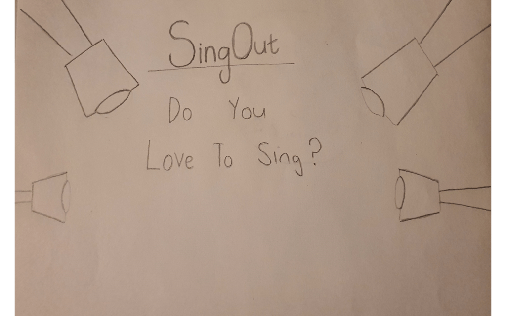
Experimenting with layouts
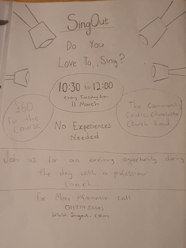
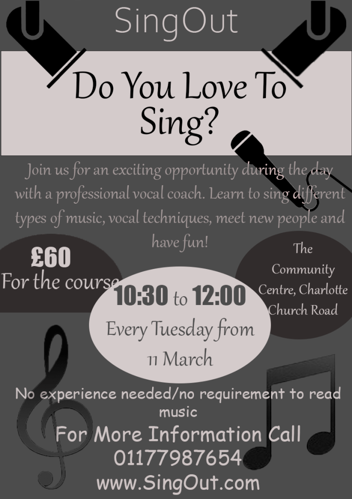
I felt like the colour scheme in the first design is more eye catchy than the second one but I liked the second poster better because I’ve managed to add some pictures to it.
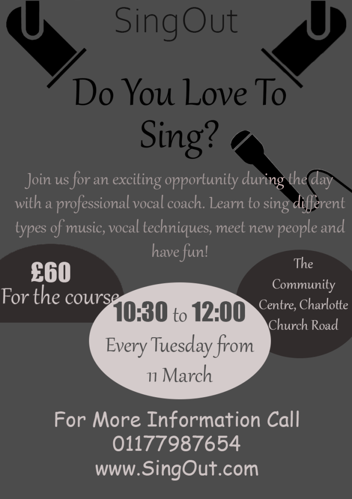
Final Poster Design
I decided to go with my original layout, I added a few more designs to it and I also added a white strip behind the wording ‘Do you love to sing?’ I did this to make the hierarchy stand out. I then circled the information that I felt like will be the most important to the viewers, for example the information of the time and the price of the classes – I changed the number of the price and the time to the font ‘impact’ to make them stand out even more. The majority of the text on the pages were in a serif font, I did this to make the paragraphs more legible, I also felt like this font looked quite fancy so I kept it the same for the title.
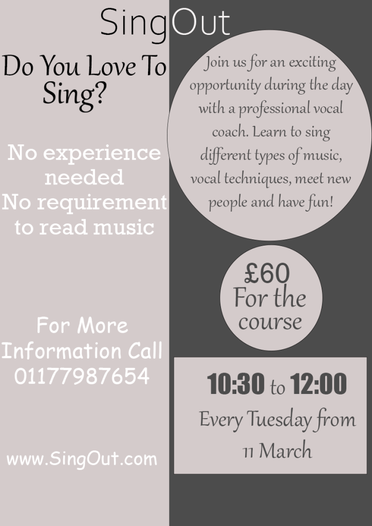
Flyer Design
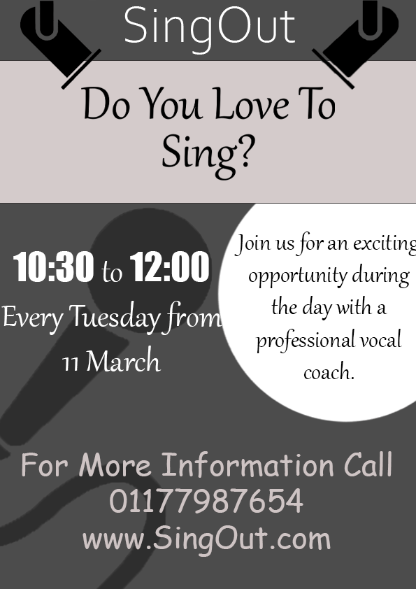
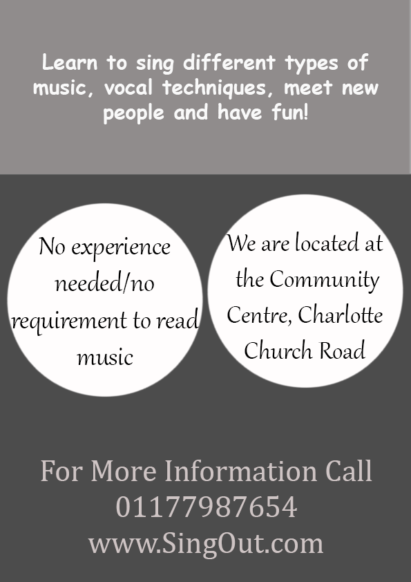
To make my A6 flyer link with the poster I kept the top half of the designs on the main pages the same, I also kept the same fonts and colour scheme on all of the pages.
I wasn’t forced to keep all of the information on one page which is why my flyers look less tacky, I would have preferred to keep more white space on my poster but the brief required me to add a lot of information
I feel like this exercise wasn’t my best piece of work, but I established the hierarchy and broke down the information constructively so I feel like the criteria is met.
