Find some examples of information graphics. For example bus timetables, city maps, diagrams or representations of statistical data. Look at the way they are designed and try and work out the decisions the designer made. What can you learn from them and when would it be appropriate to use a similar design solution?
For this exercise you are going to describe your immediate surroundings using information graphics; this could be a plan of your desk, the layout of your house, the arrangement of objects in your cupboards or your morning journey; anything will do.
Before you start you will need to think about scale and about how you will break down the information for your design. Create a graphic that represents an aerial or front on view of your location. Be mindful of the hierarchy of the elements in the composition and the dynamics needed to draw the viewer’s eye from one stage to the next. Use typography, numbers and colours to describe what is being represented. You may want to produce a key to help us understand what is being shown, as well as a diagram title to put things in context.
Keep all your sketches and notes in your learning log.
Infographics break down information in a very interesting fashion. For example I came across this infographic poster of a frozen yoghurt, I very rarely pay attention to the nutritional information when I buy deserts, but because this was broken down in such a productive way It made me want to find out what it was saying.
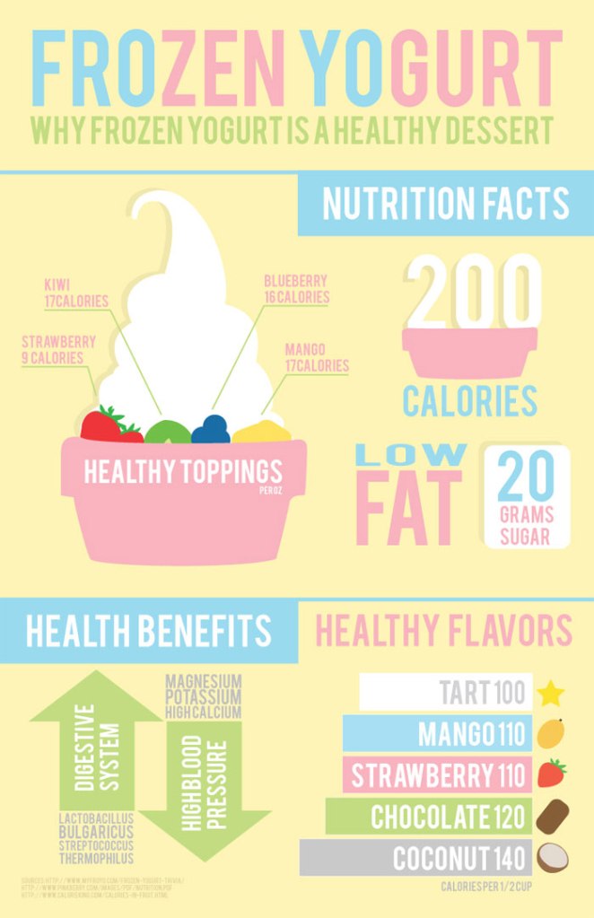
I have a friend who owns multiple desert bars and I think that this design solution would definitely be of help for anyone who is looking to advertise the ingredients or nutritional information of their products.
Mood board
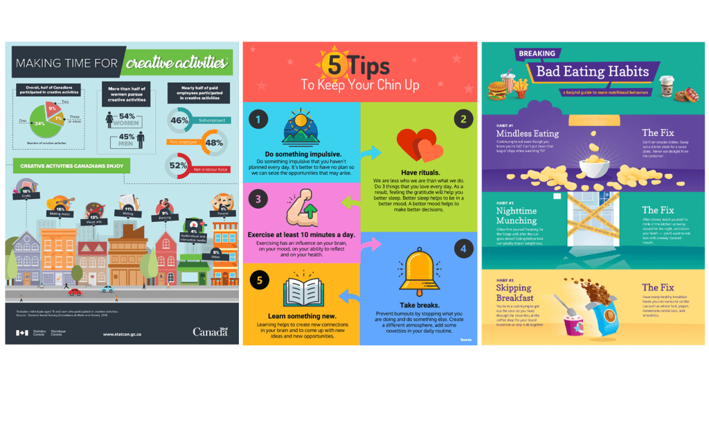
I always have fitness related infographs popping up on my newsfeed, I have always thought that these are a very effective way to present information. I am excited to make my own infograph.
Sketch
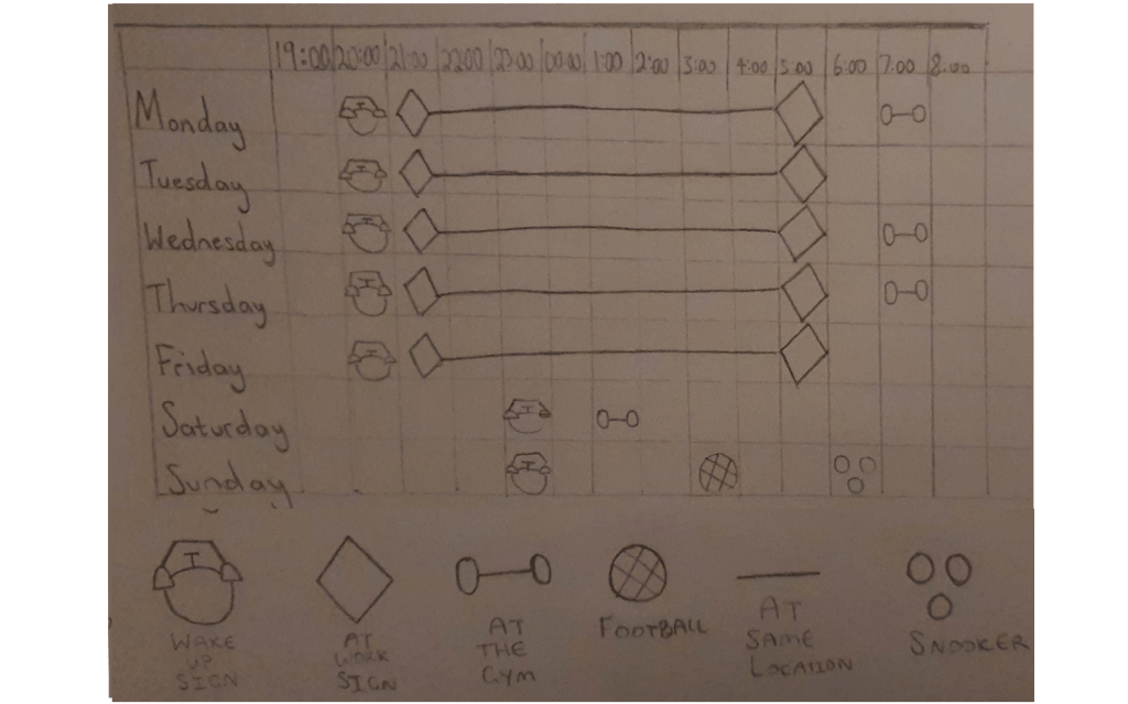
I designed a rough sketch of the idea that I had in mind, but looking at it now it just looks like my weekly timetable and I am not sure if this idea will meet the criteria of the brief.
Coming up with an idea
Since today is Sunday I’ve decided to base my infograph on how I usually spend my Sundays, when we are not in lockdown.
Final Design
I began the task by designing a graph, once I created the graph I used colour coded boxes to break down my journeys. At this point the time scales of my journeys were clear but the specifics of my exact whereabouts were vague, this is when I decided to take snap shots from google maps which I then polished into my graph.
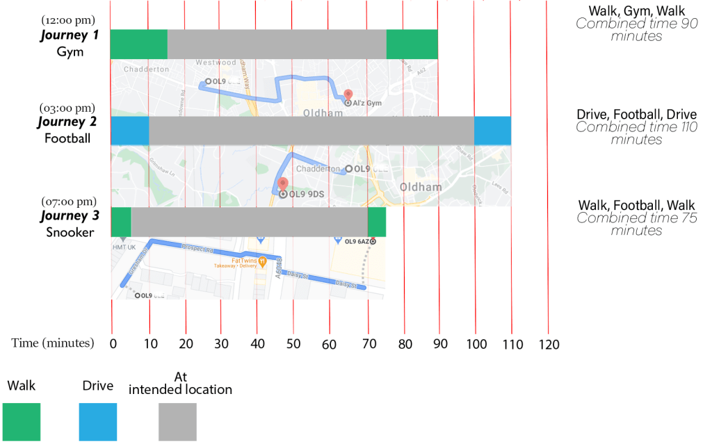
I am very happy with my final design, even though it is very simple it is filled with information and the colour code makes it even more easier to follow.
