Choose a book by an author you are familiar with. You are going to design two different covers for it, one using illustrations or photography and the other using just type.
Design the whole cover including the spine and back page. Include the title of the book, the author’s name, a brief description of the story and any other information you think is necessary.
As you are working remember that your design is intended to help a reader know what the experience of reading the book will be. Is it a serious text book or an off-beat funny novel? Are the readers expected to be young women or older men and does this matter? Is it an ‘easy read’ or ‘literary’? Does the publisher have a house style you need to be part of?
When you have finished critique your work – which of your two designs do you feel works the most successfully and why? Make notes in your learning log.
I decided to choose one of my all time favourite books, ‘Of Mice and Men’. I remember when the main character ‘George’ had to sacrifice the life of his best friend ‘Lennie’ after years of striving towards a dream that they both had. The story cuts very deep so I will try to replicate this theme on my design.
Mood Board
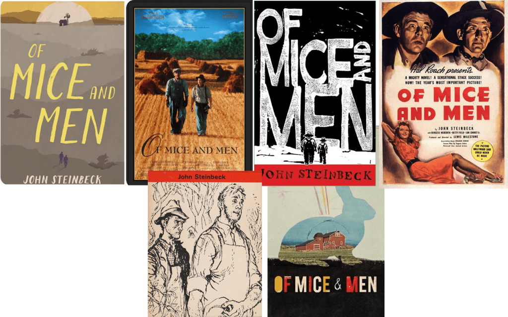
I went on Pinterest to get some inspiration and it was interesting to see that the book cover has been re-iterated many times, I think this is because of the popularity of the book and because of the fact that it has been around for a long time.
From the examples that I saved I have seen some examples dominated with images and illustration, some with words and some with a mixture of both.
Design One: Type Cover
The first thing I did was I designed the cover of the book, I wanted an old fashioned theme so I designed a dark blue leather cover. Most American western books have serif fonts so this is what I decided to use.
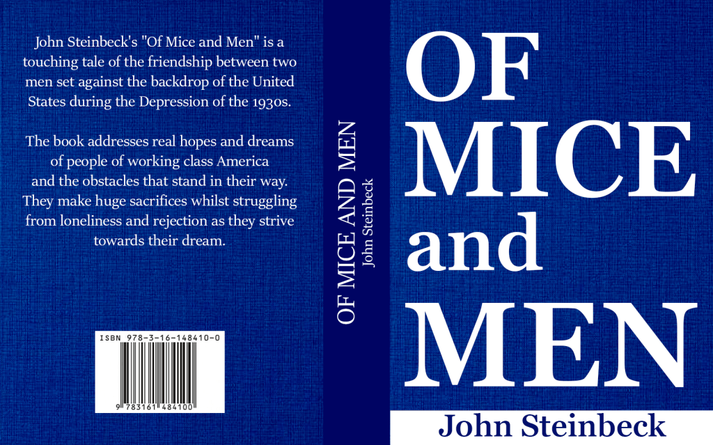
Since I wasn’t allowed to use any pictures I didn’t want to fill up the space with unnecessary writing, I increased the size of the title until it took over the whole page and it looked really good.
Even though the font looked good I felt like the white colour didn’t go too well with the sad theme of the story, I also wanted to change it to a more western type cover.
Final Design
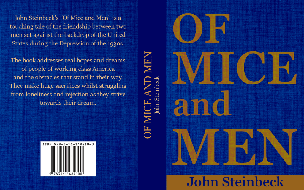
I am really happy with the final outcome of my type cover. The colour scheme goes with the dark depressing theme of the story. I wanted to show that the story is based in American West, even though I wasn’t allowed to use pictures I feel like the serif font mixed with the brown colour represents this well enough.
Illustration Cover
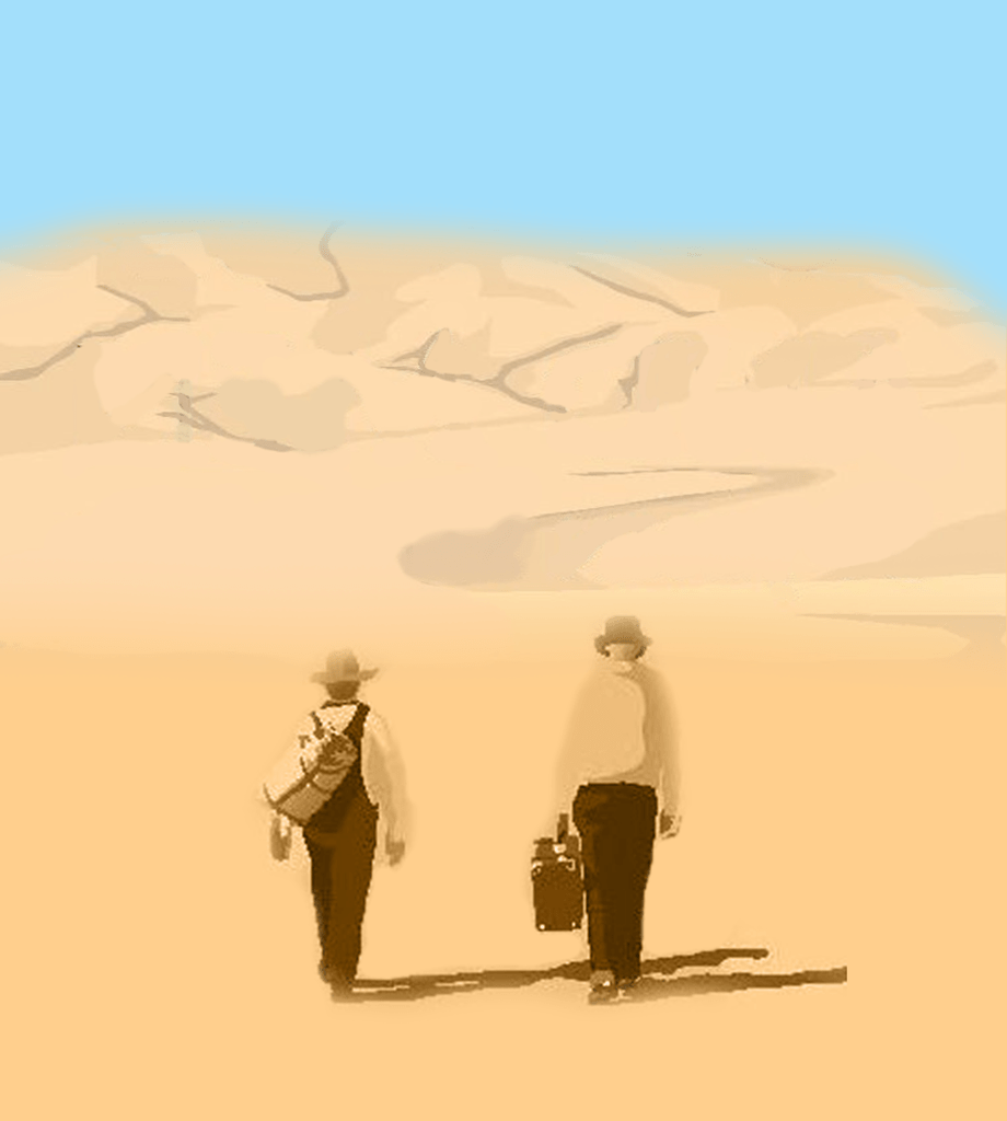
The first thing I did was I re designed an image of George and Lennie; the two main characters. The story was based in West America so I used photoshop to re create this hot, dry scenery.
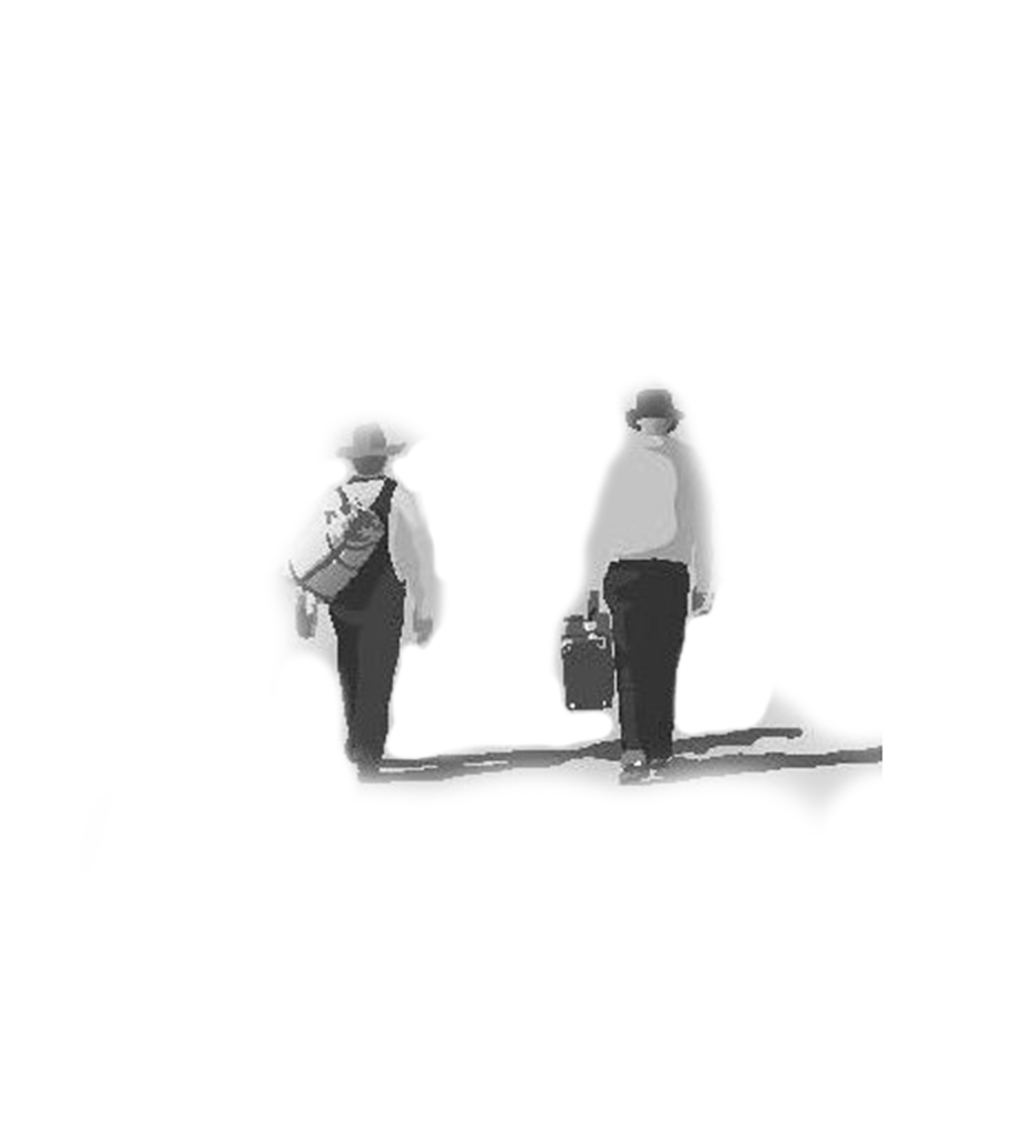
Final Design
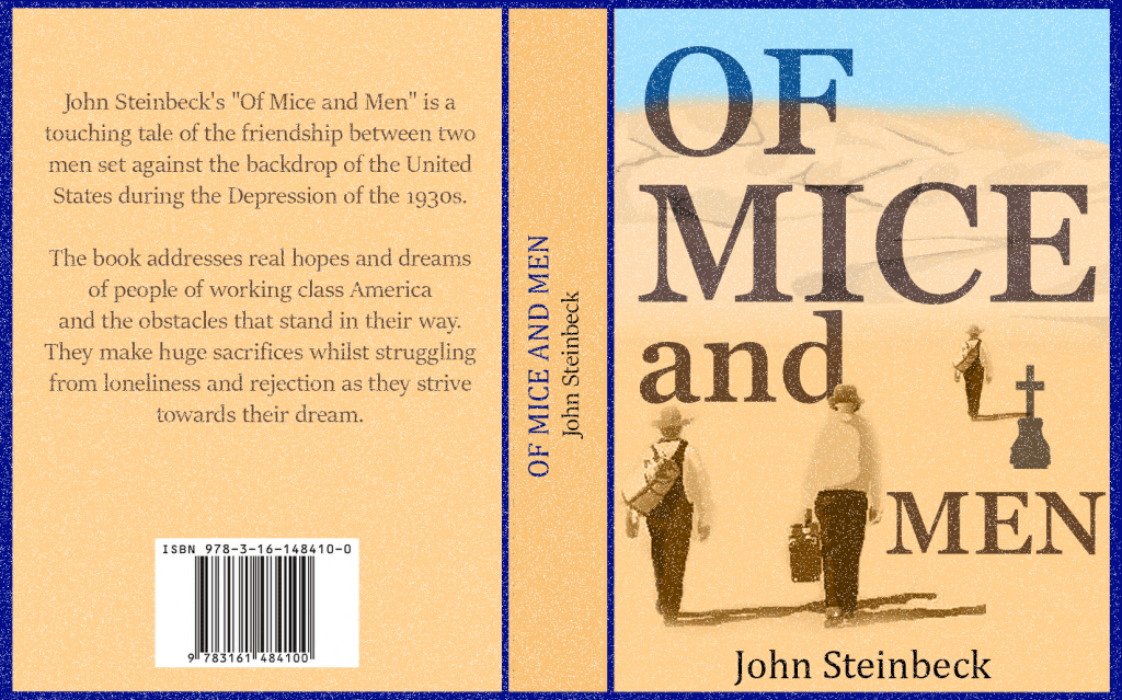
Once my imagery was set I just had to slightly re arrange the placement and the colour of the font and it was complete. I wanted my images to briefly tell the story of the famous George and Lennie who started their journey together – this is why I placed them side by side at the front of the cover. As the story progresses, George is forced to kill Lennie, this is why I designed a grave beside George as he walks off to the distance.
Final Overview
My thoughts on the illustration vs type cover debate is that they both are effective. Some people are attracted by imagery and some people feel more curious to find out what is behind the simple cover. Even though my first cover doesn’t have any images, the target audience will still be able to tell that it will be more of a serious book than a funny one just by looking at the fonts and the dark colours. However, if a potential customer was looking for a book to spark their deep emotions I think my second cover will be more effective in getting their attention because of the images of the grave and the men walking alone into the distance.
If I was to produce my own book I would definitely use images on my front cover, in this fast moving world I think images communicate better than words.
Tutor Feedback
This is a good piece of design with very sensitive use of complementary
colours, you say brown, but it has a very orange cast that activates the blue
creating a visual energy and increased dynamic of the fonts, again I think you
can consider the borders around the blocks of type and where they are set on
the cover, more experiments on scale and placing will bring different readings
to the text. That said very successful.
Mice and men 2
You have created a very different feel, more nostalgic and as you rightly say
have created and intrigue with the image manipulation, again a good solution.
