Choose a magazine, newspaper or journal and work out the grid or grids they have used.
You will probably need to look at least four pages to get a feel of the layout.
Measure the size of the pages, the margins, the text columns and the gaps in between them. How many columns do they use? Is it the same on every page?
Can you identify the fonts they use? Do you have it or one with similar properties?
How do they use photographs and illustrations? How much ‘white space’ on the pages is there?
Draw up a two page spread using the same grid as the magazine. Indicate text using Lorum Ipsum and indicate images by either filling a picture box with a 10% tint or using a picture from your collection.
When you have done this see if you can develop the grid further.
Select a title and images and see how many variations you can come up with. What happens when you alter the body font or headline font? Do different kinds of images change the ‘feel’ of the publication? Do you think the readership for each of your variations would be the same? Does the image you choose suggest a different design? Which ones work best and why? Make notes in your learning log.
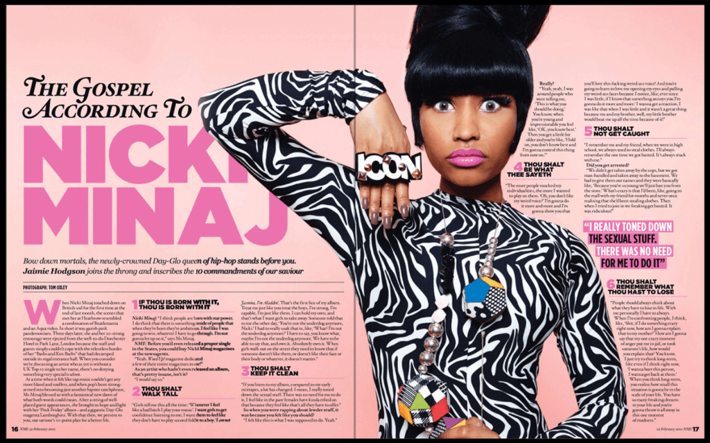
I began browsing to see which magazine I want to analyse and this ‘Nicki Minaj’ magazine caught my attention. It has a very large image of the star in the middle of the article which is enough to spark someone’s curiosity, then when you look into the article it has very beautiful headings and colour schemes. I also liked the white space at the top of the page which creates a bit of breathing space for the viewers and also prioritises the focus area for the article.
Nicki Minaj magazine size
Height: 14.306 inches
Width: 22.917 inches
First page layout
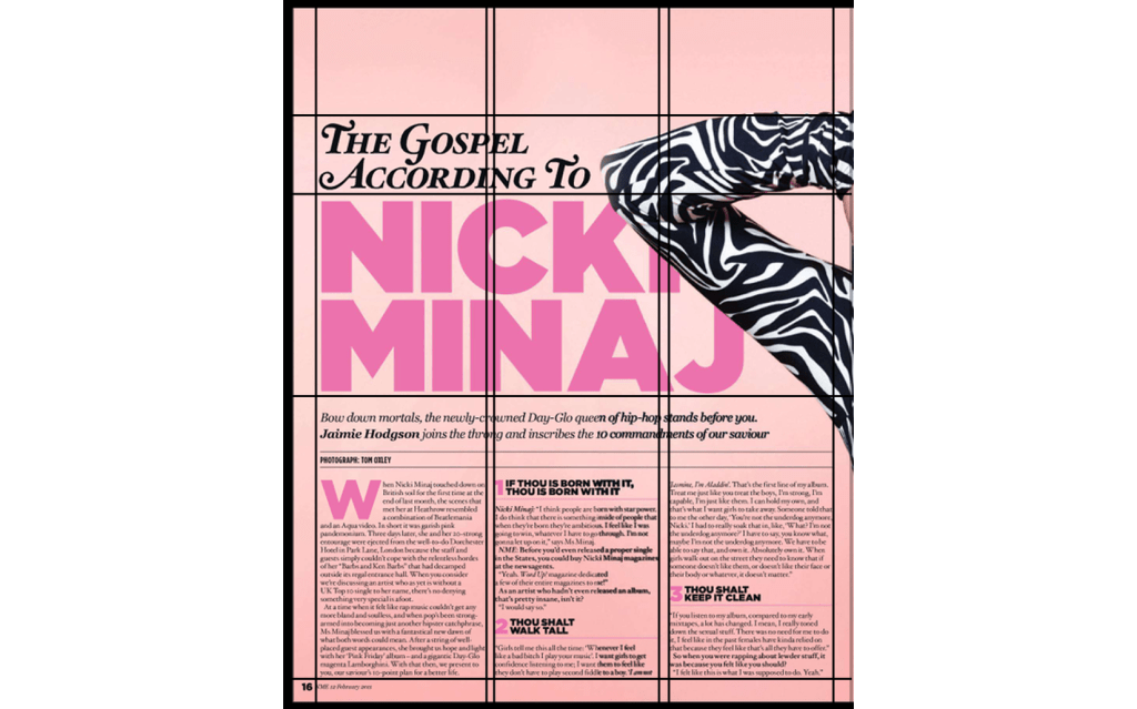
Page size:
Height: 14.306 Inches
Width: 11.500
Margins:
Top part is 2.350 Inches.
Side: 0.630 Inches.
Bottom 0.6 inches.
Columns:
Three column layout.
Width: 3.330 Inches.
Height: 4 Inches.
Second page layout
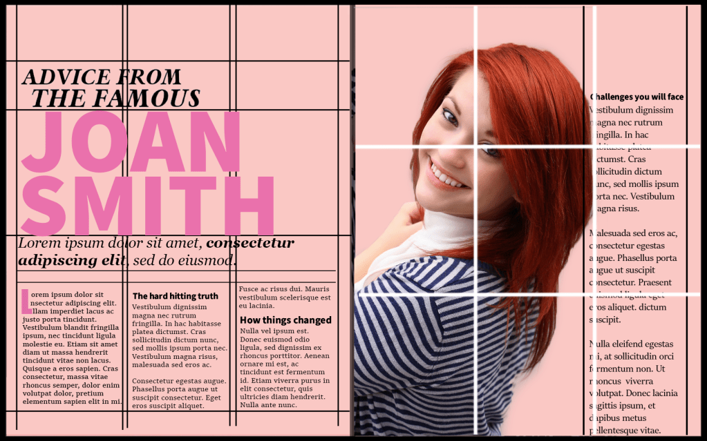
For the second page I used ‘the golden selection’ grid to see how it aligned with the image, the top left of where the lines intersect were on her face, the bottom left of the intersection were on her chest and the one on the bottom right was just below her shoulder. This proved to me that the golden selection method is definitely an important and effective tool.
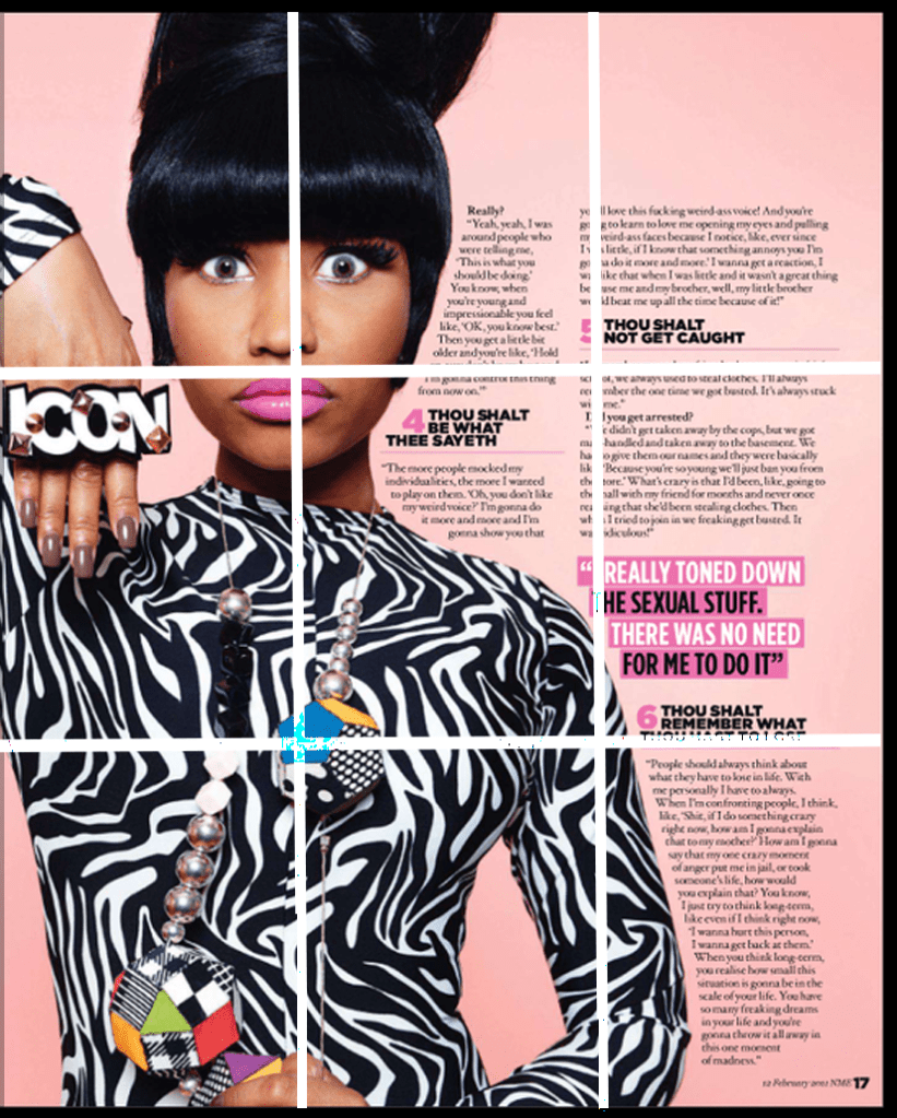
Margins
The margins are the same as the first image, the only part that is different is the gap in the margin from the writing to the left side of the page, this is because of the image.
Columns
The second page has two columns, the paragraph furthest to the image is 3.330 inches wide and 11.1 Inch in height. The paragraphs closest to the image is approximately 2.25 Inches wide, it varies because the paragraph is placed around the image.
Fonts
Heading ‘The gospel according to’ – Mauritius Bold Italic. App used= ‘What the font’.
Heading ‘Nicki Minaj’ – Alright Sans Ultra. App used= ‘IdentiFont’.
Text below the heading – Georgia Bold Italic.
Subheading – Geometos Soft Ultra.
The body text is unclear but I can tell that it is a serif font, from what I can see it seems similar to the font ‘Sitka’.
The magazine uses a range of different fonts and an overlapping image which takes over part of the first page and more than half of the second page.
Replicating the grid
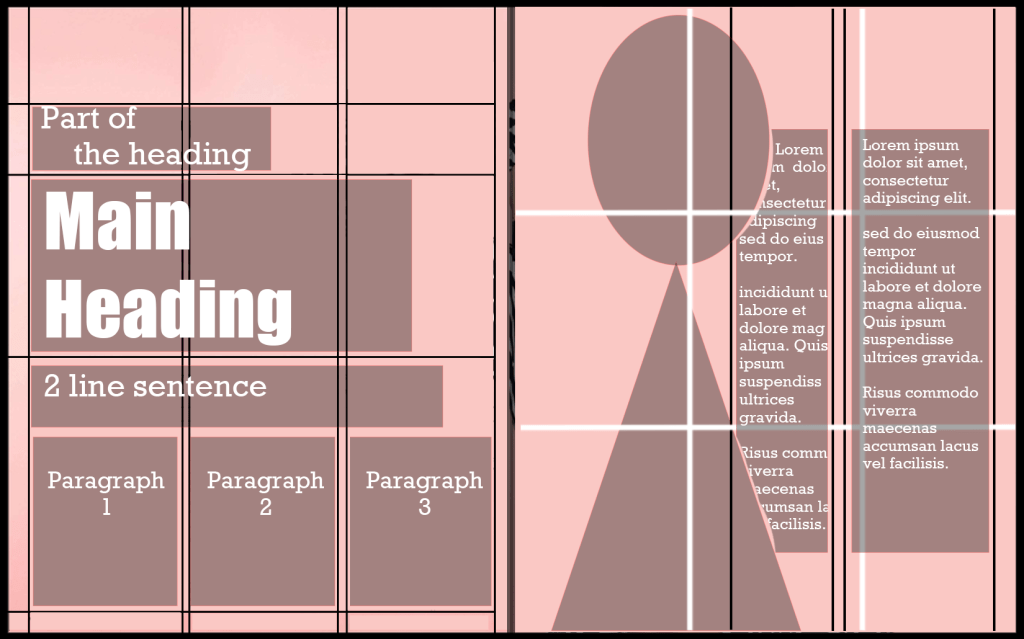
I then created a layout of the magazine and replicated the grid, I did this so it could assist me with designing my own magazine.
Design one
My first magazine is almost a duplicate of the Nicki Minaj magazine. I used the exact same layout, colours, columns and the same/similar fonts on my own copy, I also used the grid to help me to manage how much white space and what font sizes to choose. The golden selection grid is another effective tool which I used to align my picture. This is what I created.
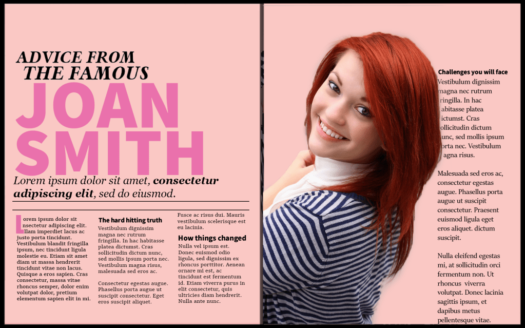
The colour scheme of the magazine seemed more suitable for a women’s gossip magazine, I wanted my font to match with this theme so I experimented with a script font to give it a more cheeky touch.
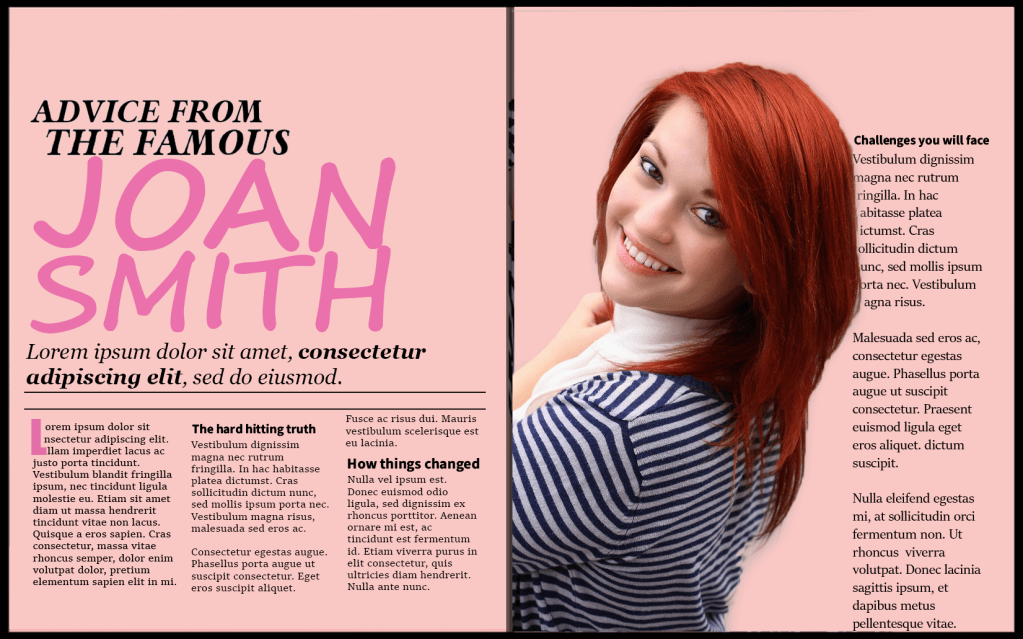
I think the font of the heading on this page could be more targeting towards a teenage audience because of the sassy style.
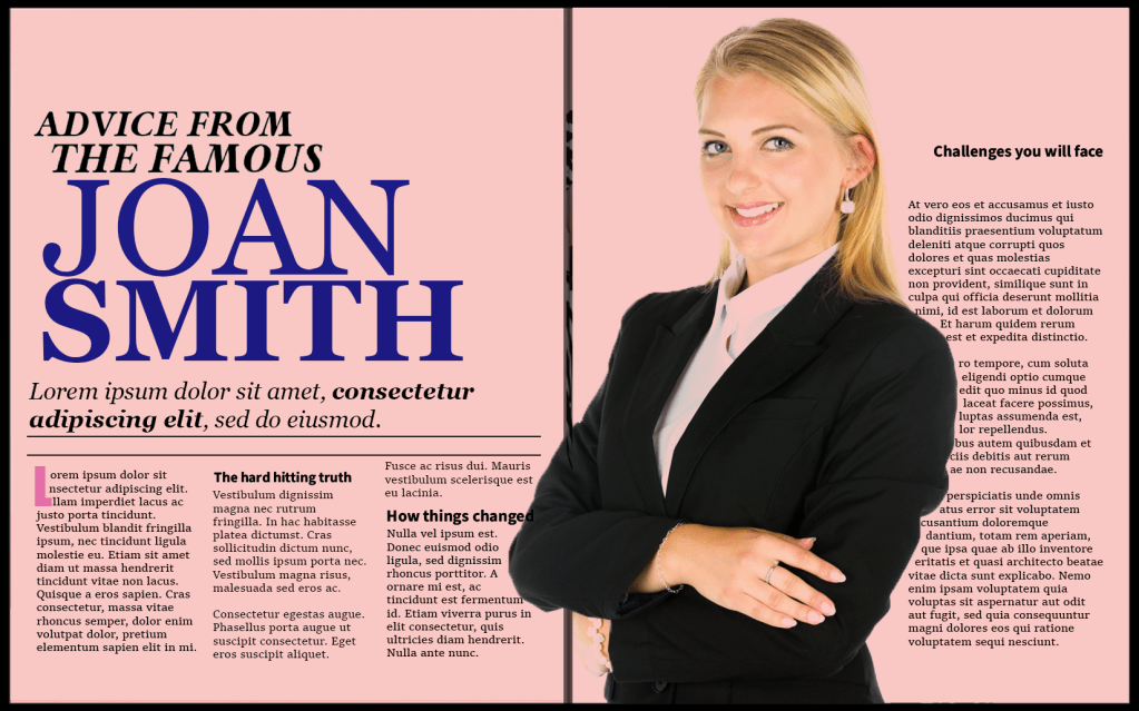
Experimenting with a different image
Design two
I then changed the image to a more formal picture, to have the same effect with my heading I changed the heading to a serif font and I also changed the colour to blue, these two adjustments completely changed the whole theme of the magazine. The magazine transformed from looking like a women’s gossip mag to a professional business publication.
Reflection
I enjoyed experimenting with the grids, especially the golden section grid which is used to align pictures. After using it myself I feel like it is a very effective tool. One other thing that sparked my interest was the effectiveness of using white space, it makes the article a lot more scannable and enhances the legibility. After creating my first magazine I really enjoyed how two subtle changes can change the whole theme of the project – my second magazine compared to the first one is an example of that.
