Context
Typographers and type foundries (the companies that commission and produce typefaces) have always had to promote their latest designs to printers and designers to show off a particular typeface, its different fonts in a variety of sizes and contexts, and the unique features of it. Once Specimen Sheets were the main way of doing this. Nowadays most of that marketing takes place online – research type foundries on the internet.
Brief
Design the font for use on the cover of a magazine called type and write a short article for the magazine using a range of typefaces, with typographic illustrations, drawing on all that you have learned in this section. The article should include sections on:
• what makes a typeface interesting • how a typeface is constructed • question marks.
Requirements
Do a mock up of the magazine cover to show where and how your title font will appear along with other cover elements.
Produce a magazine article that is attractive and interesting enough for someone to want to pick it up to read, and which shows off what that you have learnt so far about typography. Add illustrations, photographs and colours as you want.
What am I being asked to do?
My task is to design a magazine cover with the title ‘Type’. I also have to create my own typeface. Once I have created the typeface I will then have to write an article on all that I have learnt on this section. The article should be based on ‘what makes a typeface interesting?’, how a typeface is constructed and question marks.
Keywords
‘Design the font’, ‘cover of a magazine’, ‘type’, ‘short article’, ‘range of typeface’.
Design Issues
The thought of having to design my own font caught me a bit off guard because I have never done this before. My only concern at this point is that I’m wondering how I’m going to develop a handwritten font into a digital version clean enough to be the title of a magazine.
Mind map
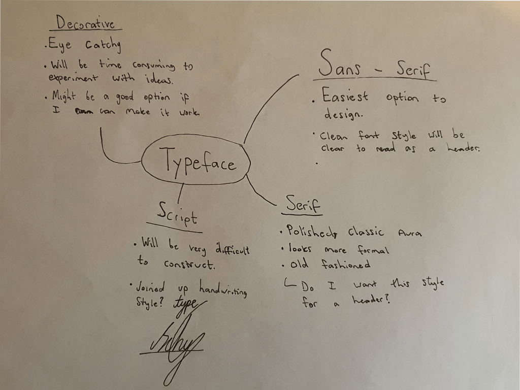
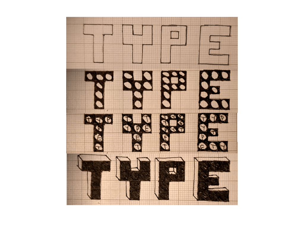
I created a mind map to make some brief notes on the different styles of fonts, I’m already leading towards the sans-serif department but I am going to draw a few sketches to get a better feel of all the fonts.
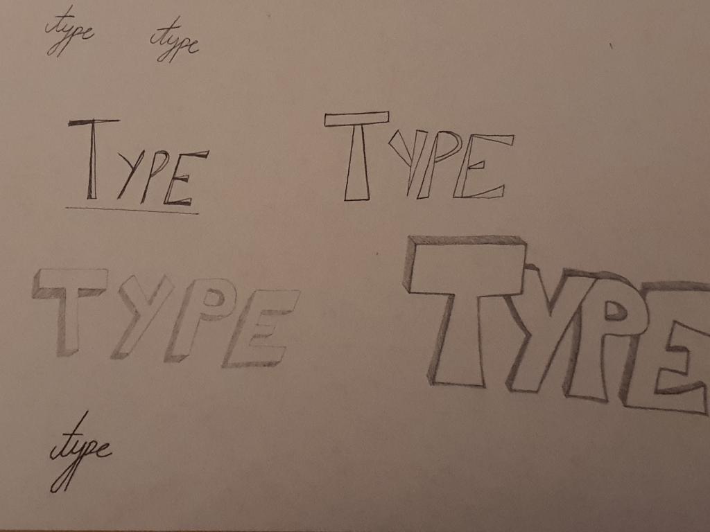
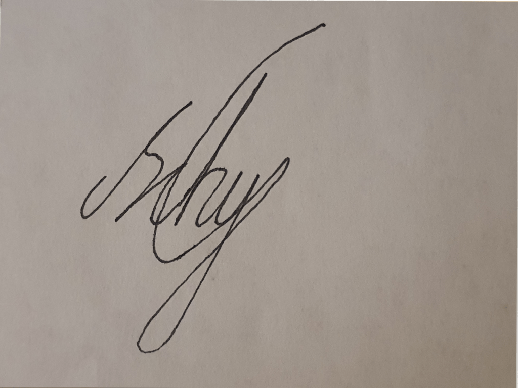

I tried to mimic my signature but the handwriting script style wasn’t working with these letters because the balance of ascending and descending letters were not there with the word type.
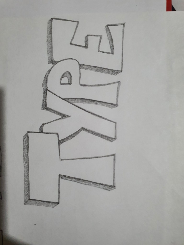
I then uploaded one of my handwritten fonts (the one below) on adobe photoshop, I added colour to it and tried to refine it but it looked so bad that I forgot to save it.
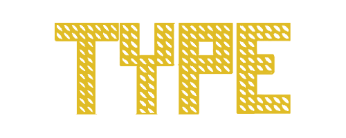
I then took a different approach, I used graph paper to design my fonts which made it easier to balance the size of my handwritten letters, I then went onto adobe illustrator and used the shapes to redesign my letters, I modified the shapes and refined it and this is the font I created.
Designing the cover
Once I created the font I then moved on to designing the cover. I began by going over the magazines I saved in the previous exercise to jog my memory. At first I felt like I was struggling to design a cover to match the font, my typeface was something unique that I created so I didn’t have the option to research how this font is usually used in a magazine which was a bit of a problem, so I started experimenting with colours to see which one fits well.
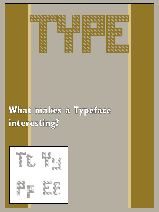
This is the first cover I created, I tried to colour code the typeface to the cover by adding brown strips to the page, the idea seemed entertaining at the time but I felt like it was too dull to catch the attention of a potential customer.
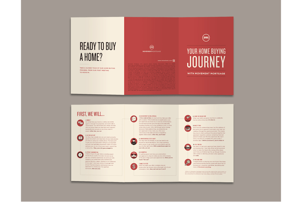
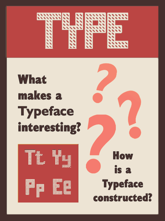
I then decided to copy the colour scheme of a brochure which I saved. The red and cream colour looked satisfactory so I decided to experiment a bit more with other colours.
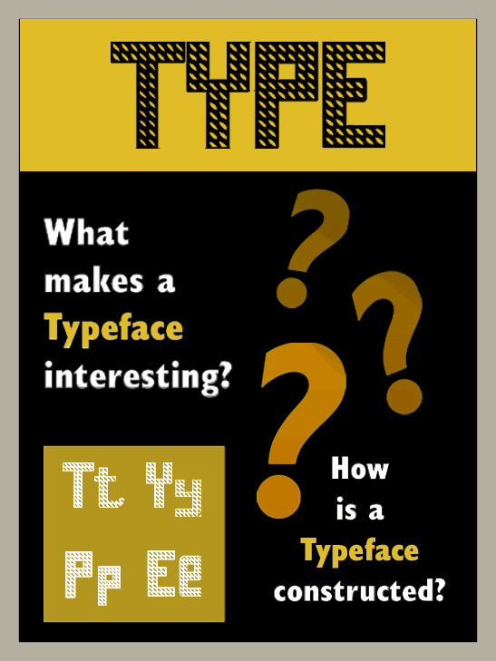
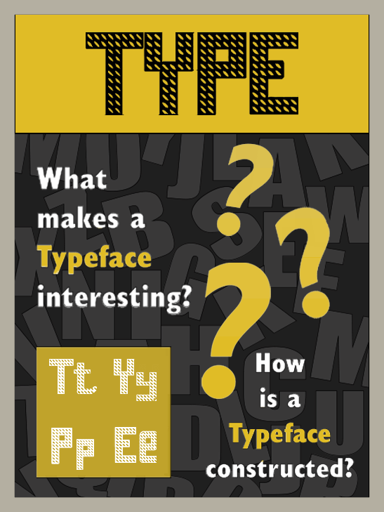
When I tested out the black background it brought my excitement back, I added a yellow strip across the top which made the colour scheme more exciting. I placed my typeface right at the top of the page, I then added a sans serif font to the page with the questions ‘what makes a typeface interesting?’ and ‘how is a typeface constructed?’ I used a white colour on the fonts and highlighted the word ‘typeface’ in yellow which looked really good on the black background, I also added a box on the bottom left of the page with upper case and lower case letters of my own font. I was happy with the colour scheme but the magazine still looked incomplete.
Even though I was happy with the colour scheme the magazine still looked really empty to me, there wasn’t really any space to add pictures in the cover and I wanted to do something with the background space so I created a mood board with letters.
Mood board
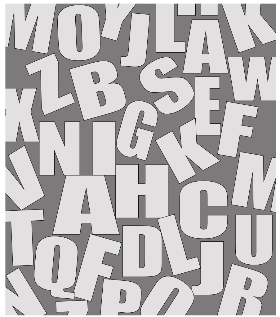
Once I created the mood board I then lowered the opacity and placed it on my background. This made my magazine complete.

Second part of the magazine
Now that I had my theme in place my focus shifted on the design and the layout. Once again I went through the collection of magazines that I had saved and one of the designs caught my attention.
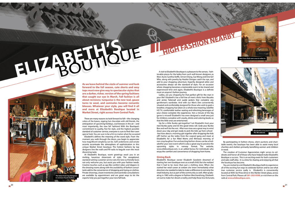
I really liked how the title went across the page diagonally which is something I wanted to do to my article. Here is what I created.
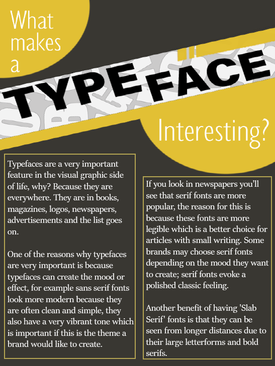
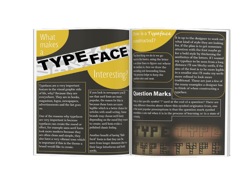
For the heading I used the eye catchy font ‘Impact’, for the words ‘what makes a’ and ‘interesting’ I used a light sans serif font which makes the word ‘typeface’ stand out even more. I put the paragraphs in columns of two in which I articulated the importance typefaces hold. For the body text I used a serif font to make the writing more legible.
Page 3
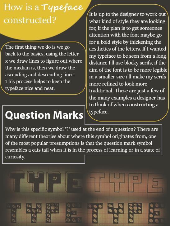
For the third page I wrote two paragraphs explaining how a typeface is constructed, once again I used a serif font for legibility and I circled both of the paragraphs in orange for the reader to know which heading the paragraph belonged to. I added a script font to the word ‘typeface’ in the heading because I wanted to use a variety of fonts without overdoing it. I placed the second heading in a bold sans serif font, I had to research the origins of where the question mark symbol came from which was slightly confusing because I came across so many theories, the story of the cats tail made sense to me and it is also one of the more popular theories so this is the story I narrated. To finish off the article I added some of my own handwritten fonts on the bottom of the page, I was happy to be able to make use of so many different typefaces without over doing it.
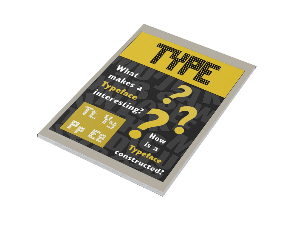
Final Design
Feedback
I asked my brother for feedback and his opinion was the same as mine which gave my confidence a boost. He liked the colour scheme of the magazine, he also voiced his appeal for the mood board that I created for the background.
Reflection
I’m content with the overall design of the magazine, creating a new typeface was very new to me and basing my whole magazine off the typeface did feel a bit puzzling at times. If I was to do anything differently maybe I would design the cover first and then create the typeface to fit the theme.
The exercises in part four really has triggered my passion for typography, I find myself analysing typefaces everywhere I go whether its an advert on a billboard or a logo on a jacket, this will definitely benefit me as a designer.
This section took me a lot longer than I was planning to, adapting to the new changes due to the pandemic whilst having close family members being affected by the virus was very troubling. I am happy that I have completed this unit.
Tutor Feedback
It is good to see you using your sketches here, but the visual development
moves to a more finished Typographic solution too quickly, as a consequence
there is a reduced level of creative and critical thinking.
More evidence of your research into other texts on type and your observations
on how they use type and layout will better feed your knowledge and
understanding and help your mark in future.
