Using about 500 words of Lorum Ipsum (or other dummy text) you are going to design
three different pages:
• an interview with a TV actor in a listings magazine entitled: Will Sheila tell the naked truth?
• a review of a new piece of hardware or software in a specialist computer magazine • a book review in a newspaper’s weekend edition.
Research these types of publications and identify three different combinations of typefaces appropriate for each publication.
Now you need to invent headings and subheadings for your articles. Set these combinations so that your header is above 12pt in size, your body text is 12pt or below and subheadings sit in between in your hierarchy.
You will need to create some text to allow you to show your combinations in action. Use your text to describe your decision making process, why you think the combination works and what your intentions were.
I don’t remember the last time I’ve scanned through a ‘listings magazine interview’ so I began my research by looking at existing copies.
After looking at the examples the task seemed simple enough, select a font for the heading, subheading and body text and workout which combinations are appropriate.
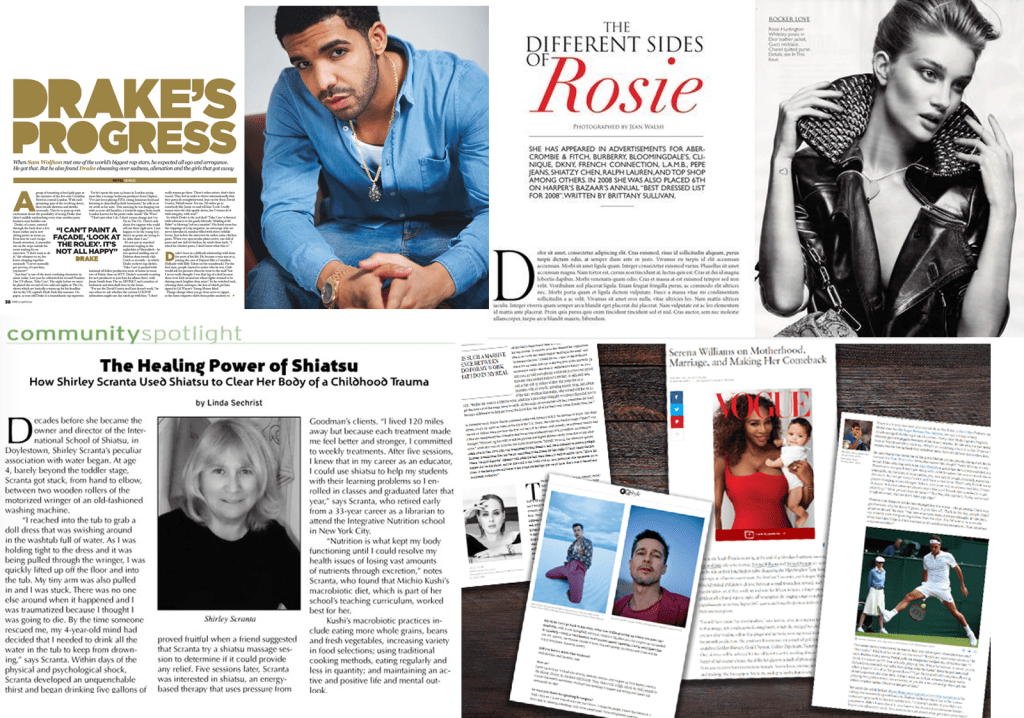
I really liked the layout of this magazine that I created, I put the picture and the heading on both pages, and I split the paragraphs into two columns. The heading font is ‘source sans variable’ and I put the wording below in italics which worked well. For the body text I used ‘source serif variable’, I kept the same typeface for the subheadings but I made the font bigger and bold. For the next magazine I’m going to try to experiment with the layout, columns and fonts…
Magazine 2
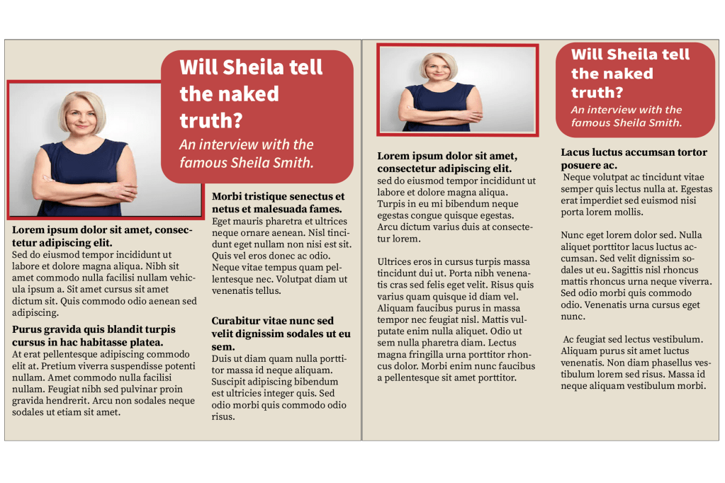
For the second magazine I went with a different style, on the first page I placed a big picture with a small caption reading ‘hear from the famous Sheila smith herself’, I chose the ‘Segoe smith’ font to go with the sassy quote. For the heading I chose ‘comic sans MS’ because the font has a feminine touch to it just like the overall image of my magazine and for the body text I kept it the same font as the previous one, the only change I made was that I coloured the subheadings in red.
Magazine 3
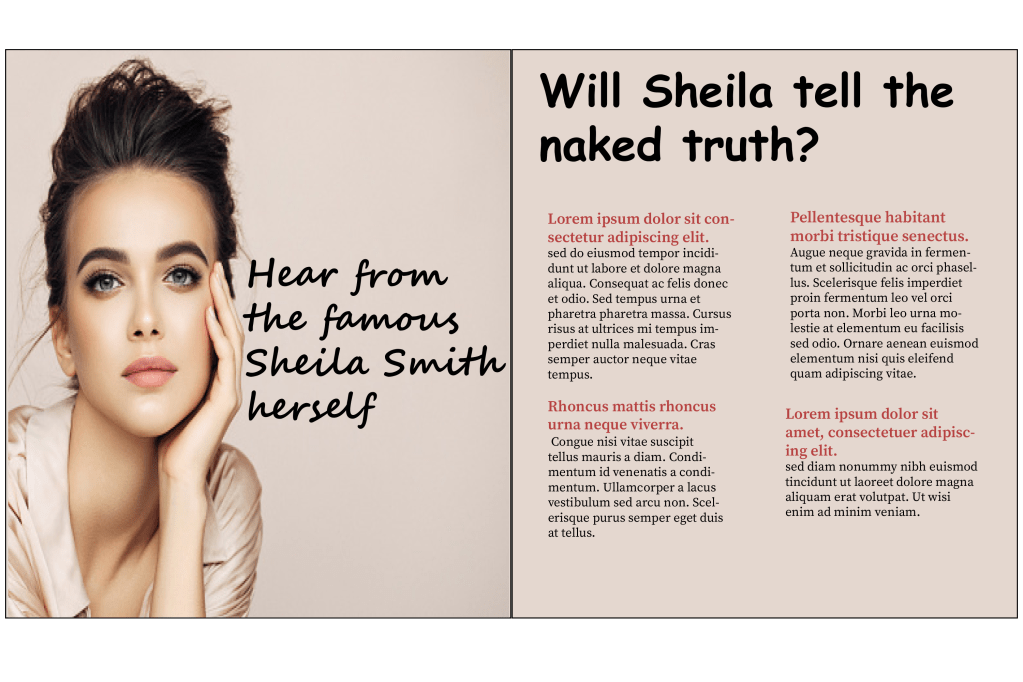
I tried something different with the third magazine, instead of having two separate pages I kept all of the information together but I split them into 3 columns. I used the ‘source serif variable’ font for pretty much the whole magazine, I did this because I wanted my design to look more formal and for the heading and the subheadings I just made the typeface slightly bigger and bold.
I created three very different magazines and I enjoyed experimenting with the different concepts.
Second part of the exercise
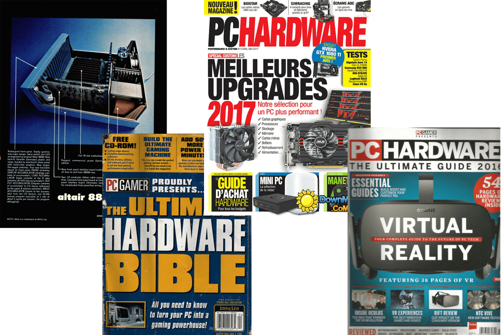
The second part of the exercise wanted me to create a magazine review for a computer hardware or software, the first thing I did was what I usually do – I looked up computer/ gadget magazines to obtain some ideas. I decided that I wanted to base my magazine on the apple pencil.
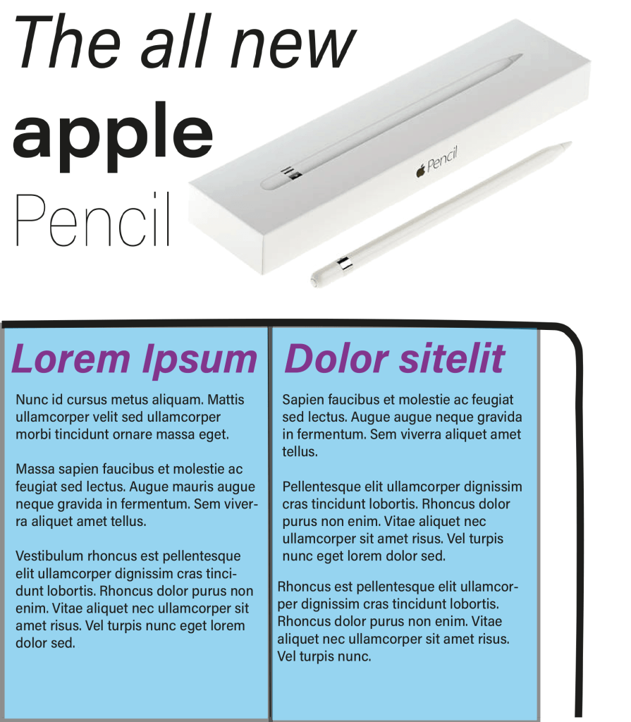
Magazine 1
Magazine 2
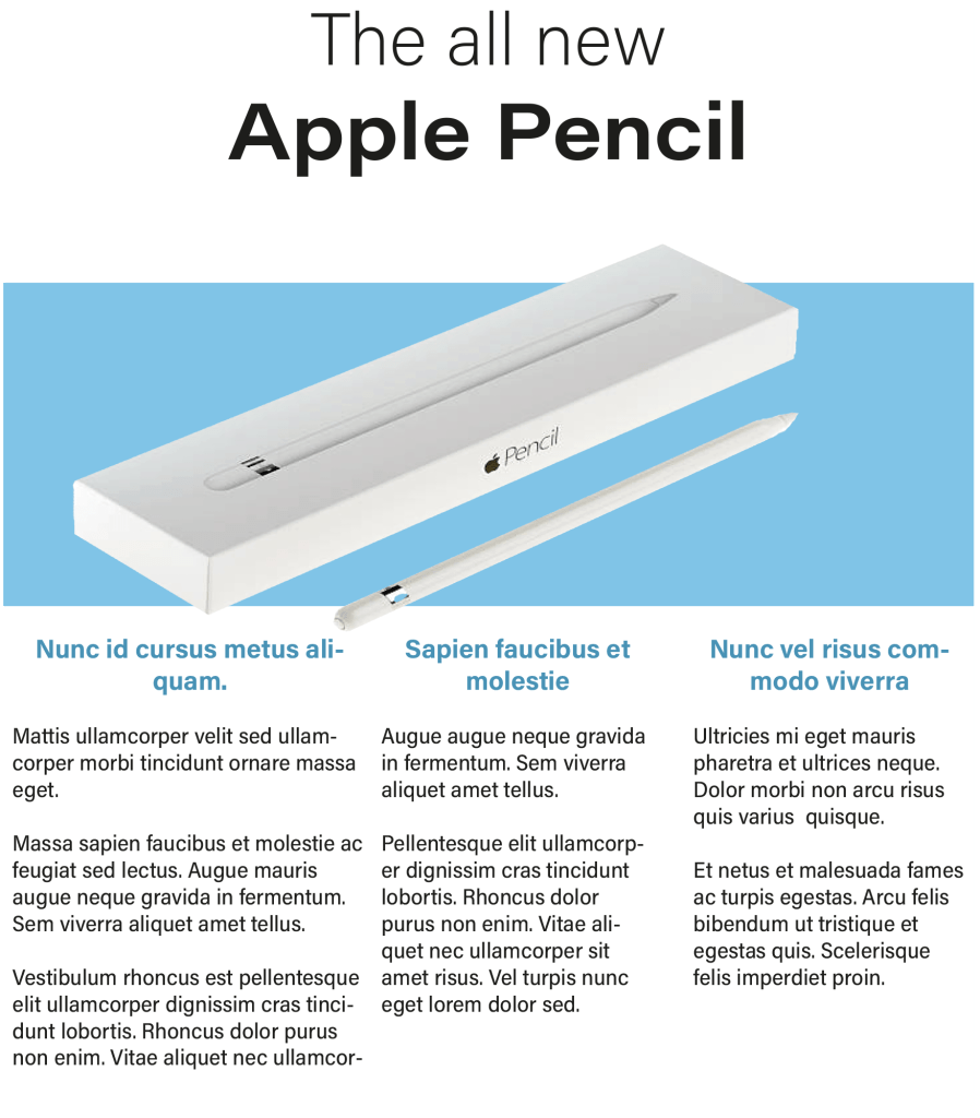
For my second magazine I went with a different approach, I separated the information: I put the heading on top of the page, imagery in the middle and the detailed paragraphs at the bottom. Once again the font I chose was ‘Acumin variable concept’, I put the words ‘the all new’ in the normal version of the font and I changed the name of the product ‘Apple pencil’ to a bigger size and in bold, I did this to establish the hierarchy. For the subheadings below I changed the colour of the typeface to match with the image and I also changed them to bold.
Magazine 3
I felt like the second magazine worked really well so I wanted to stick to the same concept. before I started the third magazine I went back to the ‘light bulb’ exercise because I remember experimenting with lots of different layouts – I picked the idea that I thought will be suitable for this exercise.
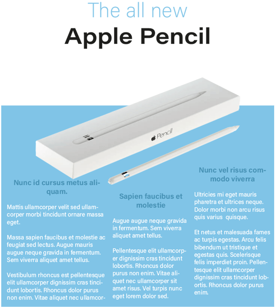
After choosing the layout I made slight changes to the fonts, I changed the first line of the heading to the same colour as the bottom half of the page and I changed the the colour of the body text to the top half of the background, I then changed the subheadings to a slightly darker shade of blue. Once it was complete I really liked the final design.
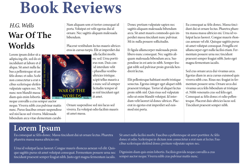
Book review
My task for the third part of this exercise is to create a ‘book review’ in a newspapers weekend edition. When I browsed newspaper book reviews online the first thing I noticed is that the paragraphs come in columns of three’s four’s and five’s. For some reason I was expecting all of the headline fonts to have serif’s but I was quite surprised to see that there is an equal mixture of both serif and sans serif. The imagery in the article are not positioned in a specific place; some are on the left, some are in the middle and some are on the right. These are things I will consider when designing my own papers.
Fonts
⦁ Heading: Minion Variable Concept
⦁ Sub heading: Minion Variable Concept Semi-bold
⦁ Body text: Minion Variable Concept Display
I kept all of the fonts similar because I really like this serif font, it gives it a very professional look which is what I need for a newspaper article. I spaced out my paragraphs in four columns and left another area at the bottom for a separate story. For my next article I’m going to try a different font with a different layout.
Book review paper 2
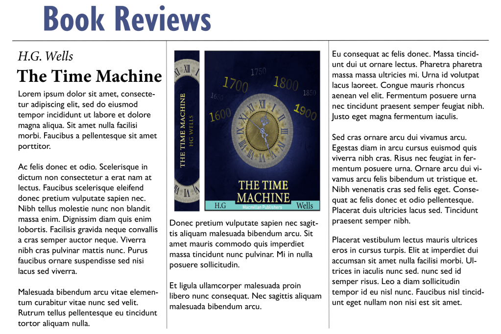
Fonts
⦁ Heading: Gill sans nova bold
⦁ Sub heading: Minion Variable Concept bold
⦁ Body text: Gill Sans Nova Regular
For the heading and the body text I used a sans serif font and it looked much better than I thought, the reason why I used this font is because I wanted to experiment with something different, a serif font would make more sense for the body text because it is much more legible. I also used three columns instead of four – I had to slightly increase the size of the text because or else the sentence would spread apart too much. I also placed the image right in the middle of the page instead of across the two columns, however I think placing the image across two columns makes more sense because it allows you to fit in more writing.
Book Reviews paper 3
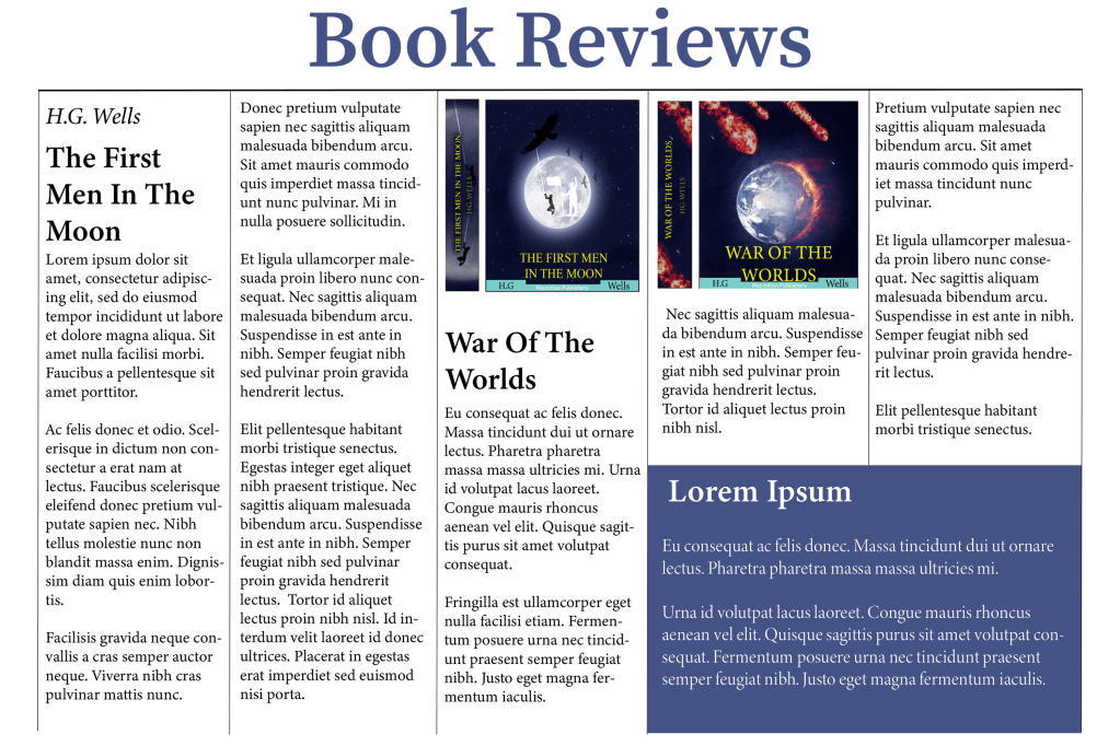
Fonts
⦁ Heading: Source Serif Variable
⦁ Sub heading: Minion Variable Concept
⦁ Body text: Minion Variable Concept Regular
I changed the layout of the third paper, this time I experimented with five columns, I created a separate area in the bottom right instead of taking up the complete bottom part of the page like the first one, I did this to maximise the word count in the article without it looking too boring. I also made sure to keep a serif font for this page because when there is so many words in an article there is a bigger chance for the viewer to misread something.
Final thoughts
I feel like most people already have a natural inclination in knowing how certain fonts should look from the perspective of hierarchy, it is common knowledge that the headline usually has the biggest typeface and that the subheadings are slightly bigger than the body text. However, it was fun working with different combinations to work out which one works the best. I feel like for formal projects such as newspaper articles I would lean towards serif fonts and for women’s magazines I feel like modern sans serif fonts work better.
Tutor Feedback
You were asked to typeset headings, subheading and body text for three
different pages.
It was good to see you referring to the lightbulb project, The Apple pencil is
very successful in terms of layout, you give a suitable type and layout with lots
of space and well-designed columns creating a cool understated layout in
keeping with the product, well done. I would like to have seen you use range
left and justified to explore the spatial possibilities. You are using space much
more effectively and the page can breathe, much improved well done.
