Lorem Ipsum is dummy text with more-or-less normal distribution of letters that makes it look like readable English. It has been used for many years and some desktop publishing packages now use it as their default model text.
If you don’t have it already, go to http://www.lipsum.com and generate as much as you need.
Now select one of the designs from your research that you like and think works. Using the dummy text, try and copy the layout and design as closely as possible. You will need to measure the margins and column widths. If you don’t have the exact typeface get as near as you can. If you are copying a page that includes photographs just leave 10% tinted boxes to indicate their position.
Is the type serif or sans serif? Is the text set ragged or justified? Are there spaces after paragraphs or are new paragraphs indented? How many columns are there to a page?
What happens when you alter the fonts, change the alignment, adjust the leading or tracking?
Now try another, different publication from your collection.
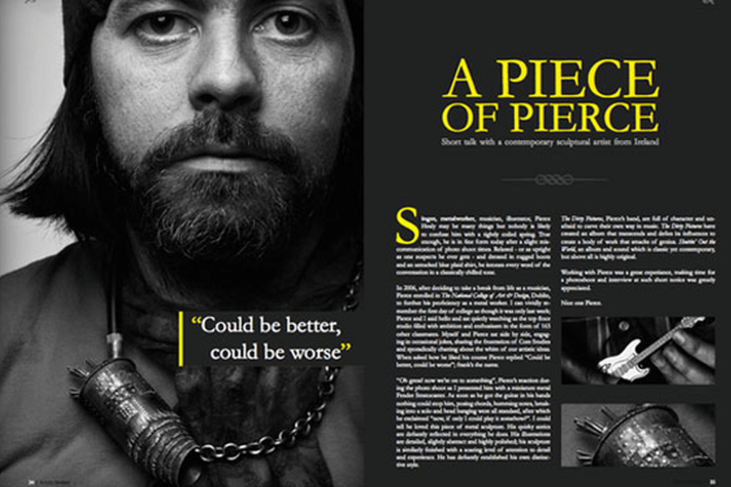
I decided to reproduce the ‘A piece of pierece’ magazine, I really liked how everything went together with this magazine, it has a very interesting colour scheme and the placement of the headings, images and paragraphs is exactly how I would position my own design if I was told to create one.
I used the ‘what the font’ app to discover which font the headline was in, the fonts name is ‘Trump Medieval Roman’. After replicating the headline I then went to the body text, unfortunately the writing was so small that it was difficult to make out the font so I searched up the original magazine again, after scanning it with my app the font came up as ‘Pockota Regular’, but because this was a paid font I had to look for an alternative, I went through the fonts that I have already saved from the previous exercise and I found that the text is quite similar to the ‘Georgia Regular’ font therefore this was the one I chose.
Reproducing the magazine
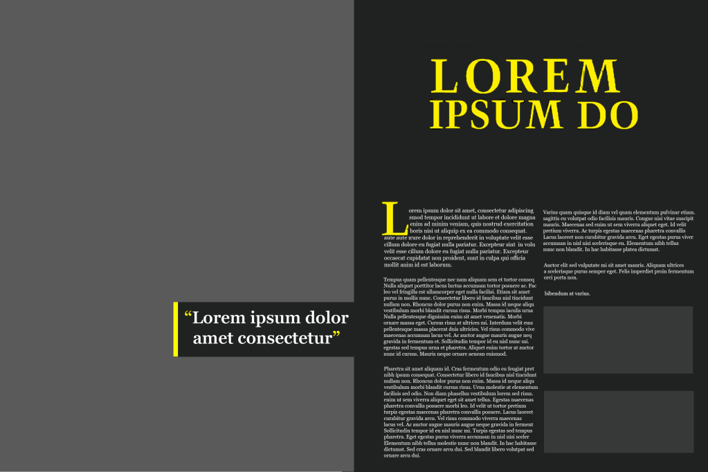
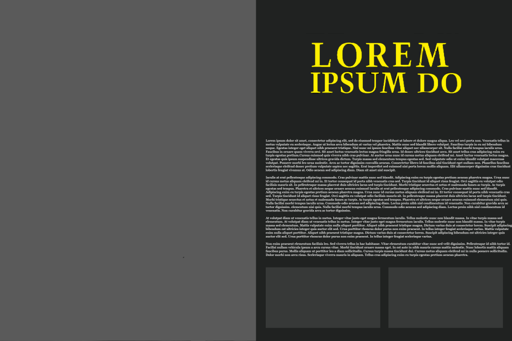
The overall layout of this magazine was impressive, the serif fonts are clear to read, the colour scheme enhances the legibility and the columns are separated nicely into two’s with space available for pictures. I created an alternative below where the paragraphs are not separated into columns and the difference can be noticed immediately. Personally I think columns are very important because it separates the information effectively – imagine having to read a newspaper with small fonts and no columns, it would make for a very tough read.
Alternative
Tutor Feedback
Your research into legibility and readability is very good with accurate analysis
of the merits of each of the selected texts. What you have learned is then well
presented in the Piercing Magazine.
