Exercise: If the face fits Create your own sample book of typefaces on your computer that you can refer to. Organise them into:
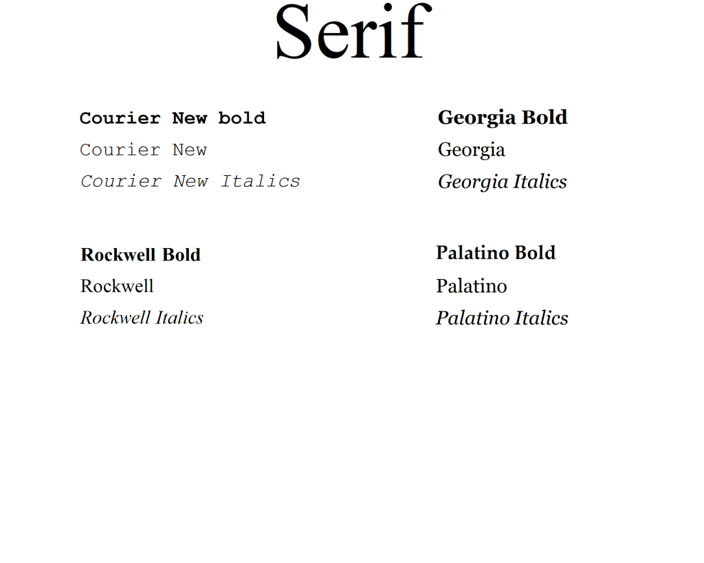
• Serif for continuous text; readable at small sizes and those suitable for headings.
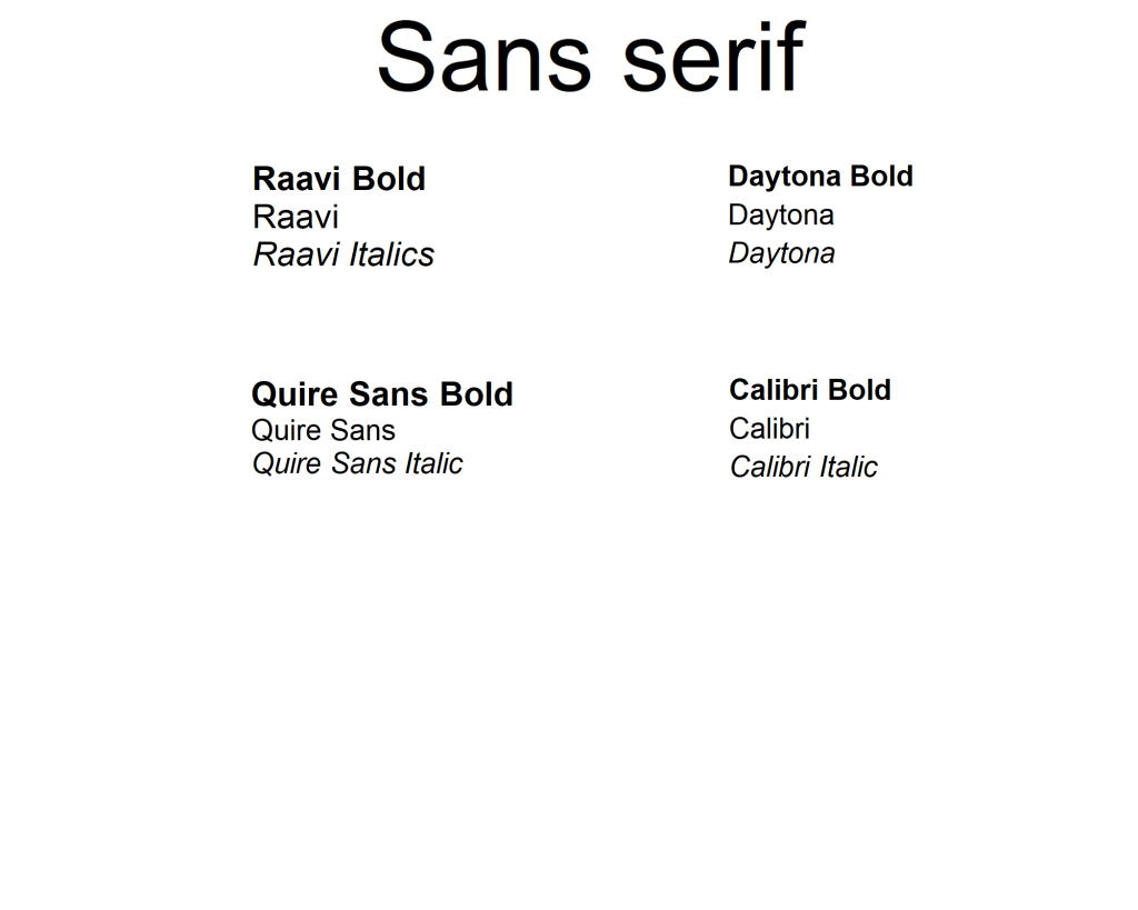
• San-serif for continuous text; readable at small sizes and for headings.
• Script fonts that look handwritten with a pen or brush.
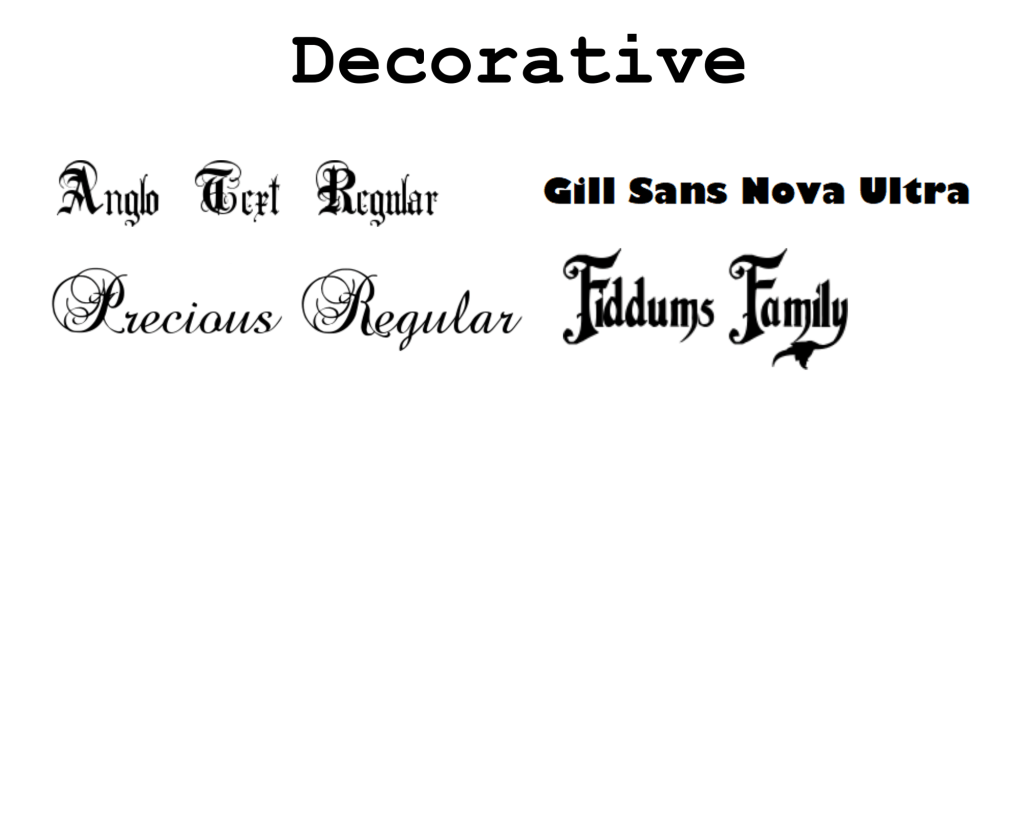
• Decorative fonts only suitable for headings or ‘fun’ uses.
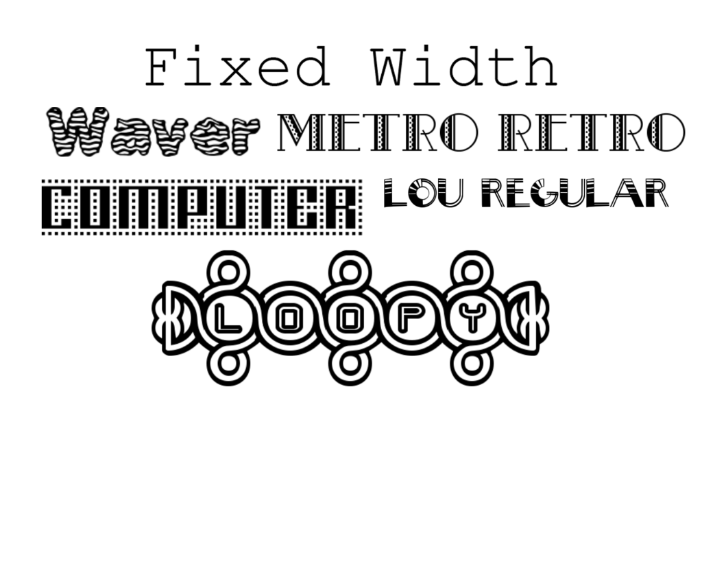
• Fixed width, techno and pixel fonts for use on the web or to give a computer appearance.
Identify which typefaces have bold, italic, black or light fonts.
Now identify which fonts you might use in each of the following commissions:
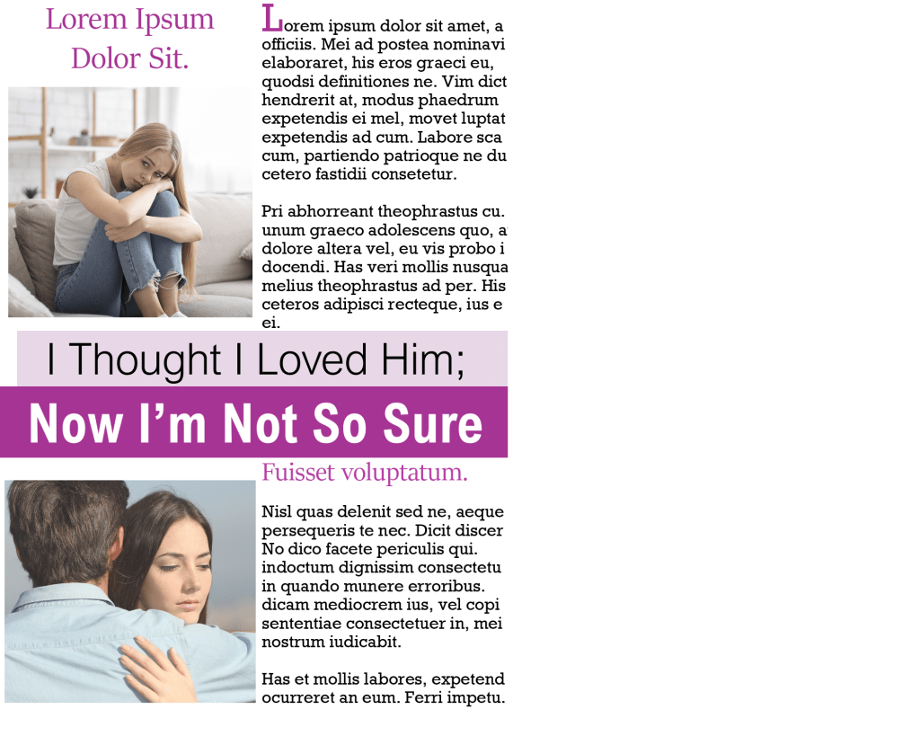
• A short story in a woman’s magazine entitled “I thought I loved him; now I’m not so sure”. The story is 1300 words long so you will need to identify a text font and a headline font.
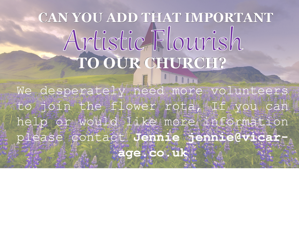
• An advertisement in a parish magazine asking for more helpers on the flower rota. The finished size is A6 landscape and the text reads: “Can you add that important artistic flourish to our church? We desperately need more volunteers to join the flower rota. If you can help or would like more information please contact Jennie jennie@vicarage.co.uk.”
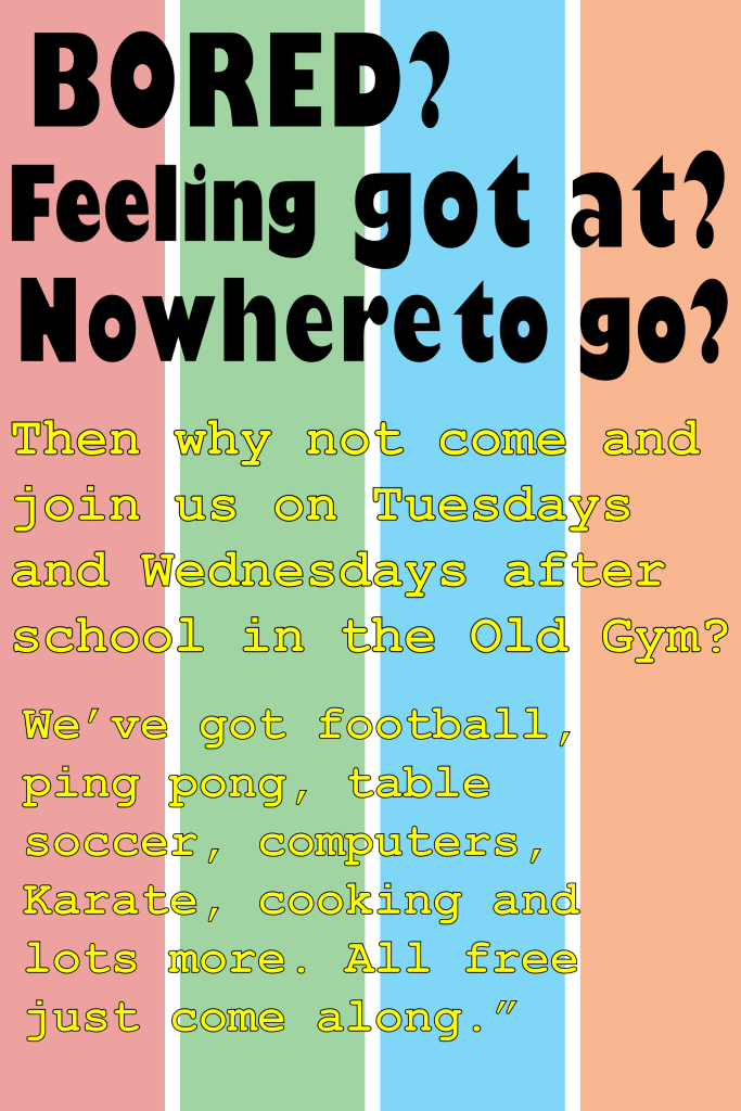
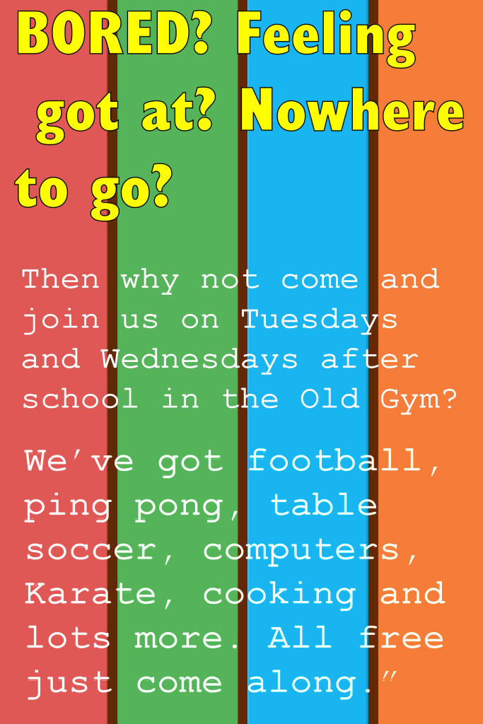
• A poster to advertise an after-school club for boys aged 13 – 14. The poster will be A3 size and the copy reads: “Bored? Feeling got at? Nowhere to go? Then why not come and join us on Tuesdays and Wednesdays after school in the Old Gym. We’ve got football, ping pong, table soccer, computers, Karate, cooking and lots more. All free just come along.”
• Your friends’ engagement party. They want a flyer A5 size to send to their friends as if advertising a club night. The copy reads: “Mandy and Josh are finally going to do it…well almost!!!!! Come and join them on Friday 24 March from 8pm at the Golden Calf to celebrate their long awaited engagement… and yes lots of presents would be gratefully received particularly if we can drink them!!!!!
Then have a go at mocking up each of these. Try different fonts to see how each changes the feel of the text and make notes in your learning log about which works best and why.
As the brief suggested, the first thing I did was I began to explore the different types of fonts. I chose the ones that I felt will be most suitable for this exercise. The software’s that I used were Adobe Illustrator and Word, I also got some of my fonts from a website called 1001 fonts.

Once I had all of my fonts ready, my focus then shifted to the layout of the magazine. I started browsing on the internet and I came across this women’s magazine; I decided to use this concept for my design.
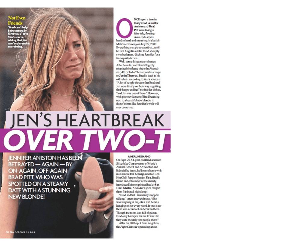
For the heading I experimented with the fonts that I already saved in my collection, but when I tried the combination of ‘Arial Nova’ I felt like it worked best. The first line I chose was in normal black font and the second line was in bold white writing – I liked how the composition looked. For the rest of the text I tried to use a font that I already had saved, but the font ‘stika’ looked perfect for the job, the serifs weren’t overly designed and the font is very legible, I also kept this same font for the subheading but I increased the size of the font and also changed the colour.
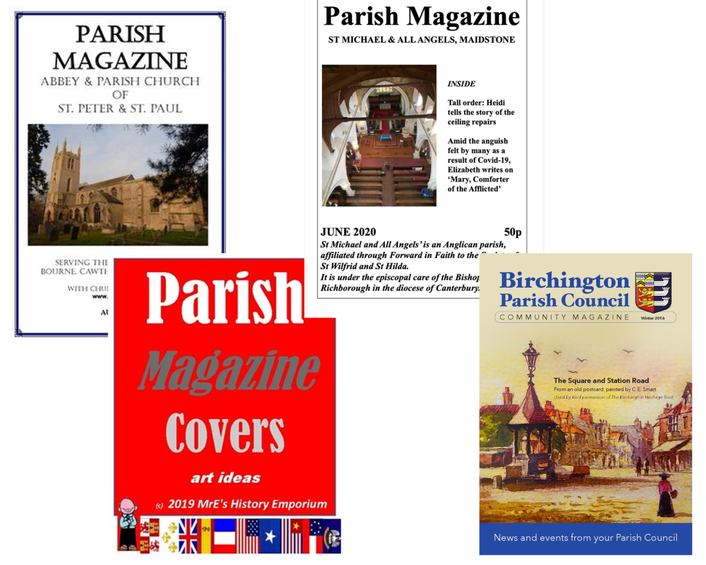
Parish magazine
I was looking at Parish themed magazines and most of them appear to have an old fashioned style, the fonts are mainly serif which is what I will have to consider, but being that the magazine is looking to get people to help with the flower rota, I am going to try to add more of an ‘artistic flourish’ to the magazine.
For the heading I used two fonts, I used Georgia Bold for part of my heading to match the fonts in the other Parish magazines that I’ve seen, but I then added a ‘script MT Bold’ font for part of the heading because I wanted to give it an artistic touch. For the rest of the writing I used ‘courier new’ which gave it a softer touch to match the background.
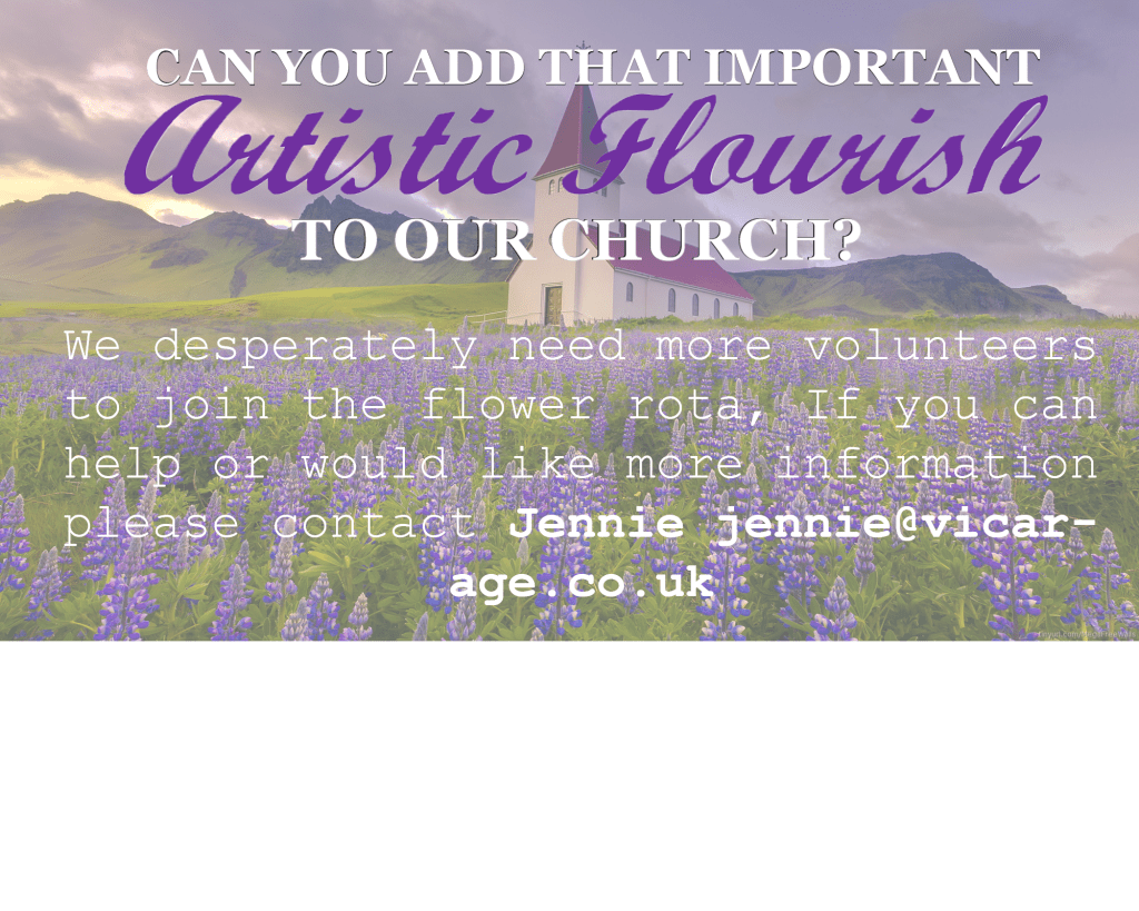
I asked my brother for feedback on the magazine but when he read the title, he read it as “autistic” instead of “artistic”, for this reason I decided to experiment even further with the fonts because I do not want legibility to be an issue.
I changed the font to one that is more legible which shouldn’t be an issue for anybody, I think my brothers mistake was more due to cultural reasons, personally I prefer the first one over the second.
After school club poster
The third poster is for an after-school club aimed at boys aged 13-14. I began to look at posters designed for youth clubs and I saved a few that caught my eye.
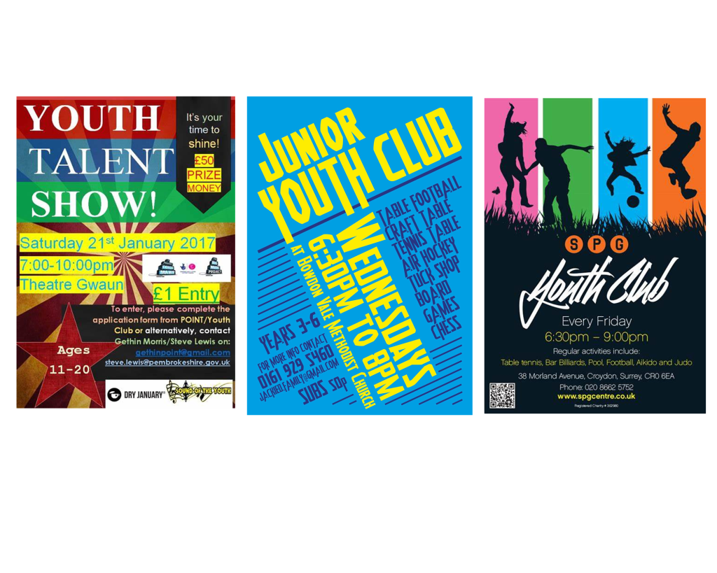
I tried to combine the ideas from the posters that I saved, I created a design for my background and then moved on to the fonts because this was the main focus of the task. For the heading I decided to go with the Gill Sans Nova Ultra Bold font, it was quite an eye catchy font however when I added colour to this typeface it looked very childish, so to make it more appealing to teenagers I felt like black would be a better option. For the body text I used Courier New because of its legibility.
Once I completed the poster I didn’t feel satisfied with the outcome; specifically the black font. I decided to change the font of the heading to ‘Gill Sans Nova Cond Bold’ instead of ‘Ultra bold’, after making this change I could get away with applying colour to the heading without it looking too childish. I kept the body text the same font but I slightly changed the colour and the outline of the font. I felt like this poster wasn’t my best work but I had a good go and felt somewhat satisfied with the second poster.
Engagement Party poster
The final poster is for an engagement party, so to get familiar with the theme of these posters I did what I usually do which is to look at existing posters. These are the ones that caught my attention.
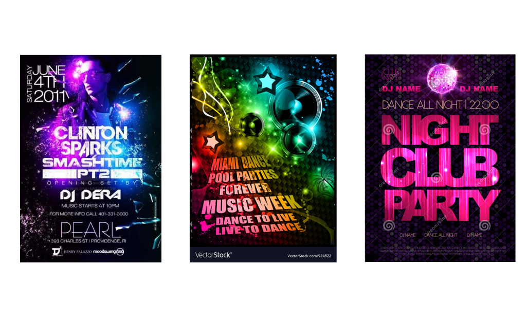
The first thing that I noticed is that all of the words are always in a bold font and in sans-serif, this is why I decided to use the ‘impact’ font for the title ‘Mandy and Josh’. Then for the next part I used ‘Gill sans nova’, I kept all of the letters in capitals to match with the informal theme. For the rest of the body text I used ‘Microsoft new tai lie’ I played around with the sizes of the body text, I made the important part very clear and legible and kept the excess unnecessary information smaller in size but clear enough to read.
Final Reflection
From this exercise I have learnt that it is not always about making the typeface look nice, sometimes certain fonts are used to make the writing more legible, I also feel like fonts can create the feeling. For example for the parish church magazine the majority of the words were in serifs, I felt like this worked well for the magazine because it was designed for a formal organisation. When I designed the poster for the engagement party, I felt like the sans serif aesthetics of the typefaces worked well with the informal theme.
Furthermore, another thing that I have learnt from this task is that although it is good to have fonts ready before starting the exercise, we should always be prepared to use different fonts if they fit better. Overall I feel more confident in knowing which typefaces to choose in the future.
