Using the following words create typographical representations that present both the word and a suggestion of its meaning.
Sad Safe Sardonic Saucy Scholarly Serious Shadow Shattered Shy Short Silly Sinking Skimpy Sleek Smart Snowy Sodden Soothing Sordid Sophisticated Speed Squat Squeeze Stiff Stodgy Stoned Style Supine Swagger Sweet
Start this exercise by working on A4 sheets of paper. Set the words in 48pt Helvetica Bold, print and cut out the words and then arrange them and stick them to a sheet of paper trying to capture the meaning of the word visually. Think about the composition, using the white space of the page to help you construct your meanings.
Then work digitally using any of the software you have available. Explore how you can set text at a slant, at different sizes, in different colours and fonts. Try using filters in your software for other effects.
Make notes as you work explaining your choice of representations and which ones you feel that you were most successful with.
I began this exercise by printing out all of the 30 words, after cutting out the words I felt a bit confused about how I was going to construct the meaning visually without using any extra material. However, once I started playing around with letters I got more of an understanding. This is what I came up with.
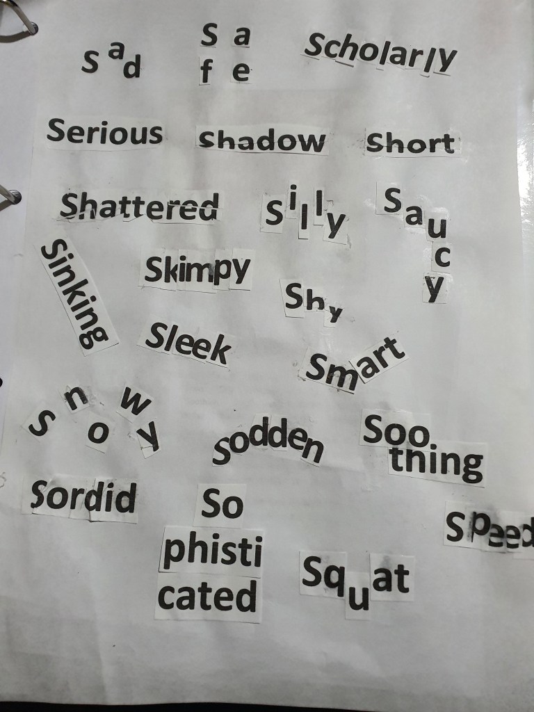
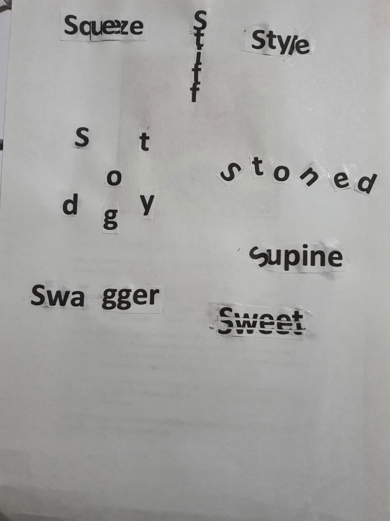
With there being so many limitations on the brief, I played around with the words as much as I could and I feel like the outcome was met.
Digital exercise
I then went onto the second part of the exercise, I decided to use both Adobe illustrator and photoshop to create my designs.
I wasn’t completely familiar with some of the words so I researched them further, the words: sordid, sodden, stodgy and supine were new to me – but comparing the aesthetics that I created with the definition of each word I feel like I am content with the designs I created. Out of these four words I am most satisfied with the terms ‘sodden’ and ‘supine’, I made the word sodden look drenched with liquid by making drops hang off from the letters. When I researched the term supine the first definition that came up was ‘flat on ones back’, to visually imply this with the letters I tilted them all to the side to make it look as if it is on its back.
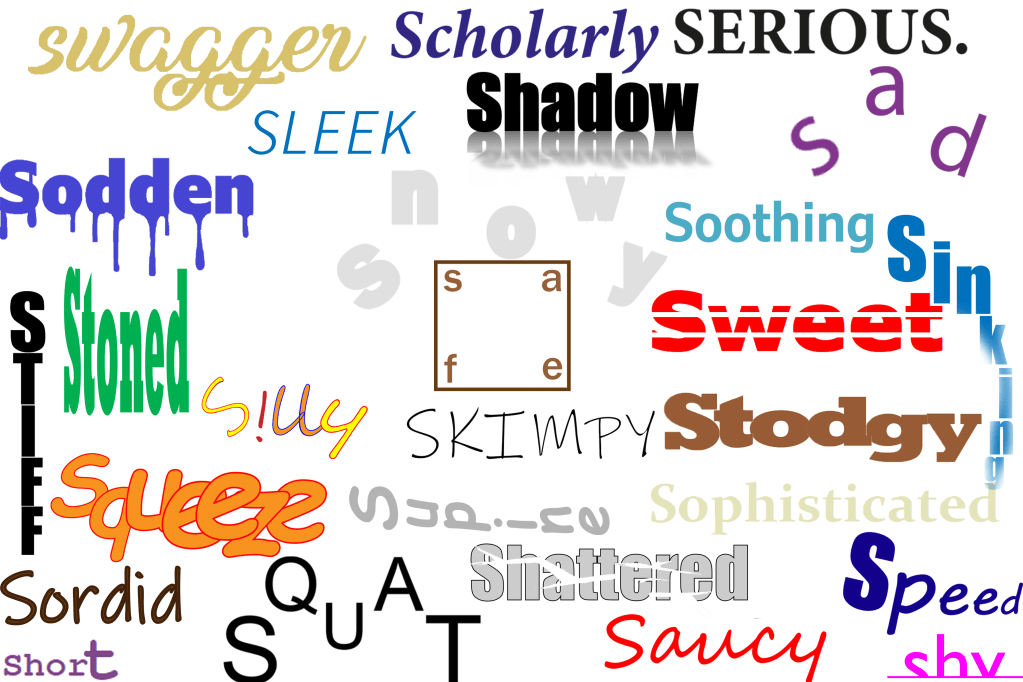
Some of my concepts were very simple, an example of this is the term ‘serious’, I chose a simple black coloured font and typed out the letters in capital, I didn’t add any colourful designs because I felt like this would take the ‘seriousness’ away. I also used a minimalist approach for the words scholarly, soothing and sophisticated because I felt like this approach was more effective in conveying the message.
The designs I was most impressed with were the words: safe, squeeze, squat, shy, skimpy, stiff and saucy. For the word safe I put the letters in each corner and put a box around it, I was visualising a padlock when I was doing this, I also placed the word in the middle of the page because the middle is usually the safest place. I really enjoyed working with the words squeeze, squat and shy, the reason for this is because I was able to place the letters in a way that each position had a visual meaning, for example the placement of the letters in the word squat resembles a persons lower body squatting, for the word squeeze I squashed all of the letters together to emphasize the meaning of the word, for the word shy, I cut out the bottom half of the word where I put a line to make it look as if the word is hiding out of shyness. Even though the words skimpy, stiff and saucy didn’t require me to think outside of the box I was still very happy because the aesthetic design of the words resembled its meaning.
Final overview
I feel like these exercises will be very fruitful for future tasks because it is encouraging us to experiment with different concepts even though there is so many limitations. I have never focused so much on the visual representation of a word before and I think that exercises like this will help me as a designer.
