The brief:
To produce a poster (297mm x 420mm) that celebrates a colour of your choice.
Choose a colour that has a meaning that you want to explore and celebrate. Think about what the colour you have chosen means both to you and to other people and create something that celebrates that meaning, for example you may choose a golden brown because you like real ale, a vivid green because of a particular landscape, green to celebrate Irish identity or the yellow sandstone of Bath’s architecture..
Requirements:
Work only with your chosen colour, its complementary colour and black and white. You can include text, collages, illustrations and photographs. Use black and white to help establish a range of tints and shades with your chosen colour. These limitations are to get you to work with colour thinking creatively about how to make a limited palette work for you.
This project is as much about visual dynamics and contrast as it is about creating something with meaning. Make full use of it to show off to your tutor all the skills and processes you have learnt so far.
You need to submit at least three variations of your poster as well as the finished artwork.
What am I being asked to do?
The brief requires me to create a poster that celebrates a colour of my choice whilst having in mind what the colour represents and means to other people.
Keywords
“produce a poster (297mm x 420mm)”, “celebrates a colour of your choice”, “think about what the colour you have chosen means both to you and to other people and create something that celebrates that meaning”.
Beginning the task
Since the last exercise was about geography I decided that my colour will represent a geographical location. I decided to explore the colour green because this is a very powerful colour for Bangladesh. The main colour of the country’s flag is green, this is a representation of the land that the people of Bangladesh died fighting for during the 1971 war against Pakistan. Bangladeshi people are very connected to that colour and I will try to represent this through imagery.
Mind Map
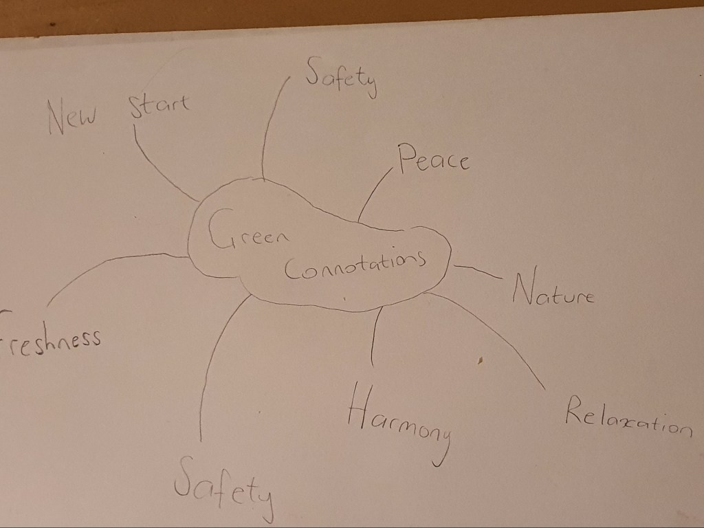
Since the main focus of this exercise was on colour I decided to create a mind map. I wanted to see how many different themes and moods I could create with the colour green. From what I gathered I had a few options to select from.
Research
To get a better overview of how colour is used to represent a culture I thought it would be a good idea to look at posters aimed at Irish people because green is always associated with Ireland.
Moodboard
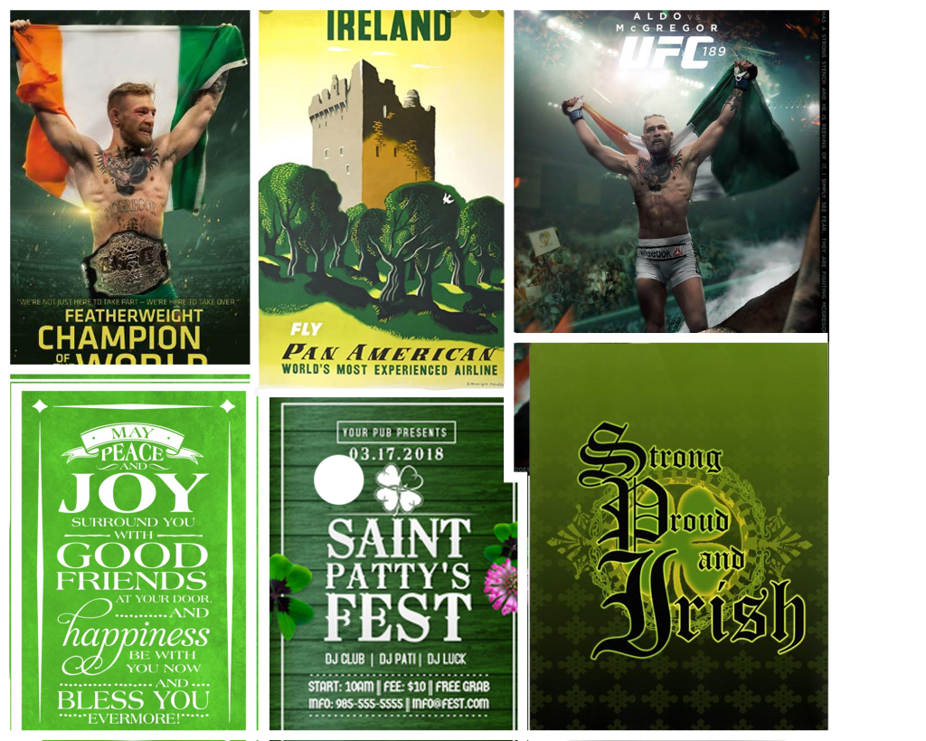
I created a mood board with all the designs that I found interesting, the usage of green was very important on these posters which relates to my brief because I am going to be limited with this colour.
Brief sketch
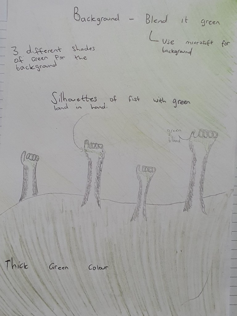
Poster 1
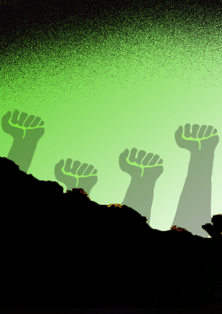
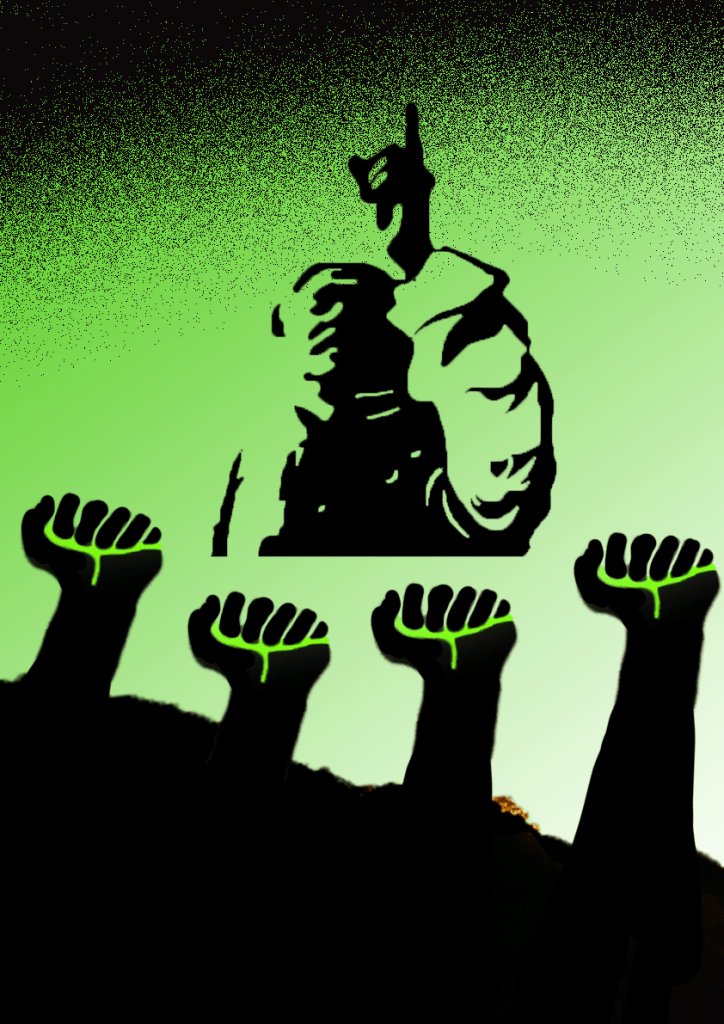
I started off by designing the background. I created a gradient background which consisted of both light and medium shades of the hue. I then went on to design the silhouettes of the fists, to invoke the love for the colour I placed a light green shade in the hands of the silhouettes as an accent. To finish off the cover I added a sprinkle of black on the top to compliment my design and not to leave it looking too empty.
Poster 2
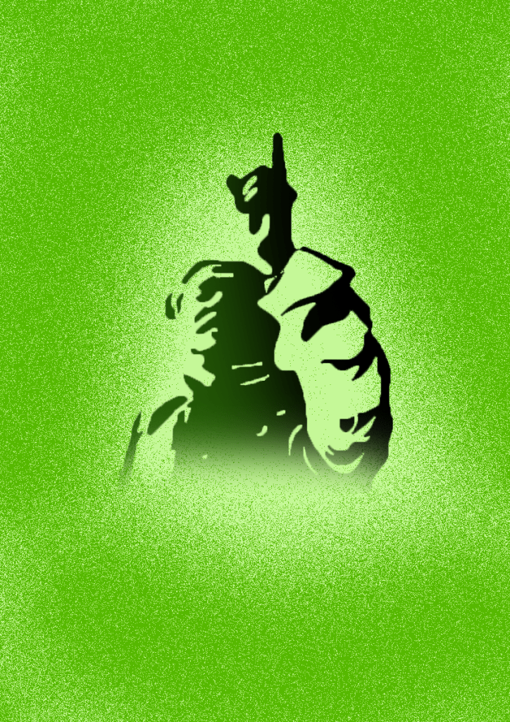
For the second cover I chose a light green background. I then went on to design the silhouette of ‘Sheikh Mujibur Rahman’ who is known as the father of the nation, in this silhouette I added a dark green/black blend. To finish off I used another shade of green to create a sprinkle around the silhouette. I made sure to adhere to the limitations of colour and not breaking the rules set by the brief.
Poster 3
For the third design I decided to use images from my first two posters and combined them into one. I put the silhouette of Sheikh Mujibur Rahman in the middle with silhouettes of fists below that image with greenery in their hand as a sign of allegiance. The combination of the images gave the poster a more clear idea of what is being narrated.
Final design
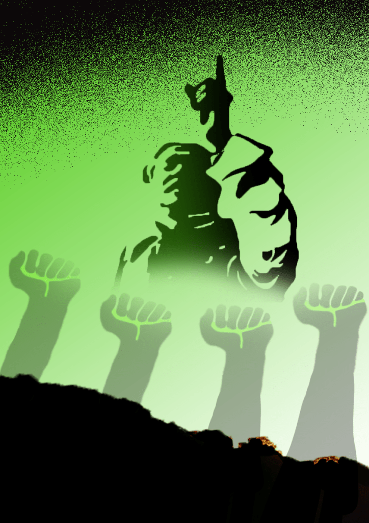
After designing the three iterations I felt happy with how my plan evolved, I kept to the colour limitations set by the brief and at the same time I feel like my posters story is clearly narrated. I brought back the dark green/black theme for my silhouette and made the bottom fade out, I then reduced the opacity of my silhouettes of the fists by 70% and made them blend in with the silhouette above.
Final overview
I am very happy with my final design, I love using silhouettes and I think it worked perfectly for this poster. At the beginning I was a bit worried about using the colour green to connect with a story related to war because I think there is a cultural difference between how people of Bangladesh view the colour green in this context compared to how the majority of people view it. But I was able to narrate the story with clarity with the designs that I merged.
