Create a series of 10 abstract designs in which you balance blocks of subordinate, dominant and accent colours. These designs are going to be used as covers for guidebooks to the following cities: Madrid, Malmo, Managua, Manchester, Manhattan, Marrakech, Marseilles, Melbourne, Montreal and Mumbai. The books are going to be A5 landscape (210mm x148mm) size. You can use as many colours as you like and need to include the name of the city – where you place this and its colour are also important decisions to make. You may want to find out more about each city to help you develop your colour palette and also the size, shape and positioning of the colour blocks. Explore your DTP packages further by creating the artwork in the different software packages you have to experiment with the possibilities and ease of use. You can also do this exercise on paper using coloured blocks that you can cut and move about. Make notes in your learning log as you research and create your designs.
What am I being asked to do?
My task is to design ten A5 landscape guide book covers for the ten cities on the list, I should focus on using blocks of subordinate, dominant and accent colours.
Keywords
Abstract, blocks, subordinate, dominant, accent, colour, size, shape, A5 landscape (210mm x148mm) size.
Beginning the task
The first thing i decided to do is to create a seperate folder for each city, I know from first hand experience how much confusion an unorganised folder can cause, especially for a task which requires me to create ten different covers.
Initial thoughts and plan
Geography is my weakest subject which might make this exercise a slight downfall for me. Luckily this isn’t a geography exercise, my plan is to research and find pictures of landmark sights for each city and then base my covers off those pictures.
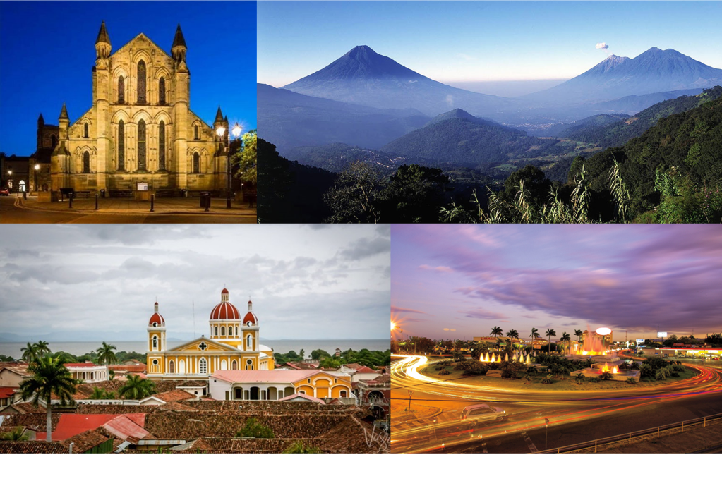
Madrid
“Madrid is the capital and most populous city of Spain. The city has almost 3.3 million inhabitants and a metropolitan area population of approximately 6.5 million. It is the second-largest city in the European Union, surpassed only by Berlin, and its monocentric metropolitan area is the second-largest in the EU, smaller only than Paris. The municipality covers 604.3 km².”
Mood board
After getting briefly familiar with the city I decided to narrow down all the pictures that I browsed and make a little mood board.
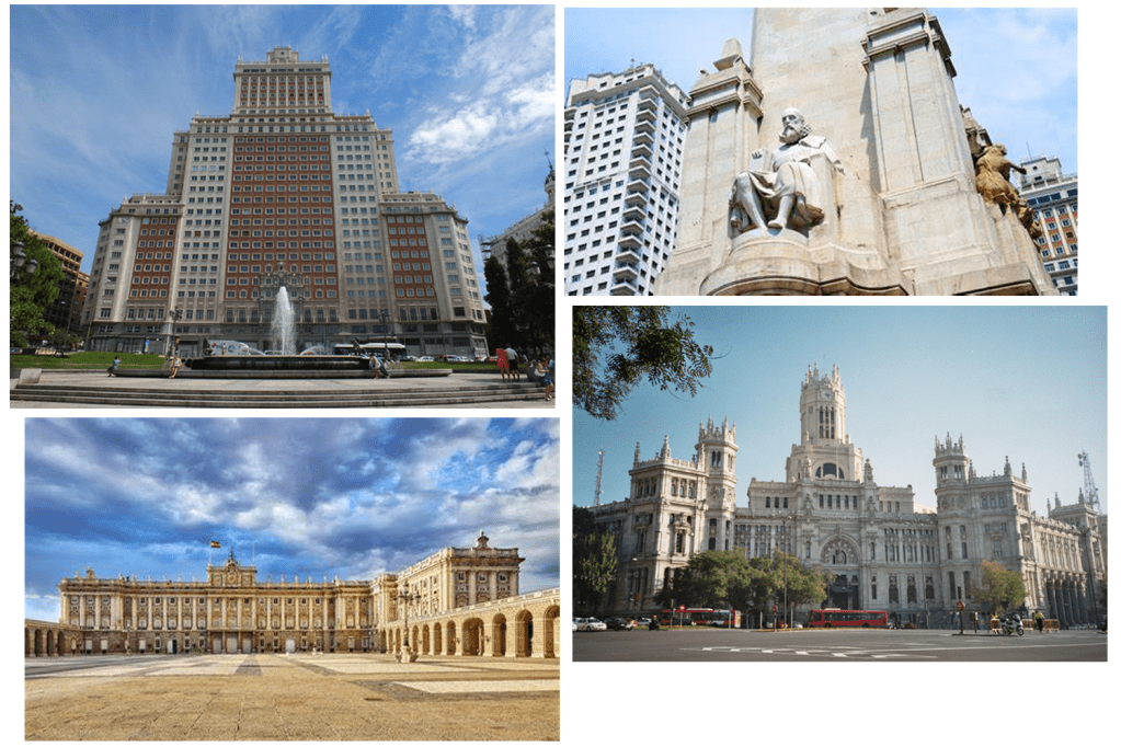
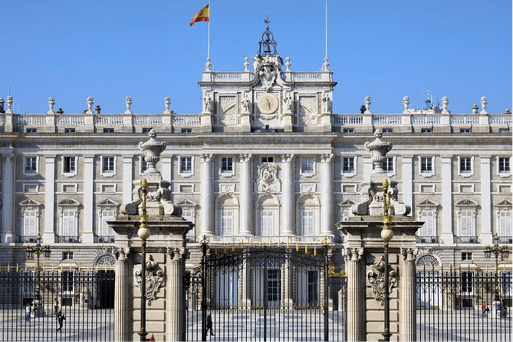
The sight that caught my attention the most was the Royal palace of Madrid, it is also one of the most iconic landmarks in the city so I’ve decided that this is what I will base my cover on. I then went on to sketch up my plan to give me a rough idea of how my design would look like.
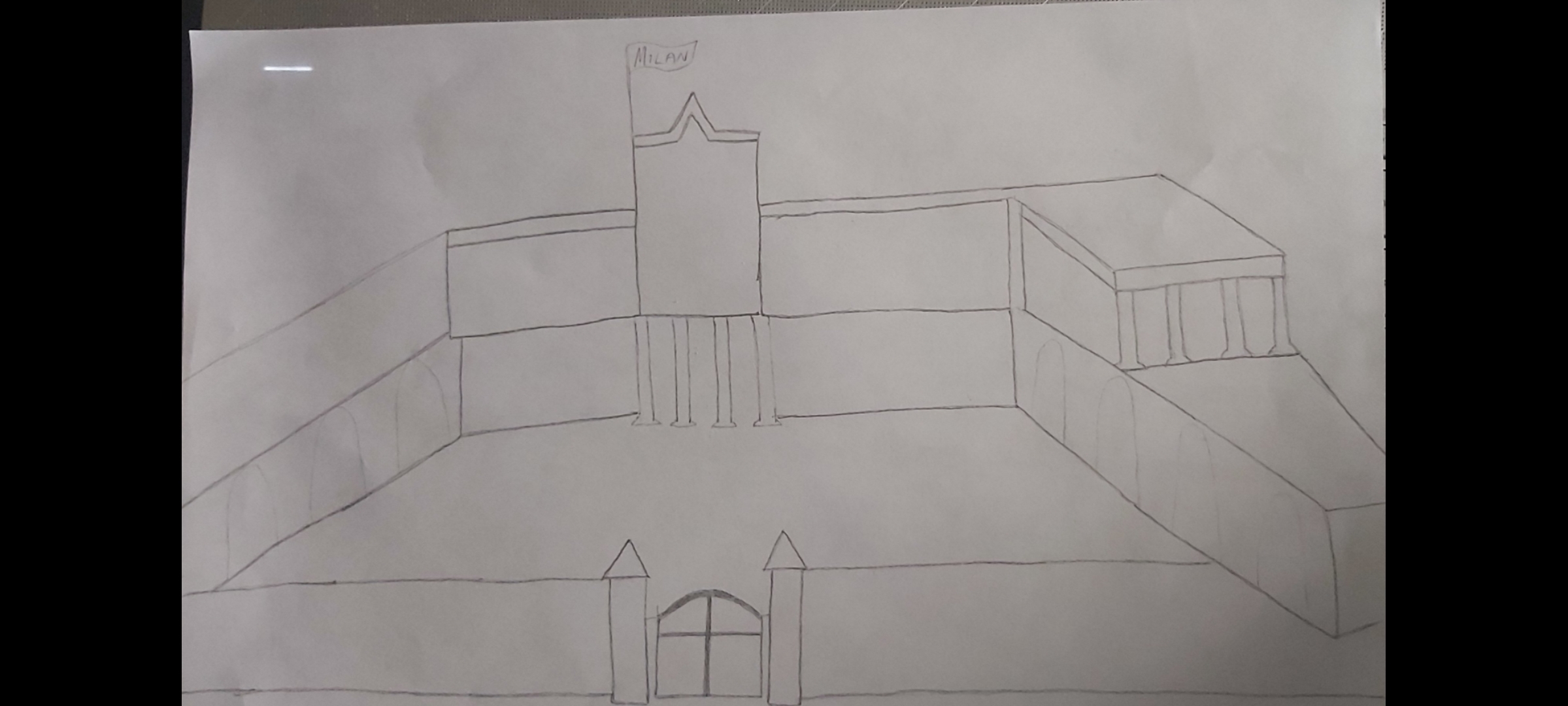
After finishing the sketch I had to decide which software would be the best for this task. I figured that Adobe Illustrator would be the best DTP programme to use since I wont have to concentrate on making colours blend etc, also the illustrator app allows more freedom when it comes to resizing and re shaping images.
As I started to design my cover I felt like I needed to simplify it so I started drifting away from my initial sketch, the picture below was a better angle of the palace to base my cover off so this is what I did.
Finished cover

I created a simpler version of the palace by using the rectangle tool and resizing the shapes. For the structure of my building design I used a dull, subordinate shade of brown. I then used a slightly brighter hue to design the pillars of the building – this dominant colour gave the image a more 3D look. After that I used a vibrant blue colour to resemble the sky. To finish it off I placed the word “Madrid” across the bright blue sky, I chose the colour red for the wording not just because it stands out on the blue background but because it also compliments the flag.
Malmo
Malmö is the largest city in the Swedish county of Skåne. It is the third-largest city in Sweden, after Stockholm and Gothenburg, and the sixth-largest city in Scandinavia, with a population of 316,588. The Malmö Metropolitan Region is home to over 700,000 people, and the Öresund region, which includes Malmö, is home to 4 million people.
After doing a brief bit of research I began to browse the most famous sites in the city, some of the buildings have very unique and interesting aesthetics so I decided to create a mood board to save some of my favourites.
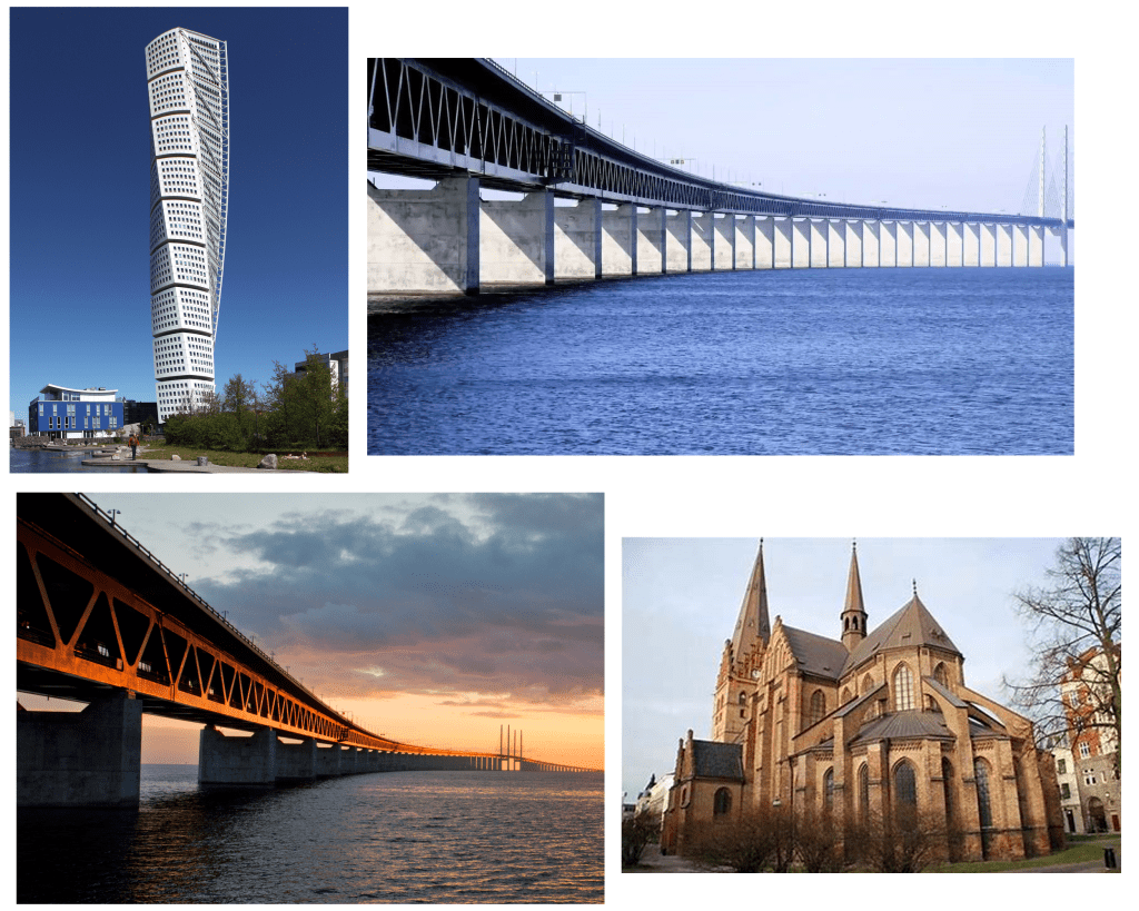
The turning torso building is a very unique structure, but the size and the beauty of the Oresund bridge caught my attention.
Sketch:
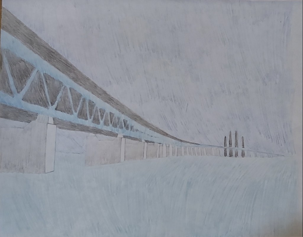
At first I felt limited with the colour scheme, the background of the sky and the sea below are both blue, the light coloured bridge also has a blue effect, so I decided to research the colour to expand on my options.
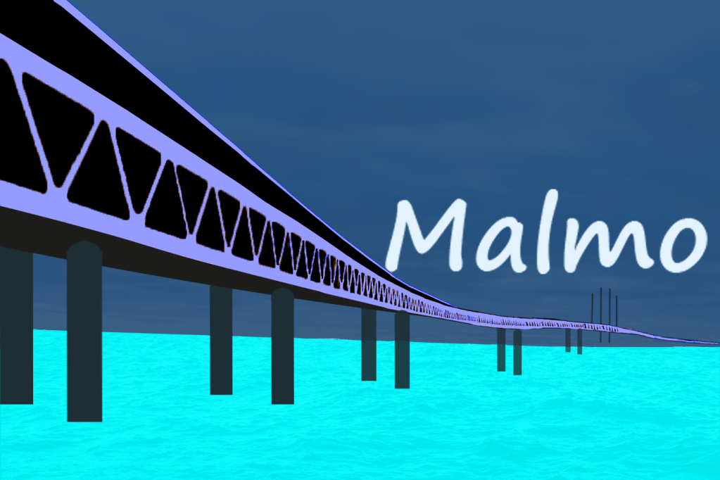
I began the cover design by choosing a dark royal blue colour for my background, I then picked a bright turquoise colour as the subordinate, the contrasting shade of the colours looked good when placed on top of each other. After designing the bridge I played around with the colours to see which one fit well and I came to the decision that the “Maya blue” shade was the best accent colour to pick because it added a little pop to the image. To finish off I placed the word “Malmo” quite low – almost resembling a sunset.
Managua
“Nicaragua is the largest country in Central America and is slightly bigger in area than New York State. The country is bordered by Honduras to the north and Costa Rica to the south. Managua is the capital and the nation’s largest city.”
I started browsing the landmarks in the city but I couldn’t find any structures that really caught my attention, however what was extraordinary was the volcanos and the mountains that I came across.
Mood board
Sketch
On my previous two covers I feel like I put too much effort into the details of the design, so for this cover I have decided to keep my designs as basic and simple as possible and to put most of my focus into the colour
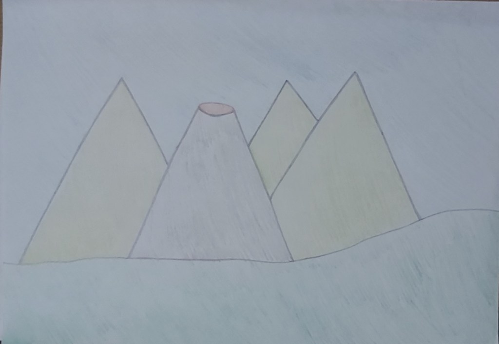
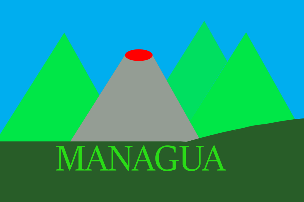
I put a dominant colour on the bottom of the cover in the greenery, for the background I put a light subordinate colour. For the mountains and the wording on the cover I used a green accent colour to add more emphasis with the contrast to the dark colours I used for the greenery and the volcano.
Manchester
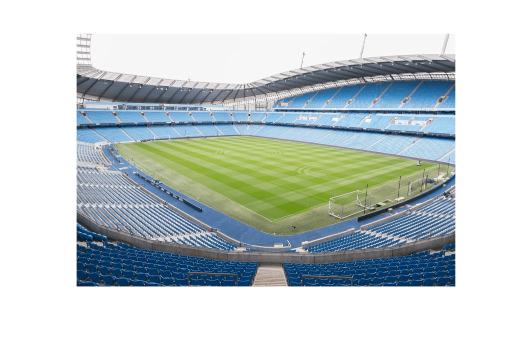
As a Mancunian who was born and bread in this city Manchester has always been known to us for our successful industrial work in the past. The ‘worker bee’ symbol was given to Manchester which represented the ‘hive of activity’ which workers were taking part in during the 19th century. The worker bee which is also known as the Manchester bee has come to light again in recent years after the horrific terrorist attack on May 22nd 2017 to represent the cities indomitable spirit after the tragedy.
Internationally Manchester is known for their successful football teams like Manchester City and Manchester United who are respected and well known word wide.
Mood board


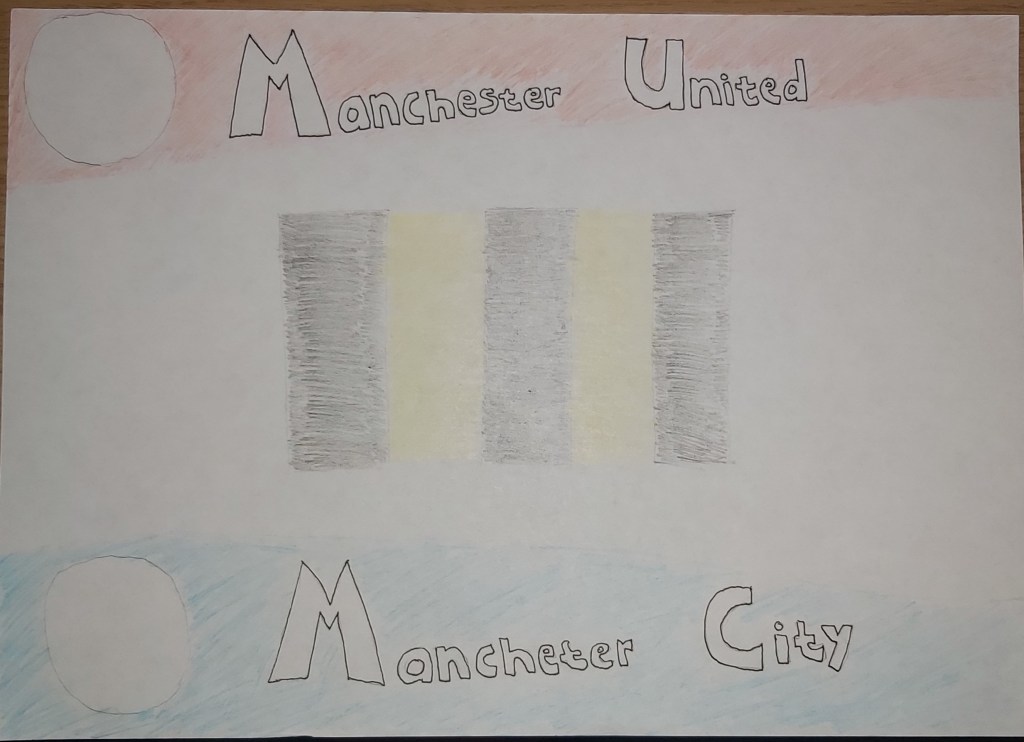
Breaking down the images from my mood board I created a sketch of which colours I wanted to use and how I wanted to place them as blocks.
Final design
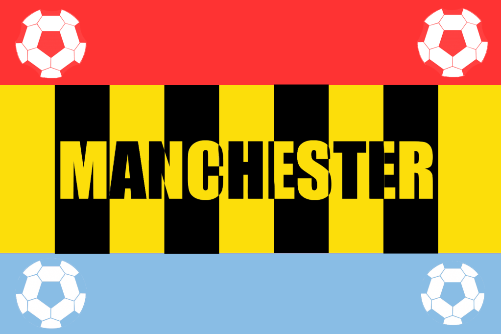
This cover is my favourite one so far, I like both the visual colour scheme of my design and also the meaning that each colour holds. For my dominant colour I used dark yellow, I added four black blocks of stripes on to the yellow to represent the Manchester bee. For my subordinate colours I used a light shade of blue on the bottom of the cover to represent Manchester city and a light shade of red to represent Manchester united. To finish off I added four very simple accent white colours in the form of footballs to represent the two teams. I placed the name of the city ‘Manchester’ in the middle of the cover in which I also used the Manchester bee theme.
I am very happy with this cover. I kept the designs simple but at the same time kept the colour scheme interesting and meaningful, I think this cover is a very good representation of Manchester.
Manhattan
Manhattan is another city that I am familiar with, I went on holiday to visit my cousins in New York back in 2012 and I explored the city for two weeks, it was my first time visiting America and the experience was amazing.
Landmarks
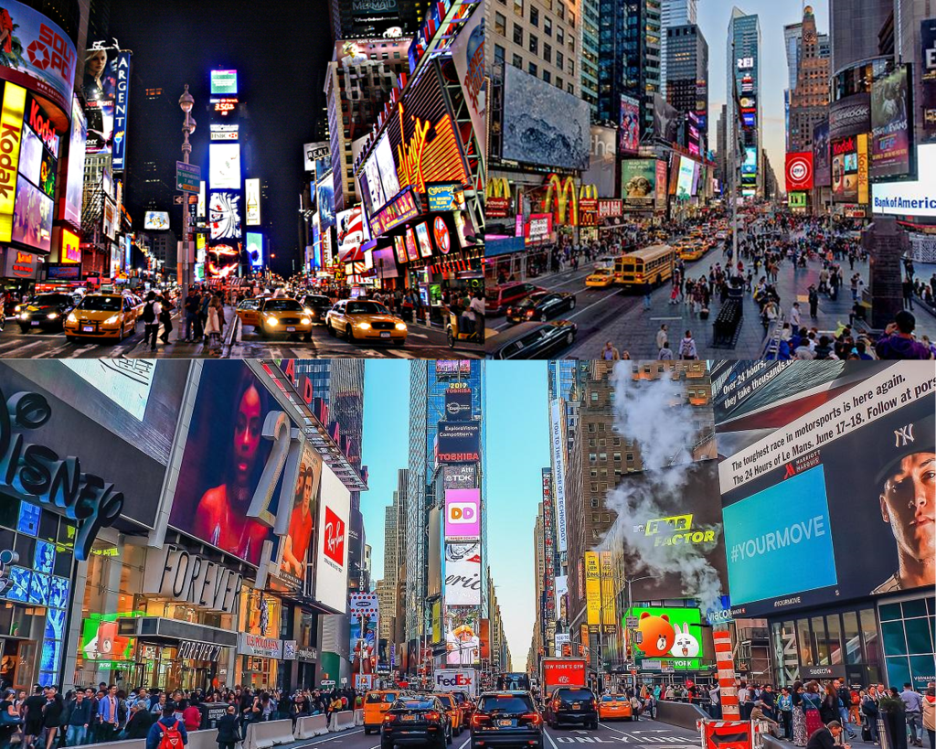
I really enjoyed my trip to the empire state building where we were allowed to go up to the 80th floor, but visiting the Times Square after looking at pictures and videos of it on the internet for years was breath taking.
Mood board
I created a mood board below with images that I took of the empire state building myself.

unfortunately the pictures I took with my iPod during the night time in Times Square weren’t the best quality so for my second mood board I used pictures from the internet.
Sketches
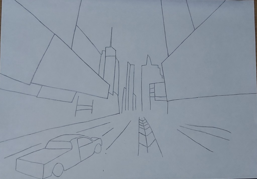
Times Square is definitely the perfect choice for this task because the sight is full of glimmering colours which will give me a variety to work with.
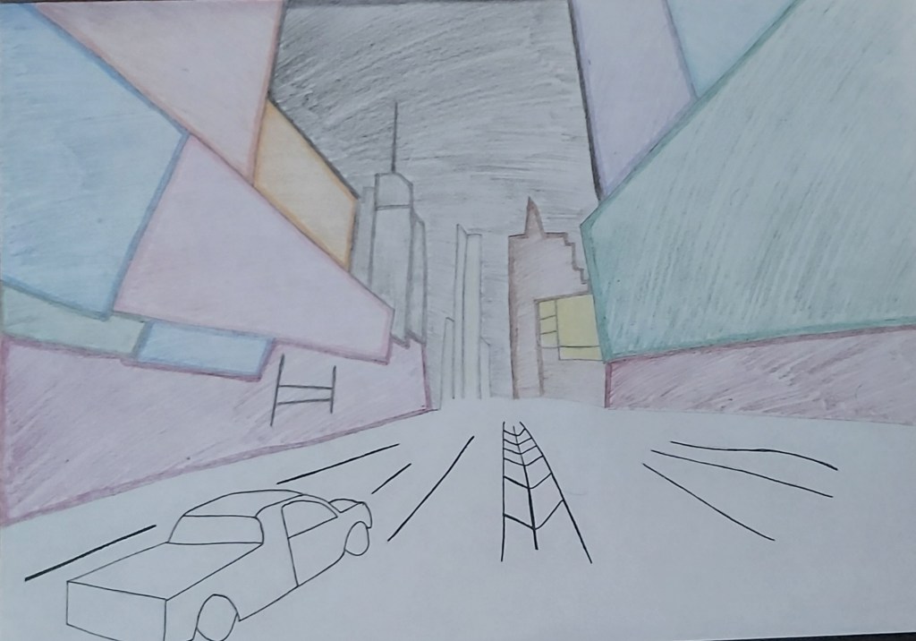
Final Design
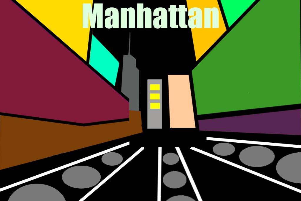
When I sketched my idea I was very happy with how it looked, I was really looking forward to creating a digital version of it but I didn’t want to overdo the design like I did in the previous covers so I kept it simple, personally I feel like its not my best craft of art but the aim of the exercise is to get us to experiment with different hue of colours which I did. For the title of the cover I first used a funky font with a bright green colour, but the whole imagery is a bit funky as it is, which is why I changed it by switching the colour to white and the font to a basic bold style.
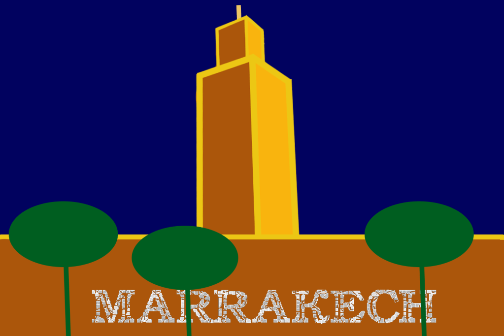
Marrakech
Even though I’ve never been to Marrakech I am quite familiar with the place because my college teacher was from the city, I also have quite a few friends that have been there.
Mood board
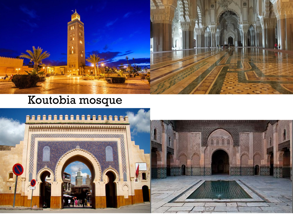
From what I have been told by friends and what I’ve seen on the internet, Marrakech is home to some of the most beautiful mosques and palaces.
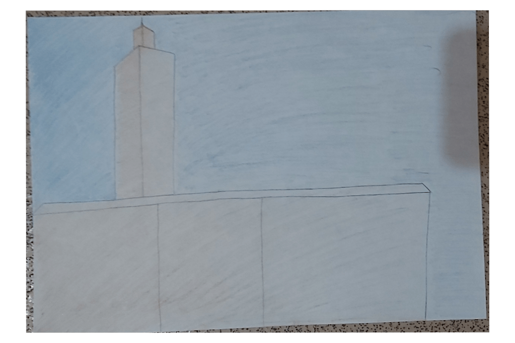
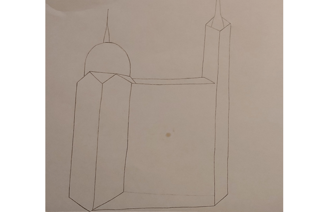
sketch
Final design
For this cover I focused more on using dominant colours, I seperated the designs by using accent/golden lines, I also used shapes to replicate the trees around the koutubia mosque where I used a subordinate green colour. For the title I used a mosaic font because a lot of mosques use stone and tile to create patterns, this is another reason why I placed the wording across the mosque.
Marseille
“Marseille is the second-largest metropolitan area in France after Paris. To the east, starting in the small fishing village of Callelongue on the outskirts of Marseille and stretching as far as Cassis, are the Calanques, a rugged coastal area interspersed with small fjord-like inlets.”
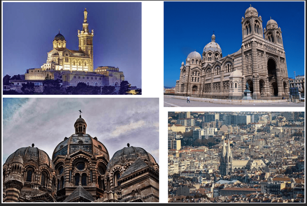
Growing up in a religious family I have always been fascinated by mosques and churches, It has always been a source of inner peace for me and looking at these pictures revives that feeling.
Marseille is home to many churches which includes the well known Notre Dame, these buildings have magnificent structures and I am looking forward to basing my covers on these landmarks.
Final design
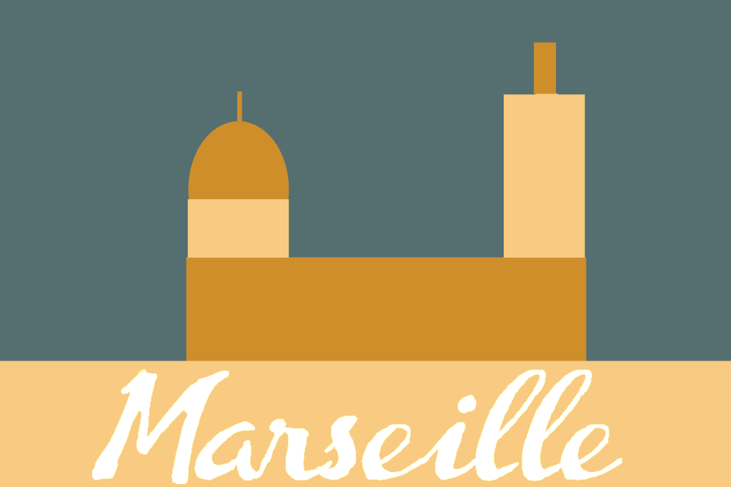
I decided to keep the design to a minimal and focus more on the colour, I am getting a better sense of feel on differentiating between dominant, subordinate and accent colours. For the background I used a subordinate grey colour, I then went onto add a dominant golden/bronze colour for the wall, dome and pillar of the church, then to finish I used a lighter creamy colour as an accent to create a bit of a contrast.
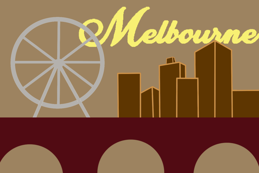
Melbourne
“Melbourne is the capital and most populous city of the Australian state of Victoria, and the second most populous city in Australia and Oceania. Its name refers to an urban agglomeration of 9,993 km (3,858 sq mi), comprising a metropolitan area with 31 municipalities, and is also the common name for its city centre.”
I don’t know much about Melbourne apart from the fact that it is located in a tropical country. When I picture the city in my head I think of it being a very hot, humid place with a very summery aura.
Mood board
Melbourne has got some interesting structures but I feel like its got nothing out of the ordinary, maybe the reason why I’m feeling this way is because I am comparing the city to places like the times square etc… My plan is to use ideas from each of the pictures on my mood board and create an amalgamation for my cover.
Sketch
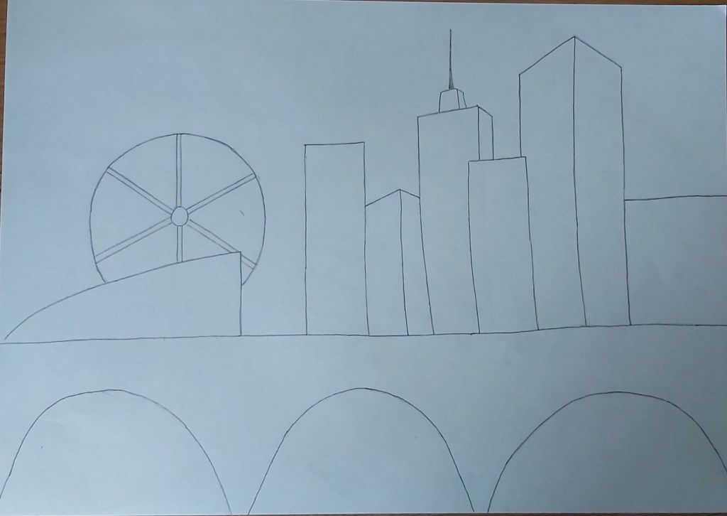
For my background I chose a subordinate, light brown colour, I then went on to design the buildings and the bridge in which I put my dominant colours; for the bridge I used a dark maroon shade and for the buildings I used dark brown in which I added some accent lines to make the structure stand out more. I also re-created the Ferris wheel from one of the pictures in the mood board in which I used a light grey hue, I did this to add more detail and to keep the colour scheme exciting. To finish off I added a swirly, yellow font to my title because I wanted the title to have a summery vibe.
Montreal
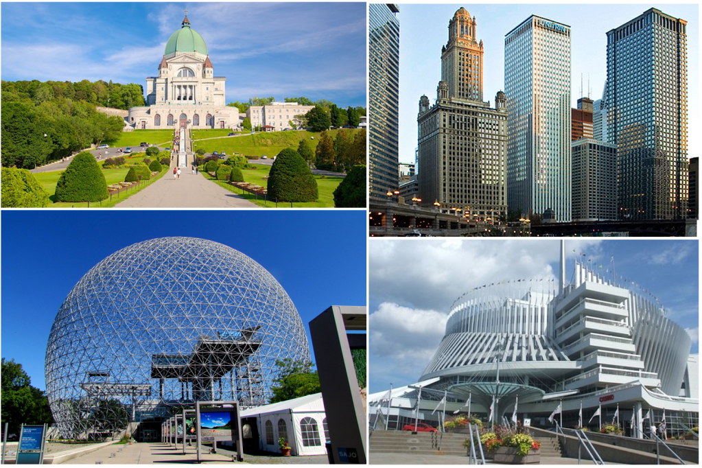
I was trying to find some landmarks that looked unique instead of the usual skyscrapers and I found some interesting ideas.
Sketch


For this cover I wanted to switch it up, instead of using dominant colours for my main image I used it for my background, personally I didn’t like the outcome but I wanted to have a play around with the colour schemes. I added a few designs in the background of the buildings and the sphere, I kept them simple and minimal in which I also used accent colours.
The reason why I placed the wording where I did is because I wanted it to be a visual representation of the Montreal biosphere.
Mumbai
“Mumbai has the second largest number of Art Deco buildings in the world after Miami. In the newer suburbs, modern buildings dominate the landscape. Mumbai has by far the largest number of skyscrapers in India, with 956 existing buildings and 272 under construction as of 2009.”
Mood board
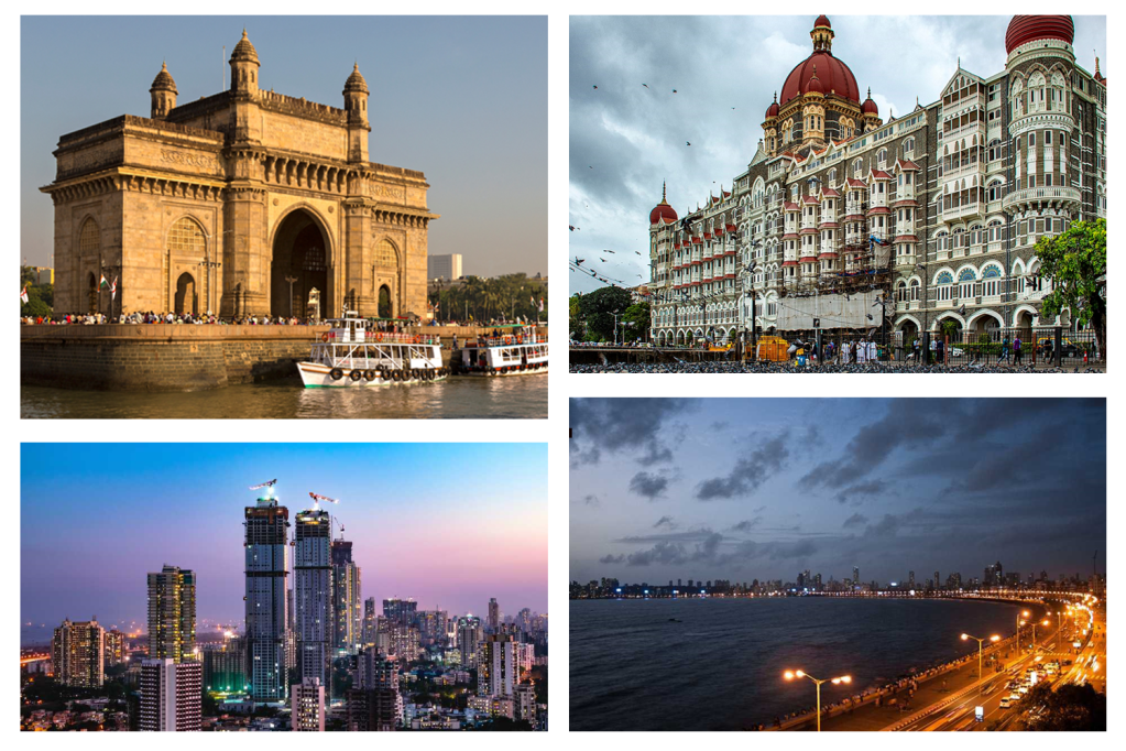
Mumbai has some fascinating landmarks. I myself am ethnically south Asian and I have travelled to Bangladesh a few times when I was younger (last time was over ten years ago). I remember Bangladesh being a very hot, sandy country and I imagine India to have a similar atmosphere.
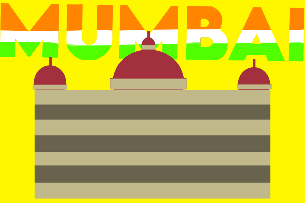
I was happy with my final cover, I was able to use blocks of colours consisting of a good mix of dominant, subordinate and accent colours. Since Mumbai is the biggest city in India i decided to use colours of the Indian flag on my wording.
Final overview
Half way through the exercise I was starting to feel like this task was a bit too drawn out, but looking back at it now I think it is very important for graphic designers to get comfortable using a variety of different subordinate, dominant and accent colours. Although at times I felt like this exercise was never ending I definitively believe it was an important one and I’m also looking forward to putting these new skills into practice.
Tutor Feedback
Overall you have done very well with this project.
However more visual research in terms of thumbnail sketches will help evolve
your final solutions. You have not evidenced sufficient cultural research into
each of the Cities, this will provide a better understanding of the cultural icons
and symbols. You sometimes confuse dominant and subordinate, please read
again the definitions.
That said you have some very good solutions demonstrating both colour
awareness and abstracted compositions. Some of my observations here.
Madrid, Bold abstraction and good use of colour.
Malmo, Strong perspective and selection of image with good research into the
colour blue. You can be too literal with your understanding of the type as
sunset.
Managua, Bold and interesting selection of imagery.
Manchester, this is a visual communication problem. The image does not
communicate as intended. It reads as football no history or cultural
perspective on the industrial north.
Manhattan, Very strong bold design great perspectives and strength of colour
Marseilles, Successful minimal and reductive.
Montreal, very brave decision to switch it up that does demonstrate your
knowledge of dominant and subordinate, not all designs do as I have said.
Mumbai, simple and successful.
