Brief:
Johannes Itten was an artist, designer and educator who spent much of his life exploring how colour works, especially the dynamic relationship between colours. This is one of his exercises.
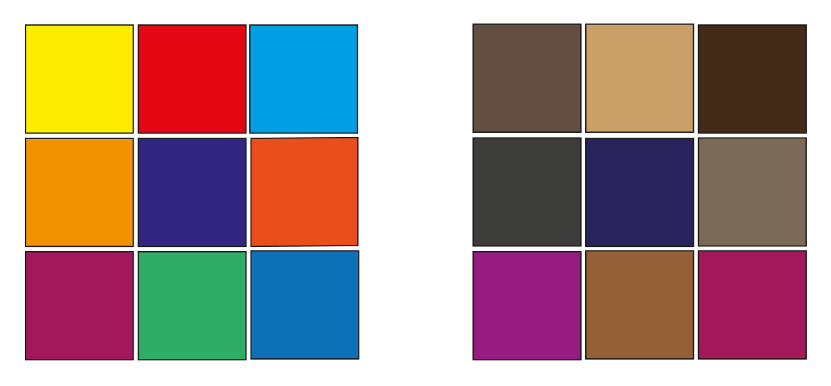
Draw two grids of squares, filling one with colours that you like and the other with colours you dislike. Then put the two grids side by side and ask the question ‘which one looks better?’
The usual result is the grid full of colours you dislike. This is because we tend to pick bright colours as the colours we like, which when placed side-by-side look garish and jarring. By contrast the colours we think we don’t like as much are often the more subtle and muddier mixed colours, tertiary colours and occasional bright hues. When placed side by side the effect is more balanced.
This is an important lesson for designers when picking a colour palette to work with: use bright colours but balance them against more subtle colours. It will also help you become better acquainted with your image manipulation or DTP software – identifying where your colour swatches are, how to select them and how you blend colours by changing their opacity.
Next try experimenting with placing colours together as Itten did.
Beginning the task
The exercise started off by instructing me to create two grids of colours; the first being with colours that I liked and the second with the colours that I disliked. So this is what I did.

After creating the two grids of colours I asked myself “which one looks better?” I was surprised that my opinion was in line with Johannes Ittens school of thought. The colours that I usually dislike, when put together look more well balanced. Meanwhile the colours that I like and frequently use, when observed for a little while, look excessively bright.
Colour squares
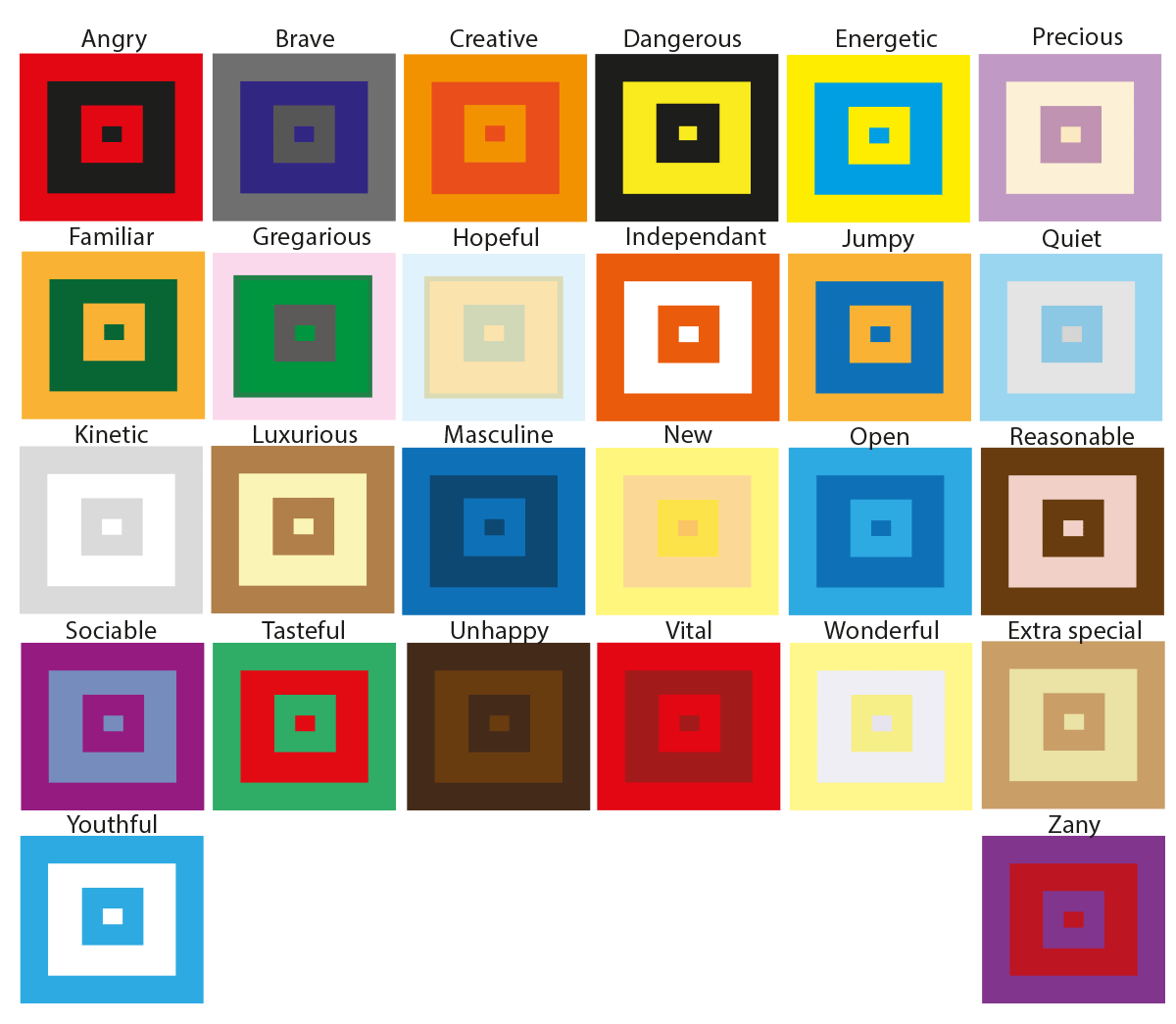
The next portion of the exercise wanted us to experiment with colours. More specifically, we were given twenty six different words and the idea of the task was for us to create a combination of two colours that best described each word. These are the examples I came up with.

Some of the colours were easy to come up with, for example the hue that I chose for the word angry was red. The reason for this is because when I think about the word angry the first thing that comes to my mind is a furious, bright, red face. Another expression that I found quite straight forward was the word ‘dangerous’, I automatically chose the colours black and yellow because if you look at most signs that refer to the word danger these are the most popular colours.
However, there were other words that were more challenging. I had to think outside of the box to find the correct colour scheme. For example words like precious, wonderful and quiet had soft connotations to them. So for my colours to match those words I had to reduce the opacity of my colours to make them have a more softer effect. The word ‘wonderful’ reminded about a sunset, this is why I used a faint yellow colour. The word ‘precious’ made me think about an innocent baby which is why I used a combination of a soft purple colour on a light creamy background. For the word ‘quiet’ I used a baby blue colour on a light grey background. Once again this is because the colour and the word quiet reminds me of an innocent child. For words like unhappy I thought that a dark brown colour would work well with the dull mood.
Final thoughts
This exercise was very interesting. Some of the parts were quite challenging. Usually I like to conceptualize my ideas through imagery, but with this exercise I was limited to only use colours to illustrate the ideas. However, I was happy with the end result.