You have been asked to design a leaflet for an organisation, inviting people to to volunteer for a task. (You can choose the task for example, school governor, fundraising or building a community garden). In addition to a title the information has been broken down into four chunks each of about 120 words. You will also need to leave space for contact and address details.
Working with a sheet of A4 paper or larger if you prefer, and ignoring the actual words and subheadings, explore the different formats for leaflets that are possible. Consider and experiment with options for final size and types of paper as part of your visualisation.
The organisers are particularly interested in trying to attract new people. Your job is to find a way to make people want to pick up the leaflet. Be creative and playful in developing a range of ideas. Will the leaflets be put in racks? Will they be handed out or sent in the post? You will need to do some research to see how other people have solved similar problems.
Choosing which task
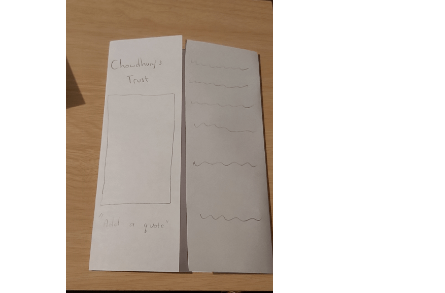
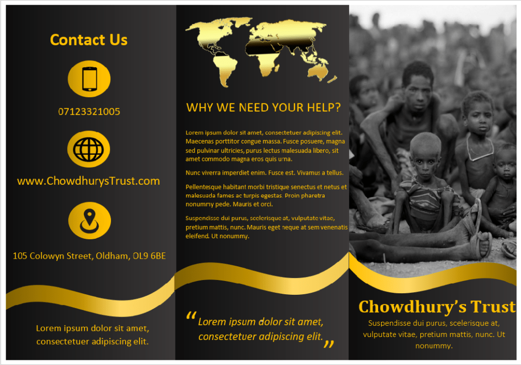
For this task I decided to go with the fundraising option because out of the three choices on the list this is the one I am most familiar with. I came up with the name ‘Chowdhury’s Trust’ and the theme of my project would be to raise money for starving children in Africa.
Experimenting with different leaflet formats
The aim of this exercise is more focused on making us experiment with different formats of leaflets more than the actual headings and subheadings so this is what I decided to focus on.
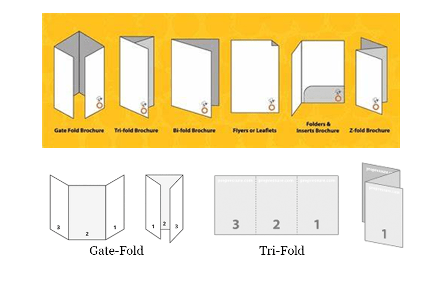
Gate-Fold 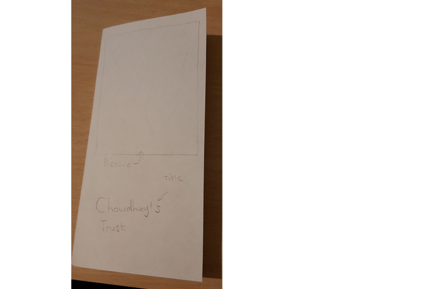
Tri-Fold 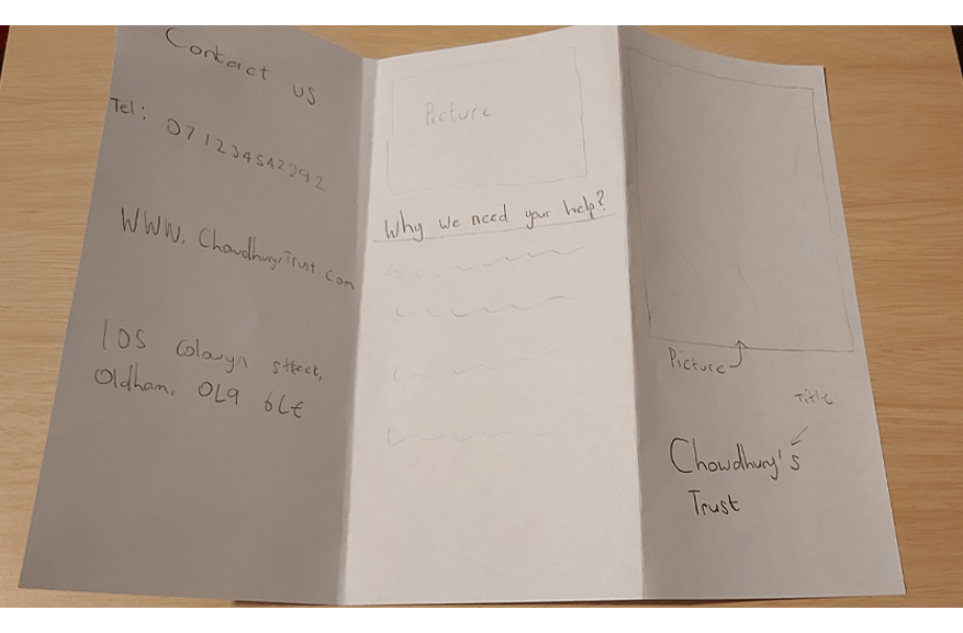
Tri-Fold
Although I was falling towards the gate-fold style leaflet I felt like the tri-fold method would be the best option. The tri-fold design doesn’t just look professional but it also makes it easier to separate information. For example, I can use the front page to attract people by displaying pictures and a clear title, I can use another page to talk in detail about my charity and why people should help us, then the final page can be used to display any extra information such as contact details, online websites and address etc. The tri-fold style leaflets are also smaller and easier to carry, if I was to hand out my leaflet it would be more easier for people to fold it into their pockets.
I then went on to learn how to make leaflets by watching tutorials on YouTube and I started to begin my design.
My main focus while designing the leaflet was to make it stand out. I played around with different colour schemes and I really liked the combination of having gold writing on a gradient black background and this is how my final design looked.
Final Overview
Overall I was very happy with how my leaflet looked. The way my black background colour blends from dark to light is something that I am very impressed with, also the juxtaposition of the golden designs and the colour of the fonts compliments my leaflet. I was a bit worried at first because I wasn’t sure if black and gold would be the correct colour scheme for a charity fundraising event aimed for children in Africa. However, once my design was completed I was very pleased with how it looked.
Tutor Feedback
You have produced stronger work here, a clear process has led to a
satisfactory solution. The tonal range of the black is very effective as is the
classic gold. There is still a lack of evidence of image development through
iterations. Try to ask more questions that lead to more image development
How did you arrive at these colours? What other colours did you explore?
What would gold on black normally signify? is it appropriate to the charity?
By critically reflecting in this way you evidence your knowledge and
understanding which is essential for success at degree level study.
