This first assignment is about introducing yourself so that your tutor can get to know you, your interests and your work better. This assignment is not submitted for formal assessment.
Design a series of at least three postcards (final size A6) that say something about who you are, your interests in graphic design and your wider cultural influences or interests.
Use the front of the card to present your designs while on the back of the card say something about what this image means to you or why you chose it.
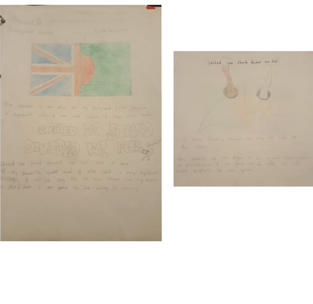
Postcard 1
I decided I was going to make three postcards which would give my reader a better understanding of my cultural background, my hobbies and what influenced me growing up. I started off writing a very brief mind map with a self centering question “Who am I?” Although the mind map was very brief and basic I had a lot of visual ideas flooding in which I began to sketch up.
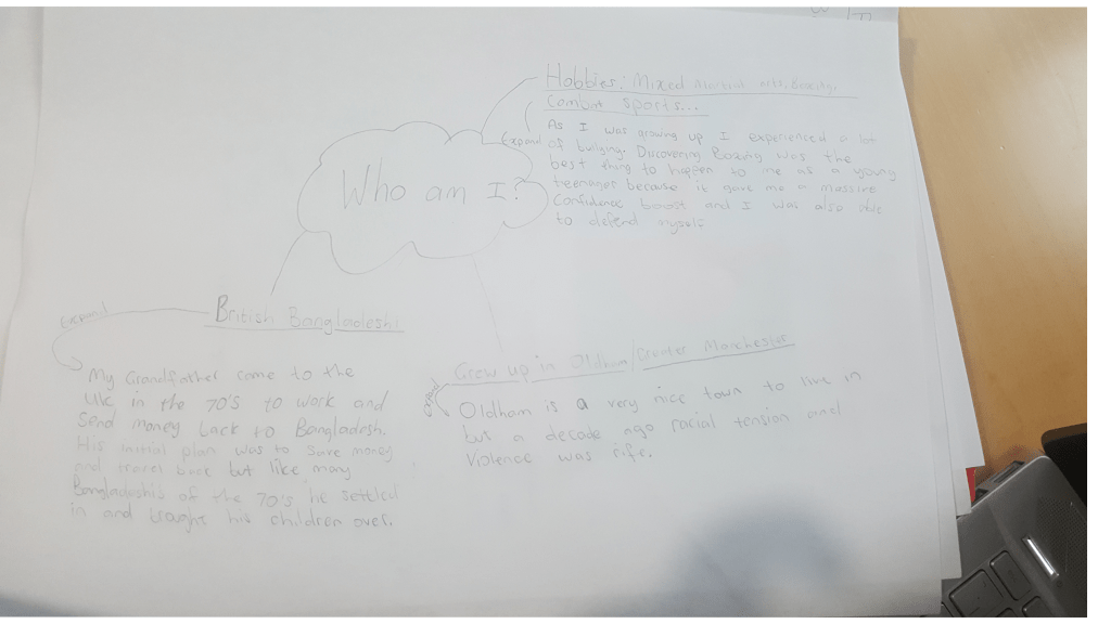
Mind map
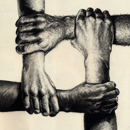
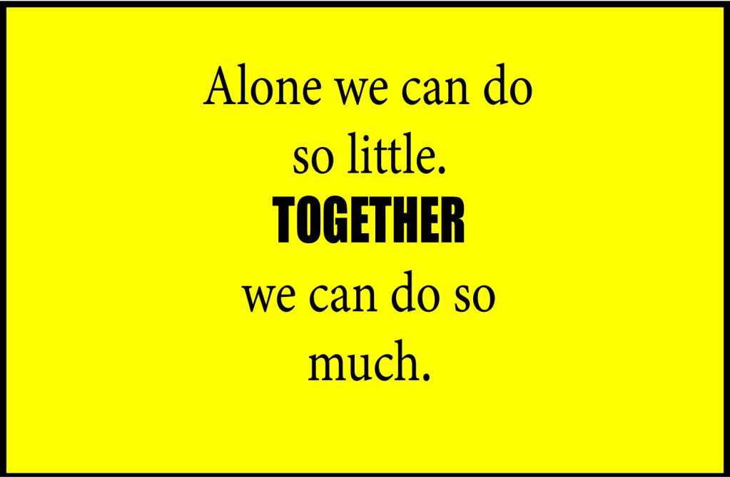
These pictures below gave me an idea about how a visual representation of unity looks like.

I then started to sketch up a few ideas that came to my head and this is what I came up with.
I used Adobe Photoshop to put all my ideas and sketches together and I was very pleased with how my postcard looked. I have explained below why I came up with these designs and the meanings behind them.
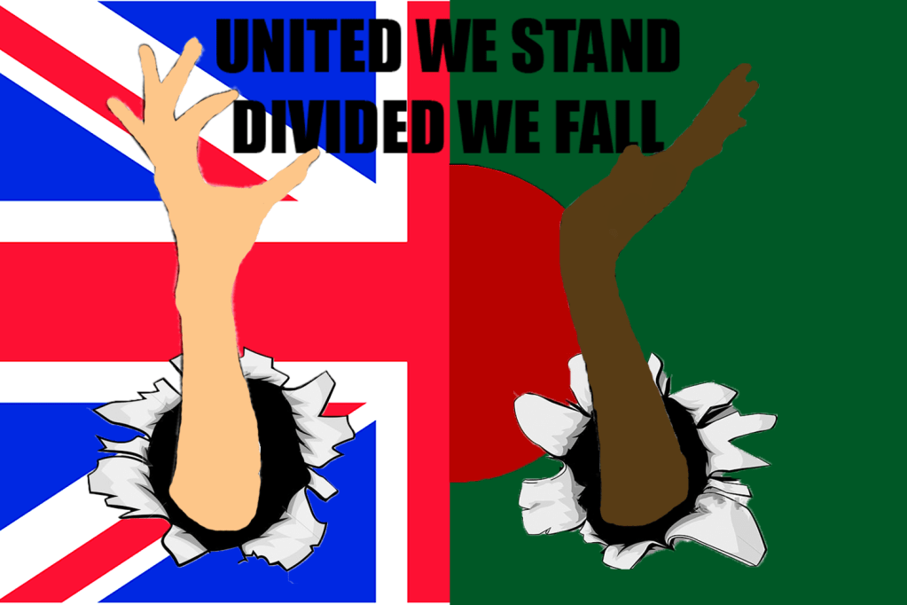
First of all I started off my postcard by designing the background. I wanted my background to be a visual representation of my nationality as a British Bangladeshi so I used both of the flags and combined it into one. I am a big fan of motivational quotes and I love keeping a log of quotes that inspire me. I felt as if the quote “United we stand, divided we fall” would be a suitable title for my postcard because I wanted this to be the theme of my project. This quote is also a positive reflection of Oldham (the town I grew up in). A decade ago racial tension was dangerously high and hate crimes were on the rise which led to people isolating themselves into their own areas, neighbourhoods used to feel like territories and people were constantly looking over their shoulders. However, we have moved on from the dark past and Oldham is now a safe, care free place to live in. Furthermore, I then had an idea to use two silhouettes of hands shaking each other after seeing some examples on google, but instead I used my own idea to personify my project by creating the effect that the hands were shooting through the flag to hold up the quote, one from the union flag and one from the Bangladesh flag as a sign of unity. The reason why I chose this topic is because this played a big part in my life and everyone that grew up in Greater Manchester in the past two decades.
Postcard 2
For my second postcard I browsed on the internet for inspiration and I came across a poet who’s twitter account goes by the name of ‘@Dialectichiphop’. On this page I found a few pictures that really stood out to me and caught my attention. One of the images brought back nostalgic, childhood memories whilst the other one got me thinking.
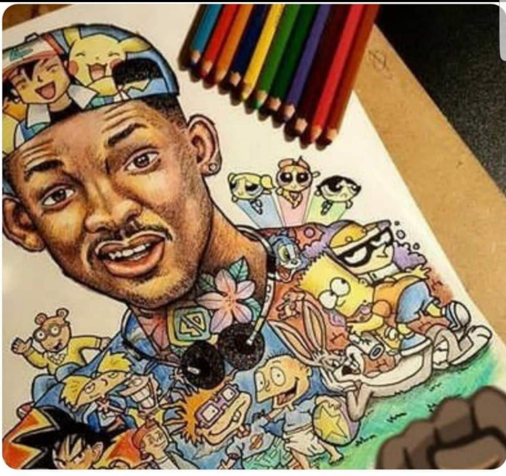
The artist who designed this image used all the famous characters from the most popular cartoons and tv shows from the early to mid 2000’s and created this image. Not only did the colour catch my eyes but the idea behind the design impressed me and I wanted my Postcard to have the same effect.
–
–

This is another picture that caught my attention. The artist posted this image with the question, what does this image mean to you? People have many interpretations about the meaning behind the picture but what caught my attention was the emotions on everybody’s face. Everyone faces some sort of hardships in their life’s whether its physical or mental, this picture influenced me to make a postcard about my hardships and how I overcame them.
–
–
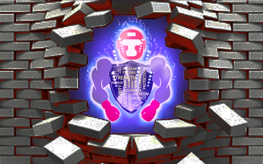
My second postcard was inspired by a few negative moments I experienced in school which had a huge impact on a large period of my life. When I first started secondary school I felt like I entered a new world. I went from a happy, innocent primary school to a secondary school which felt more like a prison, People were constantly trying to instigate fights and looking for trouble, I remember feeling helpless and weak all the time and after being coerced into a few incidents my anxiety got worse. The first two years of school was a struggle. But once I discovered boxing, my life changed. The more I trained the more confident I felt and overtime I was able to break through the wall of fear that was taking over my life.
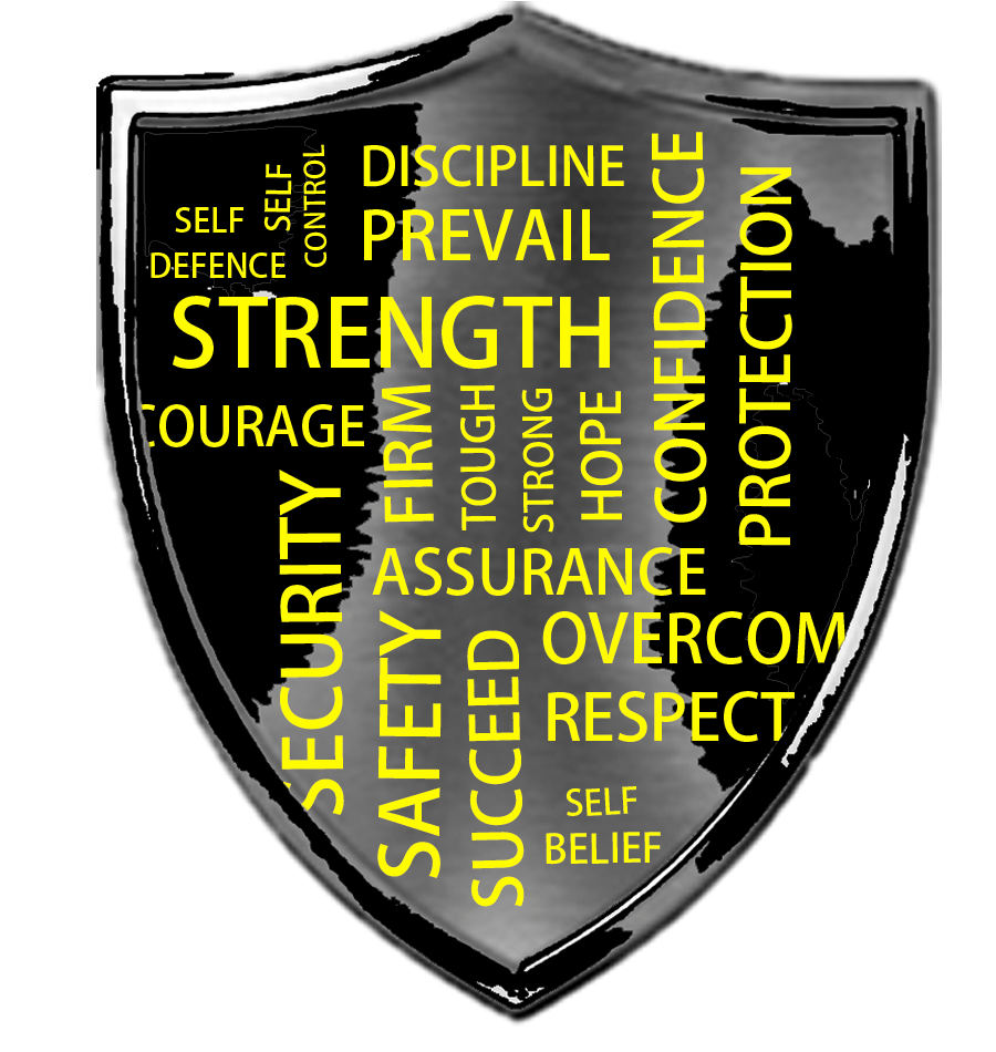
First I started off my postcard by making a mood board of everything that boxing gave me. I used words such as: discipline, overcome, confidence etc… I then placed the mood board onto a shield that I designed using shapes. The reason why I used a shield is because boxing was a source of protection for me and I wanted to visually narrate that.
–
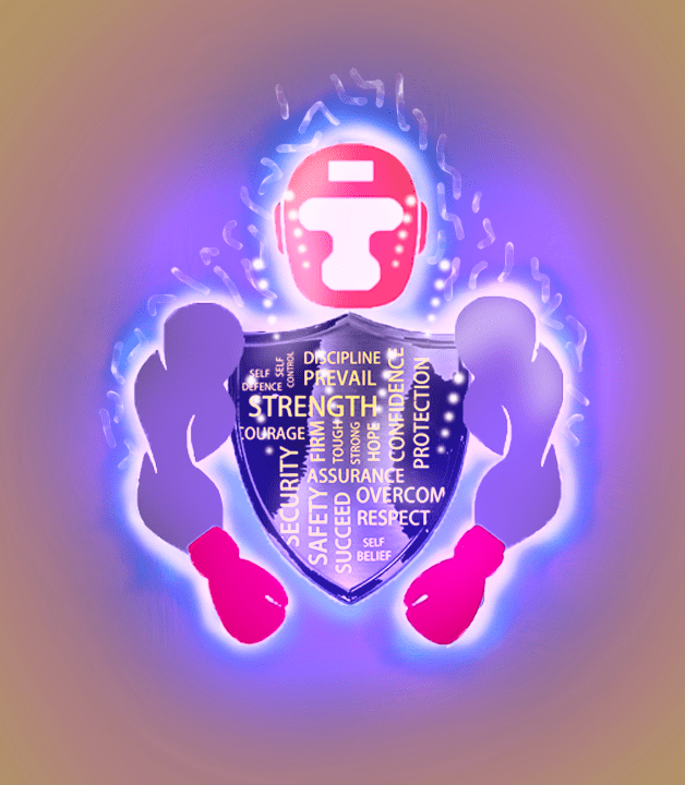
I then wanted to transform my postcard from just being a simple mood board to adding more meaning to it with designs so I added a pair of boxing gloves and headguards. I also designed a set of strong looking arms and I added a ‘ultra-instinct’ theme to my image to represent the strength that boxing gave me.
Finally, I then designed an image of a wall being smashed through where I placed my image. My aim was to narrate how I used my passion for boxing to break through my wall of fear.
Postcard 3
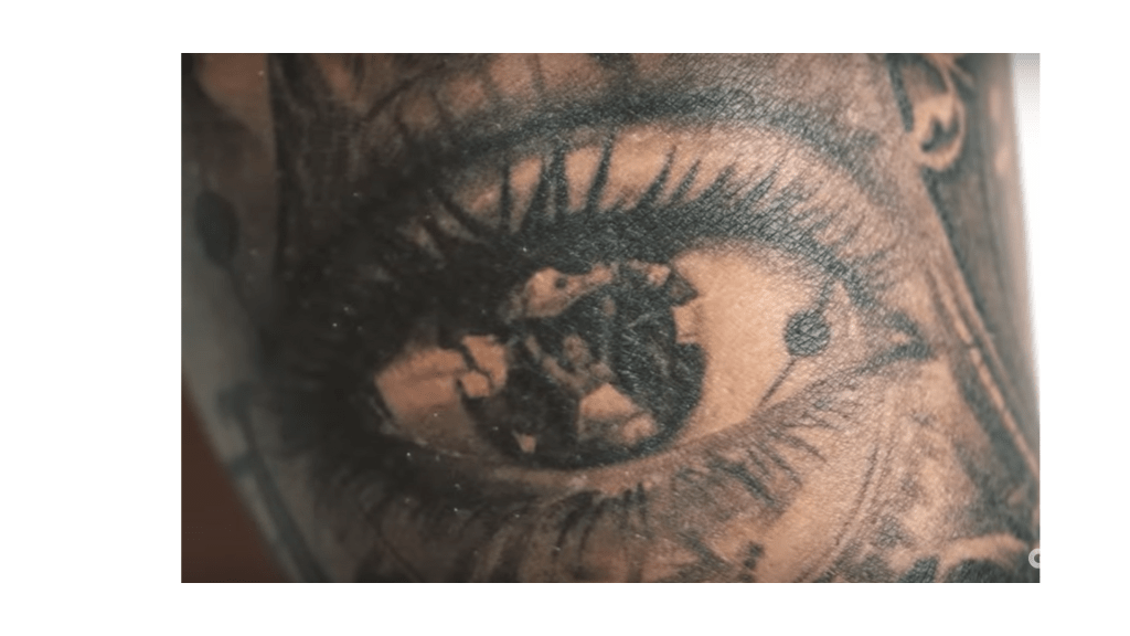
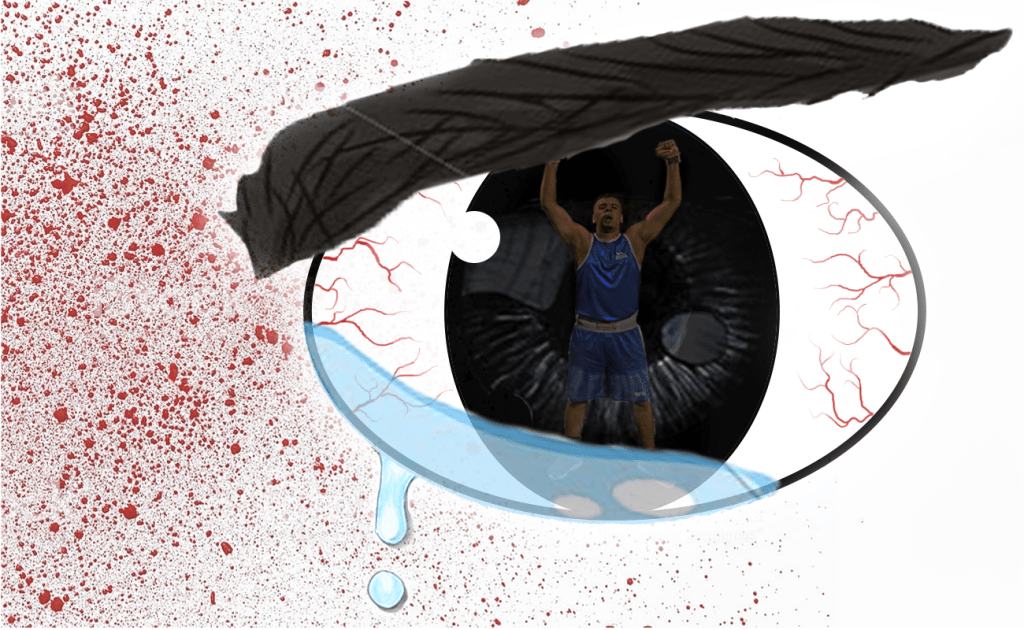
My third postcard was inspired by a tattoo of one of my favourite UFC fighters TJ Dillashaw. The tattoo is a picture of his wife’s eye and in the eye is a reflection of him after winning the world championship title. This reminded me about my dream as a young teenager when my only vision was to be a professional boxer, it also reminded me about the tough training camps that I was doing when I was preparing myself for upcoming matches. I want my postcard to be a resemblance of the hard work and torturous training that I put myself through to become successful.
Brief sketch
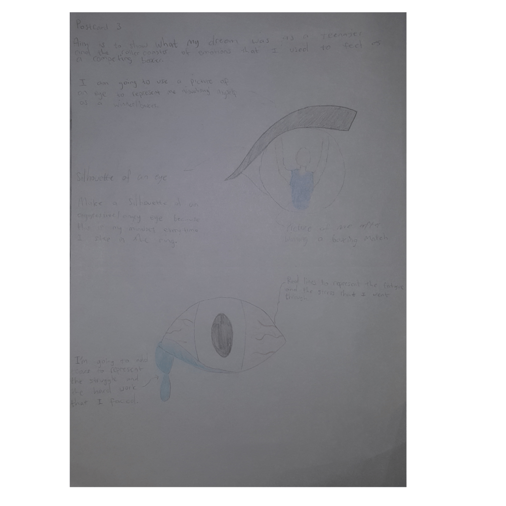
Before I started designing my postcard on Adobe Photoshop I made a sketch of how I wanted my image to look. I decided to create an eye with a reflective picture of me after winning one of my boxing matches; I did this to represent me visioning myself as a champion. I then added red lines and tear drops to make my eye look fatigued and stressed and I added an eyebrow and placed it at a 20 degree angle to add to the effect.
–
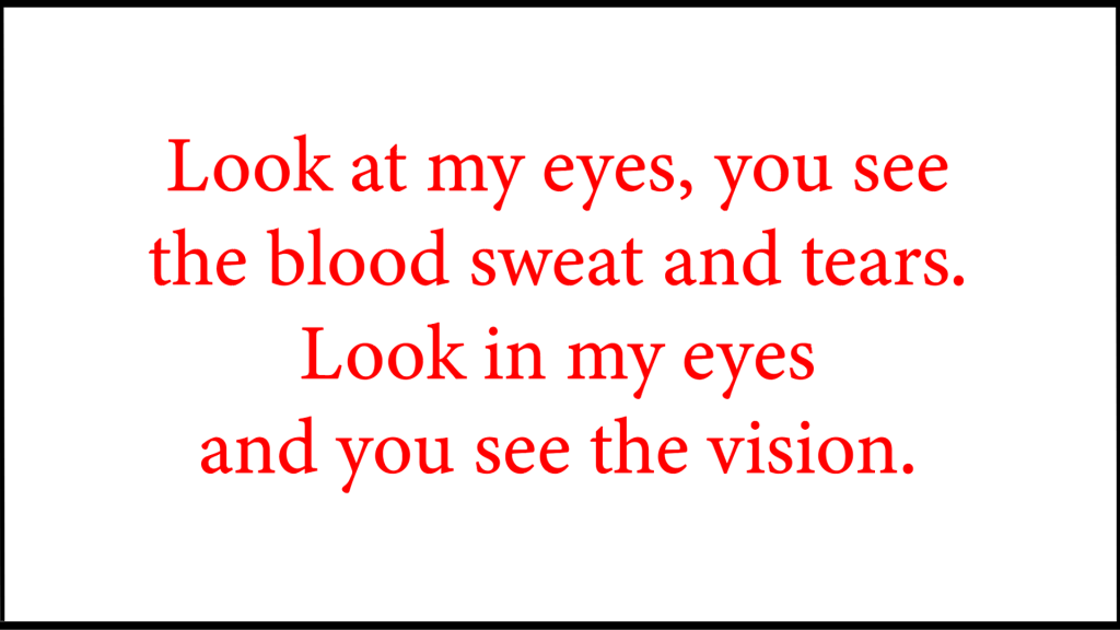
My aim for this postcard was to take my reader and delve them deeper into what it feels like to be a boxer. I want my reader to look at the external blood, sweat and tears and then look at my internal vision by looking inside of the eye of my postcard. Because this is a resemblance of every single boxer who fights through the pain visualising himself as a champion.
